|
All 5 books, Edward Tufte paperback $180
All 5 clothbound books, autographed by ET $280
Visual Display of Quantitative Information
Envisioning Information
Visual Explanations
Beautiful Evidence
Seeing With Fresh Eyes
catalog + shopping cart
|
Edward Tufte e-books Immediate download to any computer: Visual and Statistical Thinking $5
The Cognitive Style of Powerpoint $5
Seeing Around + Feynman Diagrams $5
Data Analysis for Politics and Policy $9
catalog + shopping cart
New ET Book
Seeing with Fresh Eyes:
catalog + shopping cart
Meaning, Space, Data, Truth |
Analyzing/Presenting Data/Information All 5 books + 4-hour ET online video course, keyed to the 5 books. |


A few questions... Have you ever been approached by a software development company about designing software meant for charting and data representation? It seems like I spend a lot of time hand-drawing my diagrams in order to get them to present data in the correct manner.
My second question is more simple, will an ET Bembo ever be made available to the public?
-- Tarun Nagpal (email)
.
Years ago a scientific graphing program, Sigma Plot, constructed graphic templates of about 40 of my designs for statistical graphics in The Visual Display of Quantitative Information. After SPSS took over Sigma Plot, the thing seemed to disappear. Nowadays I don't have the time or interest to get involved with a software house.
ET Bembo is a Bembo-like font for the computer designed by Dmitry Krasny, Bonnie Scranton, and myself. It will be used in my next book, Beautiful Evidence. My earlier books on analytical design were set in lead (!) in Monotype Bembo, an excellent book font. When converted to an electronic font, Monotype Bembo became thin and spindly (the computer people ignored "squeeze," the slight spreading of ink when the lead type hits the paper). So we made our own computer version and also made a some design changes (ligatures, several problems with the pi font, some letterforms, creation of a semibold). ET Bembo is used in "The Cognitive Style of PowerPoint." It is a typeface just to get my books from lead to computer; I'm not in the type distribution business so it will not be made available. Perhaps a commercial type house will produce a good computer Bembo someday soon.
-- Edward Tufte
The great Matthew Carter has designed a Bembo-like typeface "Yale", which is meant for the University's print and web publications. Alas it is a proprietary typeface, meant only for Yale University internal use. The practical effect is that the long-awaited redesign of Bembo by Matthew Carter has been locked up by Yale, the university not the typeface.
A promo for "Yale" is at :
http://www.yale.edu/printer/typeface/typeface.html
Access for downloading the typeface "Yale" is through a tricky form, so that once you reach the request page (by means of one's internal Yale password), checking off the corporately incorrect usage ("external publications," for example) causes the victim to be dumped off to a "Access Forbidden" page.
A few months ago "Yale" was called "YaleDesign". Both these names obliterate those who actually had something to do with creating the typeface: Francesco Griffo, Pietro Bembo, Aldus Manutius, Stanley Morison, and Matthew Carter.
I think the job of great universities is the production and distribution of knowledge (which is surely part of the justification for universities not having to pay taxes). And so why not make Carter's Bembo widely available? Why not call it MC Bembo?
-- Edward Tufte
The "Yale" typeface should be widely available--as Scripps College, Claremont, California, has done with Frederick Goudy's Scripps Old Style:
http://www.scrippscol.edu/dept/art/press/oldstyle.html.
-- Steve Sprague (email)
Monotype recently announced their new Bembo Book fonts. From their website:
Since the late 15th century, Bembo has been among the most universally admired - and imitated - type designs ever created. Now, Monotype announces a new, meticulously rendered revival called Bembo Book, specifically designed to capture the grace of the original in text setting sizes.

How close does this come to ET Bembo?
-- Michael Lewis (email)
Sorry for the double post, but Monotype's UK site has a better description (and a PDF sample):
Originally drawn by Monotype in 1929, Bembo was inspired by the types cut by Francesco Griffo and used by Aldus Manutius in 1495 to print Cardinal Bembo's tract "de Aetna". A beautiful design with tall ascending lowercase and elegant letterforms, Bembo has been a favourite for book setting for over 70 years. No italic was used in the Aldine "de Aetna" work so another source was needed. This was found in a publication by the writing master, Giovantonio Tagliente, produced in Venice circa 1524.(Emphasis mine)Considered by many to be one of Stanley Morison's finest achievements during his tenure as Typographical Advisor to the Monotype Corporation, Bembo has consistently been a best selling typeface, both in its original hot metal form and in today's digital formats.
Not intended to be a facsimile of Manutius' work, Bembo was drawn to embody the elegance and fine design features of the original but marry them with the consistency of contemporary production methods and to ensure that the typeface would work satisfactorily with high speed printing techniques.
The first phototypesetting and digital versions were based on hot metal 9 point drawings. This gave good legibility in small sizes, due to a comparatively large 'x' height, but lacked some of the elegance present in larger hot metal sizes.
This new digital version of Bembo, called Bembo Book, has been designed to be more suited to text setting in the size range from 10 point to 18 point. Based on the hot metal 10/18 point drawings, which were used to cut all sizes from 10 point to 24 point, this new face has been carefully drawn to produce similar results to those achieved from the hot metal version when letterpress printed. The project started in 2002 when a high quality UK Printing House asked for a digital version of Bembo which would give a similar appearance on the page to the 13 point hot metal they were currently using. Hot metal drawings were digitised and extensive editing was carried out on the resultant outlines to ensure that design features and overall colour from the digital output remained close to that of the letterpress product.
The resultant typeface is slightly narrower than existing digital versions of Bembo, it is a little more economical in use and gives excellent colour to continuous pages of text. Ascending lowercase letters are noticeably taller than capitals, giving an elegant, refined look to the text.
-- Michael Lewis (email)
Excellent news! We'll download it and see how it looks.
I suppose we should have gone to the Monotype corporation years ago instead doing ourselves.
-- Edward Tufte
I have been using David Perry's Cardo. It has served my purposes well and you can't beat the price.
http://scholarsfonts.net/cardofnt.html
-- Ed Mikula (email)
Bembo's Zoo
Dear ET,
Here is a fun website and childrens book by Roberto de Vicq de Cumptich who has created a whole Zoo full of animated animals constructed entirely from Bembo font characters and punctuation!
Best wishes
Matt R

-- Matt R (email)
Dear ET,
Here is an incredible collection of extremely high resolution digital images of original type faces in action https://www.flickr.com/photos/bookhistorian/. The collection has been put together by Paul Dijstelberge the type historian of the University of Amsterdam.
As he puts it; "This is a work in progress that will take years to finish. We have started on the 15th and 16th century. So far about 6500 pictures have been published. This includes high resolution pictures of type and also pictures of initials and ornaments in a lower resolution. We aim to publish at least 100.000 examples of type and initials and ornaments from the 15th-18th century - 20.000 in 2010."
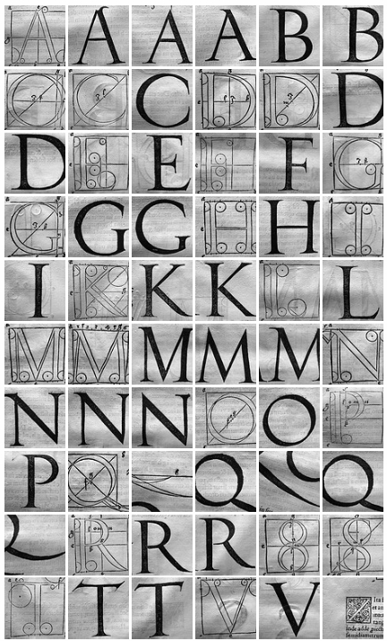
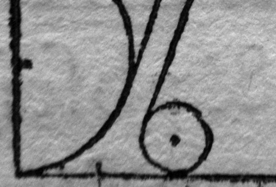
Here is a small multiple of images of Albert Durers type design from 1530 - published by Christianus Wechell in 1532. Also at the bottom a portion of one of the feet of a Durer capital A at the highest resolution.
Best wishes
Matt
-- Matt R (email)
I was delighted earlier today, to find that Google is making public their Font API, and a collection of fonts -- some suitable for both web and print (and all suitable for web, I believe). You can find out more at http://code.google.com/apis/webfonts/
This includes the font Cardo, described as follows: "Cardo is a large Unicode font specifically designed for the needs of classicists, Biblical scholars, medievalists, and linguists. Since it may be used to prepare materials for publication, it also contains features that are required for high-quality typography, such as ligatures, text figures (also known as old style numerals), true small capitals and a variety of punctuation and space characters. It may also be used to document and discuss the features of Unicode that are applicable to the these disciplines, as we work to help colleagues understand the value (and limitations) of Unicode.
This font is my version of a typeface cut for the Renaissance printer Aldus Manutius and first used to print Pietro Bembo's book De Aetna. This font has been revived in modern times under several names (Bembo, Aetna, Aldine 401). I chose it mainly because it is a classic book face, suitable for scholarship, and also because it is easier to get various diacritics sized and positioned for legibility with this design than with some others."
The font collection also includes Droid Sans and Droid Serif, both designed by Steve Matteson, and both made with screen-viewing in mind.
There are many other fonts available at the Google webfonts directory. I'd be very interested to hear what others think about the quality of these fonts. This is especially exciting to me, since Google appears to have solved some problems with rendering these fonts across various browsers, using the Google Font API, and CSS3.
With this, and the new "MathJax" package (http://www.mathjax.org/), I'm hopeful that well-typeset, online math content might be possible on the web in the near future!
-- Marty (email)
We have created a webfont based on the original ETBembo digital font files. These webfont files are freely available and open-source, and are at GitHub.
-- Adam Schwartz (email)
|
|||||||||||