|
All 5 books, Edward Tufte paperback $180
All 5 clothbound books, autographed by ET $280
Visual Display of Quantitative Information
Envisioning Information
Visual Explanations
Beautiful Evidence
Seeing With Fresh Eyes
catalog + shopping cart
|
Edward Tufte e-books Immediate download to any computer: Visual and Statistical Thinking $5
The Cognitive Style of Powerpoint $5
Seeing Around + Feynman Diagrams $5
Data Analysis for Politics and Policy $9
catalog + shopping cart
New ET Book
Seeing with Fresh Eyes:
catalog + shopping cart
Meaning, Space, Data, Truth |
Analyzing/Presenting Data/Information All 5 books + 4-hour ET online video course, keyed to the 5 books. |


Never Bitten, Twice Shy: The Real Dangers of Summer
By David Ropeik & Nigel Holmes

-- Herb Burton (email)
Response to link to NY Times article
This truly is a poor graphic. (It can be reached by the Multimedia link on the right hand side of the page Herb referenced above.) The bottom right hand third of the graph is essentially blank. The ordering of the various risks is in a bizarre order - it says it goes from "more risk, less fear" on the left to "more fear, less risk" on the right, but the "Fear Index" numbers, starting from the left are 102, 257, 233, 53, 229, 89, etc. while the odds of dying go from one in 29,500 to 55,600, 578,000, 0, 950,000, 0, etc. and the odds of injury go from one in 200 to 800, 1,700, 5,300, no statistic, 12,800, etc. And the scale is clearly out of whack also as the odds of a shark attack are so small compared to the other events that the shark numbers should be put several pages to the top and right of this graphic.
Plus, there are the chartjunky graphics of the various risky (or not) activities, as Herb noted.
However, there is one other thing about this graphic - the Op/Ed piece is by David Ropeik and Nigel Holmes, and "Nigel Holmes is a graphic designer." ET has long lobbied for the New York Times to give credit to its graphic designers, and here they have. Unfortunately, it's not a graphic to be proud of.
-- Rich Weber (email)
Response to link to NY Times article
I redid it as a scatter plot (on a log-log scale) of no. of articles (y-axis) vs. number of deaths on the x-axis. It was better as far as I was concerned but my wife liked the original better. She felt it had impact without having to read it through.
Will Roger's famous comment that, "What we don't know won't hurt us, it's what we do know that ain't." applies here.
I think the real story is that there is no relation between fatality of threat and amount of media publicity. The Times version seemed to imply a negative relation.
-- Howard Wainer (email)
Response to link to NY Times article
I am the Graphics Director at The New York Times and therefore feel the need to clarify two things about the display in question:
1. The graphics department, which produces the maps, charts and diagrams for the rest of the paper, has precious little contact with the opinion pages, and we did not produce or edit this chart.
In fact, we don't know what the Op-Ed page is doing until it is published. For better or worse, this is consistent with the American newspaper concept of keeping the news operations and opinion pages totally separate.
2. Nigel Holmes does not work for The Times. He was undoubtedly commissioned to do the piece.
This is not offered as a defense of the display's veracity, or lack thereof, but rather as a clarification of its origins and authorship.
-- Charles M. Blow (email)
Response to link to NY Times article
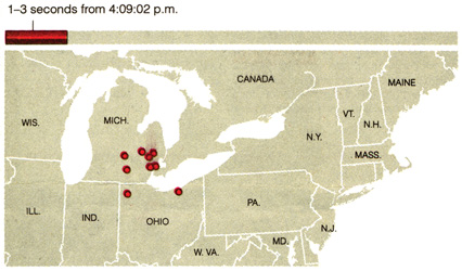
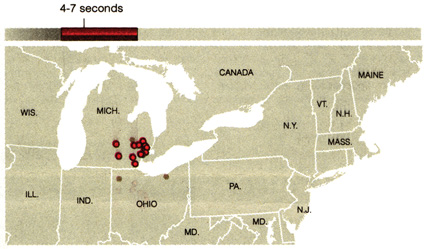
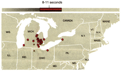
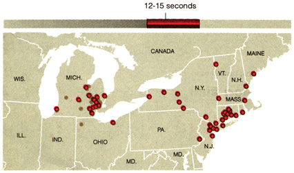
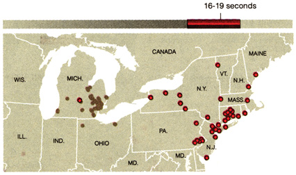
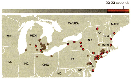
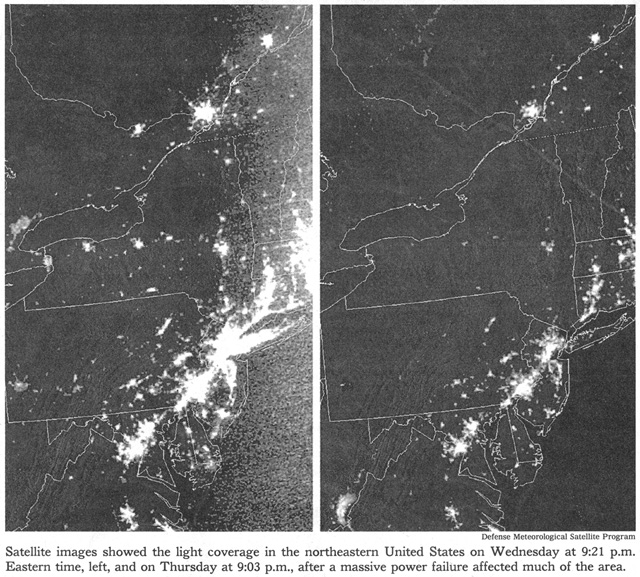
For a good many years now, Charles Blow has run the superb news graphics department at the Times. Take a look at today's amazing graphics on the blackout http://www.nytimes.com/ August 16, 2003. It is much better to see the paper edition; hard to view the graphics on the computer screen. And this beautiful work was done under enormous time pressure as well. See particularly the sequential map of the blackout as it moved from Ohio and across the country in about 30 seconds. Also shown are 2 satellite photographs of night lights in the eastern US: one normal, and one on Friday night.
In contrast to the news pages, the op/ed page at the Times has had something of a streak of Duck Graphics; I recall at least 3 in the last few months. Even op/ed data graphics should meet standards of graphical excellence, just as the Times standards of typography, layout, and grammar are largely maintained on the op/ed page. Complaints about op/ed data graphics should be addressed to the editor of the op/ed page. It would be good practice for the op/ed editor to have Charles Blow take a quick look at proposed data graphics that are to appear as editorial graphics.
 |
 |
 |
 |
 |
 |
 |
-- Edward Tufte
The blackout graphics are great. Just one quick point of detail:
In the 'Sequence of Power Loss' graphic, West Virginia morphs into Maryland after a few seconds of animation.
-- Dan Coyne (email)
|
||||||