|
All 5 books, Edward Tufte paperback $180
All 5 clothbound books, autographed by ET $280
Visual Display of Quantitative Information
Envisioning Information
Visual Explanations
Beautiful Evidence
Seeing With Fresh Eyes
catalog + shopping cart
|
Edward Tufte e-books Immediate download to any computer: Visual and Statistical Thinking $5
The Cognitive Style of Powerpoint $5
Seeing Around + Feynman Diagrams $5
Data Analysis for Politics and Policy $9
catalog + shopping cart
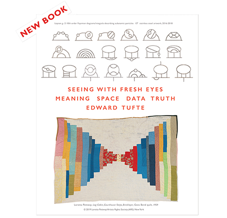
New ET Book
Seeing with Fresh Eyes:
catalog + shopping cart
Meaning, Space, Data, Truth |
Analyzing/Presenting Data/Information All 5 books + 4-hour ET online video course, keyed to the 5 books. |
My friend Jamy Ian Swiss, the excellent magician and co-author of the magic chapter in my Visual Explanations, sends this interesting link about the FedEx logo and its clever understated use of negative space:
 |
-- Edward Tufte
See also the thread on the changing Google logo:
https://www.edwardtufte.com/bboard/q-and-a-fetch-msg?msg_id=00007z&topic_id=1
All our logo threads will eventually be brought together here.
-- ET
 Has anyone compared the designs of the top candidate websites yet? I couldn't help but notice Senator Obama is using Gill Sans for display but a serif font for the logo, which reminded me of Scott Dadish's article What You See is What You Get, with this graphic by Paula Sher.
What are the measures of good design for a candidate's website? How do those standards compare to the pure textual content standard a newspaper may be held to? A candidate's site has several competing audiences: organizers may need access to registries and templates, potential volunteers and donors may want in depth opinion pieces, and the undecided may want high level overviews. All with presidential style.
Perhaps a some screenshots of candidate frontpages would be informative.
-- Niels Olson (email)
Why is it that nobody notices the glaring typewriter "foot mark" in the Bush-Cheney sticker.
This is one pet peeve of mine in typography I cannot back off about. It needs a true apostrophe.
There was a designer a while back that made a PP presentation of all sorts of bastardizations of signage throughout New York City alone. I see it all the time, even in expensive, metalcrafted signs...the incredible ', or for quotes, the " (inch mark)--which realy isn't an inch or foot mark at all: for that you use the Symbol [Mac] font's prime/ double-prime sign; and no "x" for the "by" sign, use the proper "by" sign: [option-Y] on a Mac in Symbol font.
Have Windows? Well, then you probably don't care about the nuances of typesetting anyway!
-- Jeffrey Rutzky (email)
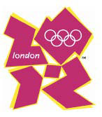
The logo for the London Olympic Games 2012 has been unveiled today.
 |
It is "the vision at the very heart of our brand."
It will "act as a reminder of our promise to use the Olympic spirit to inspire everyone and reach out to young people around the world."
It is "an invitation to take part and to get involved."
It is "about reaching out and engaging young people."
When people see the new logo "we want them to be inspired to make a positive change in their life."
Olympics Minister Tessa Jowell said "This is an iconic brand that sums up what London 2012 is all about - an inclusive, welcoming and diverse games that involves the whole country."
"It has "cost £400,000 ($0.8 million) to design."
Throughout the day a vast crowd of several million people - muscular miners from the coal producing area of Haywards Heath, horny-handed sons of the soil from the rolling farmland plains of Soho, proud, tough upright decent labouring men from the industrial megapopolis of Stow-on-the Wold, and dewy-eyed fresh-faced eager young students from the University quarters of a thousand ancient English Cities - has processed spontaneously through the streets of London scattering gold coins to the ragged poor and chanting with one voice in unison "Our undying gratitude is owed to our Olympics Minister who has given us an iconic brand that sums up what London 2012 is all about - an inclusive, welcoming and diverse games that involves the whole country."
-- Martin Ternouth (email)

I have been struggling to interpret the negative space but I may be giving the designers more credit than they deserve - I think it reads 2012 but it is not obvious. The best
explanation that I can come up with is that it will come together in some sort of animation and be ...wait for it... a blob
There is also a microsite for individuals to create a personal 2012 logo. http://www.london2012.org
I can't help but wonder if this is graphic design a la American Idol. My bet is that some small child will design an improvement on the online site and the committee will adopt a revised version and then we will truly have a 2012 design by, and for, the people.
Shall we post an entry? It is intersting to see how the mark has evolved since London was a candidate city. (NOTE: I using the Gould interpretation of the word, i.e., evolution is not necessarily progress...)

By KinoDesign [ http://www.kinodesign.co.uk/main.htm ]
NOTE:
Natural selection is an immensely powerful yet beautifully simple theory that has held up remarkably well, under intense and unrelenting scrutiny and testing, for 135 years. In essence, natural selection locates the mechanism of evolutionary change in a "struggle" among organisms for reproductive success, leading to improved fit of populations to changing environments. ( Struggle is often a metaphorical description and need not be viewed as overt combat, guns blazing. Tactics for reproductive success include a variety of non-martial activities such as earlier and more frequent mating or better cooperation with partners in raising offspring.) Natural selection is therefore a principle of local adaptation, not of general advance or progress. online
-- Tchad (email)
Five golden rings...
I printed out the 2012 logo and stuck it on my wall; it does work
better from a distance. The shape is unique, which will undoubtedly
be an asset for signage to guide crowds. Perhaps each venue
will have a colour coding.
There is a left to right movement in the piece with a focus
on the reversed out olympic rings. It should work well as a
watermark on video and seems to be the right proportion
for a t-shirt, etc.
As a piece of design, it is not to my taste but I see why it
was created.
-- Tchad (email)
What many people do not understand about the London Olympics logo is that it is meant to be seen in motion, as part of a multimedia campaign. You can no more capture it in a single, static image than you could hear a symphony in one note.
-- Gaijin Biker (email)
Like it or not (and the debate is *huge*, the 2012 London Olympic branding is here. They invite you to download a PDF containing four segmented squares, each representing a certain quality: create, inspire, play, and imagine. Here's the link to get you started:
http://www.london2012.com/index.html
My design overlapped all four grids, and I made a stained glass out of the "official" colors. See it here:
http://www.london2012.com/joinin/create/fullsize/yxqhDn.html
One of my fave ad agencies is in favor of the logo: http://coudal.com/olympics.php
-- Jeffrey Rutzky (email)
No multimedia please...
The Olympic Logo Saga continues; here are a few extracts from a news article about the multimedia animation:
A segment of animated footage promoting the 2012 Olympics has been removed from the organisers' website after fears it could trigger epileptic seizures.
A London 2012 spokeswoman said the health concerns surrounded a piece of animation shown at the launch, which was recorded by broadcasters and put on the official website.
Emphasising that it was not the logo itself which was the focus of worries, she said: "This concerns a short piece of animation which we used as part of the logo launch event and not the actual logo."
She said the section of footage concerned showed a "diver diving into a pool which had a multi-colour ripple effect".
SOURCE: http://news.bbc.co.uk/1/hi/england/london/6724245.stm
-- Tchad (email)
Google logo
Ruth Kedar describes her design of the Google logo:
http://blogoscoped.com/archive/2008-01-14-n16.html
-- Edward Tufte
Similar to the "Fed-Ex" logo, but predating it by a few decades is the wonderful Burlington Northern logo:

-- Michael Round (email)
Todd Klein is a letterer and logo designer for comics. His blog has been running a series of logo studies. These include arguably some of the best known pop culture graphics of the 20th century, such as the Superman logo. His logo studies can be found here.
In one post, Todd addresses what he thinks make a good logo:
...the four basic criteria I think are crucial for a good comics logo: READABILITY, STRENGTH, APPROPRIATENESS and ORIGINALITY.
-- Zen Faulkes (email)
Logo evolution
http://www.neatorama.com/2008/02/07/the-evolution-of-tech-companies-logos/
-- Edward Tufte
Ruth Kedar, Google logo story
http://www.wired.com/techbiz/startups/multimedia/2008/02/gallery_google_logos
-- ET
CAR EMBLEMS OVER TIME [ http://www.neatorama.com/2008/02/18/evolution-of-car-logos/ ]
-- Tchad (email)
This is an interesting compilation of political election logos over the last 40+ years. May be worth looking at in the context of Mr Olson's May 5th post.
USA political election logos 2008 - 1960 [ http://logoblink.com/2008/03/23/usa-polit-logos-2008-1960/ ]
-- Tchad (email)
Presidential Campaign Logos
It seems McCain has chosen a logo using the font Optima, making a subtle reference to the Vietnam War memorial.


Obama, on the other hand, has chosen the typeface 'Gotham' to deliver his messages. This font was originally designed by Hoefler & Frere-Jones, apparently as a commission for GQ Magazine.


-- Gideon Baldridge (email)
Logoblink have compiled an interesting collection of
Presidential Campaign logo-type.
SOURCE
http://logoblink.com/2008/03/23/usa-polit-logos-2008-1960/

-- Tchad (email)
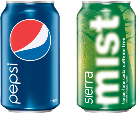
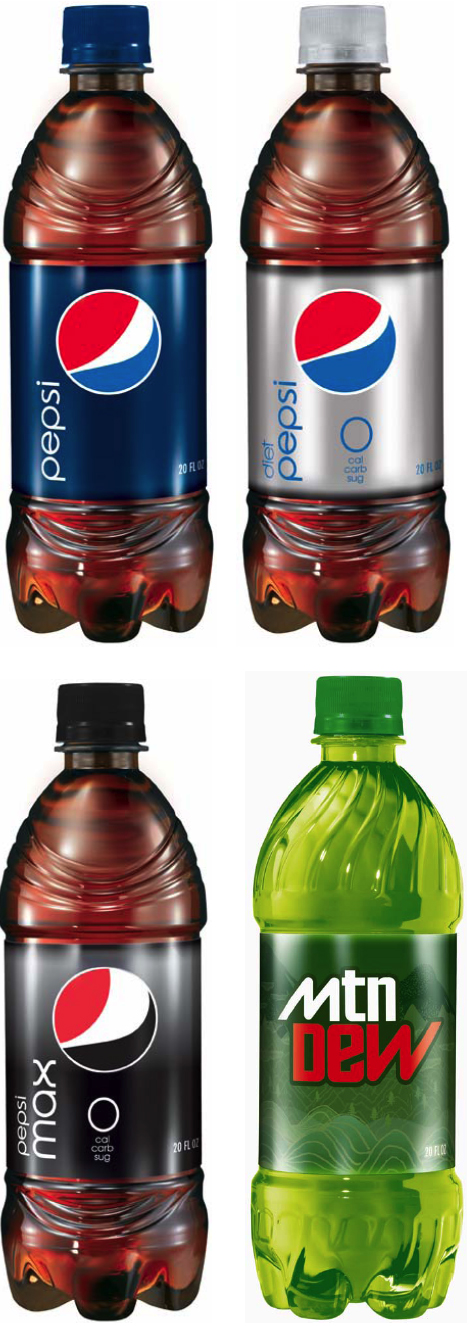
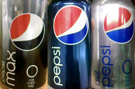
Pepsi gets new logo(s)
PepsiCo is rebranding the Pepsi line of products at a cost of $1.2 billion.
The logo even changes between the different classes of drink. PepsiCo says the Diet Pepsi logo has a `slight grin',
Pepsi's a `full smile', and Pepsi Max expresses laughter.
The character 'e' in the word Pepsi has a counter with a slight wave to it, a slight throwback to the previous
logo.
Aside: Pepsico also announced it would be cutting about 3,300 jobs at a savings of about $1.2 billion over
three years.
-- Matthew Yohe (email)
|
||||||
