|
All 5 books, Edward Tufte paperback $180
All 5 clothbound books, autographed by ET $280
Visual Display of Quantitative Information
Envisioning Information
Visual Explanations
Beautiful Evidence
Seeing With Fresh Eyes
catalog + shopping cart
|
Edward Tufte e-books Immediate download to any computer: Visual and Statistical Thinking $5
The Cognitive Style of Powerpoint $5
Seeing Around + Feynman Diagrams $5
Data Analysis for Politics and Policy $9
catalog + shopping cart
New ET Book
Seeing with Fresh Eyes:
catalog + shopping cart
Meaning, Space, Data, Truth |
Analyzing/Presenting Data/Information All 5 books + 4-hour ET online video course, keyed to the 5 books. |


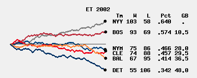
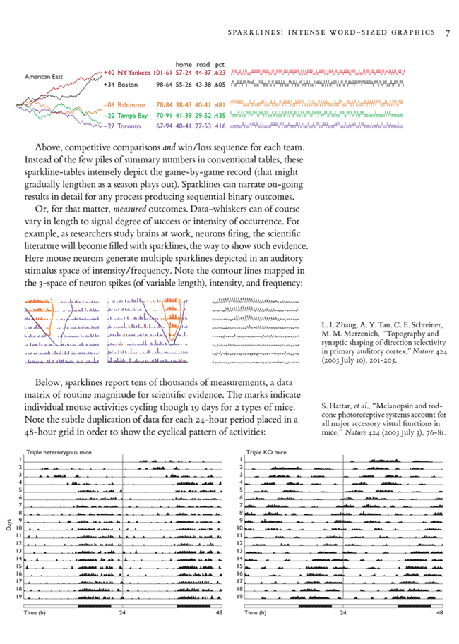
I recently created some simple graphs that display baseball standings over an entire season and then came here to look for more ideas. I was surprised to find sparklines of baseball win/loss records. My graphs have no innovation beyond our common idea of displaying a season's worth of standings on a single graph. Until a better term comes along, I call my graphs "runnings" since that implies position change over time and "standings" imply just positions. My traces are simply games above .500 vs. game number, which is pretty close to time. A win goes up and to the right, a loss continues the trace and goes down and to the right. They're just sparkline tics assembled differently.
The Orioles spent most of the season playing just under .500 ball. They last saw that standing 27 games ago after a 4-0 run gave diehard fans hopes of a strong finish. No one anticipated that the team would win just 4 more games this season, finishing a dismal 67-95. Only the Tampa Bay Devil Rays (55-106) kept the Orioles out of the basement.
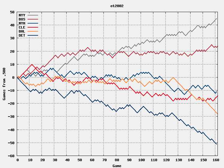 |
The key thing that is easier to see with runnings is the relative position of one team vs. another over time. The Red Sox get off to a good start, but the Yankee's consistant play lets them catch the Red Sox while the Sox have an extended stretch of .500 ball. It would be interesting to make an interactive variant where selecting a team's trace would highlight it (e.g. use a wider line) and also highlight the corresponding segments in the opponents' traces. A pastel color could denote the away games (mnemonic - the colors of distant mountains becomes more pastel). A parallel line or tic marks could denote shutouts. ET suggested it would be interesting to show teams' performance vs. another, e.g. giving the reference team the X axis and showing the others as games ahead or behind the reference. At the very least, my graphs need a couple improvements - the legend ought to be on the teams' traces, not in a stray corner, and at the right end of each trace should be the win/loss/ratio data representing the final standing. I've experimented with shifting each team's trace slightly vertically so that tie stretches don't overlap but have't tried it on a full season. The overlaps aren't necessarily bad, but there cases where ambiguities can appear for a while when more than two teams have similar or identical records.
Of course, a sparkline saves vertical space, but note that my graph can overlay multiple teams pretty well, but the sparklines need vertical separation as they can't be overlaid. Perhaps the graphs belong in the Sunday newspapers and the sparklines belong in the rest of the week an inside articles any day.
The data behind the graphs is excerpted from WWW pages like http://www.baseball-reference.com/teams/BAL/2002_sched.shtml which got it from RetroSheet. Pertinent data was extracted by a Python program which wrote a gnuplot control file to produce the traces. I chose the colors by picking out representative pixels from team logos at mlb.com.
I have graphs of the AL 2004 season including a couple key post-season series of some interest to Boston's fans, but there's little reason to include them here.
-Ric Werme
-- Ric Werme (email)
Response to Sports Graphics - Sparklines
Ric, Excellent visual! May I make the following suggestions to convert your design into a great sparkline: (1) Compress the scales of the X and Y axes by about 75%-80% (that is 20-25% of the current size); (2) Remove the grid, outline box, tic marks, and axis labels; (3) Highlight the terminating point (current standing) with a dot, following ET's glucose example, (4) Show team names in color to the right of the terminating point (again, following ET's glucose example) and delete the legend (5) Show the current y-axis value to the right of each team name.
The resulting multi-sparkline might be about the size of six individual team sparklines stacked vertically, and it will preserve your wonderful idea of providing team comparisons. Good work!!
-- garrybooker (email)
Response to Sports Graphics - Sparklines
The graphic is excellent - but I should point out that ESPN.com ran exactly those graphs on their MLB Standings page until the 2004 season. I'm not sure why they stopped doing it - but great minds think alike!
-- Gordon Fuller (email)
Response to Sports Graphics - Sparklines
I finally had some time to make sparkish versions of a couple of my graphs for both the 2002 sample here and the 2004 AL East. Here are both:
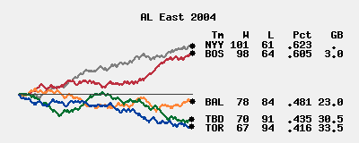
You can't spot individual game results as easily as in the big graph of course, but it doesn't harm the comparison over time and between teams. In fact, the smaller scale reduces the high frequency roughness making the ebb and flow over the season stand out better. Notice that the vertical scale is different between the two graphs. That's partially because I did the 2004 graph first and that has the smaller spread between first and last. I think it's okay - conventional standings have the same height regardless of the spread. A real sparkline has a fixed height anyway, so it's okay by definition! The graph could be shrunk to the height of the conventional standings, but I'd want to add lines to connect the dots with the appropriate standing.
Including real standings obviates the key I had in the big graph. I used black dots instead of color dots in part because they help the transition from trace to text and because there's no need for color since the text doesn't overlap. I manually placed the standings instead of writing automated software to prevent overlap.
161 or 162 games? Some rained out games were not made up if scheduling them was too hard and if they had no impact on the final standings.
Note about ESPN. Currently, ESPN.com has dropped the "RACE" link from the 2005 standings. It's still there for the 2004 standings, but clicking on it brings up 2005 data. Sigh.
-- Ric Werme (email)
Response to Sports Graphics - Sparklines
Ric, Awesome sparklines! I agree with your choice of line width because it enhances color perception. Have you tried using matching colors for the team names at the right? Also, if you color-match the 5 terminating sparks with the GB data column it will be more clear that you are charting games behind. Also, see Thomas Carlson's post on January 27 where he placed a star indicating the mid-season All Star game. That's a nice touch, because it parsimoniously indicates the time scale. I would either push the star into the background (behind the color curves), or perhaps just away from the curves, so it doesn't interfere with the data. Again, wonderful!
-- Garry L. Booker (email)
Response to Sports Graphics - Sparklines
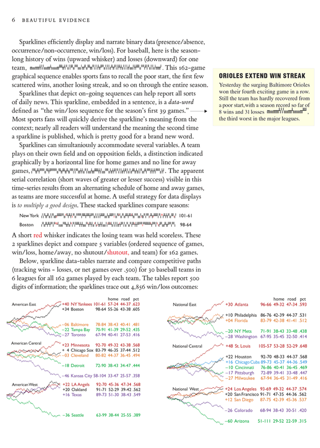
Here are some revised baseball sparklines and some mouse sparklines as well. At the top of page 7 (baseball example) , the lower 3 whisker sparklines are temporary mock-ups, for position only. The top 2 are real data for the 2004 season.
I like the idea of a really thin gray line at .500 in the ESPN-Werme sparklines (showing competitive relationships over the course of the season).
Note the new and perhaps informative comparisons by showing all 6 leagues together in 6 paragraphs of sparklines (bottom of page 6): 3 of 6 leagues had real races down to the end of the season; in 5 of 6 leagues, the leader at 100 games was the leader at 162 games (the season's end).
The various redundancies within the tables, and between the tables and the graphics, seem reasonable since they break out the data into different views. The redundancies are a bit much within a given row, but seem to help when comparing a set of row values down a single column. Note also the redundancies in the mouse sparklines at the bottom of page 7, an idea illustrated in The Visual Display of Quantitative Information (pp. 98-99). Imagine mounting the non-redundant part of the mouse sparklines on a cylinder with a circumference of exactly one cycle-width so all parts of the cycle would be visually connected. And how about sphere-graphics?
Some earlier drafts used black numbers in the tables, but right now I prefer the color numbers--mainly for beauty reasons. Perhaps gray numbers would maintain a good optical balance between the table and the various sparklines.
Pages 6-7 below also exemplify a new idea: layouts for sparklines should be a data-rich as the individual sparkline itself. These 2 pages show something like 107 sparklines. In reasoning about data, analytical comparisons are to be made not only within a sparkline but also among many sparklines. As one sparkline is to a word, so many sparklines are to a paragraph of words. Thus the word metaphor is extended to sparkline layouts.
The contributions to this thread by our amazing Kindly Contributors are superb! Ric Werme's work is particularly helpful; his work also illustrates that idea that graphical analysis is often effectively done by producing new and different graphics.
 |
 |
-- Edward Tufte
Response to Sports Graphics - Sparklines
Some subtle wording issues, since I find all the pictures beautiful:
Major League Baseball has two 'leagues' -- American and National. Each 'league' has three 'divisions' -- East, Central, West. As such, there are six 'divisions' but two 'leagues'.
Recall that Washington was Montreal last year. And, the Angels were called Anaheim. (Apparently the location of the Angels has for years been a legal hassle between them and the Dodgers. I can recall them being 'based' in LA, California, and Anaheim. Perhaps there are even more!)
The headers on the six paragraphs ("American East", "American Central", ...) are certainly clear enough in what they represent; however, it seems like the preferred title is "American League East", "American League Central", etc. If space is at a premium, as it always seems to be, a more commonly used moniker is "AL East", "AL Central", etc.
Are the vertical data ranges the same for all six paragraphs? If not, how does it look when done that way? It might be nice to really show how far back the poor Diamondbacks fell last year.
A question: What *exactly* is the horizontal measure? Is it game number or date? And then, what about those rainouts that aren't made up? Do those end up a point short? If it is actual date, perhaps a some sort of vertical demarcator could indicate month boundaries so as to better allow the viewer to recall the season. The games-back lines and the won/loss ticks might have to have some flat spots but then we could see stuff like double-headers, if they still do those sorts of things, and the All-Star break, and we could even find that one game we attended while at the Tufte course in Philadelphia!
Oh, and while I'm at it, a comment on the won/loss ticks imbedded in the text. The sidenote example says that the Orioles are 8-31, third worst in the major leagues. Who could possibly be worse than 8-31? I realize that someone could be 7-32 or so but 8-31 is .205. There are two teams worse than 8-31? Ouch! Maybe we should see the team that actually IS worst in the major leagues! :-)
Thanks for the opportunity to nitpick; we are all looking forward to the book!
-- rafe donahue (email)
Response to Sports Graphics - Sparklines
A handful of thoughts on the baseball running graphs and sparklines...
On Dr. Tufte's game-by-game sparklines: a nice touch would be an indication of the month as the season wears on. Or the All Star Game. I'd also like to see a "w" and an "l" leading into the sparkline run, maybe just for the team in first place, to show that a mark in the upper range denotes a game won and the lower, lost; the sparklines have the look of bar codes and may be indecipherable (without some other explanation) unless "decoded."
All of the examples shown so far are for complete seasons, making for a very nice review of the ebb and flow of the fortunes of the teams. But, how would this method work for early in the season? If the ranges of the x and y axes are set for the whole season, then the graph lines would be horribly scrambled and difficult to read early on. If they're set to the season "so far," then the axis ranges will expand and the graph line will compress as the season progresses; this may not be so bad but the issue hasn't come up in this discussion.
I don't think the "sparks" at the end of graph lines on Ric Werme's examples, at least as presented, have much to say; the end of the line is pretty much the end of the line and the sparks are mainly graphical niceties. Dr. Tufte's setup works better in this regard. But, you could use them to show some relational information, such as those teams that made it to the playoffs. Or, if running these throughout the season, the sparks could show those teams currently positioned for the playoffs. Or conversely, could show those teams eliminated from a chance at the playoffs. And, since the playoff "wildcards" compete across divisions, the shape (perhaps an open circle) or color of the spark could also be used to show those two or three teams in contention to be wildcards. As Ric mentioned, it would be easy to load these up with a whole lot of stuff, but this might be one way to use the sparks.
As suggested by Rafe Donahue, setting a common ranges for the x and y axes, for all the divisions, would make for a nice set of small multiples.
I, too, like the faint line at .500.
And ...
The Angels were established in Los Angeles in the early 1960s as the Los Angeles Angels, then moved to Anaheim a few years later, remaining there ever since, and were known as the California Angels. They became the Anaheim Angels several years after that, and were so known when they won the World Series in 2002. This year, they changed their name to the Los Angeles Angels of Anaheim. Go figure...
To Andrew in Australia, baseball games are played for nine innings, an inning being one round of batting (offense) for each team. If the teams are tied after nine, they continue to play, one inning at a time, until one team wins.
There have been countless commentaries on kids getting their first taste of applied mathematics by working out baseball statistics: figuring the percentage we call batting average, calculating a team's won-loss percentage, grappling with the concept of how a win for our team only counts for 1/2 a win in the standings, the odd factor of 9 in a pitcher's earned run average. These graphs nicely illustrate another, the conservation law of wins and losses: there're only so many wins and so many losses in a season, and these will be distributed completely amongst all of the teams. Getting this concept down as a youngster must make conservation laws a whole lot easier to understand come high school physics.
-- Steve Sprague (email)
Response to Sports Graphics - Sparklines
To add to the richness of both the data and the nuances of the baseball pennant races, here's a thought/comment:
First of all, at the risk of overstating the obvious for those baseball fans and those in North America, in addition to the races in each division, there is a fourth title: Wild Card. In fact, the last three World Series champions (Red Sox in 04, Marlins in 03, Angels in 02) were all Wild Card winners. (The Wild Card is a uniquely American institution, started in the NFL, that gives another opportunity to the best team that didn't win a division. Baseball instituted it beginning in 1995. And, though many don't like it, it's like the Designated Hitter rule -- it's really not going anywhere.)
These end up being rather interesting races toward the end of the year, as often there are more teams in the running for those slots than for division races. (As a Cubs fan, without the Wild Card chance last year, we would have lost interest, since the Cardinals finished 16 games ahead of Chicago.)
So I offer this question in eager anticipation of this book: is it possible to add a fourth graph showing the Wild Card races for each League? Neither AL or NL Wild Card graphs would have to include the eventual division winners, but looking at how the Wild Card races shaped up would provide added context.
Also, an earlier posting suggested that the color-coding was possibly off-putting (the Reds not winning and the winning color being red). Would it make sense to add a different color to just the Wild Card winner?
-- Dave Van de Walle (email)
Response to Sports Graphics - Sparklines
For basketball data, really excellent, see Grig Gheorghiu at
http://agiletesting.blogspot.com/2005/04/sparkplot-creating-sparklines-with.html
-- Edward Tufte
Response to Sports Graphics - Sparklines
Some sparklines in action at: http://www.hardballtimes.com/main/article/ten-things-i-didnt-know-last-week9/
-- Michael Eglinski (email)
Response to Sports Graphics - Sparklines
FYI, I've been posting daily updated graphs -- not sparklines -- of division races at www.hardballtimes.com for over a year now. You can find them in this section:
http://www.hardballtimes.com/main/teams/
Our 2004 Baseball Annual includes over 40 graphs, including division races. As far as I know, we are the only baseball publication to intensely integrate graphs into our work. I plan to research the potential of sparklines, too.
I also graphed the division races for 2003 at www.baseballgraphs.com.
-- Studes (email)
Bumps Charts: Boatraces and other space-time narratives
|
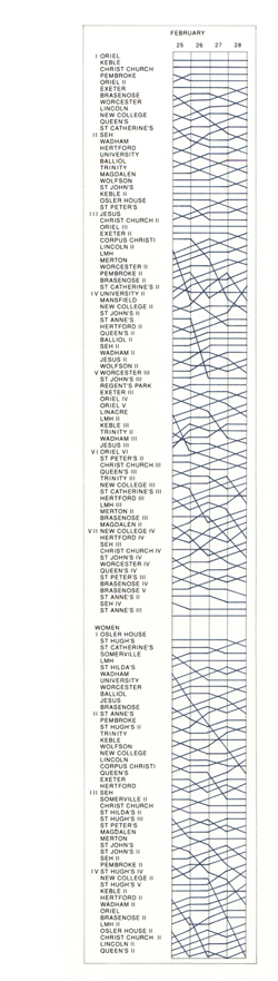
Envisioning Information (page 111) presented this account of the bumps chart:
"One of the interesting graphics presented in your book is from English collegiate boat races. You mused at the possible history of the name for these 'bumps' races. You'll be delighted to know that at Cambridge University, where the river Cam is indeed too narrow for more than one craft, the aim of each team is always to bump the boat in front. Passing is never the objective; neither could passing ever feel as good as a victoriously visceral bump. In addition to the communicative features of the bumps chart described in your book, the graphical bumps chart shown here has a few features that you may find interesting. 1. Bold lines indicate those teams of rowers that earned their 'blades', which is accomplished by moving up at least 4 spots over the four day competition. 2. Very steep lines indicate very exciting action and thus the graphic draws the interest of the reader. Why did Clair IV, for example, drop 5 positions in a single day? Was there a disastrous start? Did a rower drop his blade? Was there a calamitous bump that actually sunk a boat!? After the races, huddled students study the bumps charts, ruminate and gossip. The chart directs their attention to the important events and questions. 3. Each team's position relative to the other 102 boats and within their division, is represented. The long narrow graphic is suggestive of the river itself, with the boats lined up in their hierarchical ordering. The top team earns the title 'Head of the River' and the graphic does a fine job of directing the reader's attention to this premier position." [Originally posted May 27, 2003] |
|

-- Edward Tufte
Response to Sports graphics: excellent sparklines
Interesting charts are found at http://www.cucbc.org
and http://www.mcshane.org/bumps/
Showing bumps charts for 11 years and for men and women, the second link illustrates the idea that if you have a good display, multiply it.
[Originally posted May 27, 2003]
-- Edward Tufte
Response to Sports graphics: excellent sparklines
A bump chart of a Formula 1 race positions can be found at the Formula 1 website at http://www.f1.com/timings and then click on the vertical "Lap Chart" tab. If you move your mouse over the driver names it highlights the line for the driver.
There is a similar style of chart showing the ascent of Mount Everest by Hillary and Norgay and others in 1953 on pages 20-21 of the May 2003 National Geographic. It vividly shows how climbing a mountain doesn't just involve one ascent.
[Originally posted May 28, 2003]
-- Andrew Nicholls (email)
Response to Sports graphics: excellent sparklines
The auto-racing laps chart is accompanied by some annotation. Even more annotation would be better; it would also be helpful to combine the laps chart with the data table (now on a separate screen).
[Originally posted June 02, 2003]
-- Edward Tufte
Response to Sports graphics: excellent sparklines
For people interested in baseball sparklines, we have a new "sparkline generator" page at The Hardball Times site. I would really appreciate any feedback this community can provide on what features should be available, what settings should be default (you can choose the bar spacing, width, height, etc.), or other ideas for baseball sparklines (I plan on making sparklines for individual players for various statistics).
One particular question I have is, what colors do you think the distinguishing whiskers should be by default? I've added the ability to pick from a list of colors, but I would like to settle on a good default. I first used red, but a red-green colorblind friend of mine said he couldn't tell the difference between the black and the red bars, so I went with gray (on the advice of another somewhat colorblind person).
Here's an example of an inline sparkline with the gray whiskers for the Oakland A's from May 30 through August 3:  43-15. (note that the gray bars in this case are not shutouts, but are games where the difference in final score was less than or equal to 2 runs).
-- Bryan Donovan (email)
Response to Sports graphics: excellent sparklines
Bryon Donovan's baseball sparkline generator is superb, and quick and easy to use. Now surely the conventional baseball standings can include the season-to-date narrative of wins and losses at home and away.
As a supplemental variable, I prefer shutouts to win margin (of 2 runs more or less), since shutouts testify about pitching and lack of run scoring obviously. Shutouts are not as arbitrary as a special case of a win greater than 2 runs. Also baseball fans, as they relive the narrative of the season via the sparkline, may be prompted to remember the details when their team won by a shutout or lost by a shutout, and less so by a winning margin of more than 2 runs.
-- Edward Tufte
Response to Sports graphics: excellent sparklines
I wanted to let everyone know that I have updated the Hardball Times baseball sparklines page to include an option to select shutouts instead of the default run difference. I also want to clarify that the run difference is intended to show how a team did in close games (although you can adjust it to whatever run difference you want). The significance (or lack thereof) is explained in part in this Bill James article.
-- Bryan Donovan (email)
Response to Sports graphics: excellent sparklines
Thanks to Kindly Contributor Bryan Donovan for including the shutout encoding in his fine baseball sparklines. The default color for the shutuout (or run-differential) should be somewhat more distinctive; the current default gray is difficult to read.
A good way to handle the shutout indicator, which avoids color issues, is to reduce its whisker-height by about half.
-- Edward Tufte
Response to Sports graphics: excellent sparklines
I came across an art exhibit in Kansas City that features graphs showing the Boston Red Sox season. In the more interesting works, the artist, Mike Hill, graphed the progress of each game for a full 162 game season. Each game is on a sheet of paper maybe 17 x 22 and the entire seaons is on several walls of the gallery.
I've posted a couple of snapshots at:
http://okansas.blogspot.com/2005/10/sports-art.html
-- Michael Eglinski (email)
Response to Sports graphics: excellent sparklines
Here's a sketch of the results of the last 25 or 30 at bats for a baseball player. A period is an out; a slash a walk; the verticals singles, doubles, triples, and home runs; and the whiskers beneath are the resulting runs batted in from that at bat.
 |
Shown above are 3 sizes of the same material; smaller sizes are useful for inline graphics in sentences and tables. This originally was done in Gill Sans, which suggests the construction of a small baseball-performance font to type in the sequential results of each at bat. Kindly Contributor Steve Sprague made useful comments on an earlier version.
-- Edward Tufte
Response to Sports graphics: excellent sparklines
Can a Kindly Contributor locate or provide the sequential data for the last 50 at-bats of Bonds, Pujols, and Ruth (in R's run-up to 714) for plotting?
-- Edward Tufte
Response to Sports graphics: excellent sparklines
For our 30th season of women's basketball, we implemented sparklines for each year's results. I've posted for my colleagues in college sports information my examples at my blog: http://doctorbs.blogspot.com/2006/06/from-graphic-arts-dept_08.html
I added the shading to differentiate between non-conference and conference games, the larger slashes to divide the months of the season. Working with the team for 17 of these 30 years, I found the lines were quite revealing of the character of those teams. Thanks much for the concept.
-- Bill Smith (email)
Response to Sports graphics: excellent sparklines
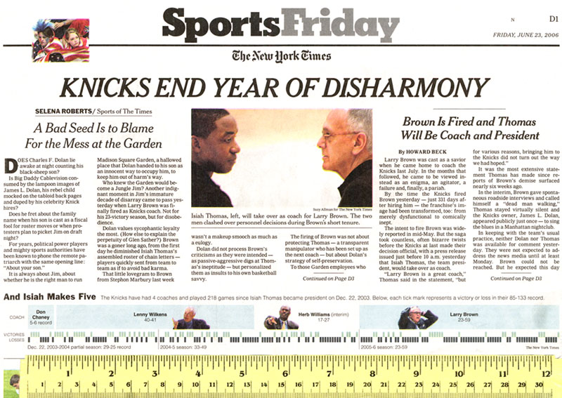 |
The New York Times sports section on June 23, 2006 displayed a sparkline-like graph showing the outcomes of the last 218 games of the New York Knicks, a basketball team. As our scale of measurement shows, the graph is 12 in (30 cm); a real sparkline would be a little over 2 in (5 cm).
The graph is nicely integrated with surrounding text, numbers, and images. The whiskers showing wins are too light compared to the whiskers showing losses. The win-whisker blue-tint is also used as a background tint immediately above, an unnecessary congruence. Wins might be shown in red not pale blue. The instructions for reading the sparkline "Below, each tick mark represents a victory or loss..." is not needed especially since the two rows of ticks are labelled "victories" and "losses". (Why not "wins" rather the "victories"? Perhaps because "wins" is both a verb and a noun.) Those labels are not needed; every reader of the sports page will know what the whiskers mean. After all the reader is expected to understand these big words in the reports accompanying the graph: sycophantic perpetuity passive-aggressive tenure enigma pariah dysfunctional
Both the column and the news story psychologize about the personalities of those in the team bureaucracy rather than the performances of basketball players and the competition, both of which might have something to do with the team performance. Of course not every column or news story need fully account for all the sources of variance, but these accounts seem a bit one-sided in their analysis.
The graphic reporter is not credited for her or his good work, although the columnist, reporter, and photographer are. Publicly acknowledged creatorship signals responsibility for work and also often improves the quality of work.
-- Edward Tufte
Response to Sports graphics: excellent sparklines
Sparklines built into tables of baseball standings at The Hardball Times:
http://www.hardballtimes.com/main/article/tht-daily-2000-and-450-for-a-rod/
-- Edward Tufte
Response to Sports graphics: excellent sparklines
An interesting example and comment on what happens when decoration overtakes content:
http://www.slate.com/id/2146218/?GT1=8483
"Baseball cards were no longer mementos of your favorite players -- they were elaborate doubloons that happened to have ballplayers on them."
-- Michael Round (email)
Decoration Overtaking Information
Another example where decoration - here advertising - takes precedence over the message ...
http://www.rationalsys.com/images/scoreboard.JPG
The goal of a scoreboard was to present data and information about the game. Here, the goal is to advertise, and as an aside, looking hard enough, one can find out about the game.
-- Michael Round (email)
Final standings of Bundesliga (German premier soccer league) for the 2006/2007 season
We have summarized the very exiting soccer season 2006/2007 using a straight-forward whisker style visualization.
| R | Team | GP | W | D | L | Goals | GD | P | Record |
|---|---|---|---|---|---|---|---|---|---|
| 1 | VfB Stuttgart | 34 | 21 | 7 | 6 | 61:37 | 24 | 70 | |
| 2 | Schalke 04 | 34 | 21 | 5 | 8 | 53:32 | 21 | 68 | |
| 3 | Werder Bremen | 34 | 20 | 6 | 8 | 76:40 | 36 | 66 | |
| 4 | Bayern München | 34 | 18 | 6 | 10 | 55:40 | 15 | 60 | |
| 5 | Bayer Leverkusen | 34 | 15 | 6 | 13 | 54:49 | 5 | 51 | |
| 6 | 1. FC Nürnberg | 34 | 11 | 15 | 8 | 43:32 | 11 | 48 | |
| 7 | Hamburger SV | 34 | 10 | 15 | 9 | 43:37 | 6 | 45 | |
| 8 | VfL Bochum | 34 | 13 | 6 | 15 | 49:50 | -1 | 45 | |
| 9 | Borussia Dortmund | 34 | 12 | 8 | 14 | 41:43 | -2 | 44 | |
| 10 | Hertha BSC Berlin | 34 | 12 | 8 | 14 | 50:55 | -5 | 44 | |
| 11 | Hannover 96 | 34 | 12 | 8 | 14 | 41:50 | -9 | 44 | |
| 12 | Arminia Bielefeld | 34 | 11 | 9 | 14 | 47:49 | -2 | 42 | |
| 13 | Energie Cottbus | 34 | 11 | 8 | 15 | 38:49 | -11 | 41 | |
| 14 | Eintracht Frankfurt | 34 | 9 | 13 | 12 | 46:58 | -12 | 40 | |
| 15 | VfL Wolfsburg | 34 | 8 | 13 | 13 | 37:45 | -8 | 37 | |
| 16 | 1. FSV Mainz 05 | 34 | 8 | 10 | 16 | 34:57 | -23 | 34 | |
| 17 | Alemannia Aachen | 34 | 9 | 7 | 18 | 46:70 | -24 | 34 | |
| 18 | Bor. M'gladbach | 34 | 6 | 8 | 20 | 23:44 | -21 | 26 |
R = Rank, GP = Games Played, W = Win, D = Draw, L = Loss, GD = Goal Difference, P = Total Points.
Data was taken from the official DFB site. A printable version in PDF format and further discussion is available here.
-- Nicolas Bissantz (email)
Response to Sports graphics: excellent sparklines
Frequent contributor Rafe Donahue and colleagues gave a presentation at the JSM 2007 conference, and have an interactive website here:
http://data.vanderbilt.edu/rapache/bbplot
This seems a unique and powerful method of capturing and plotting bivariate baseball pitching data.
For reference sakes, select "2005", "Houston Astros", and "Roger Clemens" as starting pitcher. Clemons had one of the most remarkable pitching seasons in history (as judged by his ERA vs. the league ERA). However, the Astros - via dismal run-support - seemed to do better without him! The layout of the data shows us how this can be: five 1-0 losses, and Clemens was the starting pitcher in each game!
Michael Round
-- Michael Round (email)
Response to Sports graphics: excellent sparklines
Nicolas's Bundesliga whisker series are very data dense, but actually reading the record of one team hurts the eyes. Perhaps they need more white space between the spark series, or thin dividers, or striping?
This is not a problem spark lines have, because line segments are obviously connected to each other. But my eye cannot remember that a blue whisker belongs in the same series as the red whisker below it, not the red whisker above it.
Perhaps if the whiskers were triangular and not rectangular, they might be more easy to read?
-- Derek Cotter (email)
Content trumps design; most beautiful chart I've seen
Andrew Fire, a 2006 Noble Prize Laureate in Medicine, recently gave a presentation on DNA. He explained that in spite of medical breakthroughs, advances in medicine are often the result of incremental improvement in therapy This is his model for advancing medicine. To demonstrate, he displayed this chart and said that most of the mortality improvements were the result, not of medical breakthroughs, but of changes in treatment timing, dosage, etc. This chart also sums up the work of a medical clinic; 40 years of work on 1 chart.
-- Guy Downing (email)
Response to Sports graphics: excellent sparklines
Sparkline-inclusive results for the 2007 American League East division, detailing how my beloved Red Sox managed to hold off the late-charging Yankees (barely!).

-- Michael Cusack (email)
Response to Sports graphics: excellent sparklines
A similar graphic for the NL East, describing the historic collapse of the Amazin's.
-- Michael Cusack (email)
Home run careers
A very interesting graphic by Amanda Cox and Joe Ward at The New York Times (Joe Ward did several excellent and subtle sports graphics in collaboration with Megan Jaegerman some years ago):
http://www.nytimes.com/ref/sports/20070731_BONDS_GRAPHIC.html
-- Edward Tufte
Response to Sports graphics, including sparklines
The NY Times home run graphic is interesting. Something very similar was created by Juice...
Why make 100 charts when one will do?
If you'll follow the discussion at the end of the article, you'll find one of the contributors submitted
Baseball_offset_2_derek.xls, which is, in spirit, almost identical to the NY Times graphic.
-- Estes
Response to Sports graphics, including sparklines
(Warning: Another long Rafe post)
The NYT Bonds plot is a wonderful interactive example of what one might call (although I typically don't like to force names onto plots, lest they become restrictive a source of argument) a "you are here" plot.
The plot shows a distribution of responses, of which one point, or group of points, is highlighted. The power comes from using these in small multiples showing the individual or individuals of interest against the backdrop of all others. This layering and separation, in conjunction with relevant small multiple splits, gives us more than either alone.
These plots can be found in a variety of situations.
The NYT plot allows us the interactivity to highlight certain individuals and bring them to the front. This helps us clarify their relationship to Mr Bonds.
The Juice plot moves in the right direction but comes up short: the horizontal and vertical reference lines help us compare salaries across the different teams but including all the non-highlighted teams in subtle, background grey would help us maintain the idea of the distribution.
I recently got some data about the number of narcotics prescriptions that certain prescribers were writing. Some of the prescribers got letters telling them that Big Brother was watching; others didn't. What was the effect of the letter?
The plot below shows the number of presciptions before the letters went out (horizontal axis) and the change after the letters went out (vertical axis). (I also have before versus after instead of before versus change; contact me if you care to see them.) The red dots are those who actually got warning letters, the blue got no letters. Yes, letters were sent to those with the highest totals over some previous time period. The red and blue numbers along the axis mark and tell the means for the letter and no letter groups. So, before the letters went out, those who were to get letters had a mean of 197 and the remainder had a mean of 96. Change for those who got the letter were a mean increase of 3; change for those who didn't get the letter was a mean increase of 9. Small black "+" signs mark the intersections of the means. The slanty reference lines show 10% increases and decreases. Yes, sometimes a mean is silly. You can see the variation; did the letter have any effect? (Yes, there is a prescriber at 400 who did not get a letter. Go figure. I don't know why. The whole letter thing was not my idea.)

But wait, there's more. We had a variable in the data set that told us the type of prescriber: MD, PA, RN, LPN, NP, and DO. So we can draw the same plot in "you are here" fashion, highlighting each group and sending the others to the background.
The MDs:

The PAs:

The RNs:

The LPNs:

The NPs:

The DOs:

Interactivity would be nice, but I don't have that. Yet. But the point is that we understand individuals by way of reference to a distribution of like individuals. What appears at the outset to be a distribution of "prescribers" is, in reality, a mixture distribution made up of prescribers of different backgrounds. Keeping the relevant background distribution in play aids in making comparisons.
Oh, and if you want pretty, full-page size pdf versions of these, they are available at biostat.mc.vanderbilt.edu/twiki/pub/Main/RafeDonahue/graphxx.pdf, where the xx can take values 00-06 (before vs after) and 10-16 (before vs change).
Ok, that's that.
Rafe
-- rafe donahue (email)
Response to Sports graphics, including sparklines
Another interesting use of a graph included in sports graphics: The image below shows a design prototype for browsing a soccer game based on visualized events (such as goals, cards or kicks), and based on a graph which indicates the ball position (y-value) and ball possession (colored integral).
This proposal was created by Angela Shen-Hsieh and Mark Schindler (currently at visual-io.com) for Quokka back in 2001. In my opinion, this visualization is a great at-a-glance insight into a game progression. So maybe also a basis for an appropriate sparkline? Given the data for a season these sparklines could then be averaged for a team or a team's opponents.
Image source: http://www.aiga.org/resources/content/1/9/1/8/documents/experience_design.pdf

-- Christoph Brachmann (email)
Response to Sports graphics, including sparklines
 |
Source: New York Times, December 15, 2007, p. D1
-- Edward Tufte
Response to Sports graphics, including sparklines
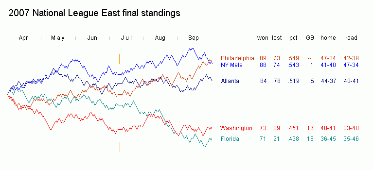
From Beautiful Evidence p54: "competitive paths (wins - losses = net games over .500)". I think "games over .500" is wrong; a team which won every game would be 81 wins over .500, not 162-0=162.
Also, it looks like either wins-losses or the record is wrong for Minnesota: 92-70 = +22 not +23.
Regardless, I agree with the focus on wins minus losses, a far more useful measure of quality than either winning percentage or games over .500.
-- Bradley Dilger (email)
Response to Sports graphics, including sparklines
Bradley Dilger's analysis may be strictly correct, but it is not baseball correct. Sportswriters use the term "games over/under .500" to mean wins minus losses. If your record is 12-10, you are described as "2 games over .500", even though, had you lost those 2 games, your record would be 10-12 ("2 games under .500"). Mathematically speaking, you are 1 game over .500 (losing 1 of those 2 games would've placed you at 11-11), but that is not the convention. So in the artificial example of 162-0, "162 games over .500" would be the "baseball correct" way to describe your record. If a team ever had that record, however, baseball writers would come up with many more colorful descriptions.
-- Christopher Kinzel (email)
Response to Sports graphics, including sparklines
Probably a better way to put it would be that the team would need to win (or lose) X number of upcoming games to become a .500 team.
-- Mike Hayden (email)
Response to Sports graphics, including sparklines
Has anyone come up with a bar-sparkline solution for non-American sports where a tie is an acceptable result?
I am currently working up a sparkline to show the performance of a soccer player over a season.
I am trying to include various things:
- Each bar represents a 90 minute match. Where a player goes off before the end of a game it will be truncated. Where he comes on as a substitute it will start at the appropriate point.
- Goals scored, yellow and red cards received either as colored horizontal lines or colored dots at the time they were scored/received on the gray bar.
- Home or away, probably represented as in the baseball examples with the horizontal line for a home game.
- Result of the match: win, lose or draw.
It's the last one that has me stumped. If I start the bar for a tie in the center going out then substitute appearances in draws will be indistinguisable from being substituted off in a win, and similar problems. If I create three sections to the chart instead of the two in the baseball example then there is too much whitespace in the resulting graphic (I think).
Does anyone have a good answer? Am I trying to include too much? (I'd also like to indicate if the match was a cup or league game in some way and maybe even the score ...)
-- Thomas David Baker (email)
Golf: Tiger Woods v. field, majors v. non-majors
A superb graphic by Amanda Cox, Vu Nguyen, Joe Ward at The New York Times here.
The fresh concept in golf data analysis is excellent. There are some interesting unexplained outliers in the gray lines. The meaning of the gray lines is not clearly defined. Very good text/graphic integration. Superb comparisons explained by the text. Good layering and separation, although the black and orange are a bit heavy. GIR abbreviation in column 4 not necessary since "greens in regulation" will fit at end of paragraph. Editorial text at top is a bit weak, differs in tone from rest, and should be longer and more explanatory or point to some specifics.
-- Edward Tufte
The NYT "How Woods Wins a Major" graphic is certainly fun, as clicking on the years allows me to march along through time. I also love the grey reference you-are-here distributions in the background, as they allow me to make comparisons across years.
But the data are bivariate and can be represented well as an ordered pair: (non-major, major) and then Mr Woods can be shown with (following what has been established) a black dot and the The Field with an orange dot. The you-are-here reference marks are then grey dots, lurking in the background. A 45-degree reference line can be dropped behind that scatter plot so as to allow us to determine increases from non-major to major (above the line) from decreases (below the line). If people have trouble with the above/below the line concept, a simple "+" could be used for increases and a "-" for decreases would give it away.
Summary measures can be marked with a subtle tick marks on the axes or or as pairs of reference lines or as a faded dot in the background. If we need to have the exact number for these measures of central tendancy, these can decorate the sidelines of the plot.
This format will allow us to make a grid of these small multiples, and allows us to eliminate the need to "click to see" when changing years, as the six measures or categories can be the columns and the years can be the rows (with one grand summary row). Thus, each of the scatter plots in each column will be identical when it comes to the grey reference distribution in the background; the rows demarcate the year and thus highlight different points. This will allow us to see immediately at a glance that Mr Woods had a smashing year in Driving Distance in 2005 compared to all the others, since that point will be most extreme in both coordinates and will be highlighted in the 2005 row.
The summary text can fill spaces at the tops of the rows or at the edges of the columns, telling us what to see and what it means.
If there is a need for "computer interactivity", rolling over of the mouse could do something like pop up a bit of text that would allow us to see, say, Mr Woods' individual rounds in that year's majors or who won them or whatever would be deemed valuable to the reader.
We can design the graphic so that there is no need to click to move between years; a simple shift of the eyes can suffice.
Can we get the raw data to play?
Just some thoughts,
Rafe
-- rafe donahue (email)
This bumps chart shows you the English Premier League 2007 - 2008. It allows you to highlight and compare two teams by clicking a team in in the table or a line in the bumps charts.
.png)
Interactively highlighting a data series in a large data set is very powerful. All lines in the data set are set to light Gray to show you the big picture and the patterns and general tends in the data set. Once you have identified an interesting data series you click it and we highlight it with a bright, saturated color. This has the effect of bringing it into the foreground and allows the user to see the details in the context of the other data series. more...
Andeas Lipphardt
BonaVista Systems
-- Andreas Lipphardt (email)
poster-style baseball graphics
http://www.flipflopflyin.com/flipflopflyball/index.html
-- Edward Tufte
Dear ET,
This is a great fun website - I particularly liked the poster that shows the sizes of different sports balls (http://www.flipflopflyin.com/flipflopflyball/other-balls.html). The downside of this one as a piece of analytical design is that it's lacking a scale of measurement. The upside is Craig Robinson's very honest statement about his sources; "Sources: for some stupid reason, I didn't keep a note of where I got this information; I do seem to remember, though, spending a lot of time on the web sites of various sports' ruling bodies."
Matt
-- Matt R (email)
Looking at the history of baseball from a "just playing around" perspective. Lots of interesting things to look at!
http://www.rationalsys.com/autosocratictimes20090722.html
Mike Round Center for autoSocratic Excellence www.rationalsys.com
-- Michael Round (email)
College basketball sparklines for predicting the S-curve
Andy Cox has a lovely implementation of sparklines on his site Crashing the Dance (http://www.crashingthedance.com/), and an explanation with credits to Beautiful Evidence at http://blog.crashingthedance.com/2008/03/sparklines-are.html.
The basic idea is to show the relative significance of a win or loss according to the RPI of the opponent using bar height (higher above the baseline is a win over a team with a high RPI; lower below the line is a loss to a team with a low one) and the location of the game according to color (red indicates a home loss; dark gray indicates a road win; light gray for all others), and sequence to show the most recent games at the right. Very elegant.
-- David Barndollar (email)
" .. .At the beginning of a race, crews are spaced apart at intervals, the starting gun is fired, and they row like mad trying to catch the boat immediately in front. When a boat overtakes another, the crew in front pulls over and the one formerly behind goes on by, now in pursuit of the next boat ahead."
This description is not quite correct, at least for the races between colleges at the Universities of Oxford and Cambridge.
In the Lent and May Bumps at Cambridge, and the Eights at Oxford, both boats involved in a bump immediately pull over, allowing other boats to continue past them. Each boat can thus be bumped only once in a race, although 'over-bumps' are possible: if the intervening two boats bump, it is possible for a boat to catch up with one that was originally three places ahead of it. Even more spectacularly, a double-overbump allow a crew to move up 5 places in one race.
In the Torpids at Oxford, the boat that bumps pulls over, and the boat that was was bumped continues on (the reverse of what you describe). This makes it possible for a boat to be bumped many times in a single race.
-- James Scott-Brown (email)
It is also not accurate to say that a bump occurs when one boat overtakes another. In Oxford, at least, a bump occurs in one of three ways: the cox of the crew being bumped concedes by raising their hand; the two boats physically touch; or the chasing crew has what is known as half a length of overlap (the bow of the chasing boat reaches the middle of the boat being chased). In the last two instances, one of the umpires stationed along the course has to have seen either event occur and given the risk that they have not, typically most crews will keep going either until the cox of the crew being chased has conceded, or else deliberately go for a very obvious clash that stops both boats. As described, in Oxford Torpids, the boat that is bumped continues rowing. As a result of the risk of being caught by boats further back and, to use bumps terminology, being bumped down an entire division, coxes will tend to concede earlier than in Eights where the rowing stops for both boats once a bump has been achieved.
-- Will Oswald (email)
Reddit does bump charts
The reddit blog has a post on the life of a link on reddit, with some graphs, including bump charts:
-- Niels Olson (email)
Rose Bowl game charts by Ward Nash
I learned of lovely collection of hand-drawn college football game charts from the 1902-1946 Rose Bowl games, created by Ward Nash. The book is entitled "The Rose Bowl: A Complete Action and Pictorial Story of Rose Bowl Football". An example can be found here:
http://www.remembertherosebowl.com/2011/09/1927-rose-bowl-drive-chart.html
-- Brian Fremeau (email)
World cricket has an estimated following of one billion, and although few of them reside in the US, I think the graphic at the top of the Aussie newspaper page here is worth noting. It gives the whole game, ball by ball, with incidents noted by clicking on the various incidentals such as the exclamation marks and the small red balls for wickets.
http://www.smh.com.au/sport/cricket/live-cricket-scores-and-commentary-20091124-jfji.html
-- Martin Ternouth (email)
I have just seen some great displays of data information with basketball by Kirk Goldsberry.
http://courtvisionanalytics.com/
It uses lots of data points, but it allows the reader to better understand where players are most successful in shooting or scoring. Of course it is one thing to see it, another to force the players to shoot from their weak spots.
-- Jeremy Brahm (email)
|
|||||||||||