|
All 5 books, Edward Tufte paperback $180
All 5 clothbound books, autographed by ET $280
Visual Display of Quantitative Information
Envisioning Information
Visual Explanations
Beautiful Evidence
Seeing With Fresh Eyes
catalog + shopping cart
|
Edward Tufte e-books Immediate download to any computer: Visual and Statistical Thinking $5
The Cognitive Style of Powerpoint $5
Seeing Around + Feynman Diagrams $5
Data Analysis for Politics and Policy $9
catalog + shopping cart
New ET Book
Seeing with Fresh Eyes:
catalog + shopping cart
Meaning, Space, Data, Truth |
Analyzing/Presenting Data/Information All 5 books + 4-hour ET online video course, keyed to the 5 books. |


This thread will discuss high-level, intense, serious, non-routine evidence presentations. Our first three examples are from Nature and from the Enron trial.
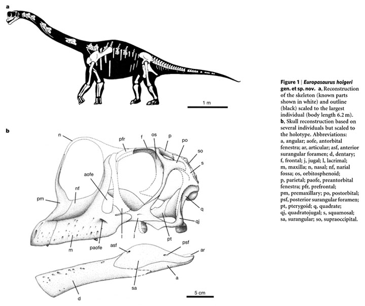 |
P. Martin Sander, Octávo Mateus, Thomas Laven, Nils Knötschke, "Bone histology indicates insular dwarfism in a new Late Jurassic sauropod dinosaur," Nature, 441 (2006 June 8), 739-741.
Then below, my redesigned illustrations eliminate the captions by building them into the illustration (why go to a special separate place on the page for words?), use direct labels to avoid the stupid and inconvenient letter code, eliminate the codes for names the illustrations, gray down certain elements to create a cartographic layering effect, fix the typography, and enhance the scales of measurement. The idea is to treat annotated illustrations as paragraphs of evidence, not as special occasions to segregate evidence by the mode of production. These changes took about an hour in Photoshop and Quark.
 |
-- Edward Tufte
Below, an excellent but imperfect display that combines slightly abstract generic diagrams with scaled images (and note the color control bars) of the messy reality.The letter linking-code is a confusing; the diagram captions are ambiguously located.
 |
Source: Abigail C. Allwood, Malcolm R. Walter, Balz S. Kamber, Craig P. Marshall, Ian W. Burch, "Stromatolite reef from the Early Archaean era of Australia," Nature, 441 (2006 June 8), 714-718.
-- Edward Tufte
An interesting account of the Enron trial, jury selection, and courtroom presentations by Brenda Sandburg, The American Lawyer, September 1, 2006. There were something like a dozen mock juries that pre-tested the trial presentations.
A month ago, for still another upcoming Enron trial, I sketched out in a email just for fun a metaphorical way to describe the mind-numbing complexity of how highly technical commodity trades were turned in disguised loans. My metaphor was The Fog Machine, comparable to the "Lies told, choices made" in the earlier Lay-Skilling trial:
"You have inputs (the initial causes) that go into a big gray box, The Fog Machine, which takes apparently business-related inputs (commodity trades) and produces the final desired outputs (disguised loans or a patina of profits or whatever).
Here's one presentation arrangement. To begin with, in a grand summary table, show all the initial inputs with their corresponding the final outputs in two long columns, by date. Now you have to demonstrate that what happened inside the Fog Machine turned the particular inputs into the desired corrupt outputs. The tone and sense of the presentation should be that we are going to discover, by good detective work, just what was going on.
Trace through a narrative of how one particular input turned into the desired output. Then you take a second example, and again narrate the path through the Fog Machine. You draw jagged lines through a foggy box, tracking the particular process of mystification.
Then revisit that first grand input-output table.
Then a third case-study narration through the FM.
The 3 narratives through the FM should each be important and different. Maybe there are 3 basic paths or patterns or strategies through FM.
Then you say, making a little joke, we've got 1,017 such histories--want to hear about them? The patterns are roughly the same, but more importantly, the underlying principle is the same: inputs go into the Fog Machine that produces the desired outputs, all while mystifying the target audiences of accountants, journalists, shareholders, business school professors, and the Feds. Maybe, at some point, above the FM are descriptions of the mystified audiences along with explanations of why they were targeted for mystification.
Then, why would anyone want to use a Fog Machine, anyway? Real companies don't (I suppose); provide evidence on this point. Thus the very existence and operation of the FM indicates self-knowledge of problematic transactions; does it have any real business purpose?
A counter-argument rests this question: Does the opacity and technical complexity of Enron's accounting procedures signal Enron's genius rather than their deception? Are audiences mystified because they're not as smart as Enron's management? For target audiences, the Enron religion relies on the confusion between being mystified versus being in the presense of deep and profound.
There is a great big Tinguely sculpture--a roomful of contraptionary equipment that, upon being switched on and starting up, then grinds, gears, flips, levers, pulls, Rube Goldbergs, and twirls on and on--and finally at last after all the grinding, gearing, flipping etc., produces a little tap on the back of a mechanical duck. Who then goes . . . . "Quack." Maybe you can get a video of it in action."
-- Edward Tufte
Some metaphors for the Enron case described in my email above: Potemkin Village, patina, the Fog Machine, the disinformation design of magic, the Tinguely sculpture, and philosophizing about appearance and reality.
Wikipedia is helpful on Potemkin Village.
-- Edward Tufte
The letter linking-code is a confusing; the diagram captions are ambiguously located.
This practice is universal, or nearly so. I have not yet encountered a scientific journal that provides authors with control over the layout of figure legends. We may not like it, but it is unlikely that we will be able to change it.
-- Alexey Merz (email)
In page-layout programs these days, it is easy to avoid legend encodings. The proper call- outs can be done by authors' illustrator or by the journal's page-layout staff.
-- Edward Tufte
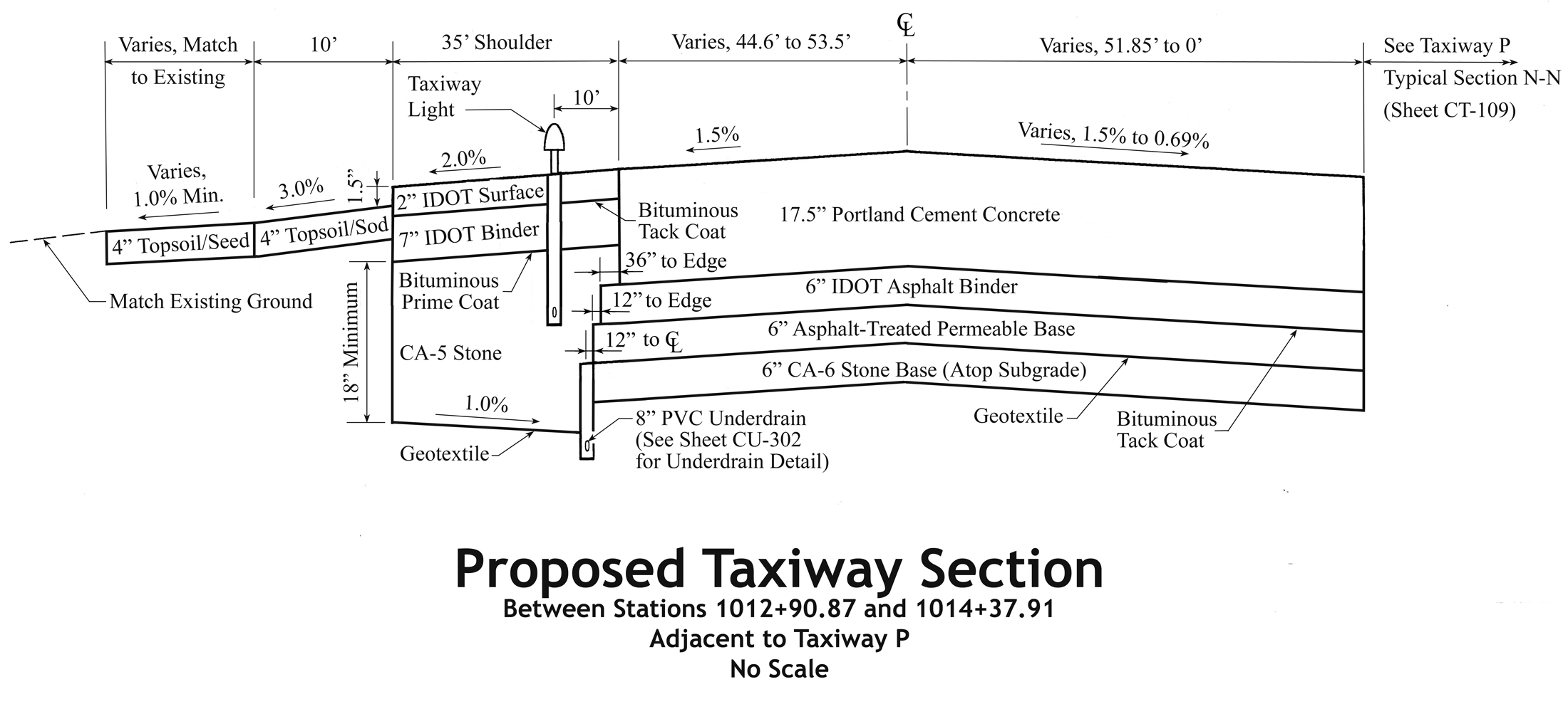
Embedded coding is entrenched in many construction drawings
Below is a section drawing of a taxiway pavement section from a recent project. I have brought the legend closer to the drawing than it appears on the original drawing.
Sadly, this is the state of many heavy-highway construction drawings in Spring of 2008: all-caps lettering, moiré effects from the closely spaced leaders, low data/ink ratio, etc. All the line weights are equal, which discards another potential layer of information. There is no shading; however, this enables the drawing to withstand multiple generations of copying, reduction and faxing—which is good.
The “STA” shorthand is for “Station.” This is industry-accepted nomenclature. In other words, this drawing shows the pavement section from approximately 101,291 feet to 101,438 feet from an arbitrary starting point. The “NTS” notation means “Not to Scale.” There is deliberate distortion of vertical scale, otherwise the different layers would be too close together. This deliberate vertical distortion enables one to see the different layers clearly. There is no issue, since the person reading the drawing should already understand why the vertical distortion is present.
Drawing standards stifle innovation. This drawing is largely the same as it would have appeared 50 years ago. In one sense, we have gone backwards—I distinctly remember bridge drawings from 20 years ago which had mixed-case lettering! The frustrating thing: the engineers who drew this section have the software to correct some or all of these issues.
-- Jon Gross (email)
Lovely examples of clarified information presentation! Both fixes are great, but the "scales of measurement" fix on the dinosaur illustration is an absolute forehead-smacking bit of brilliance.
I've occasionally engaged in fixing layouts for Shakespearean works for high-school and second-language learners. Apart from generally hideous typography, traditional layouts feature hard-to-find line numbering and hard-to-decode gloss text (modern translations of some older vocabulary).
In my experience, these flawed texts were laid out in an earlier age of typography, when technical encumbrances prevented the creation of truly intuitive presentation of information. It's also possible that the designers of the layouts simply never considered the practical implications of their designs. I believe that designing a good layout for an educational text requires sensitivity to the student, the teacher, and the content itself -- as well as the technology of layout and the art of design.
I suspect that the practice has carried over into modern days through inertia. Sadly, the effect is to take content that is challenging and make it even more difficult to apprehend.
-- Michael Friesen (email)
Revised taxiway pavement section without coding
The original taxiway pavement section and my revision both omit various details, by design. For example, it is reasonable to separate the underdrain details
on a different sheet—remember “layering and separation” from Envisioning Information. This pavement section identifies the taxiway pavement
components and shows the interrelationships of volumes, along with various dimensions. Seemingly simple taxiway pavement belies a three-dimensional
complexity of details: drainage, materials, pavement marking and electrical equipment. The full set of 24”×36” drawings is 5/8-inch
thick with 9 sheets of taxiway pavement sections alone. Through “minor” revisions and increased information density (data/ink ratio), the revised drawing is
14 percent more compact (as verified with precision planimeter measurements) and easier to understand.
The first task was to eliminate the coded legend, and use the labels themselves to denote the materials. The new line-weight hierarchy emphasizes
object outlines with thicker line weights and deemphasizes dimension/extension/leader lines with thinner line weights. This is “standard practice”
from any 1950s era drafting textbook, by the way. I have added a couple of callouts and leaders for clarity. In some cases, I have used industry-standard
nomenclature which may be mysterious to outsiders. In all, I have tried to improve the readability of the drawing, in words and pictorially.
There is no scale; however, I attempted to keep the scale relative. I have also eliminated “Detail A,” by incorporating that information into the
drawing—remember “to clarify, add detail.”
Admittedly, the audience for this drawing is small; however, is it asking too much to rid drawings of unnecessary coding?
-- Jon Gross (email)
 |
 |
-- Edward Tufte
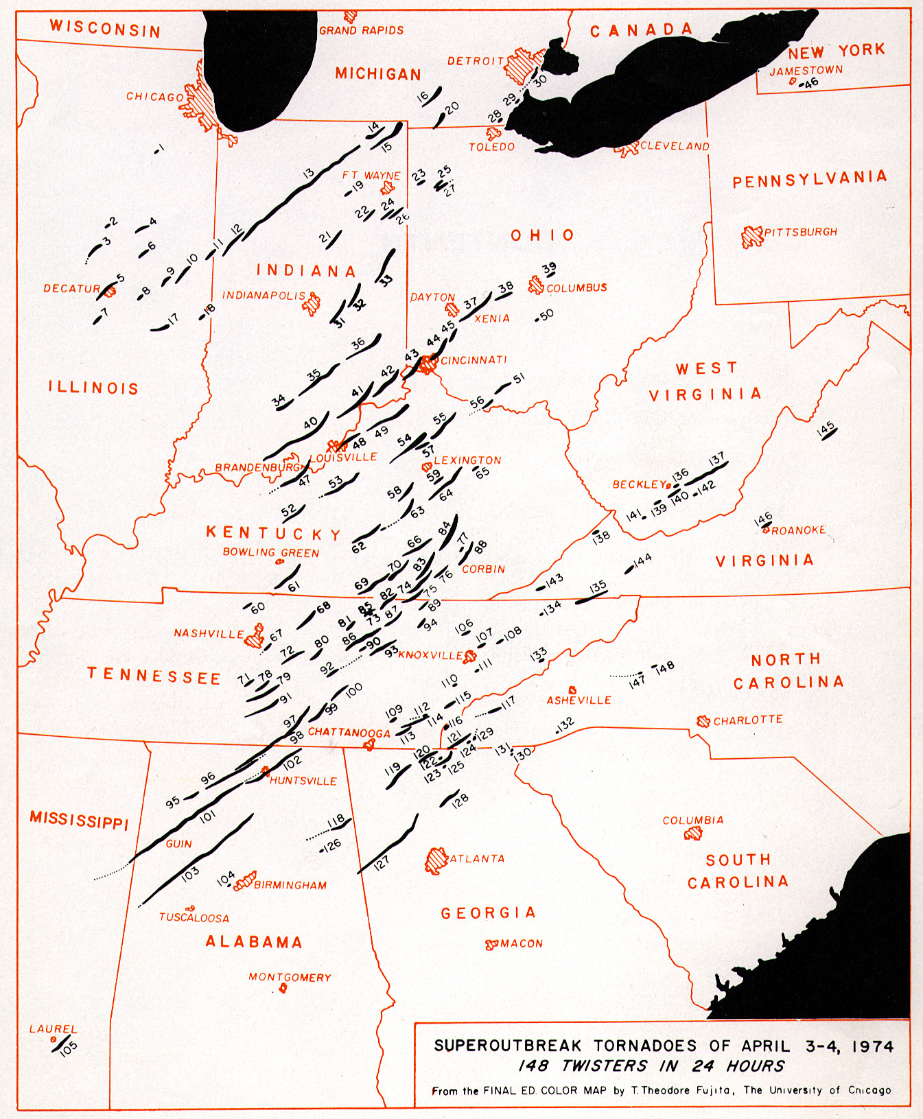
I light of recent severe weather in the southeast U.S., here is an excellent graphic by Ted Fujita, originator of the famous F-scale for tornado intensity. The graphic shows us the paths of tornadoes during the 1974 Super Outbreak, which wreaked havoc across the eastern U.S., killing over 350.
Tornado paths are represented in black, with some modulation of line width hinting at variation in tornado intensity as each twister traces out its path. We see at a glance the overall southwest to northeast orientation of the tornado tracks, and the tendency for tornadoes to dissipate and reappear along the same path, literally cutting dashed lines across the landscape. State borders, in red, show the location and scale of the Super Outbreak at a glance, as well as the location and size of many cities. The intersection of black lines with cities is laid bare simply and clearly, belying the disasters that unfolded at these fateful intersections.
-- Scott Flanagan (email)
|
|||||||||||||