|
All 5 books, Edward Tufte paperback $180
All 5 clothbound books, autographed by ET $280
Visual Display of Quantitative Information
Envisioning Information
Visual Explanations
Beautiful Evidence
Seeing With Fresh Eyes
catalog + shopping cart
|
Edward Tufte e-books Immediate download to any computer: Visual and Statistical Thinking $5
The Cognitive Style of Powerpoint $5
Seeing Around + Feynman Diagrams $5
Data Analysis for Politics and Policy $9
catalog + shopping cart
New ET Book
Seeing with Fresh Eyes:
catalog + shopping cart
Meaning, Space, Data, Truth |
Analyzing/Presenting Data/Information All 5 books + 4-hour ET online video course, keyed to the 5 books. |


The WP7S layout and typography have a looseness found in posters, commercial art and marketing, an inappropriate metaphor for a handheld information and communication device. In the splashy panoramas, there are hints of design-by-focus-group (which is like hiring temps as your design consultants). Instead of impressing focus groups, designers should do a thought experiment: Imagine what Steve Jobs and Jonathan Ive would have to say about your interface. As Jonathan Ive said: At Apple "we don't do focus groups."
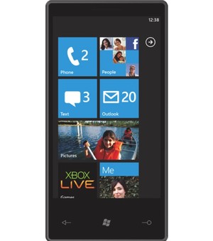
The WP7S interface has an extra sequence/layer added by big-button opening screens for the new ways of organizing stuff. Compared to the IPhone, most of the WP7S organizing screens have lower content resolution, which violates flatness and leads to hierarchical stacking and temporal sequencing of screens. In day-to-day use, maybe the panorama screens will solve the stacking/sequencing problem, or maybe they will just clutter up the flow of information. Of course Microsoft's customers are already familiar with deep layerings and complex hierarchies.
The panorama sequence appears to be an interface for an interface, a distancing from the core activities of users, who just want to get on with what they want to do. My view is to let the user's eyes do more on a screen-image rich with opportunities rather than having to slide-and-flip through a sequence of thin decorative screens in order to find the desired action. The way to reduce clutter is not to thin down and sprawl out the content; instead fix the design. Clutter and confusion are not attributes of information, they are failures of design.
On the importance of content resolution and flatness in handheld devices, see my essay and video on iPhone design from January 2008.
The WP7S screens look as if they were designed for a slide presentation or for a video demo (to be read from a distance) and not for a handheld interface (read from 20 inches). For example, the headline type is too big, too spacious. One design lesson here is that most interface design work should be done at actual final scale and all internal demos should be on actual hardware rather than on pitch slides or big monitor screens. After all, users see the interface only at actual size, and so should interface designers, their managers, and so on up the management chain.
A recent unlocking of the WP7S emulator provides many many screens (perhaps all the screens in WP7S) that reinforce my concerns about low content resolution, flatness, and hierarchy. The typography is loose and over-produced, with big blimpy titles burning up content real-estate. The titling typography does not serve user needs or activities. Instead it is about its designer self, and looks like signage on the walls of a fashionable building. Good screen design for information/communication devices is all about the user and should be endlessly self-effacing. It is much more difficult to be user-friendly undesigny than designer-friendly designy.
The booming smartphone market is intensely competitive, with lots of talent, brains, money, and a vast infrastructure at hand. What is the positioning of WP7S in this market, where many users are enthusiastically committed to their new handheld devices? And how does WP7S compare with the well-established BlackBerry, iPhone, Nexus One, Android, as well as their upcoming new releases? Android is free, WP7S apparently has a license fee. Currently the two- and three-syllable platforms are way ahead of the seven-syllable platform.
NOTES
ET reports (favorably) on Microsoft's Courier digital journal here.
Intriguing analysis by Luke Wroblewski on WP7S interface resolution.
WP7S is planned to launch late 2010, according to PC Magazine's interesting article.
Engadget provides some WP7S images and a review.
-- Edward Tufte
Asymmetric home page: feature or bug?
One of the first things that struck me during the reveal of WP7S was how 'uncomfortable' the home screen looked. Why would the designers create so much negative space on the right and top of the home screen? It throws off the visual balance of the home screen in a really unfortunate way. Is there some reason why this is a good design decision that I am missing?
-- Will Kendall (email)
ET: WP7S advantage?
WP7S ADVANTAGE? If this is the unlock screen above, then WP7S has surfaced more immediate functionality than the iPhone unlock screen, where users supply their favorite image to accompany a single command on the screen: the slide-to-unlock swipe. On the iPhone, I very much enjoy my unlock-page large personal photograph, which makes the device my phone. WP7S also personalizes the opening screen with small images, combining early functionality access with personalization. (Might need some internal controls for exactly which of your recent pictures show up on the semi-public unlock screen.)
NEGATIVE SPACE ACTIVATION The strongest visual elements in the screenshot above are the black crosshairs between the big buttons. There should instead be some proportionality between the strength of the signal and the importance of the content. Negative space activation is an important matter in all design work.
-- Edward Tufte
WP7S animations = iPhone animations?
Is not the iPhone filled with animated screens, and is it not still pleasant to use after a long time? Animation is an effective tool for showing transitions (and for hiding load times between screens).
After using a highly defective (by design and implementation) Windows Mobile 6.1 phone (SonyEricsson Xperia 1), I know that there are many more, and more important, ways that Microsoft can fail. Personally I think that snappy animations will increase the user experience.
-- Peter Holmdahl (email)
Teasing
A few comments regarding the animation. I feel like some animation is useful, and probably most of the transition animations will be OK in use.
However some I think lead to confusion. Look at the demonstration of the address book, searching for and then choosing a name. When the name is selected, the screen fades out while the name swoops to the top of the screen. The effect doesn't leave me with a good feeling of how to go away from that screen, I don't have any clues as to how I might get back to the full list. Sure that's why they have a back button, but after a number of transitions like that I don't think I have a good sense of what exactly a back button would go back to, so I couldn't for instance rapidly press back a fixed number of times to get back from the sent message in the demo to the address book list again.
The transitions for other things seem fine, though I wonder in practice if it will be a lot of developer work to support things like elements transitioning not all at once, but slightly delayed from top to bottom of the screen... the other concern would be that a user would be forced to wait for the additional animation to complete before being able to do something else, like scroll a list or swipe on to another screen. From the demos it didn't seem like the animation was blocking, but it's hard to tell.
On the Teasing, after some thought I think this does more harm than good. If I were a first time user I would be prone to think of the animating icons on the main screen as ads instead of functionality, since they look so much like animated banner ads found on the web! Sure they let you know an item can be pressed, but that seems like something someone would try anyway since you've already segmented the screen into areas that appear touchable.
Also, on the Home screen (equivalent to the iPhone Lock screen?) I think the teasing effect of showing some of the main screen behind may in fact be something of a security risk, given that a lock screen is not supposed to let anyone see data on the device until they unlock it; all of those icons on the main square grid are supposed to be populated with live data constantly.
I do think there's a place for teasing animations in UI, but they have to be very subtle, and possibly should only be active for novice users and automatically disable after some time (for instance teasing to show something can be shifted to the side). Perhaps teasing only makes sense as an entry transition that shows possibilities as elements fall into place on the screen, and not something that actively seeks to draw your attention once you are in the screen seeking information.
-- Kendall Helmstetter Gelner (email)
Right-handed users?
The bands of negative space on the right and top may not be aesthetically pleasing, but perhaps they do serve a function. The ative UI elements on the main page are huddled left and down by these bands, and into more prime thumb-range for a right-handed user. If you were to pick up your current smartphone right now with your right hand, and swing your thumb over the area of the screen that your thumb can easily attain, it's close to the same as the active area on the WP7S. That's a possible explanation. I simply can't believe these gutters are vestigal, even for a designed-by-focus-group interface.
-- Christopher DeAngelus (email)
Zune HD transitions similar?
I have a zune hd, and it uses similar transitions. i really like it, and havent gotten sick of it, and i have it for about 1/2 a year now. i still like it because the screen technology on the zune hd is awsome to look at.
-- khanh (email)
Asymmetric interfaces and handedness
First, the home is not centered. Instead, it's moved to the left slightly. I wouldn't be terribly surprised if this was the default setting, and that you could move this to be aligned right. Reason? Right handed people will find this home screen a bit more comfortable to use. Using my iPod with one hand can get difficult because to press buttons on the right, I have to curl my thumb in almost unnaturally far. I generally hold my phone in the crook of my hand between my index finger and my thumb. This also means that the right side of the screen is usually covered. It might not seem like much, but seeing a push to the left side means I can use my thumb more naturally. In addition, it makes it easier to use the phone one handed.
Secondly, the size of the buttons make it easier to use the phone one handed as well.
Thirdly, someone mentioned the big black cross. I really don't notice the black cross. I notice the 3 big icons (Phone, Chat, and Email). Even the facebook one get's lost amongst the other three. In fact, the positioning of the phone icon indicates the prime position it sits by default. A place that is incredibly easy to hit with your thumb. This is a phone, after all.
Finally, the navigation theme on the home page makes it seem easy to navigate. Up and down as opposed to left and right. This assist with the way you'd hold this thing.
While I can see navigating to commonly used areas to take a bit of time, no more than the iPhone. Obviously, there are parts I can't comment on yet, but even now, the placement of the UI appears much more practical for every day, real use.
-- Jason Lotito (email)
Subtleties and craft in animation design
Animations are tricky to get right, to please and guide without eventually annoying you. Get them right and they become wonderfully invisible; get them wrong and boy, are they terrible.
Here are a few discussions of animations used throughout Apple's products: Mac OS X and iPhone OS.
-- John Blackburn (email)
Subtle animations
I disagree that animations are unnecessary or that you get bored of them. I think that transition animations and other UI animations are integral part of the touch UI experience. Animations are one of the best ways to visualize *causation* of your actions.
Great, subtle animation design of iPhone user interface is one of the reasons that make it so great to use.
The thing is that user interface animation design is still in its infancy. Current tools don't support experimenting with animations well enough. In my work I've noticed that like in all design work, small details can make a big difference in the experience. Even in rather simple transition animation design of user interfaces, you have to try out different timings, ease-in and ease-out functions to get that natural feel. For example, transition animations of Android UI feel much more clunky compared to iPhone, and the difference is not due to technical reasons.
A few weeks ago, I blogged about the importance of animations to the design of touch user interfaces, see http://bit.ly/bMTlLC
-- Teemu Kurppa (email)
Dark space reduces battery drain, not hand strain?
> Is not the iPhone filled with animated screens
Is it? I've been using one for years and I hadn't noticed. I think that is the true test of animated transitions and transforms: if you don't notice them consciously, they're working, they're not getting in the way. Considering the iPhone is capable of 3D games, Apple could have been much less restrained in their interface animations.
> negative space
The interface looks to me like it was designed specifically for an OLED display, as on the Zune HD. With OLED displays, a flat black is free as far as battery power goes ... the pixels are completely turned off and there is no backlight behind them to draw power. The more black they show in the interface, the more battery life the device gets. Microsoft has a tradition of prioritizing engineering hacks over visual design, for example in their desktop font rendering. The visual designers were likely instructed to use as much black as possible. When you look at the numbers, this turns out to be the only way to actually save power with OLED ... if you show a typical full color image it uses just as much power as a regular LED.
Using OLED at all is questionable interface because it performs terribly in daylight and office lighting where phones are often used.
-- Hamranhansenhansen (email)
Luke Wroblewski on teasing
A thoughtful discussion of WP7S teasing from Luke at
http://www.lukew.com/ff/entry.asp?1003
-- Edward Tufte
"...which violates flatness..."
Superb essay.
The reference to flatness gave me a 'eureka' moment. Most people don't understand flatness! I'm not sure I do either.
Many places I turn for info (our office website, my bank website) are 'improving their interface by making it hierarchal.' Ha Ha
When I took your course in 2004, you referred me to aldaily.com as a great example of CONTENT on one page, over 500 links. That web site actually has not changed since I first looked at it is a testament to its durability. While I do refer people to that site, they just shrug and say "We are not a literary society." They just don't get how important flatness is because they have a focus group instead of a real user giving them feedback.
A search of your site on 'flatness' does not provide a concise discussion. A search of google on 'flatness of web design' or similar does not yield any meaningful results, either.
Please help me by referring me to some decent 500 word essay I can share with web 'designers'? Or elaborate on what 'violating flatness' means?
Greatly in your debt every day,
Bob
-- Bob Combs (email)
Note that Microsoft dropped the "Series" from the name in April 2010, so it's down to five syllables now.
-- Matt Day (email)
Windows visual pun?
In response to "The strongest visual elements in the screenshot above are the black crosshairs between the big buttons. There should instead be some proportionality between the strength of the signal and the importance of the content."
I'm pretty sure that the negative space was the highest priority on that screen for the MS executives that commissioned it. The top and right gray area look like a wall, emphasizing the cross and blue buttons that look like a window.
-- Ryan (email)
I wanted to share some of my impressions of the WP8 system.
When I originally read Mr. Tufte's impressions of the WP7 interface a few years ago I could not help, but agree with the design conclusions. Being a very adaptable person I recently started to use a WP8 device this year.
WP8 in carrier stores are open to the public to play with. The original side arrow is now regulated to the very bottom of your tile screen tucked in under the last tile and not occupying a black vertical border on its own. As such the black corner issue is basically gone from WP8, but the tile start screen still suffers from a "elasticity". I can pull down the top of the tile screen to reveal at least two rows of empty space below the top row of system icons which typically stay hidden unless touched. Since the screen rubber bands back in an odd way an extra half black row stays (unless you adjust it down) between the system icons and the first row of tiles. What is the purpose of this?
As previously, you can pin whatever app and also some elements from inside apps to the starting tile screen. This allows the screen to be as long as you would like or as short as you like. You can basically constrict it to one glance's worth if you like. The major change to WP7 to WP8 and what I've read Microsoft will continue with is increasing the maximum number of tile rows and columns over any screen to 6 versus the current 4 (WP8 today) and the earlier 2 (WP7). This coincides with a hardware end push by partner Nokia to introduce bigger physical screens and growth from 720 to 1080 resolutions on the WP8 hardware.
As a person who always played with "desktop" backgrounds on iPhone, BB7 and Android 2.3, I realized quickly that I didn't really care for a background at all anymore on this phone. At minimum tile size, the screen supports 28 (4 Wide x 7 rows on my Nokia 920 model) tiles with the minimum white icon and tile color (some which can show numbers of updates, like new email count). At medium size this is 6 and 2 1/2s and at full wide size this is 6 and 1/2. At medium and full wide, the icons are able to show much more detail. Depending on the type of app (like a weather or news app) the tile can flip periodically to show news headlines or weather conditions. 28 minimum sized apps on a screen is impressive at first glance, but without the features of medium and long tiles the information available is limited. Some unfamiliar apps may be difficult to identify with only the icon. The start tile screen is a sort of cross between the home screens of iOS, Android and a hobbled notification center. Overall information can still feel limited, but the lack of a traditional "desktop" on a mobile screen makes perfect sense.
The headline style that Mr. Tufte mentioned still exists as basic Visual C# templates in the programming software that Microsoft distributes to developers. I can't help but find every instance of this template I run into hogging up 1/3 of the screen for titles I can see from a yard away. Microsoft published apps that use this tend to have the issues Mr. Tufte and others have pointed out. Why is it so hard to get to my photo album? As a fact of my usage of this phone: Nearly every great app I have found was by a Windows Phone community site and its QR codes rather then through the actual app store. Nobody seems to see the issue with "App Collection/Finding" apps in the app store, when the app store is supposed to be serving that exact function!
Successful, well designed apps in the WP8 ecosystem have particular traits. 1) They don't follow much of Microsoft's design style and sometimes ignore some it all together. For example: headline style is significantly reduced in size and/or layers. 2) They recognize instant access (strong focus) is better then too many options. 3) They realize the value the start tile screen is and actively program to allow pinning of internal elements.
An app that does this well is Evernote. You have the choice to pin the notebook or any individual note you want to the start tile screen and don't ever need to pin the actual app itself. This is very ideal for any note taker and by using the dynamic of the tile screen, saves time. A new note option can also be pinned to enable a quick note to be started at one touch post lock screen.
Theoretically with upcoming 1080 resolution support a WP8 device could possibly have 6 tiles in 10 rows for a total of 60 minimum sized app tiles on one view of the start tile screen.
I hope for the platform that the design style improves more as resolution increases.
-- Mayo Ibarra (email)
|
||||||