Warning: Trying to access array offset on value of type bool in
/nas/content/live/graphicspress/wp-content/themes/edwardtufte/archive.php on line
21
"Wonderful Data Visualization" Edward Tufte Keynote talk to China Visualization and Visual Analytics Conference (ChinaVis)
Video on practical advice for machine learning and artificial intelligence.
Google translation provided parts into Chinese in my slides.
ChinaVis also wanted data art, so I happily included my Feynman diagrams done for Nobel to celebrate Feynman's 100th birthday
If video does not play, Click here.
: Undefined variable $count in
/nas/content/live/graphicspress/wp-content/themes/edwardtufte/archive.php on line
24
Warning: Trying to access array offset on value of type bool in
/nas/content/live/graphicspress/wp-content/themes/edwardtufte/archive.php on line
21
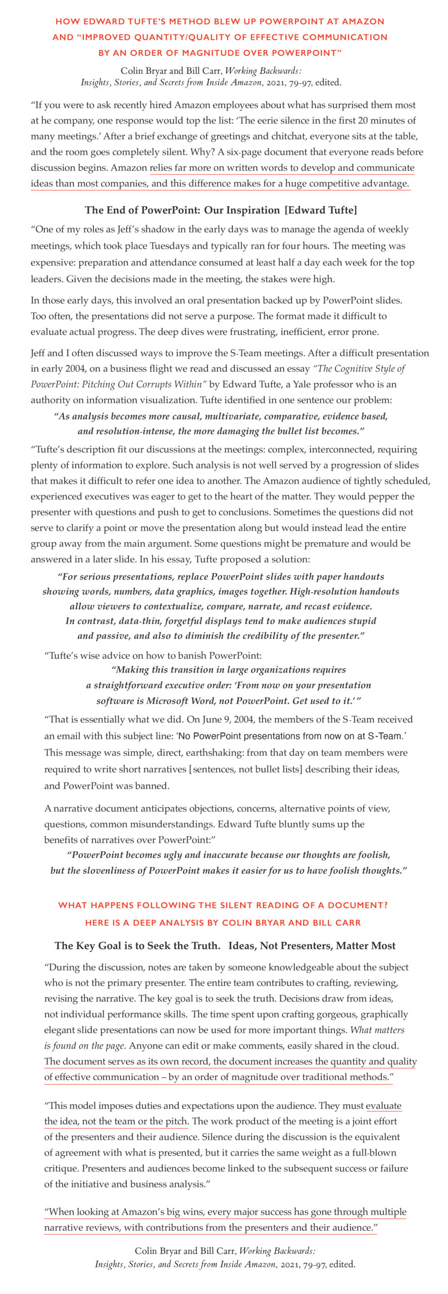
Edward Tufte presentation method caused Jeff Bezos, Amazon, AWS to throw out PowerPoint
Working Backwards: Insights, Stories, and Secrets from Inside Amazon, by Colin Bryar and Bill Carr,
Amazon senior leaders, describe how Amazon/AWS dropped PowerPoint - replacing it with Edward Tufte's redesign of serious presentations: all meetings begin with a silent reading of a 6 page narrative (sentences, no bullets). Their words claim that this method is a miracle in communication.
For a mobile friendly version,
click here
Visual Display of Quantitative Information: First Sketches
This is a handout for a brief course probably at the Kennedy School, Harvard University. I taught the course in 1976, and VDQI was first published in 1983.
For a mobile friendly version,
click here
If most medical research is false, then what about research-on-research?
Excerpt from forthcoming book

Practical Advice for Medical Patients
Practical Advice for Medical Patients
⭑ Find a good internal medicine doctor, to reassure you or fix your problem 70% of the time.
⭑ Write a problem list for every appointment. Bring 4 copies. Make them read it.
⭑ When you choose a specialist, you have chosen your diagnosis and treatment! Never forget that. Once I had a spine C7 bone bump diagnosed by x-ray. Dr. Smoth, internal medicine, said not to worry, no problem. I said: "Should I see a neck surgeon?" Dr. Smoth said: "IF YOU DO, HE WILL OPERATE ON YOU." Best piece of medical advice ever.
⭑ Take Purell with you always. In a hospital bed or the ER, put the bottle on your chest.
⭑ Reduce the frequency of screening tests; they lead to many false alarms, following by harmful interventions to confirm alarm is false. The PSA test is fading away, also mammograms, even lung cancer screening.
⭑ Until CMS (Medicare, etc.) cracked down on over-screening and over-diagnosis, each speciality set the frequency of screening in their field &emdash; so of course, they say to screen often, because they want more $$$. To understand US medical care, follow the money.
⭑ After surgery, you are likely to be dehydrated and also high. The crash will start a day or two later. The second night may be one of your worst nights ever. Prepare for it, remember that it happens to many others, keep hydrated, get a gentle massage, and, if at home, keep your dog near.
⭑ For learning about your medical issue, go first and maybe only to these websites: Mayo Clinic, NIH, Wikipedia, and, for detail about your problem once you know what it is, Medscape. Never rely on Google list or the creepy sewer of ads embedded in Google's list.
⭑ For something serious, go to best place you can. There is great variability in quality of care and survival. Many will accept Medicare. Scott Simon told me ten years ago: "If you need to have serious surgery, go to Cleveland Clinic."
Five years later I remembered his advice. I fled my local hospital, which ranked 64th, to Cleveland Clinic, ranked first. Cleveland cured my mitral valve problem. The difference between number 1 and 64 was day and night on every single measure.
⭑ Upon going for medical care, try to have someone accompany you. They can drive you to the clinic (do not supervise the driver), take notes, keep track of your bag, arrange follow-ups... Upon leaving the clinic/hospital, no matter what, we head straight for pizza or Tandoori, and ice-cold beer.
⭑ American medical care is superb for the very rich and very smart. But otherwise it ranks 20th in the developed world on fundamental measures: baby death at birth, death of mother delivering, longevity of life. The other 19 countries doing better all have universal health care.
⭑ Do rehab! Stick with it. Medicare pays for lots of rehab appointments. Rehab is not like a regular gym at all; most people go to save their lives. 20% just sit and chat, and I wore my noise-canceling to get them out of my life-saving exercises. ALWAYS bring Purell and constantly use it.
⭑ Have a living will, keep it up to date, and say, I want to die at home or hospice. Living wills don't help all that much. The key element is the person you assign to have power of attorney. That is the person the hospital will obey for end-of-life.
⭑ Avoid hospitals. You can walk or wheel out any time you want. To avoid a $3,700 "transport fee" to be paid by your heirs, have someone drive you home. Die at home or hospice.Displaying estimates +/- error, confidence bounds
Here are ways of to present +/- bounds. We should members that these estimates are usually based on assumption not completely accurate: independence of observations, models of error, absence of cherry-picking, p-hacking, . . .
Easy to do in LaTex:
showing +/- confidence limits with short stacks

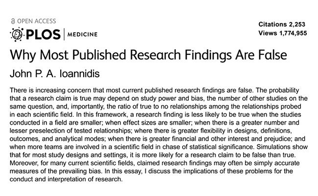
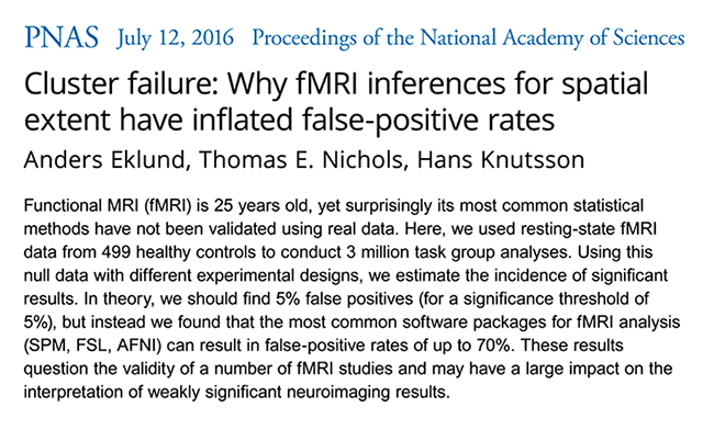
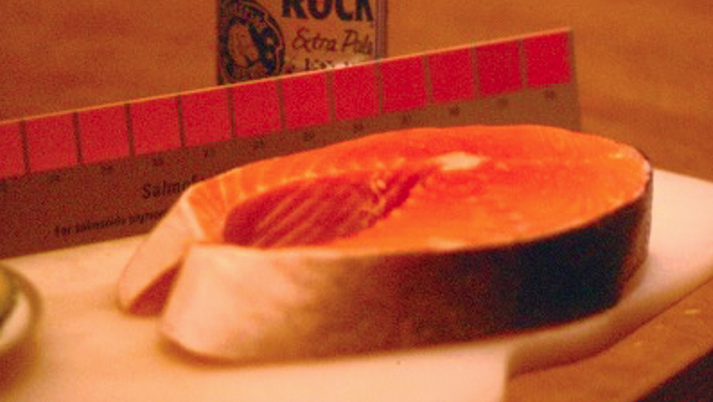
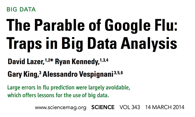
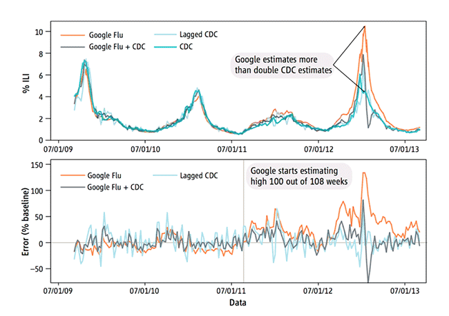
The crisis in data analysis: most published studies are false
Sparklines History by Tufte: 1324 to now
HISTORY OF SPARKLINES
EDWARD TUFTE
The essay provides a history of my work creating the concept of sparklines, and then a long history of sparkline-like graphics for hundreds of years.
Sparklines are small, intense, word-sized graphics with typographic resolution. Sparklines can be placed anywhere that words or numbers or graphics can be placed: in sentences, maps, graphics, tables. Sparklines have a data-ink or data-pixel ratio = 1.0, consisting entirely of data, with no non-data at all. Thus sparklines have no frames, tic marks, and non-data paraphernalia. Sparklines often get their quantitative scaling context from nearby words, numbers and graphics; sparklines are directly quantified by numbers on or near the sparkline itself.
Sparklines can show connected data lines, discrete individual data, and lines residing in 2-space or 3-space.


Note the connected-line medical "sparklines" in the grid in Stanley Kubrick's fine film
2001: A Space Odyssey, which was released in 1968. I saw
2001 in 1968, but not under conditions such that I would remember a data graphic.

ET WORK ON SPARKLINES
My book
The Visual Display of Quantitative Information was published in spring 1983. The manuscript was completed spring 1982, based on my work from 1974 to 1982.
Intense continuous time-series, looking just like sparklines, were the very first example after my statement of the fundamental principle of good statistical graphics:
Above all else show the data.
I took an example from an ECG textbook, and sunk it to - 75% of its original size = 56% area of original, nicely increasing the data density.
From Edward Tufte,
The Visual Display of Quantitative Information (first printing 1983), 92-93:

Sparklines then developed in
The Visual Display of Quantitative Information (1983), 133-135:


Sparklines were driven by 3 overlapping principles: maximize data density, minimize or zero-out non-data, and the shrink principle ("graphics can be shrunk way down").
I deliberately referred to the excellent Jacques Bertin by taking a large page from his book and then substantially reducing its size.
This directly produced, for free, high-res sparkline-like data graphics. The shrink principle served well in making sparklines: start large, then shrink way down to fit into sentences. My students at Yale in the 1990s did data graphics in Excel, and then would reduce the Excel out by a factor of 3 to 5 to make high-res sparklines that would fit into a sentence or a spreadsheet cell.
From
The Visual Display of Quantitative Information (1983), 166-167:

PRIOR ART IN THE LAST 700 YEARS
Line-filter graphics in medieval manuscripts look somewhat like embedded sparklines:
,%20fol.%2049v.jpg) From the illuminated Luttrell Psalter, created by anonymous artists in England around 1320-1340.
From the illuminated Luttrell Psalter, created by anonymous artists in England around 1320-1340.
 From the diminutive Book of Hours of Jeanne d'Evreux, Queen of France in the 14th century
made by artist Jean Pucelle in Paris, around 1324-28.
 From the translation of Aristotle's Politics into French by 14th-century polymath Nicole Oresme.
 Galileo Galileo, Istoria e dimostrazioni intorno alle macchie solari (Rome, 1613).
Contour lines can be thought of as
three-dimensional sparklines: for various fixed values of Z, the line moves through XY space. Here's Halley's magnetic declination map of 1700, and the amazing Swiss mountain maps.
 Edmond Halley, "A new and correct chart showing the various of the compass in the Western and Southern Oceans as observed in the year 1700 by his Majesties' command by Edm. Halley" (London, 1701).
 Swiss topographic map (1957).
 Michel Florent van Langren, La Verdadera Longitud por Mar y Tierra (Antwerp, 1644).

Patterns of sea drift and the areas where certain whales can be found.
"Sea drift and whales on which the movements of the sea as indicated by the thermometer are shown,"
from M. F. Maury, The Physical Geography of the Sea (New York, 1855)

Electrocardiogram taken with Einthoven's original string galvanometer, which he invented around 1901.

First human electrocardiogram recorded by Augustus D. Waller of St. Mary's Medical School showing simultaneous electrometer and cardiography tracings showing an electrical activity preceding every heart beat.
From A. D. Waller, "A demonstration on man of electromotive changes accompanying the heart's beat," The Journal of Physiology 8 (1887), 229.
Reproduced in Majd AlGhatrif and Joseph Lindsay, "A brief review: history to understand fundamentals of electrocardiography," Chimp 2 (2012).

Structure of the Atom: vibration of an electron as progressive waves.
From Max Born, The Restless Universe, figures by Otto Königsberger (New York, 1936).
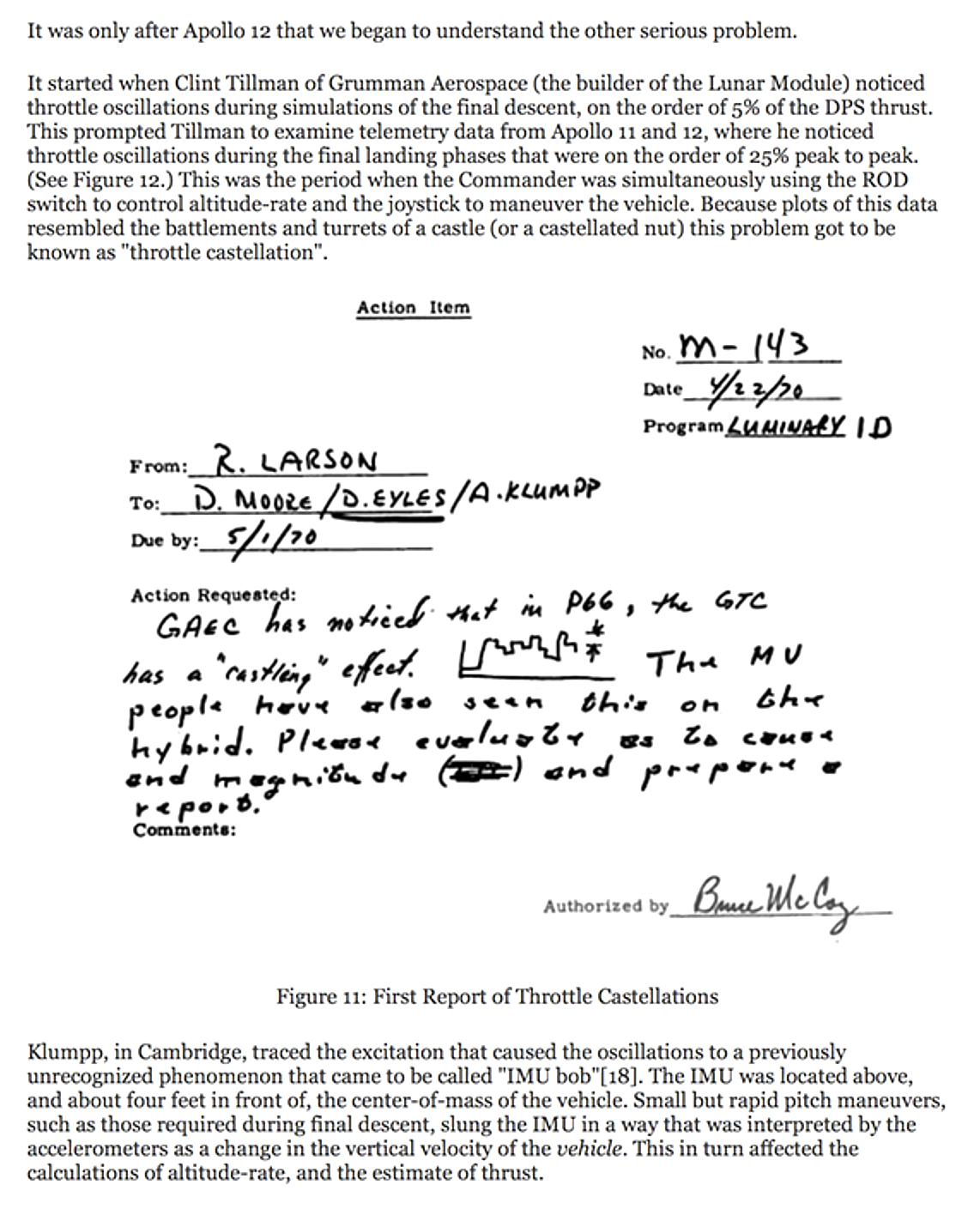
1970 NASA report of throttle problems in the Apollo Lunar Module

 Representation of different aspects of a musical melody from Iván Fónagy, La vive vois: Essais de psycho-phonétique (Paris, 1983), reproduced in Geneviève Calbris, The Semiotics of French Gestures (Bloomington, 1990)
 Martinus Veltman, Diagrammatica: The Path to Feynman Diagrams (Cambridge, 1994), 150-151.
In the summer of 1989 I consulted for Hewlett-Packard on clinical information systems and patient monitors. I examined a number of products including CareView and Sonos 1000 (for cardiovascular imaging). During one visit I critiqued a cardiovascular imaging interface as I viewed shirtless my mitral valve live on a sonogram. On June 29, 1989 I prepared a design analysis for HP. Point 3 used "postage stamp graphics" to pull together the sparse entries of medical event flowsheets that could go on and on horizontally for 5 to 10 feet. Here is my report, artwork, and notes about "mini-graphics" residing next to spreadsheet rows and summarizing the row data.


 ET report for HP, 1989
"SPARKLINES IN THE GRID"
Microsoft filed a patent application in 2008 for "sparklines in the grid." It seems to be about Excel interface manipulations on sparklines. There are problems:
(1) see prior art above from
2001: A Space Odyssey (1968) and from ET HP consulting and tech notes (1987).

(2) Nearly all design elements (words, numbers, graphics) reside in a manipulated layout grid, as in page design and interface design.
For more see
Microsoft claim for "sparklines in the grid".
Edward Tufte course review: "Best one-day course your company can send you to"
THE BEST ONE-DAY COURSE YOUR COMPANY CAN SEND YOU TO
John Dove, Paloma & Associates, May 19, 2015
John Dove
writes:
"Every year for the past 20 years or so at about this time I receive in the mail a flyer advertising Edward Tufte's one-day course on 'Presenting Data and Information.' It is the best value-for-money that you can spend if you are involved in any way in presentation of information to users. When I receive this new schedule of these courses each year I get to thinking whom do I know whose career might change for the better if they take this course.
I've taken it twice (the content is always up to date with the latest examples of both good and bad information design). Every attendee gets copies of Tufte's four major works on visual display of information. [They are all included in the annotated bibliography on User-Centered Design I posted a link to in my previous LinkedIn post.] Tufte offers a group discount so your company can send a whole department or product team. And there's a steep discount for full-time students and faculty members.
In the early days of Credo Reference, when we were still not yet cash-flow-positive and had to watch every penny, I insisted on offering to every member of the xrefer (our name then) staff who had either development or product marketing roles in the company, whether in London or Boston, a chance to go to this course. We aspired to be leaders in creating innovative ways for users to browse information from subject encyclopedias. To me it was money well spent and showed that we were a company that takes effective user-centered design seriously.
If your boss says there's no money to send you to such a course go to it on your own nickel, but buy a copy of 'The Inmates are Running the Asylum' for your boss or boss's boss.
All these one-day course fill up quickly."
Edward Tufte's one-day course is now available as '
Analyzing/Presenting Data/Information' and online video course version of the in-person one-day course 'Presenting Data and Information.' This online video course is taught entirely by Edward Tufte, includes all 5 books and 4-hour video.
Edward Tufte course review: "One visionary day" WIRED
Edward Tufte course review, WIRED
ONE VISIONARY DAY by Peter Myers
His insights lead to new levels of understanding both for creators and viewers of visual display.
Source: WIRED
Many are fluent in the language of technology. Few, however, speak as eloquently as Edward Tufte, whose theories of information design not only illuminate, they inspire. In a full-day seminar, Tufte, author of the classic
The Visual Display of Quantitative Information, uses maps, graphs, charts, and tables to communicate what prose alone cannot. He is to information designers what The New Yorker once was to writers: a model of clarity and craftsmanship. His counsel ranges from the importance of attributing authorship to the responsible use of the 16 million colors at our disposal. "Above all," he pleads, "do no harm."
Tufte course Presenting Data and Information (now as an online video course Analyzing/Presenting Data/Information)
I left the seminar with useful advice ("Force visual comparisons," "Integrate all data"). Tufte bundles his critiques with proposed solutions that serve as models for our own designing. The real benefit of Tufte in person is witnessing his passion for ethics. To listen to him review how the Challenger disaster could have been averted, had well-intentioned engineers done a better job of presenting their case, is to hear a man who believes in the power of design.
Given that the heart of his enterprise is statistics (of which he's a professor at Yale), one might worry about "lognormal distributions" and "trimetric projections." This would be a mistake. Tufte keeps jargon to a minimum. His insights lead to new levels of understanding both for creators and viewers of visual display.
What makes Tufte most persuasive are his works themselves: His books and his seminar embody his belief that "good design is clear thinking made visible."






 Note the connected-line medical "sparklines" in the grid in Stanley Kubrick's fine film 2001: A Space Odyssey, which was released in 1968. I saw 2001 in 1968, but not under conditions such that I would remember a data graphic.
 ET WORK ON SPARKLINES
My book The Visual Display of Quantitative Information was published in spring 1983. The manuscript was completed spring 1982, based on my work from 1974 to 1982.
Intense continuous time-series, looking just like sparklines, were the very first example after my statement of the fundamental principle of good statistical graphics: Above all else show the data.
I took an example from an ECG textbook, and sunk it to - 75% of its original size = 56% area of original, nicely increasing the data density.
From Edward Tufte, The Visual Display of Quantitative Information (first printing 1983), 92-93:
 Sparklines then developed in The Visual Display of Quantitative Information (1983), 133-135:


 Sparklines were driven by 3 overlapping principles: maximize data density, minimize or zero-out non-data, and the shrink principle ("graphics can be shrunk way down").
I deliberately referred to the excellent Jacques Bertin by taking a large page from his book and then substantially reducing its size.
This directly produced, for free, high-res sparkline-like data graphics. The shrink principle served well in making sparklines: start large, then shrink way down to fit into sentences. My students at Yale in the 1990s did data graphics in Excel, and then would reduce the Excel out by a factor of 3 to 5 to make high-res sparklines that would fit into a sentence or a spreadsheet cell.
From The Visual Display of Quantitative Information (1983), 166-167:
 PRIOR ART IN THE LAST 700 YEARS
Line-filter graphics in medieval manuscripts look somewhat like embedded sparklines:
,%20fol.%2049v.jpg)


 Patterns of sea drift and the areas where certain whales can be found.
 Electrocardiogram taken with Einthoven's original string galvanometer, which he invented around 1901.
 First human electrocardiogram recorded by Augustus D. Waller of St. Mary's Medical School showing simultaneous electrometer and cardiography tracings showing an electrical activity preceding every heart beat.
 Structure of the Atom: vibration of an electron as progressive waves.
