Book design: advice and examples
August 13, 2003 | Fred Weiland
44 Comment(s)
I am in the process of developing a book on nuclear medicine imaging of the heart to accompany a course. Is there a good reference on book design?
Topics: 3-Star Threads, Science


Find a few well-designed books in your field (that is, medicine and science) and follow those architectures. Even better find out who designed those books and turn the job over to a professional whose work you respect.
Textbook design these days tends toward over-produced, self-conscious, content-unconscious arrangements. Maybe look at older classic textbooks.
Ruari McLean has published several excellent books on book design and typography. Robert Bringhurst’s The Elements of Typographic Style is superb.
To do the book yourself requires the use of a serious page-layout program, either Quark XPress or Adobe InDesign, backed up by PhotoShop and Illustrator. You can get help from nearly any student of graphic design, who will know XPress or InDesign. Book design at a high level requires a great deal of professional skill and hard work, and, I believe, close collaboration with the author.
If you have colleagues in medical illustration and medical informatics, they might be able to suggest a designer.
One strategy to do this relatively inexpensively is to find a recent MFA in book design and typography, show them exactly what you want by means of exemplars, and work with them closely on the page layout to insure, among other things, that the images fall properly in relation to the text.
But the first and most important step is to identify good examples of what you want; just go through your library.
I heartily agree with Dr Tufte on looking at Ruari McLean’s work especially Ruari McLean’s The Thames and Hudson Manual of Typography and also at Robert Bringhurst’s The elements of typographic style. I would like to add Adrian Wilson’s The design of books and Hugh Williamson’s Methods of book design. Both are excellent guides to the design and production of a book. The latter offers an excellent if a little dated guide to the industrial process of producing a book.
I’d also like to suggest an addition to the list of software that can be used to produce a book. TeX and it’s derivatives LateX and ConTeXt are often used to produce scientific publications especially those that have a lot of equations and they excel at producing structured documents such as textbooks (many Springer-Verlag and Cambridge University Press titles are produced from camera ready copy or PDFs provided by the author and generated using TeX). TeX’s biggest drawback is that it is not a WYSIWYG application and that visual formatting is done iteratively. Nevertheless I have used TeX/LaTeX for papers, a great many handouts and several grants and found that I could follow the Tufte guidelines and place figures alongside relevant text rather easily. The quality of the typography is excellent and automated (e.g. fi is replaced by the appropriate ligature without hunting through the symbol tables). More information on TeX and free versions of the software are available at the TeX Users Group website.
There’s an interesting new enterprise now under construction: Richard Rutter’s The Elements of Typographic Style for the Web. He’s taking the central principles of Robert Bringhurst’s essential text and applying them to web site design, with not only a discussion of aesthetic issues but with coding examples as well. The initial pages indicate this will be an important resource not only for web site design but for anything meant to be viewed on a computer screen.
For example,
ET rightly recommends studying well-designed textbooks. Perhaps in this thread we can collect our favorites. So, what are yours?
A few of mine are:
Perhaps because it is hard to do, none of these texts integrate figures with text, the topic of this thread and what I’ll try for my textbook on the Art of Approximation. One that does integrate them is Veltman’s Diagrammatica, mentioned in this Beautiful Evidence chapter on page 13. The reproduced selections look very good, but I haven’t seen the book itself so I haven’t yet added it to my list.
I have The Feyman Lectures and also Concrete Mathematics; both are beautifully designed.
It is also notable that the Feynman lectures (3 volumes) write about all of physics in 1800 pages, using only 2 levels of hierarchical headings: chapters and A-level heads in the text. It also uses the methodology of sentences which then cumulate sequentially into paragraphs, rather than the grunts of bullet points. Undergraduate Caltech physics is very complicated material, but it didn’t require an elaborate hierarchy to organize. A useful decision rule in thinking and showing is “What would Feynman do?”
Ironically, Donald Norman’s book The Design of Everyday Things has a famously clunky design, with illustrations awkwardly placed distant from their relevant text, mediocre typography and layout, and muddy images.
It would be helpful to provide a few spreads from the books mentioned in this thread. I’ll try to do this in the next few days; other contributors should do the same.
The Feynman Lectures come in several volumes, so I would count the project as using 2.5 levels of hierarchy. But for 1800 pages on a difficult subject, what an achievement! And what a contrast with current introductory physics textbooks, which are exorbitant, overweight, and often incorrect and have a fragmented, distracting, hyper-colored layout.
Auction catalog and antiquarian book catalog design are often very good, indeed among the best book designs around. These page layouts below show off the objects at auction. The layouts are straightforward, workaday, routine, powerfully focused on content, and excellent. There’s nothing like an auction to concentrate the mind on desirable objects. The high-end auction houses use the same templates over and over in their catalogs; what varies among catalogs is the content, not the underlying design. These auction catalog layouts are also distinctly superior to today’s fussy, hierarchical, and over-produced textbook designs. For several recent textbooks in art history and science, the designer bureaucracy has actively damaged the content. Here then are 12 doublepage spreads from recent Christie’s and Sotheby’s auction catalogs for auctions in Paris, London, and New York. There are hundreds of other such page layouts from recent auction catalogs that are as good.
The first 4 doublepage spreads below from Christies’s Paris, Importants livres anciens, cartographie, livres d’artistes et manuscripts, 9 juin 2006, 8-9, 28-29, 92-93, 148-149:
The 2 doublepage spreads below are from Christie’s London, Natural history, Plate Books, and Cartography, 7 June 2006, 18-19, 92-93. Immediately below, on the lefthand page, a letter by Charles Darwin is shown and described; on the righthand page, a Darwin manuscript at the top, and at the bottom, in a fine parallel, the printed text of the publication resulting from the manuscript above.
The 2 doublepage spreads below are from Sotheby’s Paris, Bibliotheque du Baron Alain de Rothschild, 24 mai 2006, 114-115, 120-121:
The doublespread below is from Christies’s New York, Indian and Southeast Asian Art, 30 March 2006, 84-85:
The doublepage spread below is from Sotheby’s New York, The Edwin & Mary Triestman Collection of Important Glass, 14 June 2006, 24-25:
The auction catalogs are beautiful!
A book that I just learnt of (thanks to Robin Benson of Southampton) and that perhaps rivals those catalogs is the Historical atlas of the United States by the National Geographic Society (Washington, DC, 1993). You don’t want the later edition, National Geographic Historical Atlas of the United States (2004), which hardly compares in grandeur or design.
The 1993 edition comes in two varieties, ISBN 0870449702 or 0870449710 (deluxe). Now I’m not sure which one I saw at the university library, but it was giant. The 12.5×18.8 inches given for the page size is about right, and I’m trying to figure out how to logistically and legally get it near a large-enough scanner, otherwise perhaps left and right pages separately and then joined. In England, “fair use” (known as “fair dealing” here) is quite restricted especially for acts that you don’t do personally (e.g. when you request a library to make a copy or scan of a non-circulating book).
Each spread in the atlas, which covers a theme and time, has maybe 20 figures, drawings, or maps with explanations — and of all sizes and shapes and colors — and also introductory text.
Like all the others who have commented, I was delighted with my copy of Beautiful Evidence when I received it about three weeks ago. However, I didn’t immediately say so here because I wanted to write some unbiased comments for Amazon first. It made no difference because, unbiassed or not, one can hardly avoid superlatives when writing about it.
Like, I imagine, most readers who read them with an open mind, I am thoroughly convinced by the arguments for embedding images in the text at exactly the places where they are relevant, but I am curious about the software used to achieve this in the book. For articles published in periodicals one is normally forced to follow the editorial practices of the periodical, no matter how stupid they may be, but for books one may have a little more control, even without going to the extreme of setting up one’s own publishing house. (I’d love to be able to emulate Graphics Press and have complete control over everything, but that must involve a large investment of time, effort and money.) The references to Microsoft Word in Beautiful Evidence suggest that this was used at some stage, but surely not for the complete layout of the book? I’d be prepared to invest in a complete layout program if I could be sure if would let me do things the way I want and not insist on imposing the software designer’s choices.
In this connection it is pertinent to mention LATEX, which I have recently started to use for preparing scientific articles, because it illustrates very well both the advantages and disadvantages of a page layout program. On the one hand the typographical choices that it makes are expert ones, and a huge improvement on many people’s amateurish ideas of typography, but on the other hand it makes it difficult or impossible to do anything differently from what Donald Knuth decided.
The best bet for a single book on LaTeX would be Kopka and Daly’s A Guide to LaTeX. The LaTeX Companion Series (3 vols) by Mittelbach and others are great sources of information and the TeX user group has many good recommendations.
Best of all is looking at the source code of a page you like and reusing the code — this is one of the strengths of LaTeX over pure GUI applications.
As far as fonts go, I used a set I purchased from fontsite.com that have a set of LaTeX files available (I have no relationship with fontsite other than I have been a customer). But there are similar latex font files available at the TeX user group website for many commercially available fonts.
These straightforward designs celebrate and document the objects for sale.
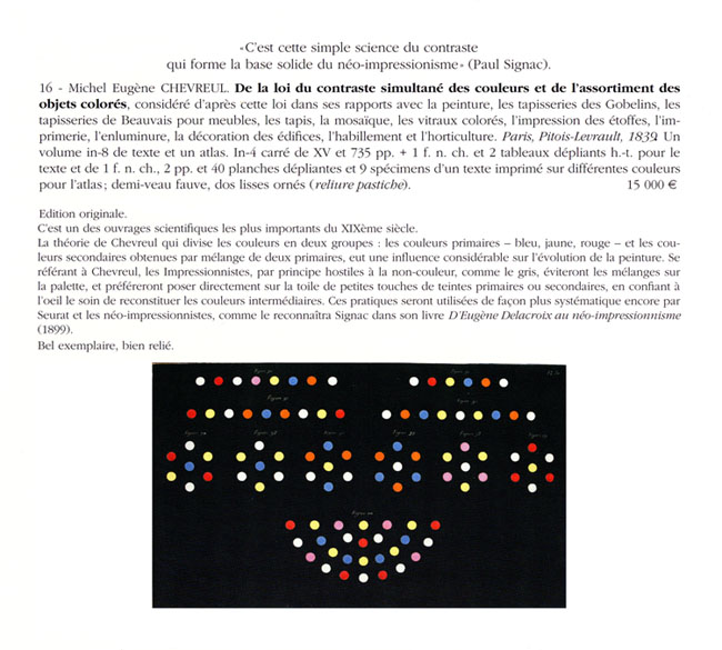
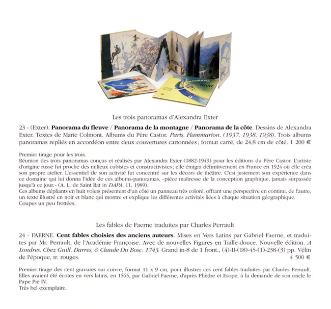
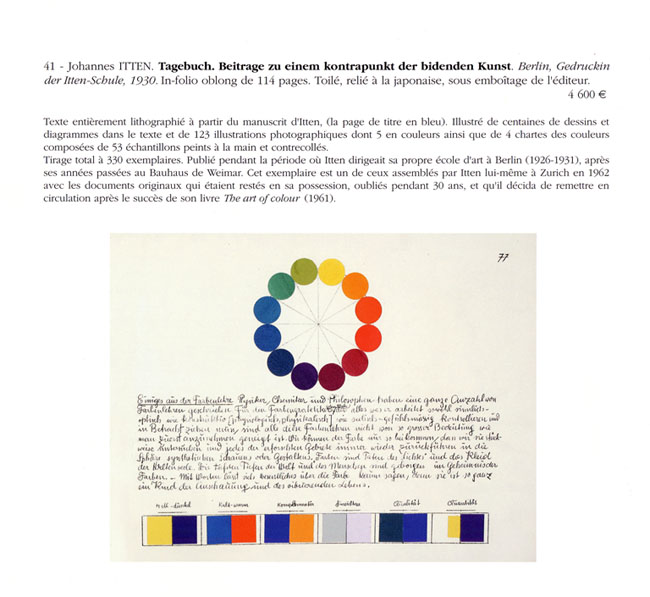
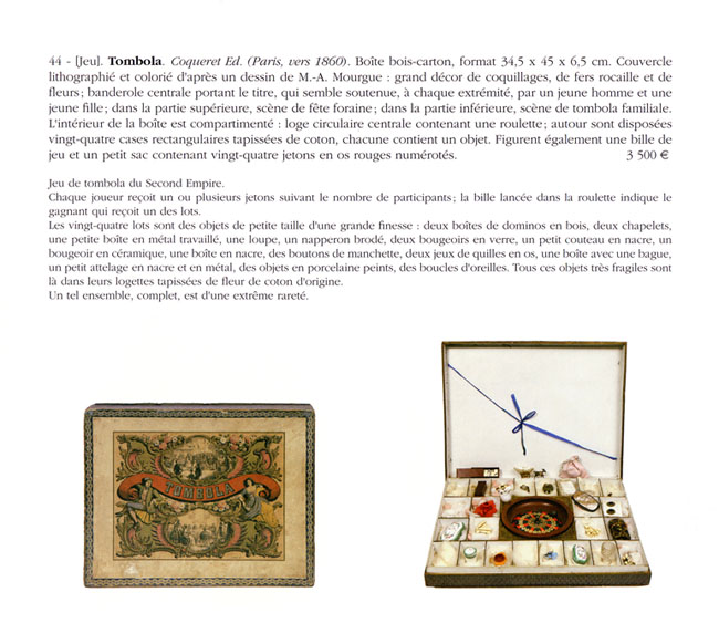
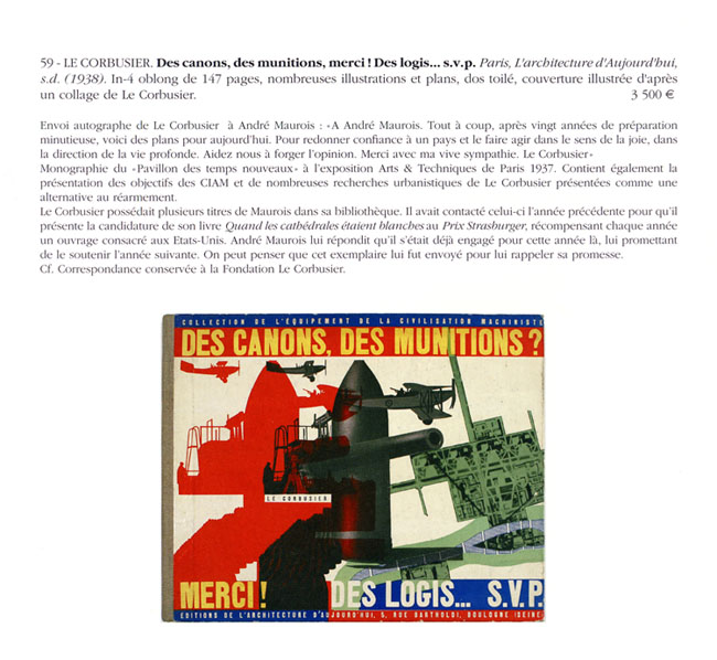
The above pages are from:
I would very much recommend the Memoir class, and its excellent manual.
Actually, I would recommend the first half of that manual as a good answer to the initial question on book design in general. It takes an approach of spending about 40 pages discussing design in general, before delving into the subject of how to implement the ideas in LaTeX.
I should note, also, that the “hard to do anything different than the defaults” problem with LaTeX is due much more to Lamport and LaTeX rather than due to Knuth and TeX itself. And it’s a problem of the document classes, rather than the underlying system — the standard document classes (article, book, etc.) really should be considered more as simple functional examples rather than the final word in doing things, and I believe that was Lamport’s intention when he wrote them. The Memoir class is a far more flexible document class, and should be much more what you’re looking for.
The memoir class is well worth knowing about, and the manual is indeed excellent.
When I read the suggestion I thought I was going to have to search for the package and install it, but it was a pleasant surprise to find that it was already installed and ready to use. This is one of the nicest things I’ve been learning about LaTeX: many of the packages I want to use turn out to be already present in a standard installation.
Henning Nelms wrote and illustrated several excellent books: Thinking with a Pencil (1981) and the classic Magic and Showmanship: A Handbook for Conjurers (1969). A few of his illustrations of magic appear in my Visual Explanations. Below, from Thinking with a Pencil:
Source: Catalog, September 2006, from Sokol Books Ltd., P.O. Box 2409, London, W1A 2SH, UK.
More from recent auction catalogues; visual statements about beautiful books at auction, not designer statements.
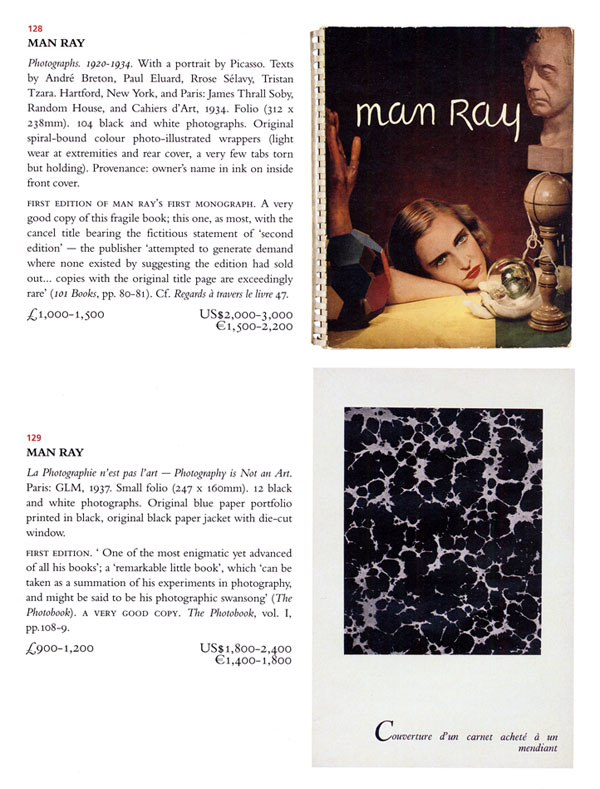
Source: Christies’s London, Photobooks, 31 May 2007, 67
Source: Christies’s London,Photobooks, 31 May 2007, 76
Source: Christies’s London, Photobooks, 31 May 2007, 94
Regarding my “I’ve been meaning to package my `Tufte-report’ LaTeX class and release it to CTAN” post above. Well, I’ve finally managed to get an open source project set up on github. Contributors welcome.
My wife introduced me to a book for the parents and caregivers of autistic children, not so much to read, but she was reading it (she’s an occupational therapist), and I smelled the pages from across the room! It’s brand new. We’re debating what the smell might be. The clay, the coating, the glue? Oh, it stinks. Considering this is a book destined for the homes of autistic children, who are typically severely hostile to new sensory experiences, this seems to be a predictable problem.
Do publishers ask authors to preview the paper their books will be printed on before printing begins?
Several smell candidates: binding glue, a coating on the cover, or possibly the ink (if very recently printed). Try airing the book out. Probably not the paper.
Or maybe it picked up a smell in transit.
For used books, the smell problem is mildew, especially for used bookstores in areas with humid summers. You’ll never get rid of it.
In 1963-1964 I took a course at Stanford University in stochastic processes with Professor Emanuel Parzen. The textbook was his Stochastic Processes (1962). In class he mentioned with pride how he had talked the publisher into putting a diagram into the book’s introduction and suggested that perhaps this was a first in textbook publishing:
Although I studied the book carefully–here are some of my dutiful annotations on the text–all I remember from the course is his book design remark (which has had great influence on me over the years) and that I was over my head when it came to stochastic processes at the graduate level.
Bill Readdy, the Commander of Atlantis STS-79 (Mir docking), gave me a copy of his flight manual as a most generous souvenir during some recent work at NASA Headquarters. He noted that, under weightless conditions, the manual in a 3-ring binder floats and opens up 360 degrees as the pages fan out. At last, manuals have escaped flatland.
Since this flight of the shuttle docked with Mir, the manual was also written in Russian. In the Russian section, the classic “This Page Intentionally Blank” (note the telltale first-letter caps of manualese) was in English, perhaps because the phrase is universally cryptic, thus needing no translation.
“This Page Intentionally Left Blank” has some of the same deadpan obviousness of “This is not a pipe” (Magritte’s 1926 painting Ceci n’est pas une pipe). For important documents, like shuttle manuals, checking of individual copies will eliminate the possibility that the xerox machine or a printing press threw off a blank page.
It’s obvious that you have never had to deal with a customer demanding another copy of a manual because, “there’s a blank page, and I know there should be something printed on it.”
Ah, but what to make of the second page of the EPA’s “Improving Air Quality With Economic Incentive Programs“? It reads: “This page unintentionally left blank.” The fourth page then reads: “This page intentionally left blank.”
An engineer would probably state:
This page left blank except for this sentence.
The thread on Beautiful Evidence chronicles my experiences with the book’s production and design.
I worked in military intelligence for a while. I was told that censors sanitized classified documents (i.e., removed information from them so that they could be released at a lower classification level) by simply excising it, leading to situations in which white space tended to indicate that more information was available in the original document. In that situation, “This Page Intentionally Left Blank” indicated that the page contained no content. Sort of a bureaucratic “Move along, folks, nothing to see here!”
One great blog worthy to be checked: The Designer’s Review of Books. For example, their review of a beautiful book, Designing design by Kenya Hara.
Tufte-LaTeX (also above) has good practical examples of layouts (of scientific and mathematical reports) modeled after my books. The layouts are also similar to Richard Feynman’s physics textbooks.
I have been reading up on Jan Tschichold and in particular his “Penguin Composition Rules” which was a very short set of rules he articulated for the UK Penguin imprint in about 1947.
I have had trouble finding them either physically or electronically. My intention was to typeset them in LateX using the rules themselves as a style guide, thereby showing by example the rules in action. Do you have any images of the original set of Penguin rules, or know where I could access them either as text or images?
Here is a thoughtful essay by an Australian philosopher called Adrian Heathcote on how using free, robust and clever LaTeX typesetting programs can help small printers in the UK and Australia make better, more beautiful, books.
Heathcote makes the following point:
‘There are, however, many other aspects of LaTeX that facilitate high quality typesetting. For one, the lines are not justified individually, as they are in Pagemaker and Quark, but in entire paragraph blocks. This simulates the decision making of the master typesetters of old, who would set a page so as to get the greatest evenness of word spacing. LaTeX–or rather the underlying TeX hyphenation-justification algorithm–is able to produce that evenness automatically (see fig. 1). This has been so successful an implementation of this old technique that it has been borrowed now for Adobe’s InDesign program, where it is called the multi-line composer.’
The image below is his fig.1 – showing a LaTeX produced page of his own with even text due to the LaTeX hyphenation algorithm. Also note margin kerning and ff ligatures. (Font: Adobe Garamond).
Having now spent the best part of 6 months hacking older electronic files of my book into LATEX and at the same time reading whatever I can on typography and book design I can now say that using LATEX to write an illustrated science textbook is not only possible but very enjoyable. I have about 250 pages done, some appendices and indexing to do then its off to the printers. For me the chance to combine my love of science and my love of graphic design has found a new outlet. I already have another volume of notes and case studies on the way and another book planned.
The memoir LATEX class already mentioned gives an incredible flexibility and using default settings can easily give you great page design and typesetting. For example, the command medievalpage will use the paper size you have selected and produce a medieval page layout based on classic proportions such as those of the 13th century French architect Villard de Honnecourt who devised an ingenious method of setting out optimum proportions for margins and text block on a book page. Other simple commands deliver Robert Bringhurst layouts. If necessary you can set up your own.
Using a single command and default font installations one can use a nice implementation of Zapf’s Linotype Palatino. This font family comes as default with modern Latex installations and is complete with Palatino maths fonts.
Once the LATEX and memoir class syntax is learnt then page after page can be typeset easily – after a while specific manual commands can be learnt to tidy up small details.
One of the most interesting things I have learned in my reading around book design and typography is the discipline required to avoid being what Beatrice Warde described as a ‘stunt typographer’ in her famous essay ‘The Crystal Goblet’ from 1937:
Here is a page of another piece of work I am doing alonside the book – set using the medievalpage and Palatino settings I mentioned. Latex and Tex do the hardwork.
All of the software above is free, very robust and surprisingly user friendly. I use TexLive on Mac OS X and TexNic Center and MikTex on my laptop. Output is direct to PDF.
Here is a book of photography and personal journals by Joel Peter Witkin published by Kat Ran Press. It is part of a bigger gallery of two-page spreads of their typography and book design.
The Museo Bodoniano in Italy has preserved sets of punches for a type designed by Giambattista Bodoni (1740-1813) in 1798. A detailed account of one visit can be found here.
The image is a set of punches showing a centimetre scale bar (I assume). The full set of letters includes special glyphs (the long s between the s and t) and ligatures (such as ae, oe, fi, ffl, fl at the end of the alphabet). I have flipped the image of this so you see a mirror image of the punches. These punches are driven into metal to make matrices from which the lead type is cast.
I am working on a journal piece on Text and have tried to get my head around the idea of a book being a multidimensional mapping of black ink into a structured 3D space.
As part of this I wanted to try and show that if you break open a book and consider it as a 2D object then there is an extended dynamic range of lengthscales that have to be right for the book to work. It has to have a coherence and structure in the use of black ink in white space over a set of objects: Book – Page – TextBlock – Paragraph – Line – Word – Glyph.
I have chosen to measure the area of each of these ‘objects’ in millimetres squared and plotted these areas as a measure of the length scale of coherence of the text. The example is based on some pages of text from an article I wrote a few years ago about Ancient Geometry, Stereology and Modern Medics.
The typesetting has been done with the memoir class in LaTeX and the free font Utopia that was designed by Robert Slimbach and released for ‘free’ use by Adobe.
In it I have 2 panels;
In each case I have measured the area of the object (page or line or glyph etc) along with appropriate white space (“text” is all about interplay of the black and white space on the 2D flatland of paper) in squared millimetres and plotted these estimates in a graph on a logarithmic axis.
The structure of ink on white space has coherence across about 7 orders of magnitude in area terms.
Read the full post here.
The first book that came to my mind since you said you are trying to design a medicine related books was Henry Gray’s Anatomy of the Human Body. I love the illustrations in that book.
A historic graph 1919 – Extracts from an Investigation into the Physical Properties of Books as They Are At Present Published. The Society of Calligraphers, Boston. This is a small pamphlet that was designed and authored by the graphic designer W.A. Dwiggins and his cousin L.B. Sigfried. It pilloried the format of books and his concern for the poor methods of printing trade books in the US at that time.
The book was published by the imaginary Society of Calligraphers and the stinging investigation was a hoax cooked up by Dwiggins – nevertheless it did have an effect on publishing in the US following its wide distribution.
The graph by Dwiggins shows the reduction in book quality since 1910.
Note added by ET, August 4, 2010: Back in 1982 the Dwiggins cartoon-graph inspired my redesign of a misleading graph by the National Science Foundation. The NSF original suggested that the United States had encountered a big downturn in Nobel Prizes. My corrected, updated design revealed in fact a US Nobel prize boom that broke right out of the grid, Dwiggin-like. From ET, The Visual Display of Quantitative Information, page 60:
Here (http://www.rightreading.com/bamboo-baskets/masters-of-bamboo.htm) is an annotated case study from Thomas Christensen (director of publications at the Asian Art Museum of San Francisco) describing how he created the Art Book exhibition catalogue for Masters of Bamboo (http://www.asianart.org/bamboo.htm) in 4 weeks.
Here is a collection of images from the study.
Matt
Dear ET,
I am in the process of researching, writing, designing and typesetting a book on observational acuity in science and art which is provisionally called Intense Seeing.
The title was inspired by a sentence of yours from Beautiful Evidence (Science and art have in common intense seeing, the wide-eyed observing that generates empirical information.)
I am typesetting the book using a modified version of the Latex Tufte class that has been mentioned above. It is modified to use Robert Slimbach’s Minion Pro and Myriad Pro fonts and it is also modified for a trim size of 171 x 248mm (Pinched Crown Quarto).
My blog (http://www.datadeluge.com) has posts on the progress of the book and early versions of ideas and passages that I am working on. Recent posts include a draft cover image, the current draft of the preface and a couple of typeset pages from a chapter on the inherent dilemmas of magnification.
Best wishes
Matt R
Dear ET,
Many years ago I taught myself how to program in the C programming language – after I had played with BASIC and got fed up with FORTRAN. I used a couple of books to learn about C and a couple of compilers. The C Programming Language by Kernighan and Ritchie was by far the best book, followed closely by The C Book by Mike Banahan.
Learning C was a great lesson in logical thinking. Breaking down a problem into the discrete logical steps required for a successful programme is both rigorously analytical and curiously creative and liberating. I would recommend it to anyone.
I went on to write quite a few programmes, some of them were deliberately tiny and others quite complex and powerful. Much of the time I spent on my PhD was in writing C code to implement the maths & stats I wanted to apply to data.
The C Programming Language by Kernighan and Ritchie (or K&R) had a refreshing and very straightforward style. In the second edition, where they expanded on the material that had been developed as part of the ANSI C standard they state that;
“We have tried to retain the brevity of the first edition. C is not a big language, and it is not well served by a big book. We have improved the exposition of critical features, such as pointers, that are central to C programming. We have refined the original examples, and have added new examples in several chapters. For instance, the treatment of complicated declarations is augmented by programs that convert declarations into words and vice versa. As before, all examples have been tested directly from the text, which is in machine-readable form.”
In many ways K&R is a great example of technical writing and a well laid out and well designed book – the material does not need a lot of figures it needs clear logical progression, clean delineation of code blocks that a reader will want to copy into their editor to compile and run and, as K&R point out, C is not a big language, so it did not and does not need a big book.
Perhaps the most famous of the programs described by K&R is hello.c – which just prints out the text “hello, world” to the terminal. It is the K&R example of a minimal working C program and is almost a haiku in its brevity. Almost all computer programming handbooks use a similar program as an example of the minimal program.
The images show the first page and hello.c
The attached screenshot must be some sort of local aberration.
[Note added by ET on March 20, 2010: Oh my goodness! What a nice happenstance. Beats out The New York Times Book Review. Replicated result today (March 20, 2010 in NYC) on my desktop with Safari browser and on laptap with Chrome browser after browser resets. However it shows up about 20th with an iphone and an iPad google search, compared to 5 on desktop computer. Could still be local aberration as Google might know what you’ve been looking at earlier on your computer, but could they refine search results on the basis of that knowledge?]
Dear ET,
Here is a superb 700+ page treatise on the structure, function and evolution of the eye. The book The Vertebrate Eye and its Adaptive Radiation was written by Gordon Walls and published in 1942 (http://www.archive.org/details/vertebrateeyeits00wall).
The book is beautifully designed and typeset and includes dozens of very clear and well thought out illustrations.
A recent paper by Prof Ronald Fernald of Stanford (Eyes: Variety, Development and Evolution Russell D. Fernald. Brain Behav Evol 2004; 64: pp141-147 DOI: 10.1159/000079743) describing the evolution of eyes refers to the book as follows;
“In his landmark book, Walls [1942] provided remarkable insights about all aspects of the vertebrate eye. This 785-page classic has numerous illustrations, many drawn by Walls, that provide details about the range and variety of evolutionary outcomes to be found in vertebrate eyes. Indeed, the variety of eyes is astonishing, reflecting the staggering range of adaptations produced by selective pressures for vision in different habitats.”
Below is a two-page spread taken pretty much at random from the book.
Best wishes
Matt
Readers may be interested in the books of the architect Christoper Alexander.
For example, The Timeless Way of Building (see http://en.wikipedia.org/wiki/The_Timeless_Way_of_Building).
The book is designed as follows;
It is written as a long series of italicized headlines followed by short sections providing more detail. Christoper Alexander suggests in the foreword that the long (552 pages) book can be read in an hour by only reading the headlines, which frame the book’s argument.
Best wishes
Matt
I’m writing a scientific textbook in LaTeX using the memoir class. I have studied several books that are well known for their design, including, of course, ET’s. Personally, while it’s hard to argue with the aesthetic excellence of ET’s book designs, I’m not sure how well the same layout will work for scientific applications in which equations have to be displayed and there may be so many references on one page that it may not be possible to fit the relevant information and sidenotes into the margin (That’s the main reason why I use memoir rather than tufte-latex, and because it seems easier to customize.)
My questions concern the integration of figures and text, particularly within the context of scientific textbooks. The custom seems to be to number each figure and add relatively detailed captions, i.e., the integration is not tight. Perhaps it’s simply because it’s hard to do, but I suspect it’s also because authors like to be able to refer back to figures. After all, that’s the main reason why equations are numbered, although we clearly don’t refer back to figures as often as to equations. I’ve adopted the custom of only numbering equations if I need to refer back to them. So I’m wondering: Should the same be done for figures (and tables)?
Furthermore, should figures only get captions if they are referred to later on in the book, their meaning is not obvious or not explained where they appear?
(This led me to wonder whether one can look at a book as a means of communication in which a continuum exists in which only text and only figures are the two poles, so to speak. In between the poles, we use both text and figures to get our point across as efficiently as possible. Pure text could be interpreted as a long caption without a figure. Such extreme solutions are seldom efficient, of course, which perhaps is a non-rigorous argument for why a combination of figures and text are a better solution.)
Hi ET,
I have been systematically mining the vaults of the Internet Archive for the past 12 months. On the basis of that I have been designing, researching and putting together a new book – tentatively titled “Pictorial Knowledge”. The book is a collection of 100 visual confections – two-page spreads that each comprise a visual gem from one of the books in the Internet Archive and a short reflection (<600 words or so) inspired by the image or the subject of the book.
The layouts are as clear and crisp as I can make them and are modeled on the type of auction catalog you highlight above. More info and my introduction material here - http://www.datadeluge.com/2014/08/pictorial-knowledge-2014.html.
Several two-page spreads below.
Best wishes
Matt