Data in sentences: Evidence on women and smoking
November 4, 2002 | Edward Tufte
6 Comment(s)
Usually tables work better than sentences to convey quantitative data, especially when the analytical task is comparison. In this material from the Morbidity and Mortality Weekly Report, however, the presentation method of listed paragraphs of text has great rhetorical power, partly because of the horrifying facts but also because of the presentation style of a deadpan march through the evidence.
Source: Supplement to Centers for Disease Control and Prevention, Women and Smoking: A Report of the Surgeon General. Morbidity and Mortality Weekly Report (August 30, 2002), pp. 2-8.
Data in sentences – Women and Smoking
Topics: 3-Star Threads, E.T.


This “deadpan march of horror” could be accentuated by use of ALL CAPS, bold, italics and font size changes. Balance the deadpan march with a “skip or two” toward recurring facts/themes within the data. Use the same stylistic change across recurring facts/themes to highlight patterns of interest. Ranking the sentences by importance would also direct the reader to the top of each chapter/section list for a quicker scan.
“A picture is worth a thousand words”, but sometimes a thousand words better describe ALL the horror surrounding a topic this important.
Charly
I utterly disagree with Charley Simmons. The bare text, the factual accumulation presented without flourish, matters here as ET points out.
Asking for caps, bolds, etc., is simply the text equivalent of Chart
Junk.
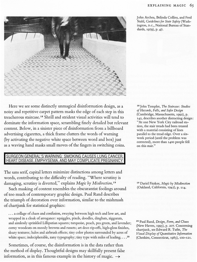
The typography in the original is just fine. I have described the problem of over emphasis and all CAPS in Visual Explanations, in the magic chapter, on page 65. Ironically, one of the examples involves the sinister masking of the Surgeon General’s warning about smoking!

A layout which properly emphasizes keywords in the Surgeon General’s warning. I don’t think I’ll see this behind the counter any time soon.
Many countries around the world have adopted graphic cigarette pack labels: a (cringe-inducing) picture is worth 20+ (surgeon-general) words. In South East Asian countries (Singapore, Thailand) the government has mandated gory pictures to drive the point deep.
These labels also have the advantage of communicating with illiterate migrant workers.
Graphic Photo
Warning Messages
around the world
Interestingly, I ran across this on the use of graphic labels that is supposed to go in effect in the near future: http://www.cnn.com/2011/HEALTH/08/17/cigarette.labels.lawsuit/index.html?hpt=hp_t2
Are these new graphics going to be far more effective, or are these just as bad (or worse) as the all caps, bold-line text box that exists today?