Display of musical structure
I’m working on a project that involves the display of as much of the structure of a piece of music as possible. I remember the Music Animation Machine from one of your lectures, but I’m wondering what other work has been done on the display of musical structure.
For example:
* beats and rhythm. (I imagine drummers use some sort of notation for these things, but I’m haven’t looked into this yet)
* musical phrasing – a lot of music has both measures and phrases. A bar of music might repeat eight times before something changes in the music. I’m wondering if anyone knows of representations that have been done before — I’m experimenting with some new designs, but I would love to see what others have done.
* visual representation of frequencies and amplitudes — again, this would help to show the underlying structure.
* what about represenations of the “jagginess” versus the “softness” of the sounds within a piece of music?
Obviously, the most basic form of representation would be sheet music. But I’m interested in representing something that has already been composed and recorded.
This is both a visualization problem and a data graphic problem, because ultimately I’d like to make a computer program which shows these representations for pieces of recorded music.
I’d love any thoughts you have on this.


Contact Stephen Malinowski; see our link https://www.edwardtufte.com/537614704/bboard/q-and-a-fetch-msg?msg_id=00005y&topic_id=1
One theorist associated with diagrams of musical form is Heinrich Schenker. There is a relatively cheap Dover edition of his book Five Graphic Music Analyses.
Jonathan Foote has done nice work applying dotplots to music. His site has details and pictures.
TimeSketch is a commercial software package for displaying musical form.
And I’ve played with visualizing phrase structure a bit, see this explanation or this art project.
Hope this is helpful–and I’d love to hear more details about the methods you’re exploring.
I think this is a great and amazingly understudied issue. I’ve sketched a system which builds on dotplots, on Wattenberg’s approach, and on opponent process color theory in in a paper called “The Macroscope Manifesto” see the section on sequences. http://radio.weblogs.com/0104369/stories/2002/04/09/macroscope022702.htm
Keep in touch!
The book A Generative Theory of Tonal Music (by Fred Lerdahl and Ray Jackendoff) applies modern linguistic/universal grammar theory to musical analysis. Jackendoff is a linguist and Lerdahl, a musician. It would particularly apply to the “musical phrasing” part of the original question.
On a related subject (music notation – old and new), there was an interesting interview
with contemporary music composer Karlheinz Stockhausen in Le Monde (French
newspaper of record) on 2005/08/08.
Stockhausen often invented new notations to adequately represent his music, and since
1970 directly manages publishing of his works.
The following excerpt reminded me of ET writings:
My rough translation:
Stockhausen website has a few examples of sheet music:
http://
http://www.stockhausen.org/stopstart_page1.html
http://
http://www.stockhausen.org/stopstart_intro.html
I think there’s another example in The Visual Display of Quantitative Information.
This has more to do with representing music for playing on the piano than for holistic appreciation, but it occurred to me once that if I turn a page of piano sheet music 90 degrees clockwise, each note and chord becomes a literal diagram for the placement and movement of the fingers on the keys, requiring little translation between the notation and execution if you just run your eyes down the staff. A major chord on the page looks pretty much like a major chord on the keyboard; sharps and flats inflect the shape notationally. This made me wonder why music isn’t written down the page rather than across. Perhaps this property of sheet music inspired the player piano.
Many people have experimented with sideways notation for piano music. The most well-known is Klavarscribo (often just Klavar in English). Compared to conventional notation, it is somewhat more like tablature, in that it reflects the layout of the piano keyboard. Here is the Dutch Wikipedia article about it, and here is an introduction in English. More recently, the idea has been incorporated into the Piano Wizard software; click the “Click to watch the demo” link on this page to see how they use it.
Thank you, thank you Stephen.
Stephen Malinowski is the creator of the wonderful Music Animation Machine, here at
https://www.edwardtufte.com/bboard/q-and-a-fetch-msg?msg_id=00005y&topic_id=1
A still-land version of the MAM opens the Beautiful Evidence chapter on sparklines.
The Piano Wizard is intriguing; is there a use for something like the little bumps on the F and J keys of a typing-keyboard to maintain hand position when the piano keyboard is rotated to its usual orientation with regard to the music notation?
On a related subject, I recently discovered the work of Oskar Fischinger, a painter and animator, who did some fascinating experimental films mixing music and abstract animations.
Two examples here (also a photo of Fischinger showing hand-drawn patterns to be copied on the sound track to generate synthetic sounds!):
http://www.my-os.net/blog/index.php?2006/04/01/331-oskar-fischinger
Norman McLaren did a lot of work with “hand-drawn sound” for the National Film Board of Canada. He developed a hand drawn card system system to be photographed onto the sound portion of the motion picture film to create different notes and tones when passed over the light sensor of a sound projector and used this to create songs and sound effects for many of his films.
Most interesting are his films where he then also moves this sound portion of the film strip into the visible projected portion of the frame so that you can simultaneously watch the see same patterns as they are making the sounds. Examples of this are “Synchromie” from 1971 and “Pen Point Percussion” from 1951. It has similarites to the music animation machine and to player piano rolls. “Synchromie” can be seen at the bottom of the page http://www.my-os.net/blog/index.php?Animation and his films can be ordered from the National Film Board of Canada http://www.onf.ca .
Not only are you seeing a visual representation of the music, but that visual representation is actually what is making the music.
I think the fascinating thing about “Synchromie” and Mclaren’s card system is how it helps visualize how frequency creates the pitch. You can take a black strip of film ,scratch a few lines horizontally across a few frames of the film (scratching off the emulsion, even in the sound track portion) and then for the next few frames, scratch lines at twice the frequency. Send the film through the projector and you will hear the low pitched noise followed by a higher pitched noise. Put a lot of time and calculations into it, and you can create music. The exciter lamp of a projector, projects light though a small slit, across the soundtrack portion of the film, and onto the light sensor which sends a corresponing pulse of electricity to the speaker. After discovering Mclaren a few years ago, my friend and I looped a piece of 16mm film and started scratching on it, then projected it. Quite an exciting thing.
Wolfram Tones [ http://tones.wolfram.com/ ]
While not exactly Oskar Fischinger there are a few visual similarities.
Visual Music created by 16mm optical soundtrack.
As a project in college, i created a piece of visual music with optical soundtracks on 16mm film. Strips of patterns were printed on clear transparencies then applied directly onto the film. The image you see is also creating the sound. A palette of about 60 different sounds were created, which was transfered to digital. The pitch of the sound depends on the characteristics of the pattern.
The music was composed by using a sound editing program that is capable of edit video formats.
This project was very much inspired by Fischinger/ John Whitney & Norman McLaren.
see the patterns:
http://www.serviceforthepeople.com/2006/05/4studies.html
see the video:
http://www.serviceforthepeople.com/4studies/study04.mov
Here’s an interesting book setting out a “score” for a play. The first 13 pages are shown, along with a couple of samples. All pages greatly reduced in size here.
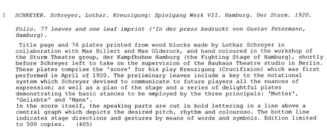
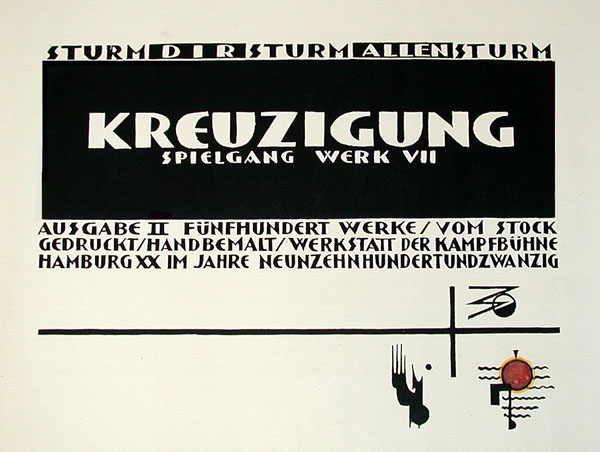
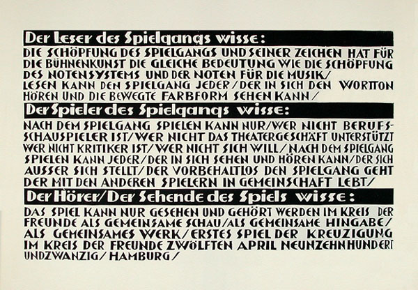
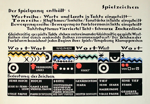
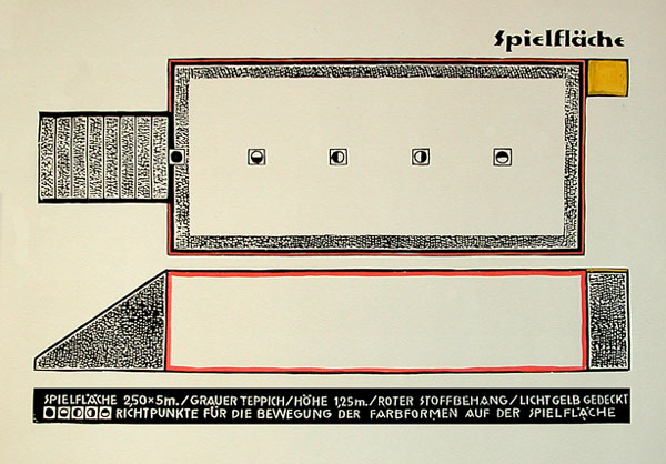
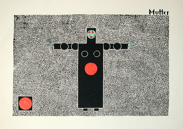
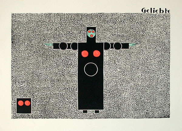
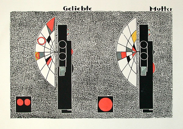
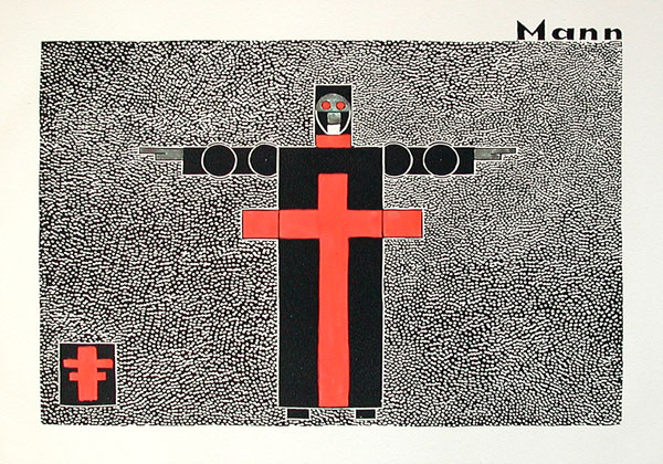
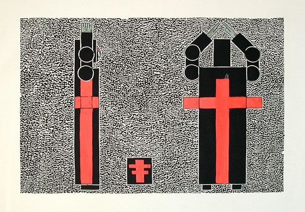
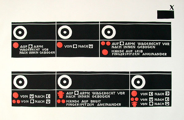
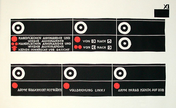
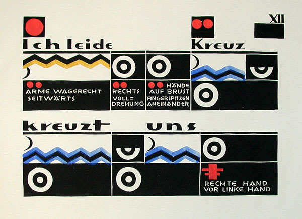
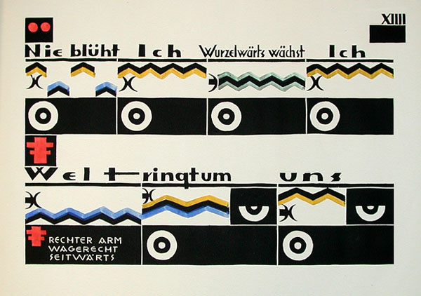
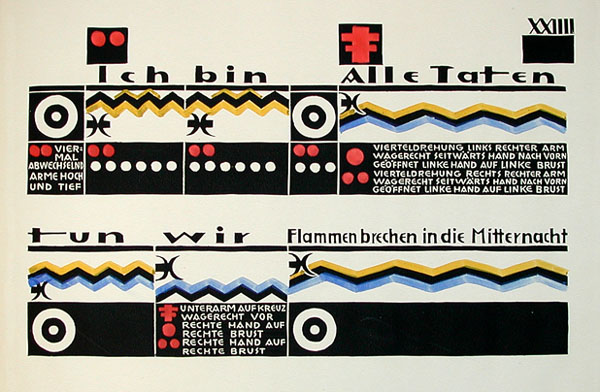
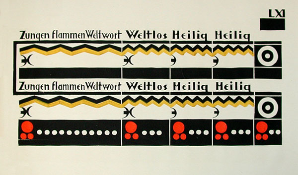
Here’s a biography of Lothar Scheyer, whose “cultic [work] with religious overtones” then wandered off into some highly unfortunate politics:
“In 1921 Lothar Schreyer was invited to teach at the Bauhaus, where he was head of a stage workshop. Schreyer left the Bauhaus only two years later after his production of ‘Mondspiel’ [‘Moon Piece’], a cultic play with religious overtones, flopped at the Bauhaus because the Bauhaus students vehemently protested the staging, which was to be developed from basic forms, colours, movements and sonic effects. From 1924 until 1927 Schreyer taught at ‘Der Weg’, a Berlin art school, of which he was also director for a time.
Between 1928 and 1931 Schreyer was general editor at the Hanseatische Verlagsanstalt publishing house. In 1933 Lothar Schreyer converted to Roman Catholicism and from then on his work was devoted to Christian themes. Even his early work from the 1920s was informed by a cultic, religious Expressionism but it soon changed to a supra.individual, objective formal language. During the 1930s Lothar Schreyer was preoccupied with Christian mysticism and folk ideas and ultimately dabbled in the National Socialist ideology.”
http://www.lothar-schreyer.com/
Perhaps the woodsy typography of 1920 was hint of what was to come.
An interesting article in the New Scientist on the use of non-Euclidean geometry in the visualisation of chord progressions:
Geometric maps reveal hidden beauty of music
The researchers have chosen to use video but a series of Small Multiples would also work well (although perhaps not as scalable).
In the video, the timepath formed by the QuickTime meter at the bottom deflects concentration from the chord analysis.
Music animations seem to work well for Chopin piano pieces (at least for linked example above, and for the Music Animation Machine), perhaps because of Chopin’s interesting architectures and the clear link between the sound and the structure that comes from a single instrument.
Apropos of the original question, here is a link to a short paper I gave on music visualization techniques at the International Conference on Music Information Retrieval in 2005:
http://ismir2005.ismir.net/proceedings/1129.pdf
See Paul Lamere’s “Search Inside the Music:”
http://research.sun.com/spotlight/2006/2006-06-28_search_inside_music.html
One of the real challenges for systems of this kind is how to define, disambiguate, and prioritize the multiple dimensions that characterize musical works. A lot of what people find to be “similar” about different musical pieces exists at a highly symbolic level, well abstracted from the acoustic signal, and different styles/genres/works have different “defining” characteristics, which vary from person to person based on their experience and knowledge.
Given three people asking for something similar to a given Haydn symphony, one might be content with a Strauss Waltz (classical), one with just a Moart symphony (same stylistic period), and one only with another Hadyn symphony. Or if I say, “give me something like Elvis’ ‘Hound Dog’,” do I want more Elvis, or do I just want something with the characteristic blues progression? Or if I want to hear something similar to “Yellow Submarine,” do you want something that’s got a pseudo-march feeling to it? Something that has a solo singer in the verse and a duo in the chorus? A drum part that emphasizes the tom-tom? Singers with British accents? Slightly quirky lyrics? Something with a nautical theme? Something in 2/4 time at quarter note = 120? A song whose melody has a similar contour? Something with ocean sounds? Something with stylistically dissonant intrusions (a brass quintet, various sound effects…)? Or simply something by the Beatles? Or just anything from the 60s? Or just another best-selling pop tune?
It’s a tricky business!
Eric: You make a good point about it being difficult to define, disambiguate, and prioritize the multiple dimensions that characterize musical works. One thought that we had on the original OMRAS project (1999-2002), and I know others have had this thought as well, is to do multiple-exemplar based retrieval. With multiple exemplars, you could run analyses to find all the features that all your exemplars have in common. For example, from your exemplar set, if one song is in 2/4 and another is in 3/4, then it is probably pretty clear that time sig is not a relevant characterization of the musical information need. However, if the raw audio timbre signal for one song is close to that of another, i.e. if both songs use a lot of fuzzy guitars or whatever, then that probably is a relevant dimension. This even works for metadata. If the exemplar set is all from the 60s, or all chart toppers, or whatever, then that information is probably relevant. However, if the metadata is scattered across the board, with songs from the 1890s to the 1970s, then you probably would not use that dimension in your similarity metric or visualization.
I think it would be quite nice to have a tool that let me throw 3, 4 or more songs together, in a set, and easily visualize all the dimensions across which those songs are similar, be it symbolic information, audio information, metadata information, or any combination.
ET asked whether the piano could use something like the little bumps on the F and J keys of a typing-keyboard. The piano has bumps that aid in navigation — they’re called “black keys.” 🙂 A player can usually estimate the position of keys with dead reckoning to within an inch or so; from there, the irregularities of the black keys (with a pattern that repeats every three to four inches) provide distinctive landmarks. The same is true with the organ pedalboard: the distance between widely-spaced black notes is big enough to stick the tip of your shoe in, but the distance between closely-spaced black notes is too small for that. The need for added navigational aids arises in keyboards that are more symmetrical, for example:
http://www.musanim.com/Harmonetta/
http://www.red-bean.com/~noel/uniform-keyboard/robotti/2.jpg
http://en.wikipedia.org/wiki/Image:Janko_piano.JPG
http://www.thummer.com/
http://en.wikipedia.org/wiki/Robert_Holford_Macdowall_Bosanquet
http://www.uniformkeyboard.com/chroma312-en.html
http://www.red-bean.com/noel/uniform-keyboard/
http://www.ux1.eiu.edu/~cfaah/emancipation/keyboards.htm
http://www.starrlabs.com/
Reconstructing Glenn Gould at the keyboard
here
On a relevant project, I created a comprehensive manual about turntablism. Turntablsim involves certain pattern making techniques which are used to manipulate sound. I designed a notation system that allows the user to read the required patterns and thus enhances the understanding of creating these sounds.
The notation is based on time and degree of rotation which combined constructs a grid in which the so called ‘scratch patterns’ can be plotted. As a result I created a manual containing 27 patterns, accompanied by a set of posters as well as range of exercise vinyl that relate straight back to the manual.
As the project relates to sheet music I provided a link to a online version of this manual where you can view a complete song visualized in the notation system.
http://www.noisebydesign.com/projects/scratchbook/pix/Gallery/45b.gif
to find out more use this link:
http://www.noisebydesign.com/projects/scratchbook
What an interesting contribution–and, for me, from another planet.
Turntablism theory and practice
The Scratchbook website by Christian is incredible. I have been listening to scratched records for over 20 years and had never thought that the field would have developed its own musical notation and a serious basis in theory. It also has superb graphics depicting what a turntablist does.
It reminded me of a couple of things;
(1) the excellent literature on percussion which it has a closer similarity to than e.g. string instruments. In particular the complex rhythmic patterns of classical Indian percussion on Tabla drums are orders of magnitude more difficult to master than many classical Western instruments and take a lifetime to master. See for example the History of percussion by James Blades (http://tinyurl.com/2fvplc). Interestingly the group Tabla Beat Science consists of classical Indian trained percussionists, western musicians, singers and an excellent turntablist called DJ Disk – see the Wikipedia entry and listen to “Live in San Francisco at Stern Grove” for excellent live examples of Table + turntablism.
(2) I was lucky enough to hear the US turntablist DJ Cheese live in Sheffield UK in 1986 just after he had won the Disco Mix Club (DMC) competition. He was the first turntablist to win this prestigious competition and transformed it into one of the top turntablist competitions worldwide. When one has seen a person juggle 2 or 3 Technics record decks a mixer and less than 10 of 12″ vinyl disks for an hour and not drop a beat or miss one of his own cues you begin to appreciate the unbelievable dedication required to achieve excellence as a turntablist. When one then tries to scratch a single disk it becomes even more impressive.
Thanks for posting this I’ll read and enjoy
Matt
It’s the 4th of July, and the Washington Post today published one of the coolest graphics I’ve ever seen “live” in print:
I think this one more or less speaks for itself. It certainly seems to me like Todd Lindeman read the books.
Hi E.T.
Here is a fascinating piece on the emergence of musical waveforms as a new icon for music
http://tinyurl.com/3sgqyhg
Some examples below.
Best wishes
Matt