Executive dashboards
July 10, 2003 | Barry Tipping
35 Comment(s)
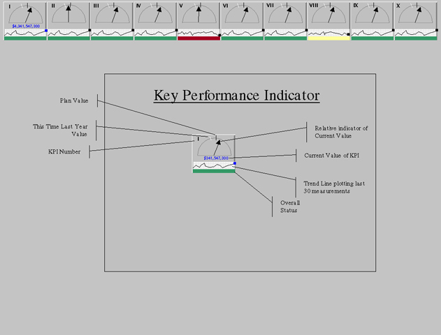
I’m developing an executive dashboard, and I haven’t been satisfied with the business graphics that are widely available (e.g. gauges, dials, stoplights). I decided to make a “Zen” version of a KPI status indicator, using as little color as possible, and incorporating E.T’s innovative “Spark Line” metaphor for display of trends. The graphic below shows the proposed KPI display across the top of a browser screen with a descriptive example in the middle. Any feedback would be wonderful!
Comments: Because of complex KPI names (e.g. This Week versus Last Week Sales (All Divisions), KPI’s were labeled with Roman numerals. Balloon help could display the KPI name when the cursor brushes the KPI indicator.
Best regards,
Barry Tipping
Topics: 3-Star Threads, Science

Those little dials don’t display much information for the space they consume. The same goes for the “Overall Status” color field. If you added that information to the sparkline, your could then use the salvaged space to name the KPI more descriptively.
Check out ET’s Graphical Summary of Patient Status for a display of much more information in a similarly sized space.
If the sparklines were arranged in a vertical array, it would be easier to make comparisons among indicators over time, because they could then be compared on a common scale, rather than on separate scales. The use of small multiples is nice– you need to figure out the key only once.
There seems to be a disturbing trend toward likening operational metrics to a car’s dashboard. The idea seems sound: in your car, the dashboard provides several readouts in small-multiple form showing current speed, engine tach, engine temperature, fuel level, oil level, and so on. These measures help alert you to potential hazard conditions with your car well in advance of any actual problem, and executives would love to have the same sort of vehicle for driving their business.
But this “dial” approach doesn’t work well for a business, whose metrics are intensely multivariate. Cars can either go faster or slower (there’s no third option), so it’s easy to represent speed on a dial. Businesses become more or less profitable according a host of factors. Thus a dial indicator isn’t a good metaphor for the information (the best metaphor for data is the data itself, after all).
Your design separates the name of the indicator from the value, forcing people to connect some KPI number on one chart with a name on a list elsewhere. Additionally, the notion of red-yellow-green status is fundamentally flawed; different cultures associate different colors with good/bad connotations, and the same value of a business metric (even compared to last year’s number) may be good or bad depending on the context in which it observed. Rising inventory levels may be good (green? gray? purple?) if you’re making candy valentine’s day hearts and it’s June. That same trend is generally bad in February.
As evidence for the general failure of hue-based color-coding, one need only look at the Bush administration’s threat index. Is red really worse than orange?
IDEAS FOR MONITORING BUSINESS AND OTHER PROCESSES
Edward Tufte
(1) See Peter Drucker’s new book, The Essential Drucker, for a thoughtful chapter on “the information executives need today.” That is, you should start by considering the intellectual problems that the displays are supposed to help with. The point of information displays is to assist thinking; therefore, ask first of all: What are the thinking tasks that the displays are supposed to help with?
(2) It is essential to build in systematic checks of data quality into the display and analysis system. For example, good checks of the data on revenue recognition must be made, given the strong incentives for premature recognition. Beware, in management data, of what statisticians call “sampling to please”–selecting, sorting, fudging, choosing data so as to please management. Sampling to please occurs, for example, when the outflow from a polluting factory into the Hudson River is measured by dipping the sampling test-tube into the cleaner rather than the dirtier effluent.
(3) For information displays for management, avoid heavy-breathing metaphors such as the mission control center, the strategic air command, the cockpit, the dashboard, or Star Trek. As Peter Drucker once said, good management is boring. If you want excitement, don’t go to a good management information system.
Simple designs showing high-resolution data, well-labelled information in tables and graphics will do just fine. One model might be the medical interface in Visual Explanations (pages 110-111) and the articles by Seth Powsner and me cited there. A model for tables might be the supertable, shown in The Visual Display of Quantitative Information, p. 179. More generally, see chapter 9 of The Visul Display of Quantitative Information. The displays should often be accompanied by annotation, details from the field, and othersupplements.
“Sparklines” show high-resolution data and also work to reduce the recency bias prevalent in data analysis and decision-making. More on that in the next book, Beautiful Evidence, probably out by 2003, I do hope.
(4) For understanding a process and for designing a display for understanding a process, a good way to learn about what is going on is to watch the actual data collection involved in describing the process. Watch the observations being made and recorded; chances are you will learn a lot about the meaning and quality of the numbers and about the actual process itself. Talk to the people making the actual measurements; maybe you’ll learn something.
(5) Measurement itself (and the apparent review of the numbers) can govern a process. For example, in printing my books, I ask that during the press run that the density of the black ink be measured in 6 or 8 different positions on every 3000th sheet being printed.These pulled sheets are then inspected shortly after the run and before the next run. The idea is to try to ensure that the color of the black type is uniform and at the right level of blackness in 3 ways: (1) across the 8 pages printed up on each sheet of paper, called a “form”, (2) over the 40,000 sheets printed of that form, and (3) over the many forms making up the entire book. We sometimes review these pulled sheets the next day to check these density readings and to yell at the printer if there is a problem. But mainly the mere fact that the printers are making these measurements keeps the process in control. And the fact that someone might review the measurements.
Note that this example is mainly just common sense in workaday action; no jargon about an Executive Decision Protocol Monitoring Support Dashboard System is needed. In fact, such jargon would be an impediment to thinking.
(6) My own encounter with a real business trying to improve management data and the display of that data was in consulting for Bose. At one point it appeared to me that too many resources were devoted to collecting data. It is worth thinking about why employees are filling out forms for management busybody bureaucrats rather than doing something real, useful, productive. The story of this work is told in Michael H. Martin, “The Man Who Makes Sense of Numbers,” Fortune, October 27, 1997, pp. 273-276; and in James Surowiecki, “Sermon on the Mountain: How Edward Tufte led Bose out of the land of chartjunk,” Metropolis, January 1999, pp.44-46. Both accounts make me appear excessively heroic.
(7) Most of all, the right evidence needs to be located, measured, and displayed. And different evidence might be needed next quarter or next year.
Many thanks for all the excellent comments. I will definitely incorporate your feedback.
I think its important to note that in the technology consulting world, we are frequently forced to “produce” given a sparse matrix of requirements and little or no contact with the ultimate user of our work. Unlike Dr. Tufte’s Bose experience, I will not be permitted to meet with the CEO, discuss his information needs, or modify the contract requirement of “An executive dashboard with dials to indicate metric values by month.” I could pack up my cube and move on, but the business world is neurotic, irrational, and doesn’t typically appreciate new ideas. Thanks again for the feedback.
Don’t give up so quickly, Barry.
Last year I was hired to do something regarding a user interface for a gentleman who is one of the hardest people (in the world of business) to meet. Even within the stratosphere of the world’s richest men, he is considered almost impossible to get a meeting with.
I worked my way up the chain, patiently and consisely explaining why I needed to have personal contact with him in order to do a good job. I also was very clear that I did not expect a lot of time, probably just 15 minutes.
Two months later I got a 12 minute meeting with him. It was all I needed – he is an incredibly good communicator.
Since then I have had a much longer meeting, and still work for him a year later.
The most important thing is to show by example that you can communicate quickly and effectively, have clear objectives, and are extremely well prepared.
It’s tough, but well worth it.
-dp-
About 8-10 years ago I gave up on consulting because, although I learned a lot, my work did not have enough consequences. This failure to make significant contributions was perhaps because I suggested impossible or naive things, but there were also some hints that consequential work might not always be possible within corporate and government bureaucracies. To say the least.
Sometimes I would look over a product and prepare an analysis, and then the product manager would say “You’re right, we know, but we’re just getting started and it will work out.” I would mutter to myself: “Too early to tell.”
Other times the product manager would say “You’re right, we know, but the VP for programming says that this product has to ship in 8 weeks and we just don’t have time to implement your wonderful suggestions.” I would mutter to myself: “Too late to change.”
Products existed only in two states: either too-early-to-tell or too-late-to-change. I hypothesized that these responses were tactics learned in product-manager school to deflect consultants and other busy-bodies from out of town.
This thread above is an example of too-late-to-change.
I’m one of the least qualified people around to provide advice about bureaucratic diplomacy, but perhaps Barry Tipping (who generously supplied this example opening the thread) could design 2 interfaces: (1) something that fulfills the stupid spec and (2) a real interface for monitoring a complex process–and then present both designs side-by side. This thread could be used as evidence in support of the good interface.
Barry Tipping might also take a look at “The Cognitive Style of PowerPoint,” an essay on a low resolution, decorative display method that pretends to show statistical data.
What I have done in the past (and continue to do to this day if needed) is very close to what ET has suggested in his last response. First I try my darndest to make sure that I have access to the right people when designing and implementing a solution. Knowing how to propose alternate solutions instead of simply stating that the requested approach is wrong is critical. I have seen too many contractors lose current and future jobs by telling the client they are wrong. I tend to offer up a couple of alternatives, usually along the lines of “Have you considered this approach?” or presenting a few mock-up screen-shots. At the end of the day though, the client is the boss and you have to implement what they ask for. In cases where I cannot get them to consider an alternate approach, I will try to include dual interfaces – the fancy, yet near-useless one they ask for, and a cleaner, no-nonsense one which seems a better fit to their actual needs (as opposed to their wants). Give a simple way of switching views and more often than not you will find them using your suggested alternative anyway.
It can be very hard to do the right thing when consulting, but there is usually some compromise you can find that will at the very least lead future development down the right path.
On the Initial Design:
I agree with most of the critique above and here are some additional thoughts. The dials inherently suggest a maximum and minimum that are not labeled so the reader guesses that the arrow farthest to the right is the best. This could actually just be a trick in scale.
Though the sparklines show historical trends, they do not show results against Plan or Forecast. The entire 30 months history could be below expectations, but that is not shown. When I have toyed with sparklines I’ve struggled with how to show multiple lines clearly in a small space and show variances to expectations.
There are quite a few online scorecard providers in the market place. All of which have a “dashboardy” option and some also offer simple status indicators with hyper-linka to detailed information. In my review, it is more difficult to find a simple practical display technology with a muted color palette, but everyone had a racecar dash board option! Hyperion Essbase, Business Objects, and Cognos, are some of the large companies, and there are a dozen or so middle sized companies that have solutions that may be easier to install and support. Do a web search on Performance Management, Balanced Scorecard, or something similar.
On Changing the Client’s Requirements:
Definitely create a prototype of what you feel to be a better idea. 2 years ago (as a contractor) I built a prototype of what I thought was a better design of paper report package. I casually inserted it in the back of the existing set of information for a few months. This gave me the chance to get some feedback to refine the design and also generated interest at the same time. Within a short time it was adopted as the standard “scorecard” format for our organization.
Another trick I have found is to have Tufte’s books and a copy of one of his articles laying about my desk. People will eventually ask about them and then you can highlight the nuances of information design and demonstrate there is a field of study, and that you know about that field. Be prepared to show examples in the books related to your assignment. You won’t get instant converts, but you may get additional support for your prototype.
One reason the dashboard metaphor doesn’t transfer well to the executive computer desktop is due to the length of time required to scan the information. In a car, the normal activity of the driver is to observe what is going on outside the car and only glance at the dashboard for a second or two to rapidly evaluate the status of the car itself.
I cannot imagine an executive staring out of his office window and only glancing at his computer screen for a second or two to evaluate the status of his business at that particular time.
A good point; it is interesting how lame the dashboard metaphor becomes when taken seriously.
There is a tremendous amount going on in this thread! The discussion of the difficulties of consulting in a corporate or bureaucratic environment is telling, and so too is the simple fact that such a job is a means for deriving income even if none of one’s ideas get used. Dr. Tufte’s note on “too late to change” caused me to recall numerous stories of Steve Jobs’ stopping projects at Apple that were nearly ready to go into production, and changing them substantially. Such are the perquisites of power.
As for the metaphor: although I agree with Dr. Tufte that the dashboard metaphor is lame, I suspect that some kind of easily grasped metaphor is essential for this kind of project. What came to my mind was the AAA Trip-Tick — a variation on the idea of a roadmap divided into easily digested bits. It further occured to me that the dials in the original do not have a component for time, and the sparklines are only past time. A triptik would project the near future, according to the time horizon appropriate to the enterprise.
I am reminded of the bell-curve representative of consciousness drawn by William James, which is fattest in the near past, the present, and the immediate future. The triptik, ideally, would be something like that.
This has proved to be a useful thread for me, as I’m investigating dashboards and balanced scorecards as alternatives to the big data grids that pass for decision support systems here. While the developers get very excited by the graphics potential of dashboards, I keep asking the hard question – “What business decisions will this information allow our clients to make?” If the only answer I get is the sound of silence, I’m inclined to think we need re-evaluate the information. I’m also concerned with visual represention of weighting of the different elements – I may report on 10 operational areas, but one of those counts for 40% of the final score, and I think this needs to be explicitly stated somehow.
Interestingly, my method for note-making for my research on Balanced Scorecord is mind maps. This has been working beautifully for me thus far.
My objection to most executive dashboards is that they tend to show only current values of a few metrics taken out of context with little or no history. See this thread for an example of what happens when trying to reduce a complex system to a few simple numbers. See also Tufte and Powsner’s work in designing a useful dashboard of sorts: a high-resolution series of small-multiple displays relevant to a particular patient and useful for treatment.
For a dashboard to be useful it must contain enough data to facilitate a thought process. Instead, most executive dashboards become excuses to deliver small nuggets of information devoid of meaningful context. There are rare examples of truly excellent one-page summaries of complex systems, but the more data becomes aggregated and summarized, the less it expresses the subtleties underlying the information.
This may seem trite, but one wonders whether an executive would be better off talking to people about KPIs rather than viewing them on his/her computer screen! This is particularly so when the KPI is less than ideal, such as the inventory example stated early, where high levels are actually good some of the time.
If the KPIs are only updated weekly then wouldn’t it make more sense to have a weekly meeting to talk about them? I have worked in an alloy wheel foundry that had six-hourly meetings about production numbers and waste around the clock, but just supplying the numbers on dials seems strange.
On the other hand I would be interested to hear thoughts about real-time status display of systems on computer screens. Are dials and bar graphs the best we can do, given the flexibility of computer displays?
There are some valid responses in here, but I think most of them missed the point about dashboards entirely. They don’t exist to “replace” analysis and understanding of KPI’s for executives. Good dashboards get very little use, by design! They are exactly like the oil level indicator in your car, or the “service engine soon” light in your car….NOT the speedometer or tachometer.
The dial metaphor is powerfull when used correctly, but that does not mean it should be likened to a car’s dials. That’s just an easy way for intellectuals to dismiss dashboards in favor of long-winded data sets and mathmatical representations of their brainpower (see articles on penis envy).
I think Barry has a good start here, and concentrating on the decision-making power and process-triggering power of a dashboard will have positive results. Keep at it Barry. I’ve produced 4 dashboards now that have been in use for years. They are used side-by-side with detailed analytics by executives. Try prying the dials and graphics from those executives hands if you want a challenge!
If the PKIs are time-sensitive but not time-critical, then I’d imagine you should be at liberty to use some more screen real estate and use a menu bar icon in the lower right corner to represent the program running in the background (like the Palm Hotsync Manager). The executive would then be one mouseclick away from the visual report. I assume you’re pulling this data from a live database with a high transaction volume?
Good presentation of interesting and relevant information can be a great help to business managers. I find ET’s advice on how to present information well is brilliant.
Recently I’ve been thinking about what we actually use management information for and come up with the following progression:
1) What will we have to tell people our results are, and how do we explain them? (A pretty important question to executives; why else would most management accounts show actual versus budget with forecasts to the financial year end only?)
2) What is our situation, really? What are our resources and how well have we been doing?
3) Why have things happened the way they have?
4) What can we expect in the future?
5) How does the world work? What causes what, how quickly, and how strongly?
6) What can we do that produces results we value?
I don’t think the exact order matters – especially in the middle of the list – but I hope you get the general idea.
(This list appears as part of a paper called “A framework for accelerating management systems”, which is on my website at http://www.dynamicmanagement.me.uk)
It’s becoming clearer that getting some progress towards the later items on this lists requires more than just looking at the data you happen to have. Some element of deliberate experimentation is needed.
I’ve written about this aspect in “Learning more from experience” which appears on the same website.
I’d be grateful for any comments on these.
I know this doen’t meet the constraints that Barry is (was) under, but it may apply to the extended discussion …
I remember an article 20, or so, years ago suggesting a new model for control panel designs for operating complex systems, like power plants. Rather than try to show a hundred guages and another hundred warning lights for the operator to constantly scan, only show those that are needed when they are needed. The article proposed that the operator would enter their personal conditions using a natural language interface, such as:
“Tell me when pump A pressure exceeds 100C”
“Alarm if volume A exceeds 80% of volume B”
“Show me feed rate for component 2”
This allowed the operator to “set it and forget it” and turn his attentions to other matters.
It would seem that if one were managing a complex business, and wanted to be able to micromanage some areas, and macromanage others depending upon the state of the business, this might be a reasonable metaphor. I suspect it’s not far from reality, except that the management information system taking the orders for information is the manager’s staff.
Mr. Tipping’s Executive Dashboard reminds me much of the world that I work in — Systems Integration / Industrial Controls Automation (there are many terms for it). Basically, part of my job is to design screens for operators to monitor a mechanical system at any sort of manufacturing facility. The process they might be monitoring could be anything from wood cutting to potato chips to bottling water. Very little thought is put into creating well-designed or efficient interfaces. Usually the screens are simply some type of adaptation of the physical plant with temperature/percent/flow indicators in appropriate locations and color changes to indicate open/closed/manual (usually that is green/red/purple).
There are several major HMI/SCADA/OIT (pick what you want to call it: Human Machine Interface, Supervisory Control And Data Acquisition, or Operator Interface Terminal) development packages to interface with the control system (PLCs). The one that I use most often is Invensys Wonderware InTouch . I feel like this program is like Powerpoint–it propagates programs with a lot of fluff and very little content. Often the reason is simply because of the need for touch screen access. But even when that isn’t a requirement, the program looks like it with large buttons and cutesy valves and guages.
I found three great examples of these types of screens on the Internet that really show off the ridiculous use of screen estate by dials and guages:
Unlike GUI development software for OS X or GTK+, there is no framework for making these applications in a standard way. Text and color changing blobs can be put anywhere on the screen and in any fashion. I have a difficult time trying to convince clients and co-workers to not put yet another dial or knob on the screen to imitate physical controls. I cannot find anyone who has applied E.T.’s clean ideas of information design to the world of automation. I have never seen an HMI screen that blew me away or actually presented the data in a well-thought-out manner. In this industry, if it works, then it is good enough. The operator can deal with it and learn it. I hate that attitude and want to change it. I want to take some time to create screens that are content-rich and useful for operators. The problem is that I am unable to find any examples of what a screen should look like. There doesn’t appear to be anyone that has thought about this in my industry.
So what am I to do? Keep re-reading Tufte’s books (read them all, eagerly awaiting Beautiful Evidence) and looking for elegant ways to display live information? Try to incorporate ideas from Apple Human Interface Guidelines? Keep seeking people in my industry that actually care about the operators and how the application can be better designed? Any help from this forum would be greatly appreciated!
In addition to Professor Tufte’s books and Apple’s HIGs (the pre-Mac OS X ones are far superior to the current ones, in my opinion, for what you’re looking for), there’s a number of other excellent resources. I particularly recommend Sano and Mullet’s Designing Visual Interfaces. Don’t Make Me Think, by Steve Krug, is another good one, as is Don Norman’s The Design of Everyday Things and User Interface Design for Pogrammers by Joel Spolsky. Anything by Bruce Tognazzini, including his web site (http://www.asktog.com) is worth reading. Jef Raskin is another excellent author.
The main problem, I think, is mapping from the computer screen controls to the physical plant. There’s no obvious way to map from the two-dimensional screen to the three-dimensional plant (incidentally, this is a problem in lots of other contexts, like light switches or stove-top burner controls). I wish I had some brilliant insight in to the problem, but I don’t seem to be able to come up with any solutions. I would just suggest starting at the end, and working back to the software. Find out what do the people using the system need. What do they expect, not from the software, but from the plant?
Ask "why" (or "why is that important") until you’ve got fundamental answers, and have driven in to the user’s core needs. Then drive back out to functional (product- or solution-independent) characteristics of the control system. Brainstorm around those functional characteristics to come up with various concepts (potential solutions), select a solution, and build your requirements from there. I imagine that paper prototyping with the end users would be useful in selecting a solution from the concepts (and there’s an excellent book on paper prototyping, though the title and author escape me at the moment). Work to find a "no-compromises" solution; one that works for all the end users.
Once you’ve done all this and have implemented a solution, do it again, iteratively, to improve.
One more thought: the layout of controls has a significant impact on the safety of the plant. Safety is not about making people work smarter or safer, but about puting them in a system that is safer and supports and encourages safer behaviors.
An excellent book on this is Safeware, by Nancy Leveson. The first few chapters serve to drive home the importance of systems thinking in creating safer (and more productive—look up Heinrich’s Pyramid) systems. She looks at big industrial accidents like Three Mile Island and Bhopal, and shows how in each case it was the system that was poorly designed, and not cases of "operator error."
Professor Tufte has made this point, in various ways, many times: the quality of how we present information both reflects and drives the quality of our thinking about that information. Present the information poorly or unclearly and inevitably our thinking follows suit. When that information drives real-world decisions, it leads to errors that place people at risk, and ultimately results in injuries.
Safety and better controls really require a systems approach to understanding plant operations, rather than point solutions (the software that controls the plant is a point solution: the plant, with the operators and the control systems and software, is the system). For more on this, you can turn to Deming, Sholtes, Juran and Shewart.
One thing that needs to be considered when designing process `mimics’ is who is your target audience? It is the engineer who designed the process? The engineer who designed the plant? The tradesman who maintains the plant? Or is it the operator who runs the plant? Having worked in the mining industry for many years and seen many different process control displays, usually they are a combination of all four and therefore end up containing redundant information for whichever person is looking at it at the time. This can lead to safety issues when there is too much clutter.
The best systems allow each user to have their own screen. The process engineer can see a process diagram, with all the variables he or she may require. An electrician can see the voltages and currents that may help diagnose a fault. And the process operator only sees a diagram of the physical plant with any fault conditions highlighted and the status of motors and valves.
One issue that always stands out for me from looking at the diagrams posted by Eliot Landrum is there no consensus on the meaning of red and green for example. This is an issue I have had many debates on over the years. In some plants green means running and red stopped. This comes of course from traffic lights. This is the standard used in the third mimic above of the incinerator. Red indicates that the `Center Shaft Drive’ is stopped. In other plants green means stopped and red means running. In the forth mimic this `standard’ is used. The `Coater #1 Enable’ is green and therefore stopped. The two valves are closed and therefore green. The rationale behind this is that green means `safe’ and red means `danger.’ The first thing I always did when starting at a mine site is to ask what their standard was.
Reading, “About 8-10 years ago I gave up on consulting” made my day — thank you, ET.
Your remarks pointed to the specifics of why you gave up on it, which is in keeping with what I think your work is about — you tie data together to create information that people can use.
Your remarks did this simply and elegantly. That’s what an executive dashboard should do, whether it’s with buttons, dials, arrows, or whatever. If the content/message isn’t there, the “image” will be meaningless.
The reason it made my day was because I’ve been wondering why I’ve had a hard time with my consulting. My home runs keep me in the game; reading your comment tells me succinctly what my gut has been trying to say but my head hasn’t been listening.
As always, thank you!
Pati
Andrea’s post and the Dilbert cartoon above highlight a constant frustration I have in producing meaningful data displays and reports, which I am forced to call Dashboards. The inability of management to articulate what their business problems/objectives are is my main problem. I have even encountered hostility when asking what it is they would like the analytics to address. I think it points to a bigger problem in management, that being managers and their employees not being clear what it is that they need to be concerned with.
Below is an interesting article on a somewhat related topic.
Unclear Expectations Is Top Reason Why New Hires Bail
http://www.shrm.org/hrnews_published/articles/CMS_021009.asp#P-8_0
I’d be interested in hearing about some techniques others have used in dealing with this problem.
This has been an interesting thread that I have watched over the last four years. The “spartan” approach that the original poster took instead of the more visually stimulating dials, gauges, steering wheels, and kitchen sink route, is “correct” in the clarity of information delivery perspective, but I’m afraid has been overwhelmed by the need for “sizzle”. Over the last few years, we’ve all been seeing the rise of executive dashboard packages that give you results that look like ad agencies designed the screens. They look great, but the data presentation may not be clear. Sadly, from the project sponsor’s point of view, however, beauty of presentation resonates better with the users. Can clarity be maintained in the face of this? I’ve spent the last year collecting over 850 screenshots of Enterprise Dashboard Examples at a blog I keep over at http://www.enterprise-dashboard.com Take a look at them. Only a few are really clear. But here’s the great news, there are actually a handful that use sparklines!
Why is it that high-level business graphics are so intellectually pathetic compared to high-level scientific graphics?
The point in both business and science is to understand evidence about complex processes. Yet the data displays in, say, the Harvard Business Review and in executive dashboards are profoundly retarded compared to those in Nature, Science, or even to a good map.
Dilbert: Executive Dashboards
See
http://blog.bissantz.com/sportsfans
I am dismayed by how popular “Stoplight” charts are in my company. Their use is pervasive and continues to increase. The quality of communication and decision making is still on a downward trend until somebody at the top snaps out of it and turns off the projector. Stupefying is the way people have been getting creative using a gradient between green, yellow, or red – with up or down arrows to indicate a trend (e.g. green/yellow with a down arrow indicating a trend towards yellow!). I think this actually represents the chart creator’s subconscious desire to escape this tri-colored flatland to no avail. But imagine a Fortune 500 company being run on three colors and an arrow!
Thanks for letting me vent.
There are so many great questions and observations posed in this thread it’s hard to know where to begin. Let’s start with Professor Tufte’s remark above: “Why is it that high-level business graphics are so intellectually pathetic compared to high- level scientific graphics.”
I suggest the answer is because the original (business) question lacks precision. A sample headline from today’s Nature web site is “Selective anti-cancer strategies via the intervention of the death pathways relevant to cell transformation.” You have a clear metric (the chillingly clinical “death pathways”) and a clear objective (anti-cancer strategies).
If you are running a specific department in a company, a dashboard can provide an equivalent level of precision. “Selective sourcing cost strategy via the intervention of the trucking pathways relevant to warehouse location.” But do you really need a dashboard for that? That’s more a one-time analysis. Unlike the scientific study, where a measurement of death pathways in cell transformation is expected to yield repeatable and identical results at any location and at any time, a measurement of warehouse productivity and transport costs will be in constant flux. Strategic decisions would also be in flux as fuel prices change the dynamics of getting your goods from the warehouse to the retail outlet. Conversely for the scientific community, what sort of dashboard would the NOAA develop if asked to monitor “the state of the world climate” in a single screen? What metrics should it choose – temperature, moisture, cloud cover, pollutants & particulates, …?
This is not to suggest a dashboard is pointless, just that the dashboard should not attempt to go too far into *making* strategic decisions as opposed to showing data that can support those decisions. As other posts to this thread describe, the business leader must identify what supporting data is of value and what parameters are acceptable. Is data grouped by geographic region or line of business (suggestion a visual map vs. product lineup)? Perhaps both – let’s say Proctor & Gamble would like to see sales of Tide by state… would we put a large map in the middle, offer product lines with little images of the brand along the top, and put sales quarters along the side to select the option? The dashboard could automatically cycle between combinations where sales (or costs) were out of bounds. Or we could have lots of little maps showing the various brand/date breakdowns so that “red” areas are immediately visible. The traffic light metaphor is still important to executives pressed for time… show the problem areas, offer drill-down to the actual numbers, and leave the strategic decision in the hands of the executive.
A single dashboard cannot summarize the health of a company just as the NOAA cannot show the “health” of the planet. But as a person noted above, a dashboard should provide a 2-second glimpse into the status of critical areas. Perhaps not a traffic light metaphor so much as the “idiot light” concept. “Look at me” truly means something.
Journals such as Nature show the creme de la creme of research, with a corresponding level of awareness in how to present it. Ted in Accounting never gets rewarded for making his spreadsheets tell a story – they are data repositories only. To be fair, his spreadsheets don’t tell a single story because 99% of the time they don’t need to. When they do, Ted just pulls a number and kicks it upstairs, where it gets dropped into a dreadful PowerPoint slide that does tell a story, only it’s usually not a story the number supports.
Business numbers (at least the ones that money is spent on gathering) are rarely neutral – they inherently carry success or failure. If a cell divides faster or slower than my scientific theory predicts, my theory is discredited and I go to work on another one. If my sales aren’t as high as expected, I’m fired. Until businesses consider the numbers in a neutral context, dashboards will continue to be politically motivated.
I was interested to read about Dashboards as my experience with them has been poor. I agree wholeheartedly about their impression and that they often didn’t seem to measure anything much.
My experience suggested that they were mostly used as a tool either to justify problems/delays (rather than explain them or just highlight them as a fact) or to highlight how someone else in the organization was creating a problem–or both. They didn’t seem useful in any other sense. When they did tout positive things those items were often of little importance (held meetings with some small amount of detail.) I’ve worked in organizations where Sr. managers actually spoke with people and that system worked much better strategically I thought.
I really thought this company (a large financial services corporation) used them to say they did it and then that middle and lower management “took over” the tool. I’m curious if there are ways to design Dashboards that this type of manipulation is less common or ineffective. Is that primarily because the purpose of the Dashboard is so ill defined? Or are there other causes? What can be done to make them less susceptible to these machinations?
Connie
The Obama administration is struggling to get the visualisation right, and get some help from Stephen Few, who also points to the work of ET http://www.perceptualedge.com/blog/?p=559 . I found his analyzis quite informing, and he also high lights how the gapminder charts Rossling developed may help the storytelling.
Stoplight charts seem to be gaining in popularity with business leaders because ostensibly because it helps to rapidly convey the status of a given set of categories without having to examine the underlying data (if there is any). Often a lot of time is wasted in meetings trying to gain consensus on whether something is red, green or yellow (or a blend of the two!). I have seen this applied to something as quantitative (and readily available) as profitability of the airline industry where each airline has either a red, green, or yellow block each year over a time period. One can look for trends by watching the change in the color of the blocks for each year.
It seems like it would be obvious that the subjective nature of assigning one of three colors to something hardly qualifies it as credible data. But it is worrisome that some feel compelled to reduce data into one of three colors because it satisfies some kind of presumption of intellectual laziness among the audience or decision makers (or they are just lazy themselves).
The attached was recently shown by aviation analysts from Deutsche Bank at an annual industry conference.
I am loving this thread. I did a presentation at the the ASQ World Quality Congress close to a decade ago railing against the juvenile data presentation graphics of dashboards. More recently, a column of mine on the same subject appeared in local media (I write twice a month more or less on evidence-based approaches in management). The specific dashboard relates to Alberta Health Services (AHS), the organization of over 100,000 people responsible for providing health services to those living in our province.
http://www.troymedia.com/2012/12/16/alberta-health-services-latest-performance-report-childish-nonsense/
Consistent with the frustrations expressed above about consulting, that I’m still fighting this fight is good evidence that my consulting in relation to dashboard design has largely been unsuccessful. But it has brought some successes too and those successes tend to make everything worthwhile. Cheers!