Graphing with dissimilar units
I’m working on a graphing project for which I’d love to get your advice.
I’m the editor and designer of a large compilation of material information related to the electrical steels used in motors and generators; over past several years, the organization I belong to, The Electric Motor Education and Research Foundation, has published two sets of data on CD-ROM and I’m now working on the third edition. One essential property of these steels is Magnetization, which can generally be thought of as the amount of magnetic induction, or flux density, you get with a given electrical input; this is commonly presented on a log-log Magnetization or “B-H curve” graph (you may recognize this as the first leg of a hysteresis curve). The data I work with is provided to us by various steel mills, produced either from their own tests or from curve-fit algorithms they’ve developed. There are several material properties covered in the complete document; the question I put before the forum will apply to all of them.
A quick note about the images that follow. They’re a workout on a complete page from the Lamination Steels CD-ROM; the core element of this disk is set of massively linked pdf files of which this page is but one (there are over 600 pages in the second edition with over 1000 planned for the third edition). The navigation bar at the left contains location information as well as links to other pages in the document. These graphs were prepared with the intention of their being used in pdf format; hence the small minor scales that help keep the curves in place should one wish to zoom in on them with Acrobat’s zoom utility (they should be apparent if not entirely readable in this posting). I wanted to keep the graphs as large as possible so the accompanying datasets are presented on the pages following the graphs. I’ve tried to keep these graphs as clean, attractive and readable as possible, with careful attention not only to plot accuracy but such compositional elements as line weight, colors, type (typeface, size, weight and color) and type placement (I’m still working on a few issues with the very small type in the minor scales). It was important that the navigation elements reside on the page so I had to carefully consider the composition of the entire page, making the navigation bar readily available and large enough to be used easily without distracting from the graph. One thing I worried over (and still don’t know if I got just right) was the visual depth of the elements; I tried to set the color of the body of the navigation bar and the ground of the graph so that they appear to be on the same plane visually, with the hope of getting the curves to “float” just a bit above them thus enhancing their essential importance on the page.
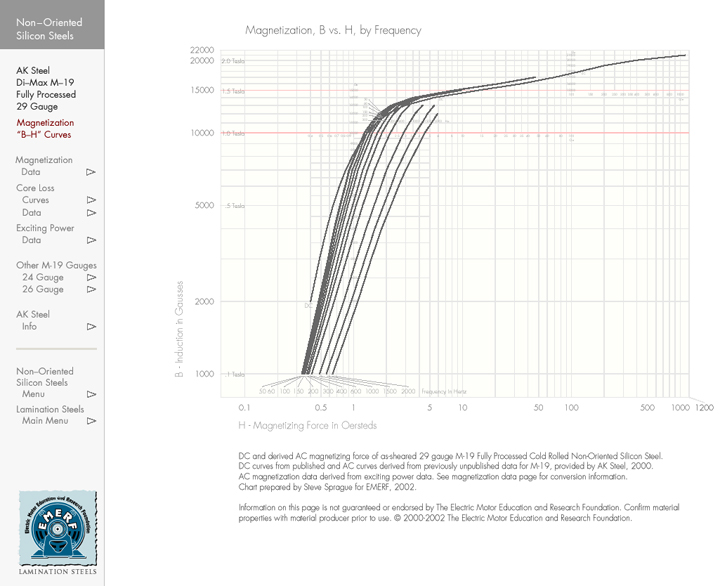
This graph, from our second edition, is a B-H curve for a common grade of electrical steel “M-19” and shows the magnetization characteristics for this material at a number of switching frequencies. You’ll see that the magnetizing force on the x axis is in the unit “Oersteds” (Oe) and induction on the y axis is in “Gausses” (Ga). (The red grid lines at 10,000 Gausses and 15,000 Gausses refer to the two standard testing points for these materials.) These units are those routinely used by U.S. producers; for the next edition, I’m developing data and accompanying graphs using what may be called “metric” units: Teslas for induction and Ampere Turns per Meter (A/M) for magnetizing force. Therein lies the rub. While the relationship of Gausses to Teslas is easily handled (1 Tesla equals 10,000 Gausses and you’ll see that on this graph I referenced Tesla units), the conversion of Oersteds to A/M is a bit dicey as 1 Oersted equals 1.256 x 10⁻² A/M. I’d like to be able to plot both units on the same graph, yet am concerned about confusing the units or overly cluttering the graph. I’ve considered several approaches. First, keeping the graph as it is and placing converted A/M values along the major and minor x axis scales:

This graph keeps the log decades on Oersteds with the corresponding A/M units underneath. While appealing in the ease of converting the data points and in having just one grid system on the x axis, I found this solution uncompelling as I’d like to be able to represent both Oersteds and Ampere Turns per Meter as complete systems. This will make it easier for those used to reading these graphs in one or the other set of units and also helps make the relationship of the two unit systems more readily apparent. I was still worried that having two x axis systems would be visually confusing. So, to help get a handle on the workings of two unit graphs, I prepared one with differently colored Oe and A/M grids on their respective decades, reducing it to a bare essential set of elements by removing all the minor scales, just to see how it would look:

After plotting this, I felt that there might indeed be hope for a graph with both x axis systems. Still concerned that a layout similar to the first graph with two grid systems would result in an unreadable spider’s web of grid lines, I plotted the minor scales just in the areas of the curves:

My final thought was to produce two separate graphs on separate pages, appropriately linked, but I found a lot to like about this graph and stopped.
So, to the question, Dr. Tufte (and the others on the forum): Do you have any thoughts about producing a graph with these multi-unit issues? Are there improvements you see for my general scheme or should I entertain a different approach?
Thanks for taking a look at these. Steve Sprague

The “9552” A/M label draws a lot of attention by breaking the pattern established by the other horizontal axis labels. But it seems content-free — an artifact of stopping the graph at 1200 Oersteds. Expanding the graph to 10000 A/M would get rid of it, and remove the need for the similarly pattern-breaking 1200 label.
Mitchell, thanks for the note and the nudge to clarity.
The 9552 A/M label troubled me as well; it was indeed an artifact that called attention only to itself and was there only for expedience’ sake. The little outrigger at 1200 Oe seemed to work as long as there was only one unit system. It marked the termination of the graph (as does the 22000 Ga mark on the y axis) while keeping with the general thrust of the x axis labeling. One of the nice attributes of a good graphing program is the flexibility to stop a log-log graph at a point off a decade.
The gap between 1000 and 1200 Oe also echoed the gap between 2000 and 22000 Ga making for a nice functional “frame” around the graph. That relationship is now filled along the x axis by the gap between 1000 Oe and 10000 A/M. (The same working frame is supplied along the x and y axes holding the frequency labels and the Tesla labels).
One point I’m now worrying over is the orange line at the right edge of the graph at 10000 A/M. While holding to the pattern of the two unit system, it’s an interruption in the design of the graph when considered as a visual object. Matisse said if he changed one thing (line, color, shape) in a painting he had to reconsider the whole thing, often painting over the original and starting from scratch and that’s the kind of trouble I see with the orange line. Then again, it was said that a child would spend hours looking for just the right color of crayon while Picasso, when out of one color, would just grab another and so maybe there’s no need to sweat the orange line.
An udpdated page is below, showing the x axis extension to 10000 A/M along with a few type adjustments to the minor scales:
Speaking of edges, are the left and bottom gray edges worth keeping? It looks like they don’t have any information content…
Mitchell,
Thanks for the post.
The left and bottom edges have been a concern since I began this project two years ago; I do revisit them regularly. My original reason for keeping them remains, to provide aesthetic consistency to the design. If removed, the lines reaching down and left out of the field would want to be answered by similar extensions above and to the right, a forced bit of designery; in addition, they would look like oversized tick marks (of which I am not fond at any size). Since the Tesla and Frequency labels were already well placed, I chose to keep a full frame around them and the field. I agree that less ink is the goal; in this case, I think the left and bottom lines are aesthetically warranted.
(A note of correction: the A/M units in this set of graphs have been plotted inaccurately; they’re off by a factor of 10. The most recent graph has been corrected to show the correct A/M units.)
Steve Sprague
These graphs (coming from someone trying to escape xl land) look great, and they have exactly the same feature set that I would like to use to present my data (mulitple scales on x/y-axes). Could you post what program was used to generate the graphics?
Will, thanks for kind comment. I used Golden Grapher to create these B-H curves and the pages were set with Adobe Pagemaker.
We had studied the above graph and found the variation in ‘H’ (AT/m) value for 1.5T ‘B’ on different figure. Can you please send the actual B-H graph of M19 steel.
Thanking you,
S. Ekram
Manager – Technology Corporate R&D and Quality
Crompton Greaves Ltd.
Kanjurmarg (East)
Mumbai-400042
India
Tel: -91-22-55558566
Fax:- 91-22-55558576
Email:- samsul.ekram@cgl.co.in