Image sequence of ski crash: best design?
For years I have saved this sequence of photos that ran in the Seattle Times. There’s an interesting tension here between the direction of reading and the implied direction of movement of the subject:

The caption reads:
Austria’s Hermann Maier goes airborne, far right, and ultimately
crashes through two safety fences in this sequence taken from
TV footage of his downhill spill at the seventh gate.
So here we have an attempt to reproduce in print the capacity of the moving image to capture the motion of a figure from right to left. This sets up a clear battle against the Western reader’sinstinct to read left-to-right.
I assume this never would have been attempted with, say, a mere sprinter running leftwards. The designer must have assumed that a human in great peril, moving with tremendous force, would be powerful enough to break the reader’s eye movement.
I think it’s clear the designer judged incorrectly; the reading pattern, left-to-right, predominates no matter the circumstance. The caption writer, finding himself having to tell the reader to begin looking at far right, should have warned the designer that no one would read this correctly on the first try.
I wonder what strategy would have worked best, especially taking into consideration the sense of movement the designer wanted to convey. And, more generally, is there any resolution to the dilemma of communicating right-to-left motion in a medium that is read left-to-right?

The sequence would have made more sense if placed across the page in the two dimensional path of the crash. Thus, the photo series would go from upper right to lower left, mimicing the actual course of Maier as he rocketted down the slope. Factor in the pitch of the newspaper as you sit and read it and you have a little 3D mountain replica of the Hermannator getting hermannated.
The third photo in the Seattle Times sequence is the most telling: moving fast, upside-down, up in the air, out of control, and all alone. By itself it could tell the story of potential disaster.
A video of Maier’s tumble can be found at RAI Sport under the hyperlink titled “la caduta di Maier” (http://www2.raisport.rai.it/news/eventi/nagano98/199802/13/34e3b7fc0616e/ ).
I used the video’s frames to assemble this rough photomontage as discussed by leMel and Steve Sprague:
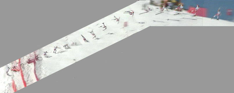
The images are separated by space rather than time: the series starts displaying every fourth frame and slows to every eighth frame as Maier slows down. A consistent interval would result in indistinguishable lumps of overlaid bodies.
Tracking the varying separation of Maier from his shadow emphasizes how fast he was going and how high he flew. It also makes clear his ground impacts.
The Seattle Times sequence would be more descriptive if it included, between frames 3 and 4, the picture of an inverted Maier bouncing off the ground (found 2/3 across the photomontage from right to left).
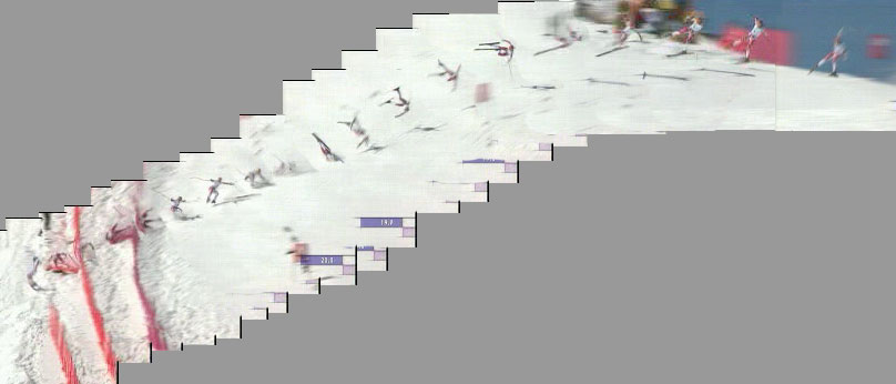
The scale of the montage lets us follow in detail Maier’s trajectory and attitude, but it also reduces the skier to almost a stick figure, trading drama for facts. CBS chose drama when they selected a sequence of three photos (close to the last three of the Seattle Times sequence) for their Photo of the Day:

(AP Photos)
(http://cbs.sportsline.com/u/photos/POD/POD12.htm).
Including the frames in the photomontage tells about the technology and its operators, but adds nothing to Maier’s story:
What an interesting and far more dynamic way to display this incident! Now the printed image matches the video in many details not apparent in the original four panels; the R>L direction, the incline of the slope and perhaps most importantly, the terrific speed of the skier best shown by the three fences he’s crashed through.
Although this approach might cause a design headache for most magazine designers, this would be a format well worth pursuing.
I could imagine, as a sort of resolution and a means of completing the story, one could use the surrounding grey areas to place an enlarged frame of the skier sitting up after coming to a halt, thus letting the reader know that he did indeed survive what is clearly an amazing spill. Great work!
David/sf
I was asked for a larger image of the photomontage. You can find a 3X copy at http://www.dnash.org/et/maier6.jpg
I was watching Ski Sunday recently [a UK based skiing programme] and found that the new sequencing methods employed help with the problematic task of presenting a competition such as downhill skiing, that doesn’t effectively convey to the viewer important factors, which help people relate and understand the real competitive nature of the sport.
From a fixed camera position mounted at key points throughout the downhill course, the path of each skier is mapped, this data is then available to be stitched together, so a ghost run of any skier could be compared against the run of another and so on. Commentators could then analyse and present the information to the viewer and convey much easier and realistically such things as finishing times, speed…etc.
In terms of understanding information, I found it gave the viewer a visual insight of time, speed and distance, and thus helped capture the intensity of the competition.
The Maier photomontage relies on separation to show motion. Here I overlay a photo sequence of a pitch to show motion, and reveal more detail in roughly the same total area.
The margins on the photos align them horizontally and vertically to the background elements and appear as the corner artifacts in the photomontage.
Paul Byrd seems to get smaller as he finishes the pitch, but I shot the series at the same zoom and the script “I” on the hat is about 117 pixels in all three photos at original size.