Links, Causal Arrows, Networks
August 12, 2004 | Edward Tufte
18 Comment(s)
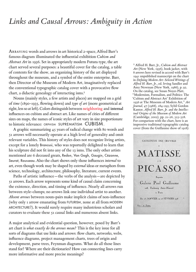
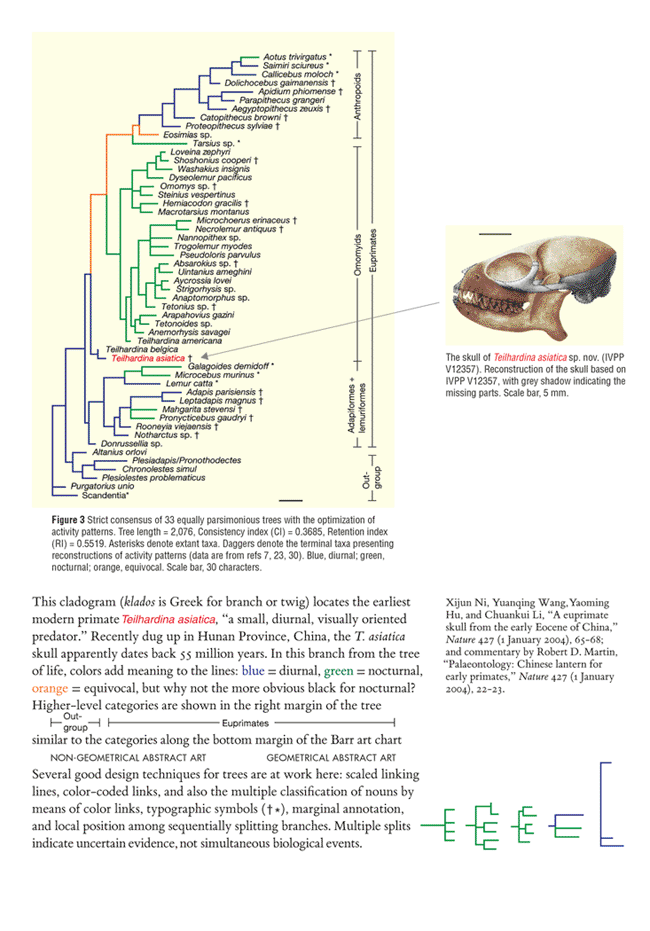
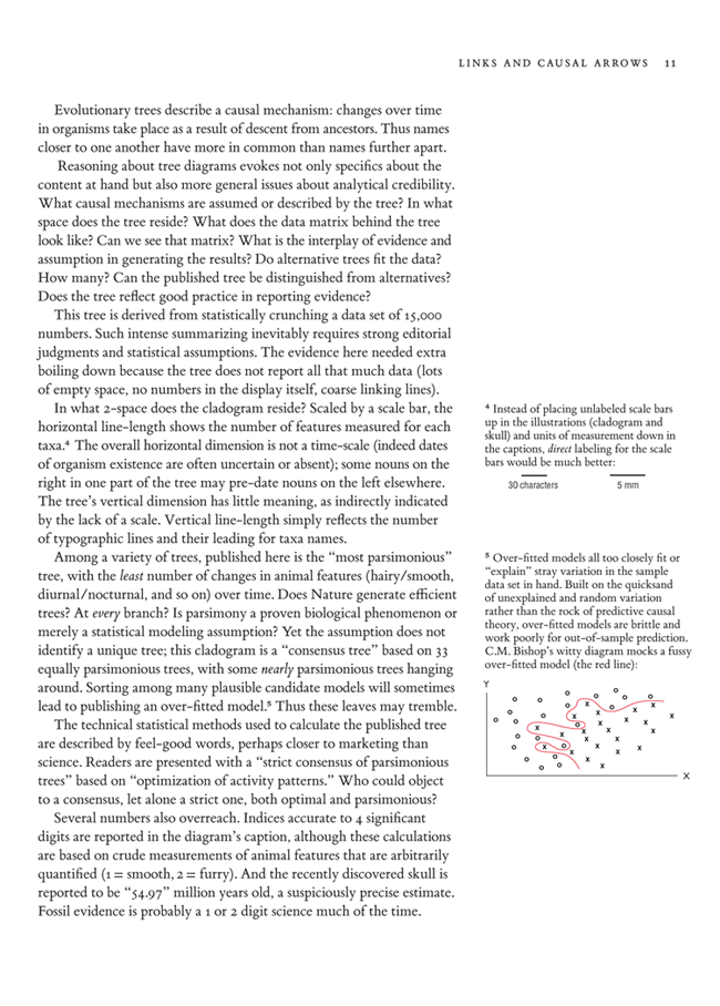
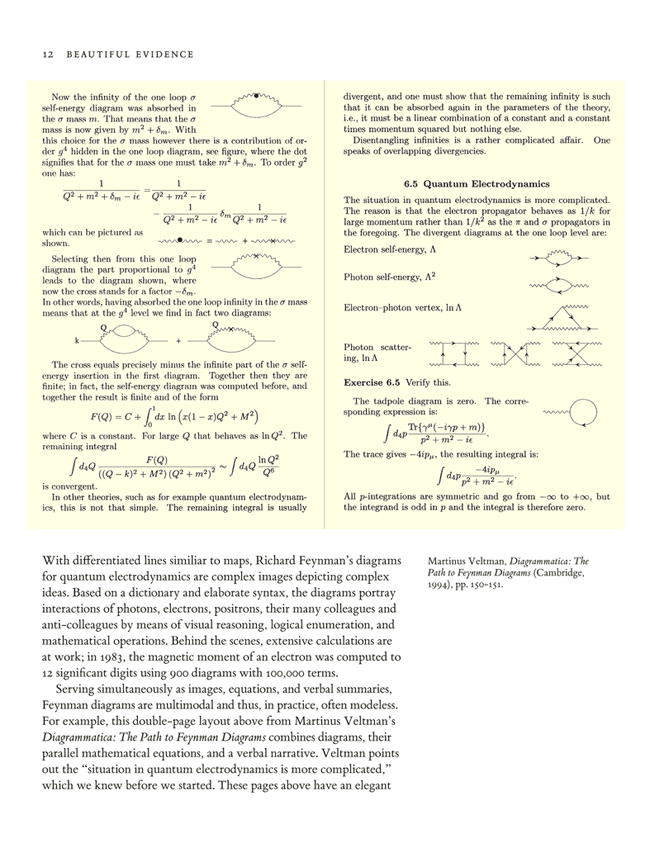
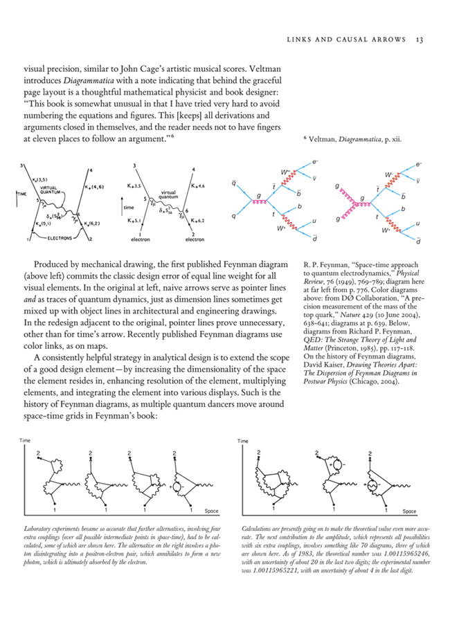
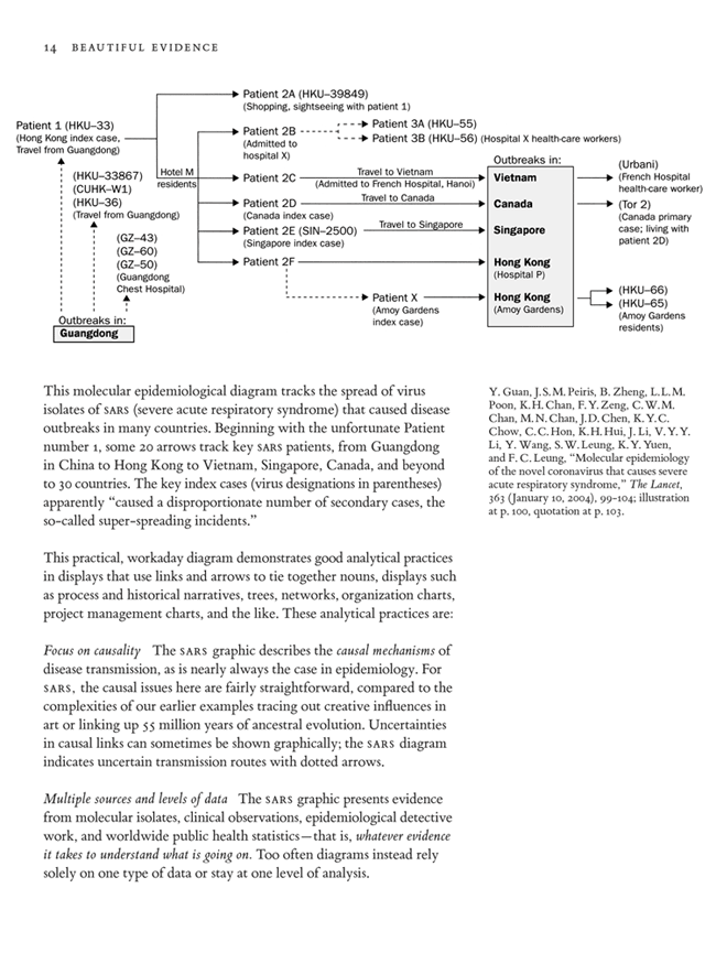
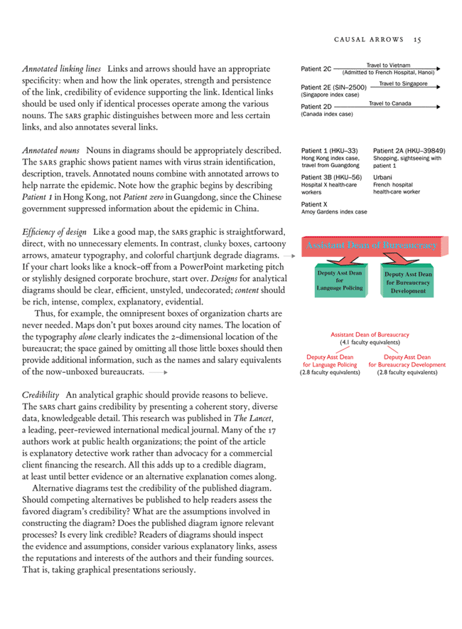
Here are some ideas on linking lines and causal arrows from a draft of some material from my Beautiful Evidence.
The chapter suggests methods for showing linking lines and causal arrows, and also demonstrates ideas for assessing the credibility of various links. That is, the links themselves are taken as explanatory evidence. Note the typographic design of the organization chart which replaces the conventional design of bureaucrats-in-boxes.
Four previous threads have discussed technical details of a few parts of the chapter: Barr Art Chart Feynman Diagrams
I’d be grateful for helpful comments.

=

Topics: 3-Star Threads, E.T.


In California last week, I gave a talk at Caltech for the Skeptics society. They asked what I expected for an honorarium; I replied the opportunity to take photographs of Richard Feynman’s van, painted with Feynman diagrams. My good host, Michael Shermer, knew where the van was stored in Los Angeles.
Inside the van, there were some posters used in a display of the van. Here is the text:
“Richard Feynman bought this 1975 Dodge Tradesman Maxivan and had it outfitted in Long Beach according to the cultural trends of the time with a mustard-yellow and avocado-green interior and a customized mural exterior. Although the van outfitter took some artistic liberty with the diagrams (changing the angles at which the straight-line electrons and the wavy-line photons are shown, in order to fit them onto the panels). They are for the most part, correct. Feynman also obtained personalized license plates. Because a maximum of six letters was allowed at that time, Feynman settled for QANTUM. (Other possible combinations, such as QED and QUARK had already been taken.) During the summers of the late 1970’s, when son Carl was a teenager and daughter Michelle was around 10, the Feynman family took several trips in the vehicle often camping out in remote, random spots in the wilderness of the American West. Although Feynman occasionally used the van to commute from his home in Altadena to Caltech (note the weathered Caltech sticker on the driver’s side corner of the front windshield), the van was usually driven by his wife, Gweneth. Richard Feynman invented his diagrams as roadmaps for calculating how things happen in the world of QED, quantum electrodynamics. There are three basic actions:
1) a photon (depicted by a wavy line “for no good reason” according to Feynman) goes from place to place;
2) an electron (depicted by a straight line, or a curved, non-wavy line) goes from place to place; and
3) an electron emits or absorbs a photon at a “junction.”
Actions 1) and 2) have sets of equations associated with them, while Action 3) is associated with a mysterious number sometimes called “the charge.”
Feynman diagrams can help a physicist avoid getting lost in the intricate calculations that result in probabilities of a particular event happening. When such possibilities are taken into account when calculating, the theory of QED more closely matches actual observations. Simple phenomena, such as electrons and photons going from place to place, can happen in several different ways; some of them quite strange. For example, a photon traveling between two electrons could disintegrate into a positron and an electron which annihilate each other to form a new photon which disintegrates into a new positron and a new electron which annihilate each other to form yet another photon.”
Here are photographs of the van and of ET with the keeper of the van, Larry Schmidt, a used book dealer with an excellent collection of scientific books for sale. Museums do not appear to be interested in the van (it is a very large van, a Maxivan) although probably the side and back panels will be part of a collection someday. No doubt Sotheby’s or Christie’s would be delighted to auction it off.
Photographs by Michael Shermer at http://skeptic.com/
1) The History of Programming Languages
2) Genopro‘s Genogram language. See also the tutorials.
This is easily the most complex network graphic I have ever seen—a diagram showing the structure and linkages of hundreds of biochemical pathways involving thousands of chemical compounds. The subject matter defies simplification, and the strategy of embracing the complexity and putting everything on one sheet seems to have worked. Helped by judicious use of spot color and appropriate typography.
The diagram was originally designed by Dr. Gerhard Michal in 1965 as a wall poster, but (unusually) it adapts well to this web presentation format. The diagram requires careful study; while the overall structure is visible at a distance, one must zoom in to see individual links. Copies of the poster are now produced in collaboration with Roche and can be ordered for free (plus shipping in some countries). According to the site, “the two enormous posters can be found hanging in just about every research institute from Argentina to New Zealand.”
Patents employ a relatively unstylized diagramming technique that is relied upon by very demanding professionals: laywers and engineers. See http://www.uspto.gov for millions of examples.
Features are monochrome black content on white page, single font, usually all capitalized, and line drawings only. A requirement is that all objects in a patent diagram must be numbered and explained in the text.
I find this visual style to be effective in communicating concepts in a concise, unambiguous manner. Noting that patent diagrams are often derived from phluffy PowerPoint charts, the process of converting to USPTO standards produces rigourous documentation.
Having said all that, engineers and scientists are very often expected, if not required, to use their day-to-day diagrams to convince their funders or managers to support their work. This is to appeal to the emotional side of mostly extroverted leaders, and is in stark contrast to the often introverted nature of many engineers and scientists.
Since it lacks emotional elements, the patent diagram style is likely to be ineffective at sparking the interest of funders and managers. Unless there are exciting numerical data to accompany the diagrams, such as sales forcasts, the diagrams will likely be glossed over. So, the engineer is tacitly expected to adopt a more embellished approach to diagrams, although usually with no formal training in visual arts.
It seems that lawyers have the cool analytical style to match the temperament of many engineers and scientists.
As for an appropriate engineering diagram style, I appreciate your pointers and techniques very much. I also feel very aggravated at the lack of dicipline in technical report writing and consumption in the PowerPoint wastelands. I author word documents whenever possible. Cheers,
Here‘s a beautiful, intriguing, and smart collection of 260 network and linking diagrams brought together by
Manuel Lima (now published in a book as well). Nearly all the examples attempt to get a handle on, or at least layout, immense multidimensional data sets.
Few of the examples have a scale of measurement (except for those with an object of known size in the scene, such as a country). The general cognitive style generally tends toward amazing visualizations and data-mining, rather than quantitative description, explanation, evidence-making, or causal analysis. This has been the history of scientific visualization (see Visual Explanations, chapter 1 on this point). One useful question to ask of each image is: What did I learn from this, in addition to seeing an elegant architecture?
The examples also make clear that the computer screen, since it is direct rather than reflected light, is wonderful for anti-aliased images; and since it is pixelated, not so good for typography, which is clunky compared to fine scale of the images.
It is interesting to compare the examples in the above draft chapter with the 260 network diagrams.
My current favorites:
The site is a must to check out, and to stay at for a long time to see the many design possibilities for big multivariate data sets.
Here is a challenge that medical folks and many others might find stimulating. I am interpreting a surgery planning diagram for a wide audience (I am visual editor for a broadsheet newspaper). The diagram, supplied to us voluntarily by a major teaching hospital, depicts a day in the life of two adjacent operating rooms where knee and hip reconstructions are performed. The hospital is clearly trying to maximize its resources. We see in the diagram how just two surgeons can conduct eight procedures in a workday by flitting back and forth between ORs, teaming up for some tasks and going solo for others. I find it fascinating and we are preparing a feature article to accompany it (dealing also with wider resource issues in British Columbia’s public health system). The diagram here
is rather nicely put together, obviously by someone who understands the process intimately and has a strong visual sensibility. I am also in possession of a much more detailed table showing the day’s progression for the full 10-person OR staff complement, in 5-minute increments. This graphic appears to be based on that table. We are taking some pictures too that will show some of the procedures. However, I do not think that the graphic in its present form is as clear and evocative as it could be, particularly for my type of audience. Maybe some things could be thrown out and others emphasized more strongly? I welcome your questions and feedback.
The diagram itself is an interesting exercise in redundancy, repetition and overkill: we are presented eight times with the six steps of an operation, each time with a number of arrows, supposedly depicting movement to and from each operating room.
I had a hard time visualising the main points of the diagram, which seem to me to be :
closely timed cadences in each rooms
continuous work by both surgeons
Cut to Stitch is ALWAYS performed by two surgeons
Anesthesists always check with their surgeon before induction (wich is probably the “fail safe” mechanism used to keep both rooms in lockstep)
I actually only got it once I gave each surgeon a color, and filled in the timelines for each operating room with the color of the surgeon(s) present (I haven’t a clue how to add images to my text, or I would have uploaded a crude example).
On this very simple framework, (which adresses points 2 & 3), you can add various time references (to adress point 1 and give a sense of the sequence of events in one operation), and finally, at the relevant points, show the anesthesists checking in.
In short : loose the many colors, emphasize where the surgeons are and the timing of events.
To Stewart Muir’s request, here’s another thread with some process flow diagrams: Visualizing song structure to maximize studio productivity
For example, here’s another annotated diagram showing a process. These are the sound cue sheets (not in their original color, alas) for the mix of Apocalypse Now, drawn by Walter Murch; from the excellent new book by Michael Ondaatje, The Conversations: Walter Murch and the Art of Editing Film (New York 2002).
An interesting diagram of links in this report on adware advertising by the Center
for Democracy and Technology (see page 4):
ET suggests, in response to a letter about the depiction of biochemical pathways, that I contribute to the forum. Accordingly, I enclose some examples for a single pathway, called the pentose phosphate pathway, with a few comments.
The following example is from a widely used web site with biological information (biocyc.org, from the Stanford Research Institute), showing the reactants by name, the arrows connecting them representing the individual enzymes for interconverting the reactants.
The next example shows the version obtained by clicking the “more detail” button in example 1, the reactants now being given as chemical structures, together with the three letter gene mnemonic, classification number, and name (e.g., RPE1, 5.1.3.1, Ribulose-phosphate epimerase). The example appears over several screens (p.2 is shown, p.1 does not print), some structures are unaccountably compressed, and in many other examples at this site vast areas of the screen are empty. The same two pictures are somewhat improved at another web site, Sacharomyces Geneome Database (www.yeastgenome.org, also at Stanford), probably through individual curation. It should be remarked that both web sites are marvelous and astonishing founts of information, barely imaginable a decade ago.
The third example refers to the extraordinary chart of much of the metabolism referred to by Brian Davies in his Nov. 9, 2005 letter to the forum. The chart, now on line and no longer available on paper, was produced over several decades and three editions by the major European supplier of biochemicals, the Boehringer-Mannheim Corp. Interestingly, an expanded paper version with the same editor, Gerhard Michal, was published as a hard bound book, Biochemical Pathways: An Atlas of Biochemistry and Molecular Biology (Wiley, New York and Spektrum, Heidelberg, 1998). As Michal says in the Preface, “over the years [he] developed a preference for the graphic presentation of scientific facts” – and it shows!
This is the lower half of p. 40 (the pages are ca. 8″ x 11 1/2″), five colors are used, there is an immense amount of information and the whole aspect is most pleasing. A magnifying glass helps.
The fourth example is the same pathway as shown in an excellent advanced textbook, David White’s The Physiology and Biochemistry of Prokaryotes (Second ed., Oxford Univ. Press, 2000), p.192. This one is just all right, the names of the compounds are too small, and the names of the enzymes are only given in the legend – which is inconvenient. The artwork does not do justice to the text. As surely has been often mentioned, it appears that fancy graphics (good or not) appear only in wide circulation textbooks but not monographs or advanced textbooks like this one.
Finally, to illustrate how good graphics is not just a matter of color, the last two examples are for the same pathway from W.W. Umbreit’s Metabolic Maps (Burgess Publishing Co., Minneapolis 1960). The cartoon of the overall pathway, here:
is followed by nine additional full pages;
with details of parts of the pathway, including some indication of reaction mechanism, given in none of the other examples above. I suppose there is an axiom in graphics that the less information the clearer they can be? Contrasing Umbreit and Michal’s books, there is 40 years more of information in the latter (which is much more than just pathways). Still, for the basic pathways and reaction mechanisms, Umbreit’s text is an enviable model. Who could get away with such use of space nowadays? (I should ruefully admit that in spite of being a professional in this field I was unaware of either Umbreit’s or Michal’s book until recently. The latter I chanced on in the local medical textbook shop, and the former by scanning the book stacks at our library – the very stacks soon to be halved in favor of more digital library, with the books going to “The Depository.”)
In the present case, how to depict biochemical pathways arose in thinking about artwork for a new textbook. The issues are obvious: what is a desirable format and how to accomplish it. On the latter, unfortunately, the answer is no more complicated than the banal one, that it will be an immense amount of work getting the chemistry right and applying the appropriate drawing program. This is a substantial challenge for a book with a couple of hundred figures, and not one lending itself to an easy fix.
Another example of the pentose phosphate pathway is on page 552 of the fourth edition of Lehninger’s Biochemistry. It is my favorite, though even this required some mark-up, because, 1) in the medical student’s persistent quest to organize information, any symmetry is highly desirable, and 2) it tells at least part of the story: we’re turning 5-carbon sugars into 6-carbon sugars.
I also adore the watercolors in Lehninger, though I haven’t yet determined who does them. Similarly, I think a fair amount of the appeal in Umbreit’s work is the hand drawing. Yesterday my wife asked me for “the best pen you’ve got.” Why? “Because I hate filling out these forms. I need something pleasurable in it.” Perhaps the drawing program you should use is India ink and some thick, acid-free 100% cotton rag on a drawing board.
Distributed systems make use of causal diagrams. This link is to one of the two researchers who extended Lamport’s original concept of logical clocks. Although the diagrams are simple, they are invaluable for comprehension.
Originally developed when sensor signals were transmitted using pneumatics, SAMA (Scientific Apparatus Manufacturers Association) diagrams helped engineers make sense of an industrial plant full of pipe, tubing, bellows, relays, etc.
This concept evolved into todays diagramming standards for control systems (function block programming, see Wikipedia).
See the discussion of flow diagrams at Junk Charts, comparing poor designs (in “Graphical Equity 1”)
with better designs in “Graphical Equity 2” and “Graphical Equity 3“:
Chris Potts, “Swearing and social networks,” at the always interesting Language Log:
Martin Krzywinski, of the Genome Sciences Center in Vancouver, has published a new rigorous way to visualize large networks, putting nodes on polar-arranged axes and connecting them with arcing edges:
I found the following example in the book Case Problems in Finance, 10th edition 1992 by William E. Fruhan Jr., W. Carl Kester, Scott P. Mason, Thomas R. Piper and Richard S. Ruback.
It is an interesting graph representing an extremely complex financing package for an investment opportunity in ore mining in Indonesia back in 1967.
The financing setup involved three governments (USA, Germany and Japan) guaranteeing USD100m of loans provided by 12 US banks and insurance companies, one German bank and 13 Japanese smelting and trading companies. Southport Minerals, Inc., the investment company, provided the USD20m shortage of funding in equity.
The financing package involved a contractual agreement to sell two thirds of the ore output to Japanese companies and the remaining one-third to German companies.
Inspired by the ideas in Dr. ET’s “Beautiful Evidence”, I made the following changes to the original graph:
1.Changed the thickness of the arrows and links to reflect the relative size of the loan guarantees, loan amounts and quantity of ore purchased.
2.Differentiated between guarantees and, money and product flows by using dashed lines for the former and continuous lines for the latter.
3.Annotated the links and arrows with information such as guarantee amount and type, loan amounts, interest rates, loan terms and split in ore production.
4.Reordered the guarantors and fund providers based on the seniority of the debt and its amount by decreasing order.