Making better inferences from statistical graphics Edward Tufte
The rage-to-conclude bias sees patterns in data lacking such patterns.
The bias leads to premature, simplistic, and false inferences about causality.
Good statistical analysis seeks to calm down the rage to conclude,
to align the reality of the evidence with the inferences made from that evidence.
The calming down process often involves statistical analysis sorting out
the “random” from the “nonrandom,” the “significant” and the dreaded
“not significant,” and “explained” from “unexplained” variance.
Alas this statistical language is swamp of confounding puns and double-talk
that play on the differences between technical and everyday language.
Perversely, these puns also play to the rage to conclude, as in “explained
variance” derived from a cherry-picked, over-specified model on a small
data set–which is very unlike actually explaining something.
In everyday work, the integrity of statistical practice is too often compromised.
Researchers easily finesse standard statistical validation practices by posing
ridiculous alternative hypotheses, by searching millions of fitted models and
publishing one, and by little tilts in data analysis (and 3 or 4 little tilts will
generate a publishable finding).
The conventional practices for insuring analytical integrity, as implemented in
day-to-day research, have not headed off a vast literature of false findings.
See John P. A. Ioannidis, “Why Most Published Research Findings Are False,”
and the stunning recent report that only 6 of 53 “landmark studies” in clinical
oncology could be replicated (one researcher turned out to have done an
experiment 6 times, it “worked” once, and only the one-off was published).
Can our data displays be designed to reduce biases in viewing data–
such as the rage to conclude, cherry-picking, seeing the nonrandom in
the random, recency bias, confirmation bias? How can visual inferences
from data be improved to separate the real from the random, the
explained from the unexplained? How can the inferential integrity of
graphics viewing, as in exploratory data analysis, be improved?
Here are some practical ways to improve the quality of inferences
made from data displays.
All statistical displays should be accompanied by a unique documentation box
For both consumers and a producers of data displays, a fundamental task is to assess
the credibility and integrity of graphical displays. The first-line quality control
mechanism for analytical integrity is documentation of the data sources and the
process of data analysis.
The data documentation box accompanying the display should provide links to the
data matrix used in the graphic display, the location of those data in the full data set,
names of analysts responsible for choosing and contructing the graphic, and whether
the project’s research design specified in advance the graphic (or was published graphic
an objet trouve, a found object, such as Marcel Duchamp’s famous conceptual
artwork Fountain,1917?).

Some journals require documentation of the data analysis process. For example, from
the British Journal of Sports Medicine:
Contributors: All authors had full access to the data in the study. JLV takes responsibility
for the integrity of the data and the accuracy of the data analysis. He is guarantor.
JLV and GNH designed the study. GNH, DWD, NO, JLV and LJC acquired the data.
JLV, EAHW, LJC and GNH performed the analysis and interpreted the data.
JLV drafted the manuscript, which was critically revised for intellectual content
by all co-authors.
Note the assignment of personal responsibility, a guarantor of data integrity/accuracy
of analysis. (The study’s finding was that watching television a lot was correlated
with a substantially shorter lifespan. However intuitively pleasing, that finding
was hopelessly compromised by use of nonexperimental data that confounded
multiple causes and effects.)
A documentation box makes cherry-picking of evidence more obvious, and may
thereby serve as a check on cherry-picking by researchers. A documentation box
also allows reviewers of the study to assess the robustness of the results against
the plausible alternative hypothesis that the findings were generated by data-selection
rather than by a fair reading of the overall data. Published data displays too often
serve as research sanctification trophies, serving up pitches to the gullible, based
unstable over-selected results.
All computer programs for producing statistical displays should routinely provide
a documentation box, just as they now provide a plotting space, labels, and scales
of measurement. Why haven’t those programs done so years ago?
Diluting Perceptual Cluster/Streak Bias:
Informal, Inline, Interocular Trauma Tests
When people look at random number tables, they sees all kinds of clusters
and streaks (in a completely random set of data). Similarly, when people are
asked generate a random series of bits, they generate too few long streaks
(such as 6 identical bits a row), because their model of what is random
greatly underestimates the amount of streakiness in truly random data.
Sports and election reporters are notorious for their
streak/cluster/momentum/turning-point/trendspotting
narrative over-reach. xkcd did this wonderful critique:
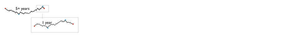
To dilute streak-guessing, randomize on time over the same data,
and compare random streaks with the observed data.
Below, the top sparkline shows the season’s win-loss sequence
(the little horizontal line = home games, no line = road games).
Weighting by overall record of wins/losses and home/road effects
yields ten random sparklines. Hard to see the difference between
real and random.
The 10 random sparkline sequences can be regenerated again and
again by, oddly enough, clicking on “Regenerate random seasons.”
The test of the 10 randomized sparklines vs. the actual data is an
“Interocular Trauma Test” because the comparison hits the analyst right
between the eyes. This little randomization check-up, which can be repeated
again and again, is seen by the analyst at the very moment of making
inferences based on a statistical graphic of observed data.
(Thanks to Adam Schwartz for his excellent work on randomized sparklines. ET)
This is looking a bit like bootstrap calculation. For the real and amazing
bootstrap, applied to data graphics and contour lines, see Persi Diaconis
and Bradley Efron, “Computer Intensive Methods in Statistics.”
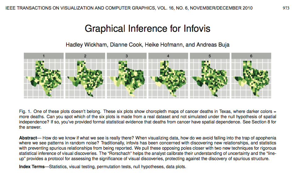
For recent developments on identifying spurious random structures
in statistical graphics, see the lovely paper by Hadley Wickham, Dianne Cook,
Heike Hofmann, Andreas Buja, “Graphical inference for infovis.”
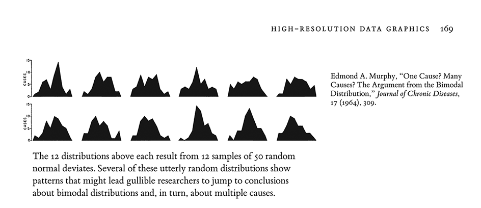
Edmond Murphy in 1964 wrote about dubious inferences about 2 underlying causal mechanisms based on staring at bimodal distributions (from Edward Tufte, The Visual Display of Quantitative Information, p. 169:
Sparklines can help reduce recency bias, encourage being approximately right rather than exactly wrong, and provide high-resolution context
From Edward Tufte, Beautiful Evidence, pages 50-51.
Sparklines have obvious applications for financial and economic data—by tracking and comparing changes over time, by showing overall trend along with local detail. Embedded in a data table, this sparkline depicts an exchange rate (dollar cost of one euro) for every day for one year:

Colors help link the sparkline with the numbers: red = the oldest and newest rates in the series; blue = yearly low and high for daily exchange rates. Extending this graphic table is straightforward; here, the price of the euro versus 3 other currencies for 65 months and for 12 months:

Daily sparkline data can be standardized and scaled in all sorts of ways depending on the content: by the range of the price, inflation-adjusted price, percent change, percent change off of a market baseline. Thus multiple sparklines can describe the same noun, just as multiple columns of numbers report various measures of performance. These sparklines reveal the details of the most recent 12 months in the context of a 65-month daily sequence (shown in the fractal-like structure below).
Consuming a horizontal length of only 14 letter spaces, each sparkline in the big table above provides a look at the price and the changes in price for every day for years, and the overall time pattern. This financial table reports 24 numbers accurate to 5 significant digits; the accompanying sparklines show about 14,000 numbers readable from 1 to 2 significant digits. The idea is to be approximately right rather than exactly wrong. 1
By showing recent change in relation to many past changes, sparklines provide a context for nuanced analysis—and, one hopes, better decisions. Moreover, the year-long daily history reduces recency bias, the persistent and widespread over-weighting of recent events in making decisions. Tables sometimes reinforce recency bias by showing only current levels or recent changes; sparklines improve the attention span of tables.
Tables of numbers attain maximum densities of only 300 characters per square inch or 50 characters per square centimeter. In contrast, graphical displays have far greater resolutions; a cartographer notes “the resolving power of the eye enables it to differentiate to 0.1 mm where provoked to do so.” 2 Distinctions at 0.1 mm mean 250 per linear inch, which implies 60,000 per square inch or 10,000 per square centimeter, which is plenty.
1 On being “approximately right rather than exactly wrong,” see John W. Tukey, “The Technical Tools of Statistics,” American Statistician, 19 (1965), 23-28.
2 D.P. Bickmore, “The Relevance of Cartography,” in J.C. Davis and M.J. McCullagh, eds., Display and Analysis of Spatial Data (London, 1975), 331.
Here is a conventional financial table comparing various return rates of 10 popular mutual funds: 1

This is a common display in data analysis: a list of nouns (mutual funds, for example) along with some numbers (assets, changes) that accompany the nouns. The analyst’s job is to look over the data matrix and then decide whether or not to go crazy—or at least to make a decision (buy, sell, hold) about the noun based on the data. But along with the summary clumps of tabular data, let us also look at the day-to-day path of prices and their changes for the entire last year. Here is the sparkline table: 2
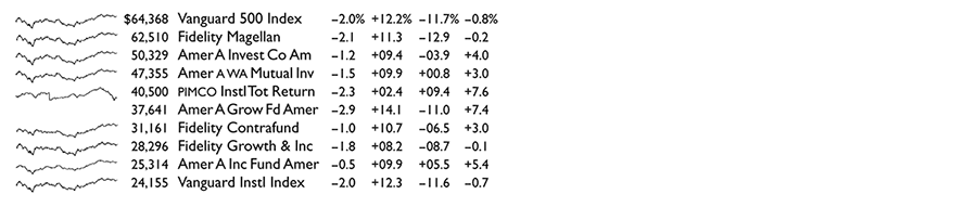
Astonishing and disconcerting, the finely detailed similarities of these daily sparkline histories are not all that surprising, after the fact anyway. Several funds use market index-tracking or other copycat strategies, and all the funds are driven daily by the same amalgam of external forces (news, fads, economic policies, panics, bubbles). Of the 10 funds, only the unfortunately named PIMCO, the sole bond fund in the table, diverges from the common pattern of the 9 stock funds, as seen by comparing PIMCO’s sparkline with the stacked pile of 9 other sparklines below.
In newspaper financial tables, down the deep columns of numbers, sparklines can be added to tables set at 8 lines per inch (as in our example above). This yields about 160 sparklines per column, or 400,000 additional daily graphical prices and their changes per 5-column financial page. Readers can scan the sparkline tables, making simultaneous multiple comparisons, searching for nonrandom patterns in the random walks of prices.

1 “Favorite Funds,” The New York Times, August 10, 2003, p. 3-1.
2 In our redesigned table, the typeface Gill Sans does quite well compared to the Helvetica in the original Times table. Smaller than the Helvetica, the Gill Sans appears sturdier and more readable, in part because of the increased white space that results from its smaller x-height and reduced size. The data area (without column labels) for our sparkline table is only 21% larger than the original’s data area, and yet the sparklines provide an approximate look at 5,000 more numbers.

Hi ET,
This is a great post about a serious subject. There is now ample evidence that a wide population of scientists active today are either totally ignorant of the assumptions that textbook statistical methods are built on, or are deliberately gaming the ‘tests’ to obtain a publishable paper. The Ioannidis paper is excellent and has made some ‘mainstream’ statisticians squeal – the ‘In the Pipeline’ piece is genuinely shocking.
On a personal level as a scientist, the state of statistical analysis has led me to become disillusioned with modern scientific research and stop publishing papers – why add another element to an edifice that is of such shaky overall quality? I would rather write papers that describe new measurement methodologies, blog posts and books.
As another source of examples see the work of Gerd Gigerenzer – at the Max Planck Institute for Human Development in Berlin ( HERE )
He wrote an entertaining paper in 2004 called Mindless Statistics.
The Abstract reads:
Statistical rituals largely eliminate statistical thinking in the social sciences. Rituals are indispensable for identification with social groups, but they should be the subject rather than the procedure of science. What I call the “null ritual” consists of three steps: (1) set up a statistical null hypothesis, but do not specify your own hypothesis nor any alternative hypothesis, (2) use the 5% significance level for rejecting the null and accepting your hypothesis, and (3) always perform this procedure. I report evidence of the resulting collective confusion and fears about sanctions on the part of students and teachers, researchers and editors, as well as textbook writers.
Gigerenzer takes apart what he calls the ‘null ritual’ that scientists are taught about in statistics lessons. In particular psychologists.
One of the great pieces of evidence Gigerenzer presents is the result of a test that was set by Haller and Krauss (2002). In this test the researchers posed a question about null hypothesis testing to 30 statistics teachers, including professors of psychology, lecturers, and teaching assistants, 39 professors and lecturers of psychology (not teaching statistics), and 44 psychology students. Teachers and students were from the psychology departments at six German universities. Each statistics teacher taught null hypothesis testing, and each student had successfully passed one or more statistics courses in which it was taught. The question was followed by 6 statements and the people taking the test were asked to mark which of the statements they believed to be true or false.
In fact all 6 of the statements were false. But all 6 of the statements erred “in the same direction of wishful thinking: They make a p-value look more informative than it is”.
Gigerenzer also goes on to quote Richard Feynman on hypothesis testing and states Feynman’s conjecture:
And quotes Feynman’s anecdotal story about his interaction with a psychology researcher at Princeton whilst he was a student.
And it’s a general principle of psychologists that in these tests they arrange so that the odds that the things that happen happen by chance is small, in fact, less than one in twenty. . . . And then he ran to me, and he said, “Calculate the probability for me that they should alternate, so that I can see if it is less than one in twenty.” I said, “It probably is less than one in twenty, but it doesn’t count.” He said, “Why?” I said, “Because it doesn’t make any sense to calculate after the event. You see, you found the peculiarity, and so you selected the peculiar case.” . . . If he wants to test this hypothesis, one in twenty, he cannot do it from the same data that gave him the clue. He must do another experiment all over again and then see if they alternate. He did, and it didn’t work.
So your three questions about how visual analytics can help us avoid the loaded and misleading language of statistical analysis seem to be both timely and timeless. I’ll get thinking.
Best wishes
Matt
Feynman, R., 1998. The Meaning of it All: Thoughts of a Citizen-Scientist. Perseus Books, Reading, MA, pp. 80-81.
Haller, H., Krauss, S., 2002. Misinterpretations of significance: a problem students share with their teachers? Methods of Psychological Research–Online, 7, pp 1-20.
Dear ET,
John Ioannidis is on a roll. Ioannidis is a professor at Stanford School of Medicine who does a number of things – one of which is to expose what is wrong with current approaches to publishing science. In particular he enjoys finding methodological weaknesses and flaky statistics. He is the author of the excellent Why Most Published Research Findings Are False mentioned above.
Recently Ioannidis published a paper called Why Science Is Not Necessarily Self-Correcting (http://pps.sagepub.com/content/7/6/645.full). The asbtract of this paper begins “The ability to self-correct is considered a hallmark of science. However, self-correction does not always happen to scientific evidence by default”. He goes on to describe a speculative future of science on Planet F345…
“Planet F345 in the Andromeda galaxy is inhabited by a highly intelligent humanoid species very similar to Homo sapiens sapiens. Here is the situation of science in the year 3045268 in that planet. Although there is considerable growth and diversity of scientific fields, the lion’s share of the research enterprise is conducted in a relatively limited number of very popular fields, each one of that attracting the efforts of tens of thousands of investigators and including hundreds of thousands of papers. Based on what we know from other civilizations in other galaxies, the majority of these fields are null fields–that is, fields where empirically it has been shown that there are very few or even no genuine nonnull effects to be discovered, thus whatever claims for discovery are made are mostly just the result of random error, bias, or both. The produced discoveries are just estimating the net bias operating in each of these null fields. Examples of such null fields are nutribogus epidemiology, pompompomics, social psychojunkology, and all the multifarious disciplines of brown cockroach research–brown cockroaches are considered to provide adequate models that can be readily extended to humanoids. Unfortunately, F345 scientists do not know that these are null fields and don’t even suspect that they are wasting their effort and their lives in these scientific bubbles.
Young investigators are taught early on that the only thing that matters is making new discoveries and finding statistically significant results at all cost. In a typical research team at any prestigious university in F345, dozens of pre-docs and post-docs sit day and night in front of their powerful computers in a common hall perpetually data dredging through huge databases. Whoever gets an extraordinary enough omega value (a number derived from some sort of statistical selection process) runs to the office of the senior investigator and proposes to write and submit a manuscript. The senior investigator gets all these glaring results and then allows only the manuscripts with the most extravagant results to move forward. The most prestigious journals do the same. Funding agencies do the same. Universities are practically run by financial officers that know nothing about science (and couldn’t care less about it), but are strong at maximizing financial gains. University presidents, provosts, and deans are mostly puppets good enough only for commencement speeches and other boring ceremonies and for making enthusiastic statements about new discoveries of that sort made at their institutions. Most of the financial officers of research institutions are recruited after successful careers as real estate agents, managers in supermarket chains, or employees in other corporate structures where they have proven that they can cut cost and make more money for their companies. Researchers advance if they make more extreme, extravagant claims and thus publish extravagant results, which get more funding even though almost all of them are wrong.
No one is interested in replicating anything in F345. Replication is considered a despicable exercise suitable only for idiots capable only of me-too mimicking, and it is definitely not serious science. The members of the royal and national academies of science are those who are most successful and prolific in the process of producing wrong results. Several types of research are conducted by industry, and in some fields such as clinical medicine this is almost always the case. The main motive is again to get extravagant results, so as to license new medical treatments, tests, and other technology and make more money, even though these treatments don’t really work. Studies are designed in a way so as to make sure that they will produce results with good enough omega values or at least allow some manipulation to produce nice-looking omega values.
Simple citizens are bombarded from the mass media on a daily basis with announcements about new discoveries, although no serious discovery has been made in F345 for many years now. Critical thinking and questioning is generally discredited in most countries in F345. At some point, the free markets destroyed the countries with democratic constitutions and freedom of thought, because it was felt that free and critical thinking was a nuisance. As a result, for example, the highest salaries for scientists and the most sophisticated research infrastructure are to be found in totalitarian countries with lack of freedom of speech or huge social inequalities–one of the most common being gender inequalities against men (e.g., men cannot drive a car and when they appear in public their whole body, including their head, must be covered with a heavy pink cloth). Science is flourishing where free thinking and critical questioning are rigorously restricted, since free thinking and critical questioning (including of course efforts for replicating claimed discoveries) are considered anathema for good science in F345.”
Of course if science on Earth was performed today like it is on F345 it would be both depressing and very difficult to accurately discern the difference between real-science and psuedo-science.
Best wishes
Matt R