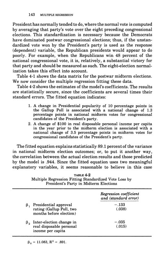
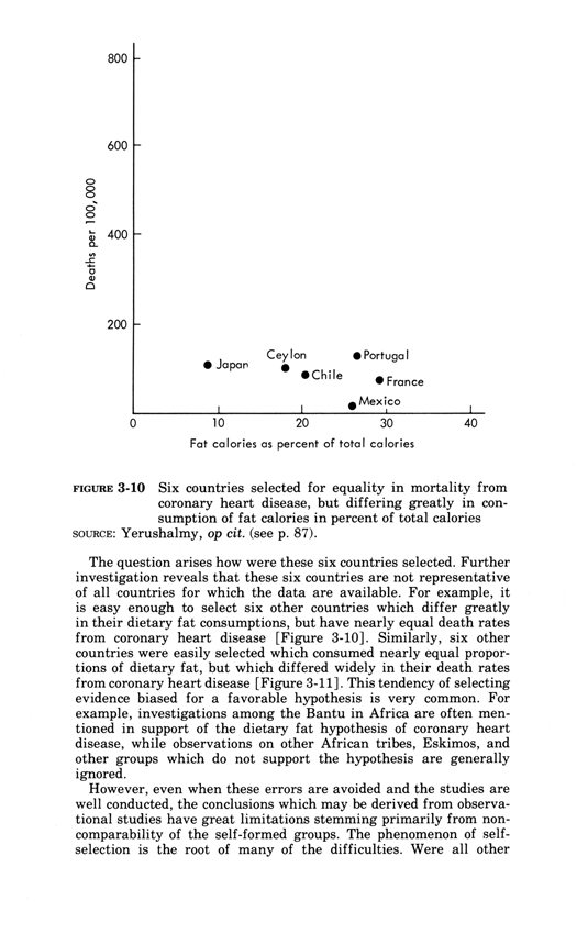
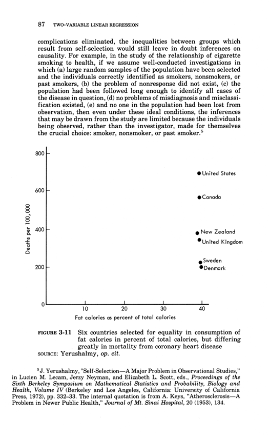
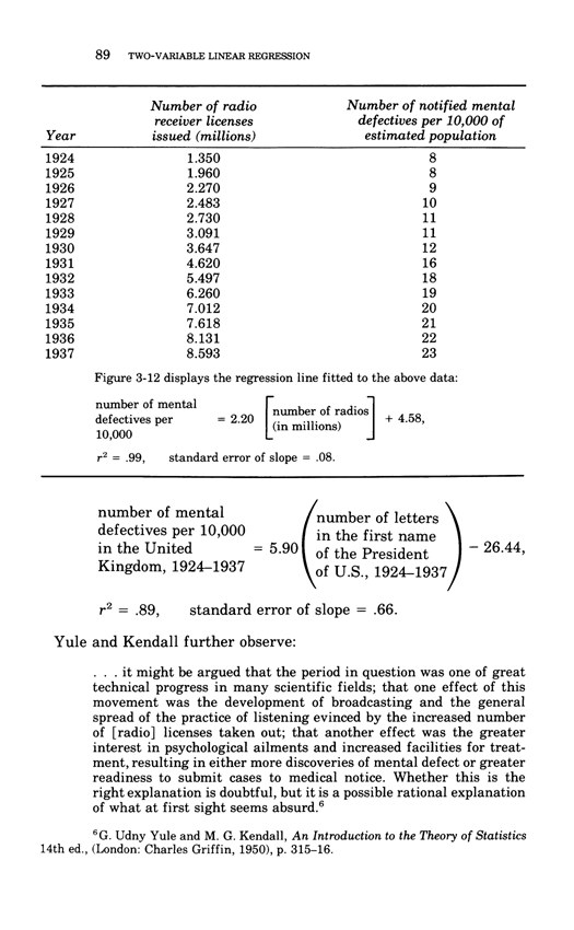
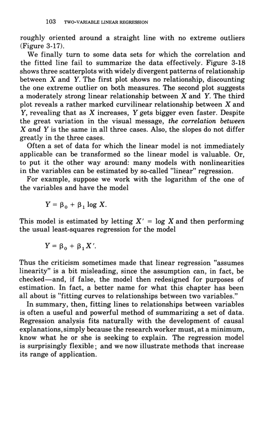
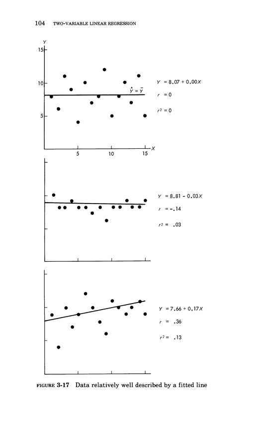
Warning: Trying to access array offset on value of type bool in /nas/content/live/graphicspress/wp-content/themes/edwardtufte/archive.php on line 21
Making better inferences from statistical graphics Edward Tufte
The rage-to-conclude bias sees patterns in data lacking such patterns.
The bias leads to premature, simplistic, and false inferences about causality.
Good statistical analysis seeks to calm down the rage to conclude,
to align the reality of the evidence with the inferences made from that evidence.
The calming down process often involves statistical analysis sorting out
the "random" from the "nonrandom," the "significant" and the dreaded
"not significant," and "explained" from "unexplained" variance.
Alas this statistical language is swamp of confounding puns and double-talk
that play on the differences between technical and everyday language.
Perversely, these puns also play to the rage to conclude, as in "explained
variance" derived from a cherry-picked, over-specified model on a small
data set--which is very unlike actually explaining something.
In everyday work, the integrity of statistical practice is too often compromised.
Researchers easily finesse standard statistical validation practices by posing
ridiculous alternative hypotheses, by searching millions of fitted models and
publishing one, and by little tilts in data analysis (and 3 or 4 little tilts will
generate a publishable finding).
The conventional practices for insuring analytical integrity, as implemented in
day-to-day research, have not headed off a vast literature of false findings.
See John P. A. Ioannidis, "Why Most Published Research Findings Are False,"
and the stunning recent report that only 6 of 53 "landmark studies" in clinical
oncology could be replicated (one researcher turned out to have done an
experiment 6 times, it "worked" once, and only the one-off was published).
Can our data displays be designed to reduce biases in viewing data--
such as the rage to conclude, cherry-picking, seeing the nonrandom in
the random, recency bias, confirmation bias? How can visual inferences
from data be improved to separate the real from the random, the
explained from the unexplained? How can the inferential integrity of
graphics viewing, as in exploratory data analysis, be improved?
Here are some practical ways to improve the quality of inferences
made from data displays.
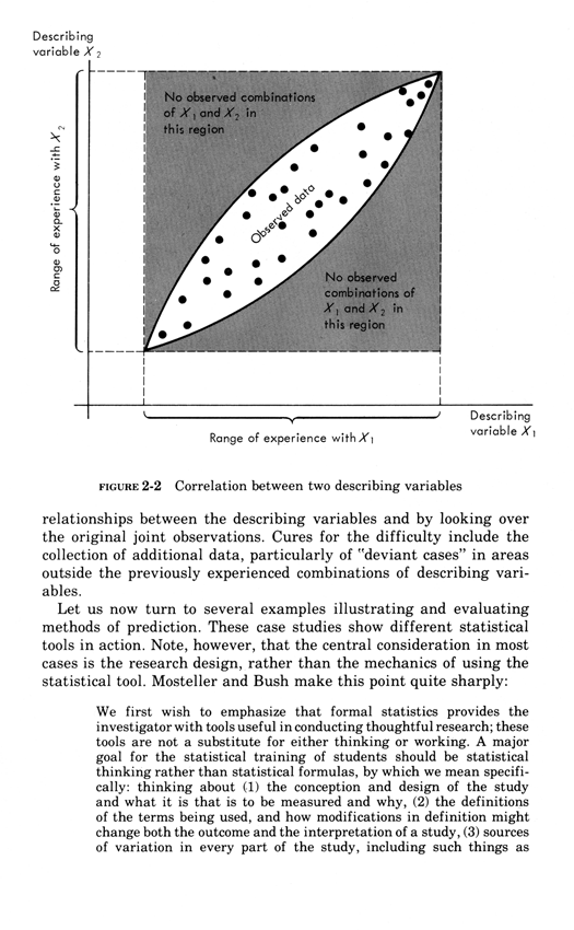
All statistical displays should be accompanied by a unique documentation box
For both consumers and a producers of data displays, a fundamental task is to assess
the credibility and integrity of graphical displays. The first-line quality control
mechanism for analytical integrity is documentation of the data sources and the
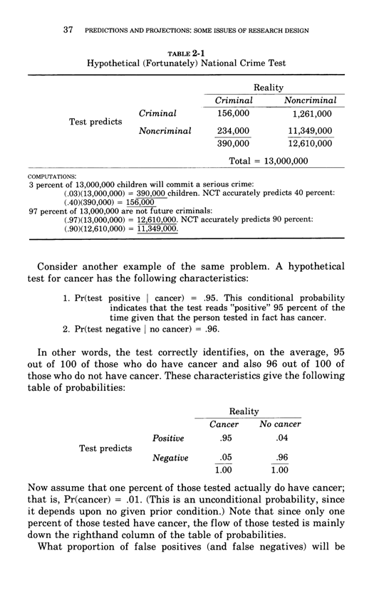
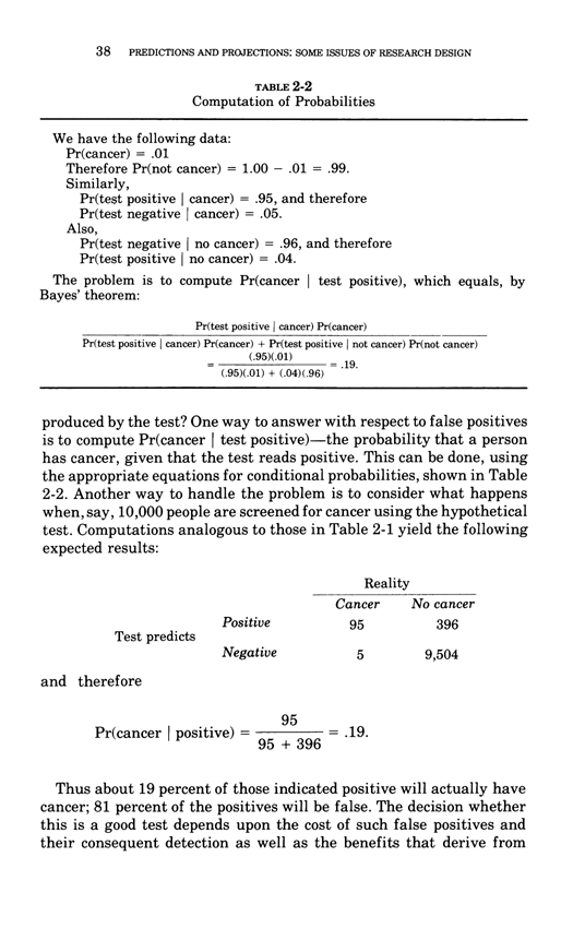
process of data analysis.
The data documentation box accompanying the display should provide links to the
data matrix used in the graphic display, the location of those data in the full data set,
names of analysts responsible for choosing and contructing the graphic, and whether
the project's research design specified in advance the graphic (or was published graphic
an objet trouve, a found object, such as Marcel Duchamp's famous conceptual
artwork Fountain,1917?).
Some journals require documentation of the data analysis process. For example, from
the British Journal of Sports Medicine:
Contributors: All authors had full access to the data in the study. JLV takes responsibility
for the integrity of the data and the accuracy of the data analysis. He is guarantor.
JLV and GNH designed the study. GNH, DWD, NO, JLV and LJC acquired the data.
JLV, EAHW, LJC and GNH performed the analysis and interpreted the data.
JLV drafted the manuscript, which was critically revised for intellectual content
by all co-authors.
Note the assignment of personal responsibility, a guarantor of data integrity/accuracy
of analysis. (The study's finding was that watching television a lot was correlated
with a substantially shorter lifespan. However intuitively pleasing, that finding
was hopelessly compromised by use of nonexperimental data that confounded
multiple causes and effects.)
A documentation box makes cherry-picking of evidence more obvious, and may
thereby serve as a check on cherry-picking by researchers. A documentation box
also allows reviewers of the study to assess the robustness of the results against
the plausible alternative hypothesis that the findings were generated by data-selection
rather than by a fair reading of the overall data. Published data displays too often
serve as research sanctification trophies, serving up pitches to the gullible, based
unstable over-selected results.
All computer programs for producing statistical displays should routinely provide
a documentation box, just as they now provide a plotting space, labels, and scales
of measurement. Why haven't those programs done so years ago?
Diluting Perceptual Cluster/Streak Bias:Informal, Inline, Interocular Trauma Tests
When people look at random number tables, they sees all kinds of clusters
and streaks (in a completely random set of data). Similarly, when people are
asked generate a random series of bits, they generate too few long streaks
(such as 6 identical bits a row), because their model of what is random
greatly underestimates the amount of streakiness in truly random data.
Sports and election reporters are notorious for their
streak/cluster/momentum/turning-point/trendspotting
narrative over-reach. xkcd did this wonderful critique:
To dilute streak-guessing, randomize on time over the same data,
and compare random streaks with the observed data.
Below, the top sparkline shows the season's win-loss sequence
(the little horizontal line = home games, no line = road games).
Weighting by overall record of wins/losses and home/road effects
yields ten random sparklines. Hard to see the difference between
real and random.
The 10 random sparkline sequences can be regenerated again and
again by, oddly enough, clicking on "Regenerate random seasons."
The test of the 10 randomized sparklines vs. the actual data is an
"Interocular Trauma Test" because the comparison hits the analyst right
between the eyes. This little randomization check-up, which can be repeated
again and again, is seen by the analyst at the very moment of making
inferences based on a statistical graphic of observed data.
(Thanks to Adam Schwartz for his excellent work on randomized sparklines. ET)
This is looking a bit like bootstrap calculation. For the real and amazing
bootstrap, applied to data graphics and contour lines, see Persi Diaconis
and Bradley Efron, "Computer Intensive Methods in Statistics."
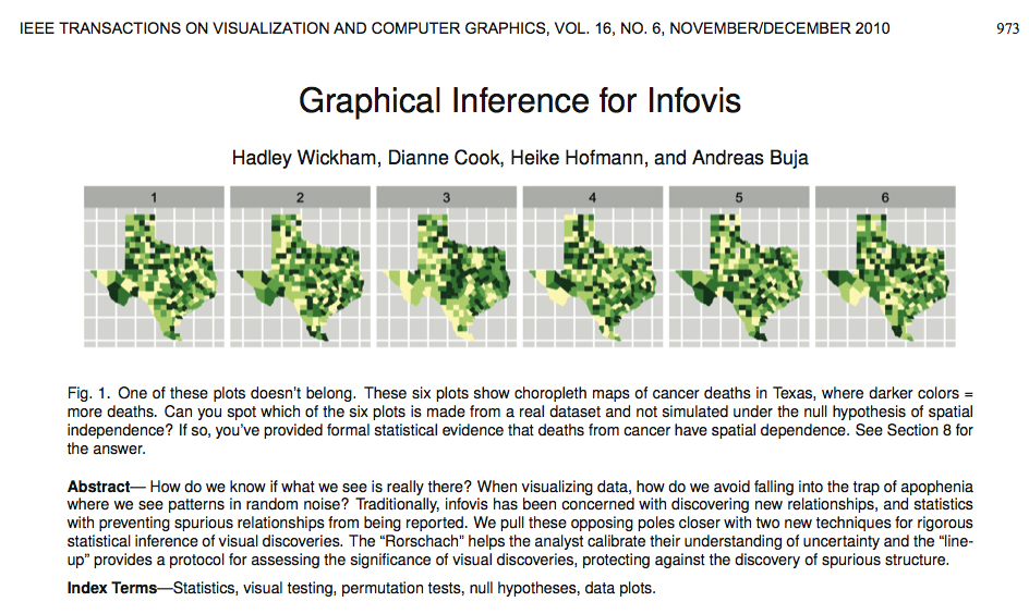
For recent developments on identifying spurious random structures
in statistical graphics, see the lovely paper by Hadley Wickham, Dianne Cook,
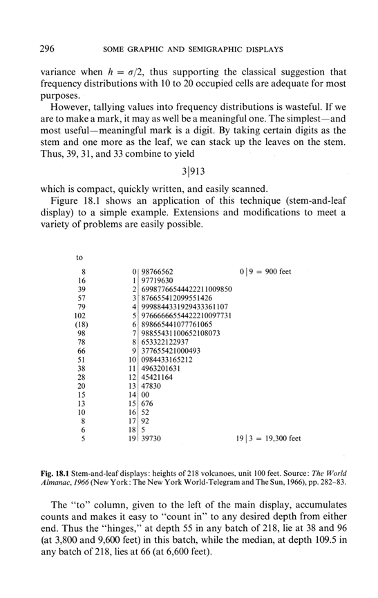
Heike Hofmann, Andreas Buja, "Graphical inference for infovis."
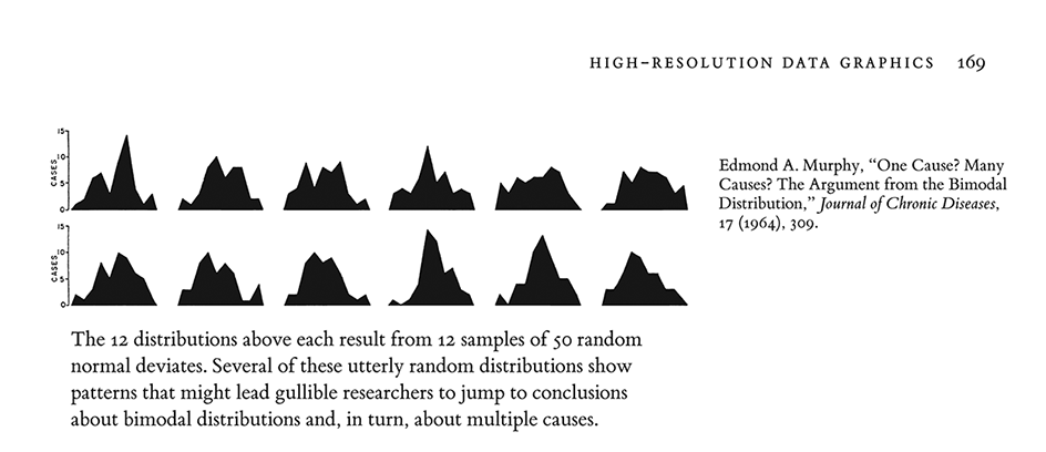
Edmond Murphy in 1964 wrote about dubious inferences about 2 underlying causal mechanisms based on staring at bimodal distributions (from Edward Tufte, The Visual Display of Quantitative Information, p. 169:
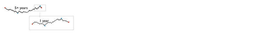
Sparklines can help reduce recency bias, encourage being approximately right rather than exactly wrong, and provide high-resolution context
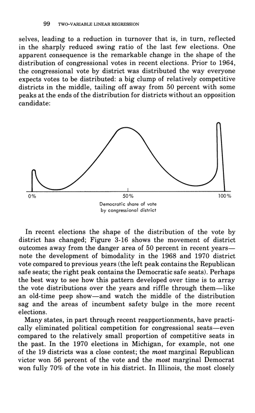
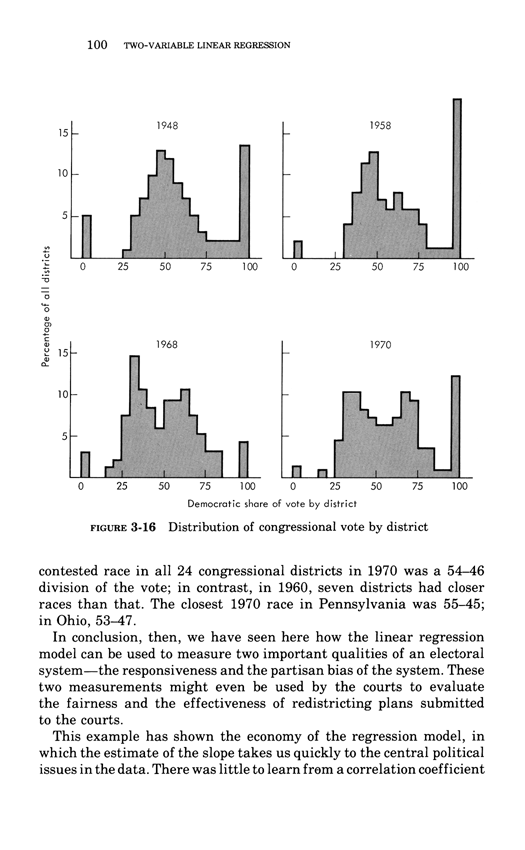
From Edward Tufte, Beautiful Evidence, pages 50-51.
Sparklines have obvious applications for financial and economic data—by tracking and comparing changes over time, by showing overall trend along with local detail. Embedded in a data table, this sparkline depicts an exchange rate (dollar cost of one euro) for every day for one year:
Colors help link the sparkline with the numbers: red = the oldest and newest rates in the series; blue = yearly low and high for daily exchange rates. Extending this graphic table is straightforward; here, the price of the euro versus 3 other currencies for 65 months and for 12 months:
Daily sparkline data can be standardized and scaled in all sorts of ways depending on the content: by the range of the price, inflation-adjusted price, percent change, percent change off of a market baseline. Thus multiple sparklines can describe the same noun, just as multiple columns of numbers report various measures of performance. These sparklines reveal the details of the most recent 12 months in the context of a 65-month daily sequence (shown in the fractal-like structure below).
Consuming a horizontal length of only 14 letter spaces, each sparkline in the big table above provides a look at the price and the changes in price for every day for years, and the overall time pattern. This financial table reports 24 numbers accurate to 5 significant digits; the accompanying sparklines show about 14,000 numbers readable from 1 to 2 significant digits. The idea is to be approximately right rather than exactly wrong. 1
By showing recent change in relation to many past changes, sparklines provide a context for nuanced analysis—and, one hopes, better decisions. Moreover, the year-long daily history reduces recency bias, the persistent and widespread over-weighting of recent events in making decisions. Tables sometimes reinforce recency bias by showing only current levels or recent changes; sparklines improve the attention span of tables.
Tables of numbers attain maximum densities of only 300 characters per square inch or 50 characters per square centimeter. In contrast, graphical displays have far greater resolutions; a cartographer notes "the resolving power of the eye enables it to differentiate to 0.1 mm where provoked to do so." 2 Distinctions at 0.1 mm mean 250 per linear inch, which implies 60,000 per square inch or 10,000 per square centimeter, which is plenty.
1 On being "approximately right rather than exactly wrong," see John W. Tukey, "The Technical Tools of Statistics," American Statistician, 19 (1965), 23-28.
2 D.P. Bickmore, "The Relevance of Cartography," in J.C. Davis and M.J. McCullagh, eds., Display and Analysis of Spatial Data (London, 1975), 331.
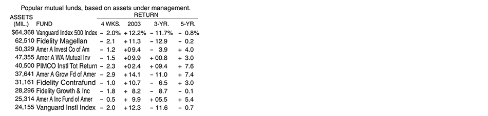
Here is a conventional financial table comparing various return rates of 10 popular mutual funds: 1
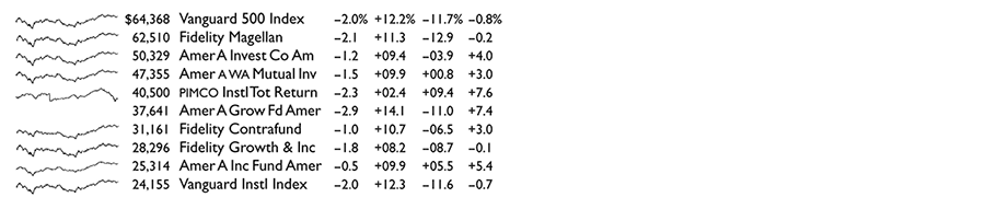
This is a common display in data analysis: a list of nouns (mutual funds, for example) along with some numbers (assets, changes) that accompany the nouns. The analyst's job is to look over the data matrix and then decide whether or not to go crazy—or at least to make a decision (buy, sell, hold) about the noun based on the data. But along with the summary clumps of tabular data, let us also look at the day-to-day path of prices and their changes for the entire last year. Here is the sparkline table: 2
Astonishing and disconcerting, the finely detailed similarities of these daily sparkline histories are not all that surprising, after the fact anyway. Several funds use market index-tracking or other copycat strategies, and all the funds are driven daily by the same amalgam of external forces (news, fads, economic policies, panics, bubbles). Of the 10 funds, only the unfortunately named PIMCO, the sole bond fund in the table, diverges from the common pattern of the 9 stock funds, as seen by comparing PIMCO's sparkline with the stacked pile of 9 other sparklines below.
In newspaper financial tables, down the deep columns of numbers, sparklines can be added to tables set at 8 lines per inch (as in our example above). This yields about 160 sparklines per column, or 400,000 additional daily graphical prices and their changes per 5-column financial page. Readers can scan the sparkline tables, making simultaneous multiple comparisons, searching for nonrandom patterns in the random walks of prices.
1 "Favorite Funds," The New York Times, August 10, 2003, p. 3-1.
2 In our redesigned table, the typeface Gill Sans does quite well compared to the Helvetica in the original Times table. Smaller than the Helvetica, the Gill Sans appears sturdier and more readable, in part because of the increased white space that results from its smaller x-height and reduced size. The data area (without column labels) for our sparkline table is only 21% larger than the original's data area, and yet the sparklines provide an approximate look at 5,000 more numbers.
Warning: Undefined variable $count in /nas/content/live/graphicspress/wp-content/themes/edwardtufte/archive.php on line 24
Warning: Trying to access array offset on value of type bool in /nas/content/live/graphicspress/wp-content/themes/edwardtufte/archive.php on line 21
Stonespace and Airspace = Lacy Stone Walls
Extension of walking wall, November 6, 2013, working with my colleagues John and Max:
Dan Snow and I started working together in January 2012. Since then we have made many pieces, including lacy walls. Some old walls in Ireland are wonderfully laced with see-throughs and large, active airspaces.
The artworks shown below were done by Dan Snow and ET.
We have a new lacy wall underway now, August 2013.
Flowing Steel Confections
Steel mounted on I-beam, eventually to wander over the land for 500 feet:
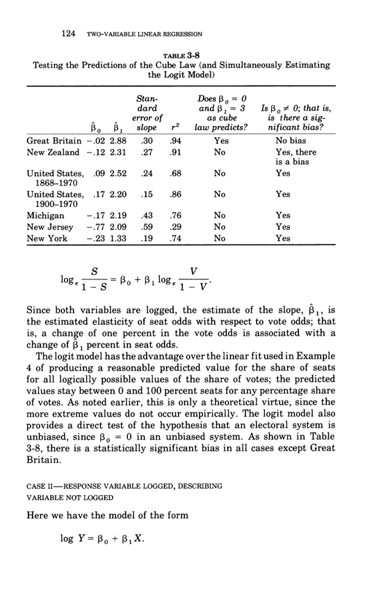
Pixelized drawing of same:
With ET for scaling purposes:
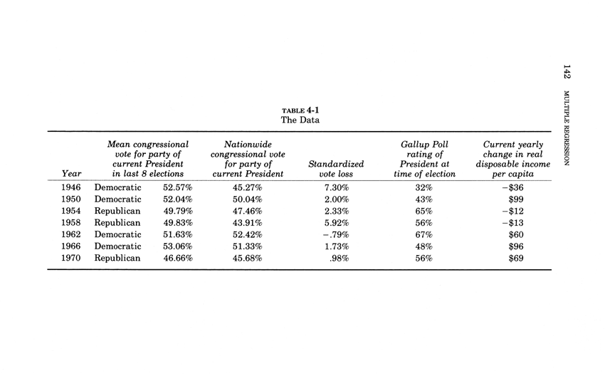
Maps moving in time: a standard of excellence for data displays
The wonderful Swiss mountain maps provide a standard of excellence
for serious information displays. Specifically:
all about content
high-resolution
vigorous expression of third dimension
local details always imbedded in larger context
use of appropriate light colors to avoid optical clutter
realistic, content-driven colors
smart, graceful typography done by serious typographers
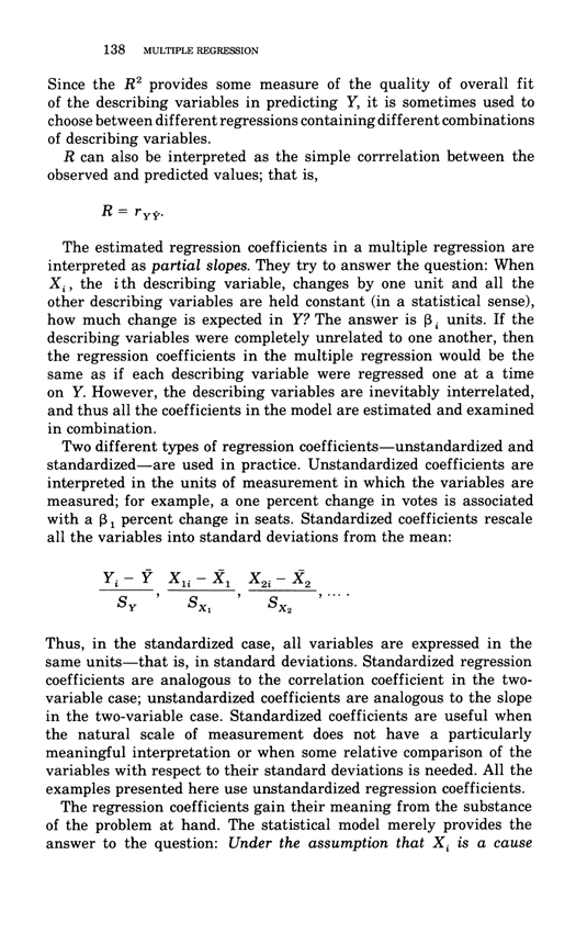
size of type proportional to size of object labeled (type is quantified)
intense quantitative data by means of contour lines (at sparkline resolution)
contours = sparklines that flow in three dimensions!
thorough, natural integration of words, numbers, depictions
shows intense local data information in position without annoying pop-ups
zero chartjunk, all pixels carrying content
many exact numbers provided (labels for contour lines, and the height of mountain peaks)
avoids dequantification found in much dataviz stuff
all about content
great content (the Swill Alps!)
open-source, non-proprietary formats
driven by marketplace ethics, not driven by focus groups.
Make the Swiss mountain maps a comparison set for high-end information displays by means
of this pairwise adjacent comparison:
the mountain map side-by-side against the current or proposed visualization.
For example, compare the Swiss map against what contractor provides,
or write comparison set into the contract. (Claiming your users are stupid is not
a good reason for failure to deploy the Swiss map standard and comparison tests.)
But the Swiss mountain maps - and many other data visualizations - can be extended by moving in time
and eventually on 4K or 8K displays. In our video below, note how panning over the Swiss mountain maps
creates a 3D-reading of the mountains, along with some lovely accidentally-separated-slightly-floating type
and a spectacular elevated effect for what may be a ski-lift.
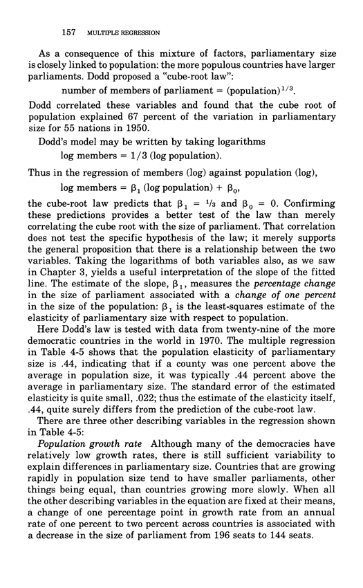
These effects resulting from slow panning repay study:
gentle 3D readings (without contraptionary apparatus) as well as
subtle separations of type/data from other design elements
(without using annoying flashboxes or popups for type/data).
An excerpt from our documentary film Inge Druckrey: Teaching to See:
"This incredible map was made in 2008 by Dr. Karl Rege of the Zurich School of Applied Sciences. Using arrival and departure data from the website FlightStats, he and his team simulated the flight path of every commercial flight over a 24 hour period and plotted them all in the map as tiny yellow dots." source
Here is a brilliant map moving through time, one of the best data visualizations around,
Stephen Malinowski's music-animation-machine version of Stravinsky's Rite of Spring. Full video.
Extremely complex multivariate interacting waves can be shown by means of my wavefield architectures,
more maps moving in time. I have only what the data surface should look like.
All that needs to be done is to hook the surface to data sources other than Nature in action!
Now, what are good design comparison sets for workaday diagrams and data displays?
Well, put your display pairwise adjacent to the most widely used data-architecture in history: Google maps.
Google Maps are used by millions of people everyday to actually do something:
navigate through the real world. That's the best user test: success in the wild.
Now in the pairwise comparison of Google maps with the proposed diagram, ask:
Does my diagram or data graphic compare with the Google maps data practices:
content rich, design straightforward
intense
subtle and effective with color
rich in typographic information
luscious with multiple layers of micro/macro information,
a typographic layer + a symbol layer + a data-map layer
calm but clear scale bar always present (avoids the dequantification found in lots of datviz stuff)
free of chartjunk and optical clutter
acommodating a diversity of users.
And Google Maps doesn't put some damn drop-shadow box
around every street name. Play in the big leagues.
"North America's best sculpture park: Edward Tufte's Hogpen Hill Farms" Philip GreenspunTriptych, steel series #5, 2013, about 5 x 10 x 1.5 feet
Someone mentioned that this steel piece had echoes of Paul Klee. Prompted memories about how the Triptych was constructed: ~ same time I made a quilt of Klee's paintings and had been studying Paul Klee's notebooks The Thinking Eye. On the other hand, 3 of these circle steel-cutouts were sitting around our outdoor studio for several months just waiting for an opportunity to fill a triptych gap.
Ken Carbone, CarboneSmolanAgency and a co-star in our documentary film Inge Druckrey: Teaching to See, visits Hogpen's Stone Mountain in the presence of 2 stone tablet artworks.
Ken Carbone + ET at my Little Steel Horse, mocking the long history of bilaterally symmetric sculptures of Dear-Leader-on-a-Big-Pedestalized-Horse. Little Steel Horse, made from an anvil and the jaw of a vise, sits atop a 30-ton stone pedestal and watches over all of Stone Mountain. 20th-century sculpture happily escaped bilateral symmetry and often sat, now depedestalized, directly on the earth. Near the end of my Beautiful Evidence, there's more in the chapter "Sculptural Pedestals: Meaning, Practice, Depedestatlization."
Images above were taken by Andrei Severny at my 234-acre tree and sculpture farm in northwest Connecticut.
Designs for Walking Maps
Here's a visual map guide to Hogpen made in a few hours right before the 3rd open house.
It started out (wrongly) with a plot plan (like the floor plan of a house), which is a lousy model for people walking around.
So instead, navigation between the 7 sculpture fields that form Hogpen Hill Farms was conducted by means of what visitors actually see: sculptures, hills, trees.
The North direction is strongly enforced on the image map and also on the ground as visitors drive in: the security staff, after greeting our guests with a show catalog, then point to the north and to a sign that says, of all things "NORTH." This visual guide is unrefined, but worked and was produced very quickly, in fact just-in-time.
Such designs might serve sculpture parks and museums. I once critiqued a sculpture park map in which the basic navigation was conducted through codings derived directly from a damn Acoustiguide that in turn were printed of the map. I suggested that the sculpture itself should be used as visual guide posts, not double-codings results from an interface (Acoustiguide) for an interface (map). Rather let the amazing art provide its own guide. No one has ever come to an art exhibit to see an interface to an interface.
Another way to think about this: use visual solutions for visual problems.
Not interface solutions, not flatland map solutions, but rather imaging the scene to be seen.
Photographs below are by Fredrick K.Orkin.
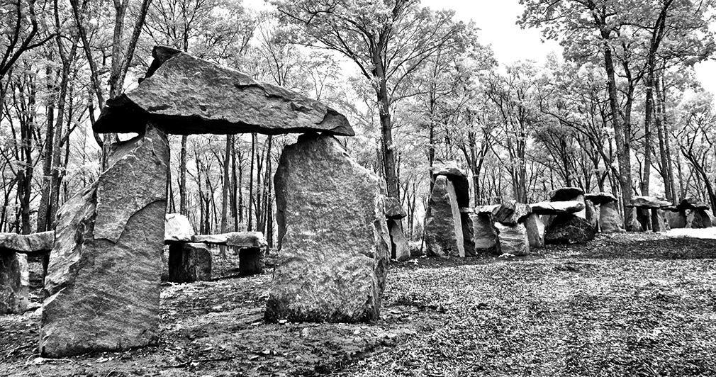
Continuous silent megalith, a structure of unknown significance.
2012-2013, native stone and air, 300 x 30 x height 16 feet, or 90 x 9 x height 5 meters, flows along on top of a local ridge.
The entire artwork is devoted to contemplative seeing beyond words, and visitors are requested to remain silent when within sight of the stones. It is constructed entirely of stones found on the farm. Many of the found stones are split to reveal fresh fractured cubist arrangement. Airspaces are constructed and worked by adjusting the stones as the local configurations are created and revised.
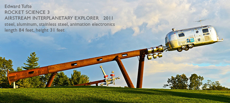
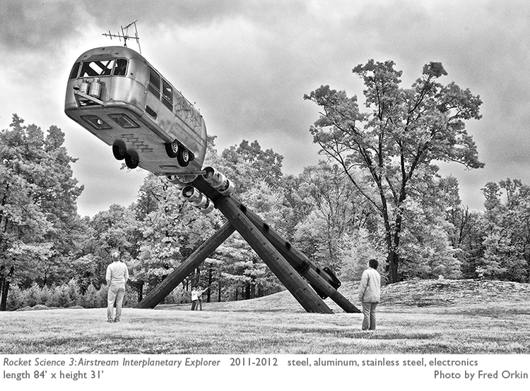
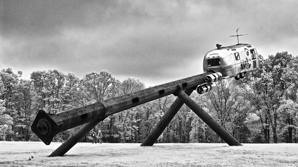
Three infrared images of the Airstream Trailer Interplanetary Explorer.
The infrared image lightens the darkness of the cool (in temperature) tree leaves, and creates an especially eerie quality to the image immediately below.
Airstream Trailer Interplanetary Explorer, with a big stainless steel Feynman diagram and a really big Tong Bird of Paradise, off toward a distant horizon.
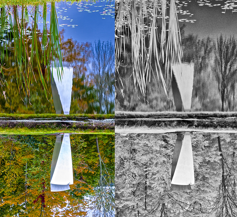
Airspace, 14 feet height, aluminum petals, luscious reflections in pond.
Saturated-color/infrared images adjacent, then rotated upside down:
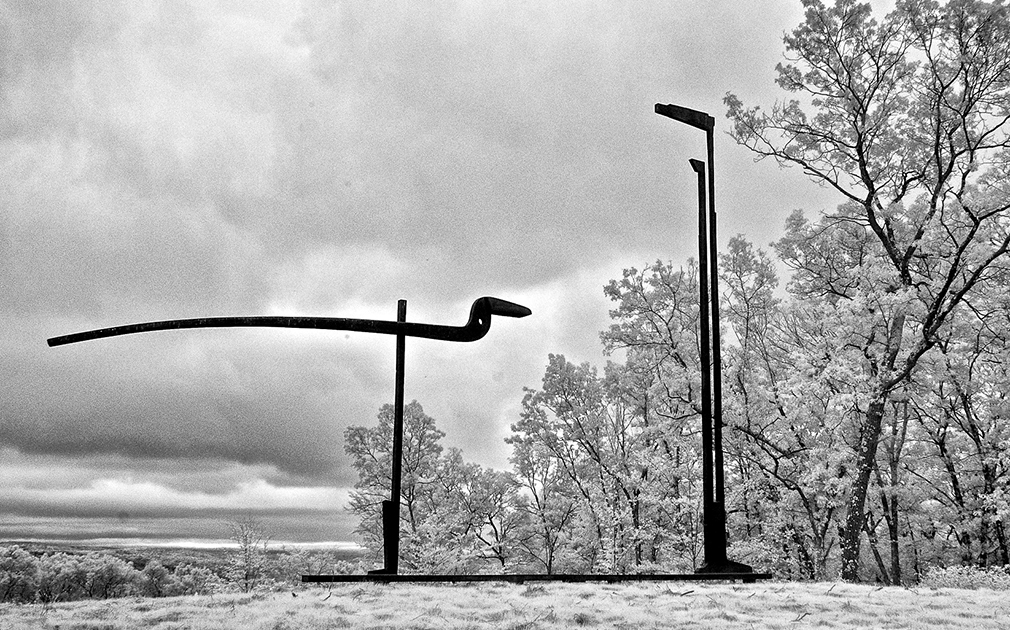
Fred Orkin's infrared photograph combines the textures of the Millstone 8 and the tree leaves (lightened by their cool temperature by infrared imaging), best picture I've seen of the Millstone series:
Hogpen Hill #1, first piece installed at Hogpen Hill Farms 6 years ago, stainless steel with matte (double-action grinding) finish intensely responsive to light, 24 feet tall, installation area recently revised.
Tong Bird of Paradise, on a hill against the horizon, largest version 30 feet wide x 20 feet tall, silhouette can be seen from far away.
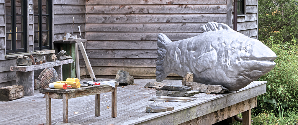
Magritte's Smile resting on the deck of a studio.
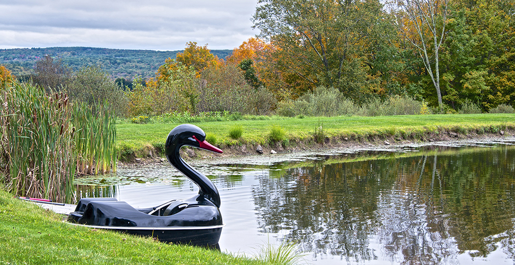
Black swan boat at pond.
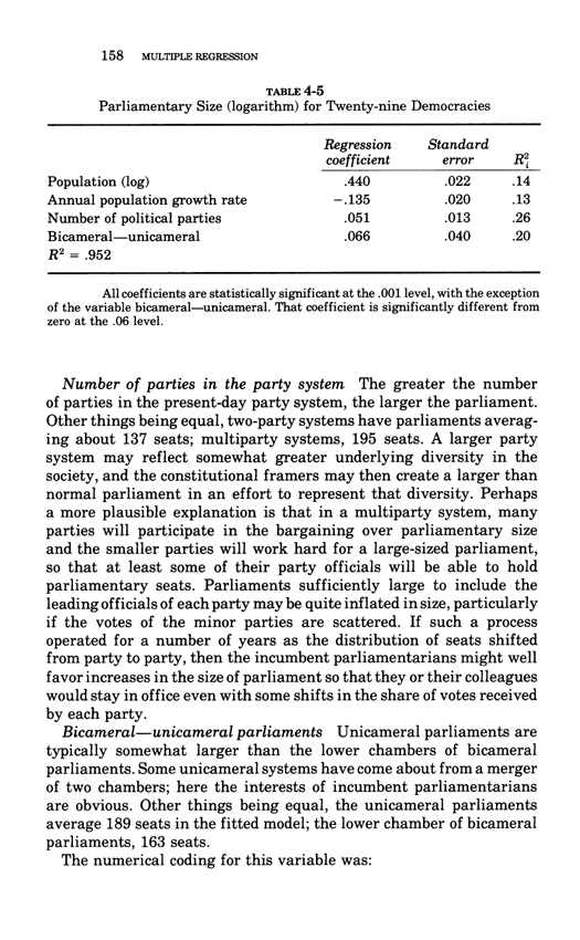
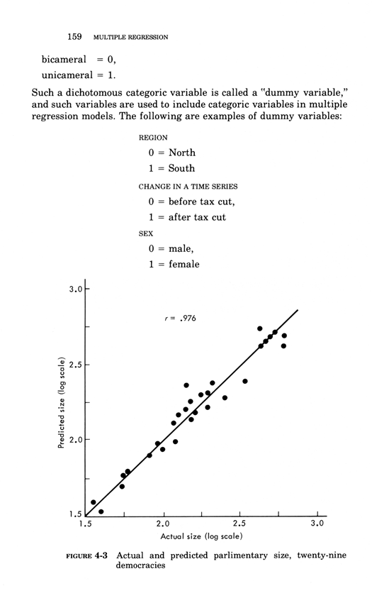
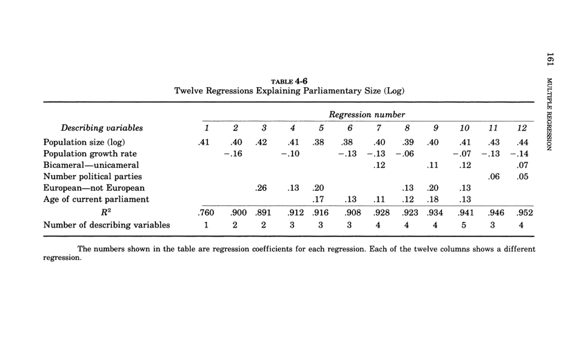
Fitting simple multivariate models
This essay below comes from Edward Tufte, Data Analysis for Politics and Policy, a classic textbook which had 17 printings in paperback.This book is now available as an e-book, the price is $9. Order here.
You will receive the 179-page book immediately.
Thanks, ET
Below, the fourth chapter of Edward Tufte's Data Analysis for Politics and Policy.
Ironstone artworks, torqued steel
torqued steel and air
calligraphic, gestural
represent only themselves, some symbolic elements of unknown significance
ET, Ironstone Table 2013, steel, 9 x 2 x height 6 feet or 2.7 x .6 x height 1.9 meters
ET, Ironstone Egyptian Bird 2013, steel, 105'' x 16'' x height 70'' or 266 x 41 by height 177 centimeters
ET, Three-legged bird, 2013, steel, 57 x 48 x height 100 in or 145 x 122 x height 254 cm
ET, Love Bunny with 6 Hearts, 2012, steel, 9 x 2 x height 6 feet or 2.7 x .6 by height 1.8 meters
Three Rocket Science pieces (Orbiter, Moon Lander, and Airstream Interplanetary Explorer)
Ears are torqued, made from a complex steel soup (used in water-pump impeller blades).
Sculpture less corny than Robert Indiana's
LOVE.
First drafts of 2 Ironstone pieces, 2012
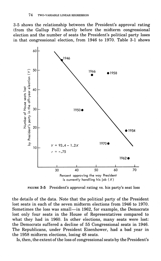
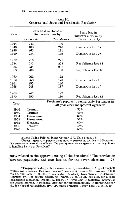
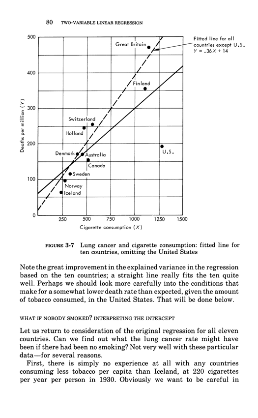
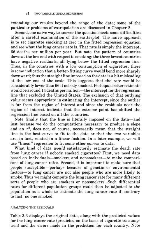
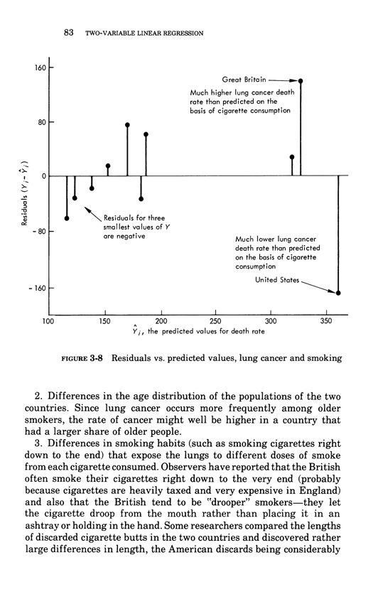
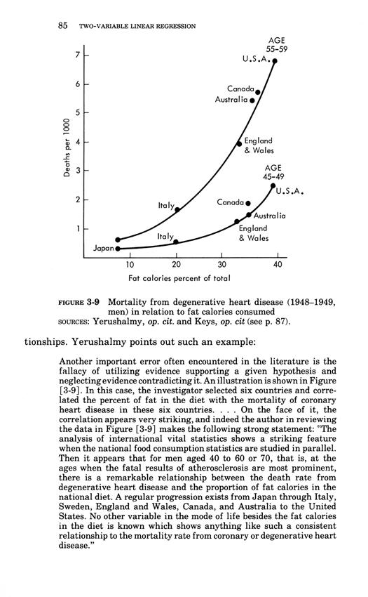
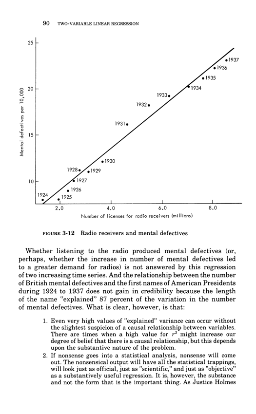
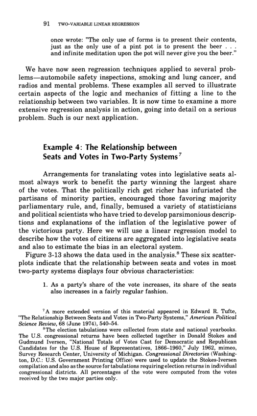
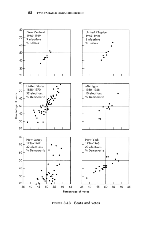
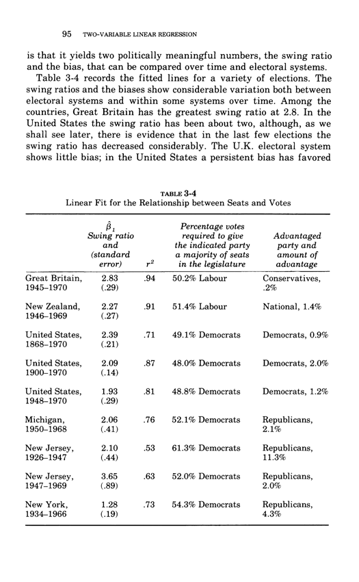
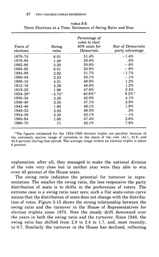
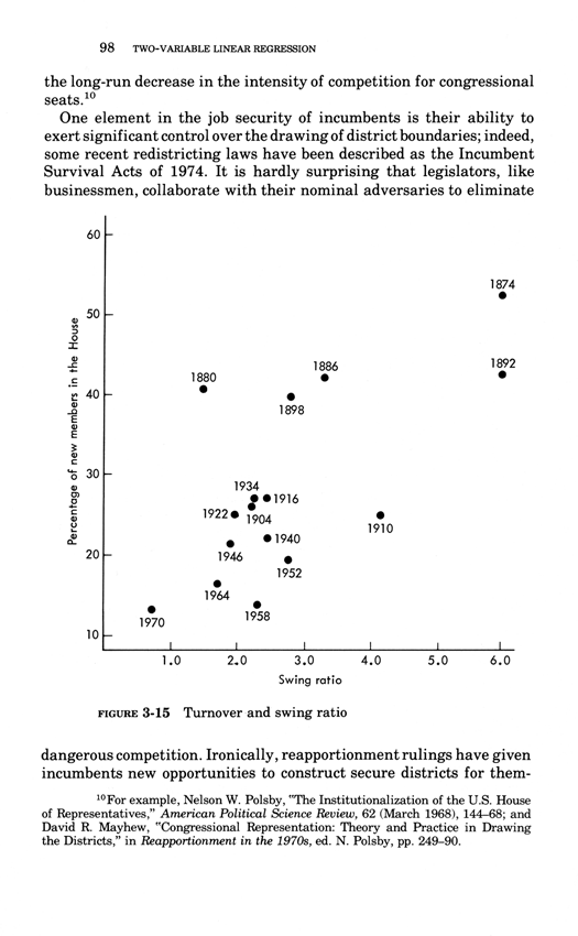
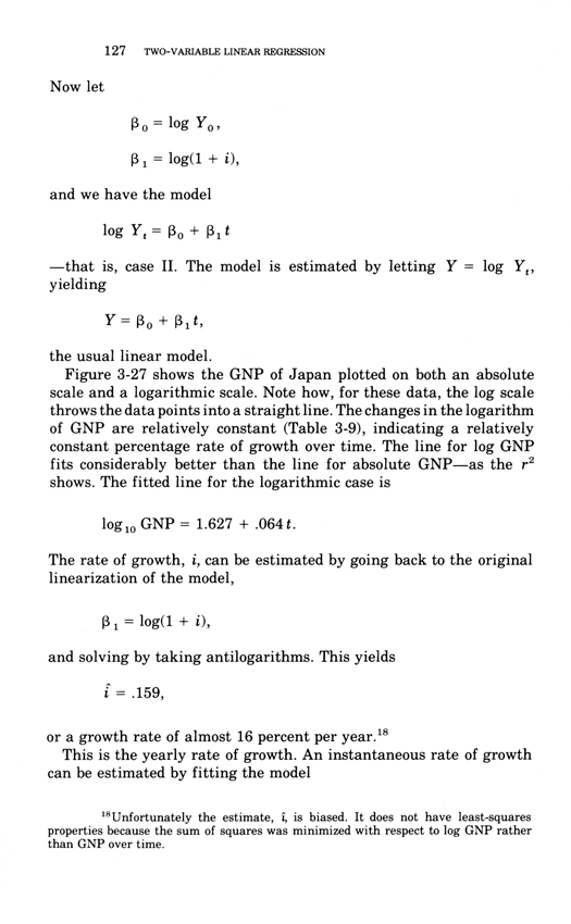
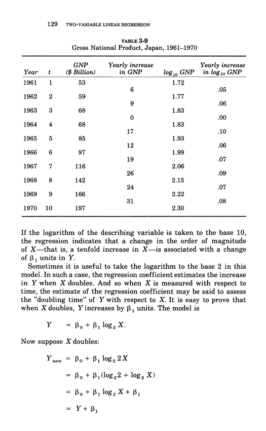
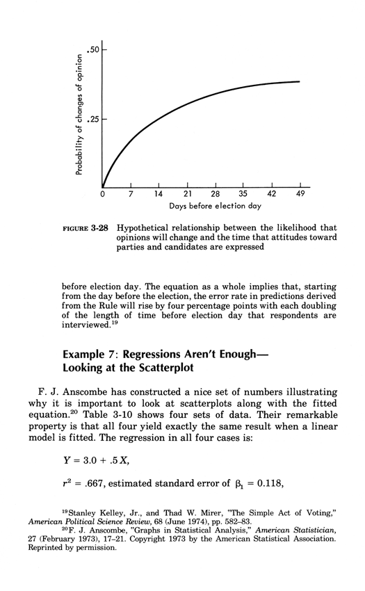
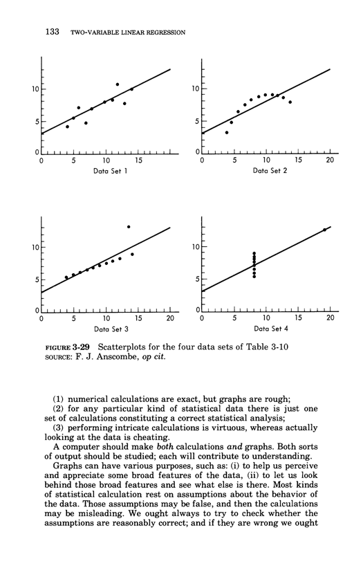
Two-variable linear regression
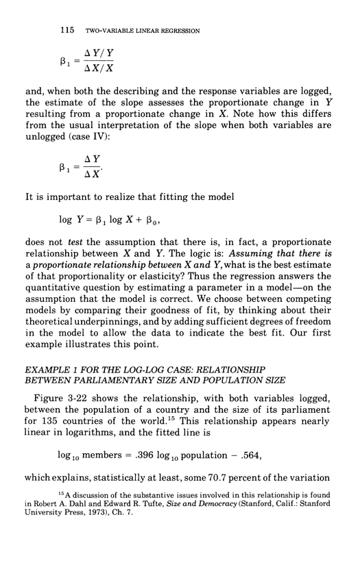
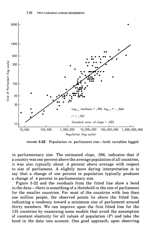
This essay below comes from Edward Tufte, Data Analysis for Politics and Policy,
a classic textbook which had 17 printings in paperback.
This book is now available as an e-book, the price is $9. Order here.
You will receive the 179-page book immediately.
Thanks, ET
Below, the third chapter of Edward Tufte's Data Analysis for Politics and Policy.
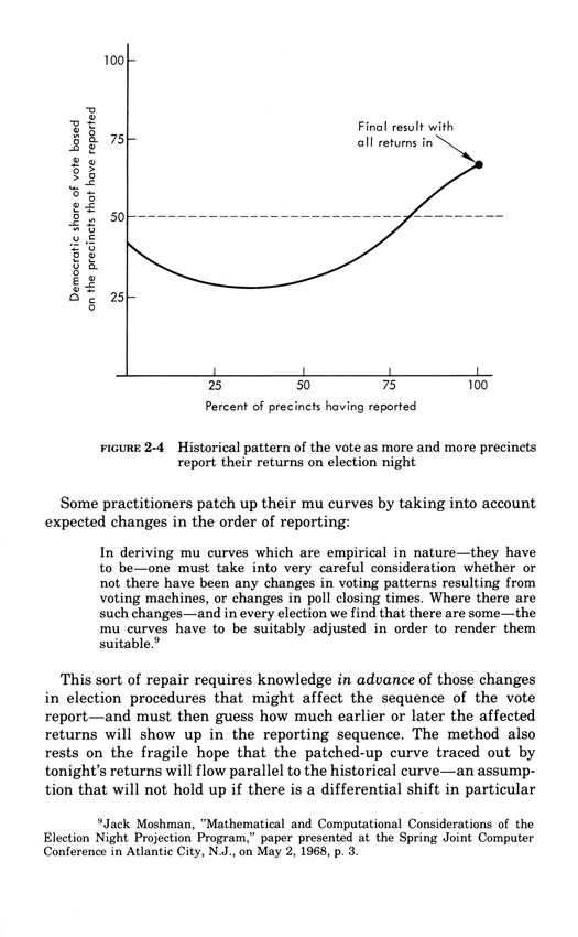
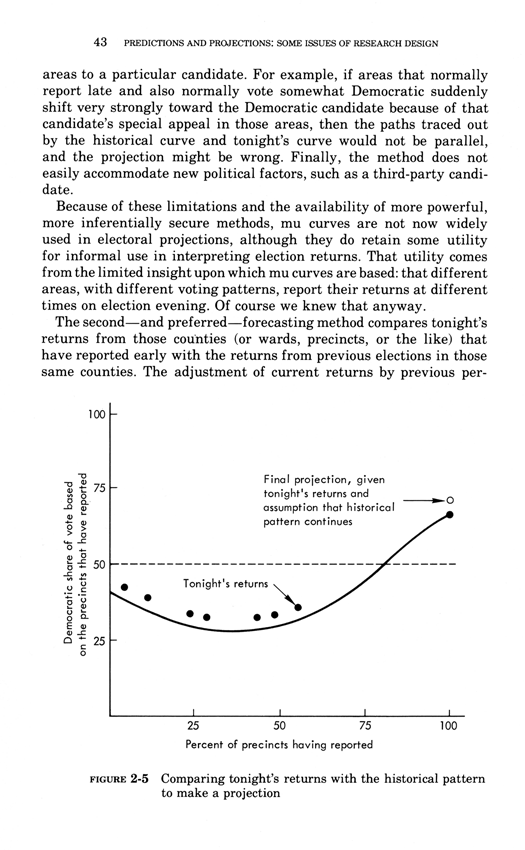
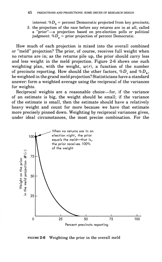
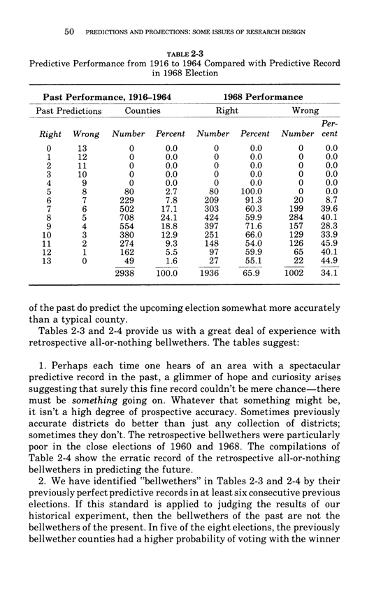
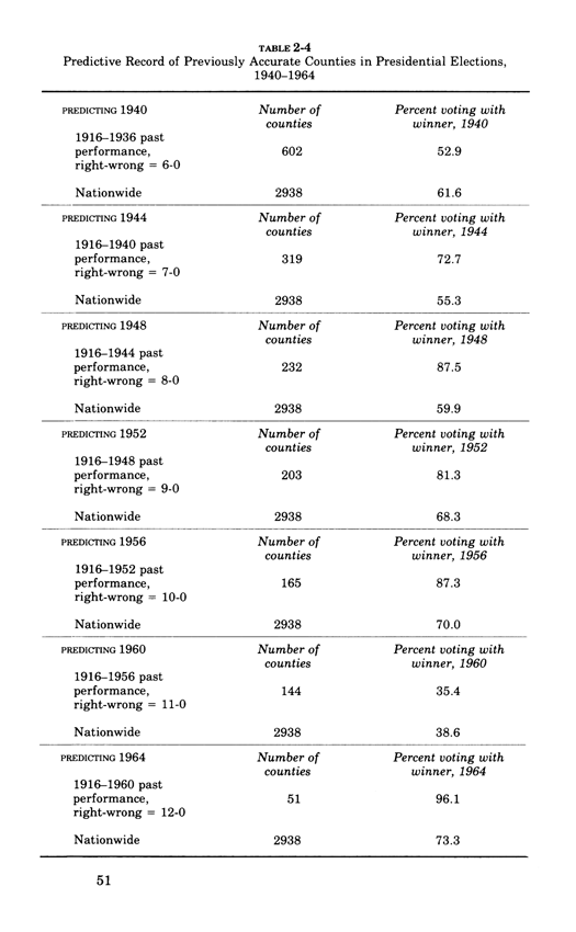
Predictions and projections: some issues of research design
This essay below comes from Edward Tufte, Data Analysis for Politics and Policy,
a classic textbook which had 17 printings in paperback.
This book is now available as an e-book, the price is $9. Order here.
You will receive the 179-page book immediately.
Thanks, ET
Below, the second chapter of Edward Tufte's Data Analysis for Politics and Policy.
We use cookies to ensure that we give you the best experience on our website. If you continue to use this site we will assume that you are happy with it.
 Some journals require documentation of the data analysis process. For example, from
the British Journal of Sports Medicine:
Contributors: All authors had full access to the data in the study. JLV takes responsibility
for the integrity of the data and the accuracy of the data analysis. He is guarantor.
JLV and GNH designed the study. GNH, DWD, NO, JLV and LJC acquired the data.
JLV, EAHW, LJC and GNH performed the analysis and interpreted the data.
JLV drafted the manuscript, which was critically revised for intellectual content
by all co-authors.
Note the assignment of personal responsibility, a guarantor of data integrity/accuracy
of analysis. (The study's finding was that watching television a lot was correlated
with a substantially shorter lifespan. However intuitively pleasing, that finding
was hopelessly compromised by use of nonexperimental data that confounded
multiple causes and effects.)
A documentation box makes cherry-picking of evidence more obvious, and may
thereby serve as a check on cherry-picking by researchers. A documentation box
also allows reviewers of the study to assess the robustness of the results against
the plausible alternative hypothesis that the findings were generated by data-selection
rather than by a fair reading of the overall data. Published data displays too often
serve as research sanctification trophies, serving up pitches to the gullible, based
unstable over-selected results.
All computer programs for producing statistical displays should routinely provide
a documentation box, just as they now provide a plotting space, labels, and scales
of measurement. Why haven't those programs done so years ago?
Diluting Perceptual Cluster/Streak Bias:
Informal, Inline, Interocular Trauma Tests
When people look at random number tables, they sees all kinds of clusters
and streaks (in a completely random set of data). Similarly, when people are
asked generate a random series of bits, they generate too few long streaks
(such as 6 identical bits a row), because their model of what is random
greatly underestimates the amount of streakiness in truly random data.
Sports and election reporters are notorious for their
streak/cluster/momentum/turning-point/trendspotting
narrative over-reach. xkcd did this wonderful critique:
Some journals require documentation of the data analysis process. For example, from
the British Journal of Sports Medicine:
Contributors: All authors had full access to the data in the study. JLV takes responsibility
for the integrity of the data and the accuracy of the data analysis. He is guarantor.
JLV and GNH designed the study. GNH, DWD, NO, JLV and LJC acquired the data.
JLV, EAHW, LJC and GNH performed the analysis and interpreted the data.
JLV drafted the manuscript, which was critically revised for intellectual content
by all co-authors.
Note the assignment of personal responsibility, a guarantor of data integrity/accuracy
of analysis. (The study's finding was that watching television a lot was correlated
with a substantially shorter lifespan. However intuitively pleasing, that finding
was hopelessly compromised by use of nonexperimental data that confounded
multiple causes and effects.)
A documentation box makes cherry-picking of evidence more obvious, and may
thereby serve as a check on cherry-picking by researchers. A documentation box
also allows reviewers of the study to assess the robustness of the results against
the plausible alternative hypothesis that the findings were generated by data-selection
rather than by a fair reading of the overall data. Published data displays too often
serve as research sanctification trophies, serving up pitches to the gullible, based
unstable over-selected results.
All computer programs for producing statistical displays should routinely provide
a documentation box, just as they now provide a plotting space, labels, and scales
of measurement. Why haven't those programs done so years ago?
Diluting Perceptual Cluster/Streak Bias:
Informal, Inline, Interocular Trauma Tests
When people look at random number tables, they sees all kinds of clusters
and streaks (in a completely random set of data). Similarly, when people are
asked generate a random series of bits, they generate too few long streaks
(such as 6 identical bits a row), because their model of what is random
greatly underestimates the amount of streakiness in truly random data.
Sports and election reporters are notorious for their
streak/cluster/momentum/turning-point/trendspotting
narrative over-reach. xkcd did this wonderful critique:
 Edmond Murphy in 1964 wrote about dubious inferences about 2 underlying causal mechanisms based on staring at bimodal distributions (from Edward Tufte, The Visual Display of Quantitative Information, p. 169:
 Sparklines can help reduce recency bias, encourage being approximately right rather than exactly wrong, and provide high-resolution context
From Edward Tufte, Beautiful Evidence, pages 50-51.
Sparklines have obvious applications for financial and economic data—by tracking and comparing changes over time, by showing overall trend along with local detail. Embedded in a data table, this sparkline depicts an exchange rate (dollar cost of one euro) for every day for one year:
Sparklines can help reduce recency bias, encourage being approximately right rather than exactly wrong, and provide high-resolution context
From Edward Tufte, Beautiful Evidence, pages 50-51.
Sparklines have obvious applications for financial and economic data—by tracking and comparing changes over time, by showing overall trend along with local detail. Embedded in a data table, this sparkline depicts an exchange rate (dollar cost of one euro) for every day for one year:
 Colors help link the sparkline with the numbers: red = the oldest and newest rates in the series; blue = yearly low and high for daily exchange rates. Extending this graphic table is straightforward; here, the price of the euro versus 3 other currencies for 65 months and for 12 months:
 Daily sparkline data can be standardized and scaled in all sorts of ways depending on the content: by the range of the price, inflation-adjusted price, percent change, percent change off of a market baseline. Thus multiple sparklines can describe the same noun, just as multiple columns of numbers report various measures of performance. These sparklines reveal the details of the most recent 12 months in the context of a 65-month daily sequence (shown in the fractal-like structure below).
Consuming a horizontal length of only 14 letter spaces, each sparkline in the big table above provides a look at the price and the changes in price for every day for years, and the overall time pattern. This financial table reports 24 numbers accurate to 5 significant digits; the accompanying sparklines show about 14,000 numbers readable from 1 to 2 significant digits. The idea is to be approximately right rather than exactly wrong. 1
By showing recent change in relation to many past changes, sparklines provide a context for nuanced analysis—and, one hopes, better decisions. Moreover, the year-long daily history reduces recency bias, the persistent and widespread over-weighting of recent events in making decisions. Tables sometimes reinforce recency bias by showing only current levels or recent changes; sparklines improve the attention span of tables.
Tables of numbers attain maximum densities of only 300 characters per square inch or 50 characters per square centimeter. In contrast, graphical displays have far greater resolutions; a cartographer notes "the resolving power of the eye enables it to differentiate to 0.1 mm where provoked to do so." 2 Distinctions at 0.1 mm mean 250 per linear inch, which implies 60,000 per square inch or 10,000 per square centimeter, which is plenty.
Daily sparkline data can be standardized and scaled in all sorts of ways depending on the content: by the range of the price, inflation-adjusted price, percent change, percent change off of a market baseline. Thus multiple sparklines can describe the same noun, just as multiple columns of numbers report various measures of performance. These sparklines reveal the details of the most recent 12 months in the context of a 65-month daily sequence (shown in the fractal-like structure below).
Consuming a horizontal length of only 14 letter spaces, each sparkline in the big table above provides a look at the price and the changes in price for every day for years, and the overall time pattern. This financial table reports 24 numbers accurate to 5 significant digits; the accompanying sparklines show about 14,000 numbers readable from 1 to 2 significant digits. The idea is to be approximately right rather than exactly wrong. 1
By showing recent change in relation to many past changes, sparklines provide a context for nuanced analysis—and, one hopes, better decisions. Moreover, the year-long daily history reduces recency bias, the persistent and widespread over-weighting of recent events in making decisions. Tables sometimes reinforce recency bias by showing only current levels or recent changes; sparklines improve the attention span of tables.
Tables of numbers attain maximum densities of only 300 characters per square inch or 50 characters per square centimeter. In contrast, graphical displays have far greater resolutions; a cartographer notes "the resolving power of the eye enables it to differentiate to 0.1 mm where provoked to do so." 2 Distinctions at 0.1 mm mean 250 per linear inch, which implies 60,000 per square inch or 10,000 per square centimeter, which is plenty.
 1 On being "approximately right rather than exactly wrong," see John W. Tukey, "The Technical Tools of Statistics," American Statistician, 19 (1965), 23-28.
2 D.P. Bickmore, "The Relevance of Cartography," in J.C. Davis and M.J. McCullagh, eds., Display and Analysis of Spatial Data (London, 1975), 331.
Here is a conventional financial table comparing various return rates of 10 popular mutual funds: 1
1 On being "approximately right rather than exactly wrong," see John W. Tukey, "The Technical Tools of Statistics," American Statistician, 19 (1965), 23-28.
2 D.P. Bickmore, "The Relevance of Cartography," in J.C. Davis and M.J. McCullagh, eds., Display and Analysis of Spatial Data (London, 1975), 331.
Here is a conventional financial table comparing various return rates of 10 popular mutual funds: 1
 This is a common display in data analysis: a list of nouns (mutual funds, for example) along with some numbers (assets, changes) that accompany the nouns. The analyst's job is to look over the data matrix and then decide whether or not to go crazy—or at least to make a decision (buy, sell, hold) about the noun based on the data. But along with the summary clumps of tabular data, let us also look at the day-to-day path of prices and their changes for the entire last year. Here is the sparkline table: 2
 Astonishing and disconcerting, the finely detailed similarities of these daily sparkline histories are not all that surprising, after the fact anyway. Several funds use market index-tracking or other copycat strategies, and all the funds are driven daily by the same amalgam of external forces (news, fads, economic policies, panics, bubbles). Of the 10 funds, only the unfortunately named PIMCO, the sole bond fund in the table, diverges from the common pattern of the 9 stock funds, as seen by comparing PIMCO's sparkline with the stacked pile of 9 other sparklines below.
In newspaper financial tables, down the deep columns of numbers, sparklines can be added to tables set at 8 lines per inch (as in our example above). This yields about 160 sparklines per column, or 400,000 additional daily graphical prices and their changes per 5-column financial page. Readers can scan the sparkline tables, making simultaneous multiple comparisons, searching for nonrandom patterns in the random walks of prices.
Astonishing and disconcerting, the finely detailed similarities of these daily sparkline histories are not all that surprising, after the fact anyway. Several funds use market index-tracking or other copycat strategies, and all the funds are driven daily by the same amalgam of external forces (news, fads, economic policies, panics, bubbles). Of the 10 funds, only the unfortunately named PIMCO, the sole bond fund in the table, diverges from the common pattern of the 9 stock funds, as seen by comparing PIMCO's sparkline with the stacked pile of 9 other sparklines below.
In newspaper financial tables, down the deep columns of numbers, sparklines can be added to tables set at 8 lines per inch (as in our example above). This yields about 160 sparklines per column, or 400,000 additional daily graphical prices and their changes per 5-column financial page. Readers can scan the sparkline tables, making simultaneous multiple comparisons, searching for nonrandom patterns in the random walks of prices.
 1 "Favorite Funds," The New York Times, August 10, 2003, p. 3-1.
2 In our redesigned table, the typeface Gill Sans does quite well compared to the Helvetica in the original Times table. Smaller than the Helvetica, the Gill Sans appears sturdier and more readable, in part because of the increased white space that results from its smaller x-height and reduced size. The data area (without column labels) for our sparkline table is only 21% larger than the original's data area, and yet the sparklines provide an approximate look at 5,000 more numbers.
1 "Favorite Funds," The New York Times, August 10, 2003, p. 3-1.
2 In our redesigned table, the typeface Gill Sans does quite well compared to the Helvetica in the original Times table. Smaller than the Helvetica, the Gill Sans appears sturdier and more readable, in part because of the increased white space that results from its smaller x-height and reduced size. The data area (without column labels) for our sparkline table is only 21% larger than the original's data area, and yet the sparklines provide an approximate look at 5,000 more numbers.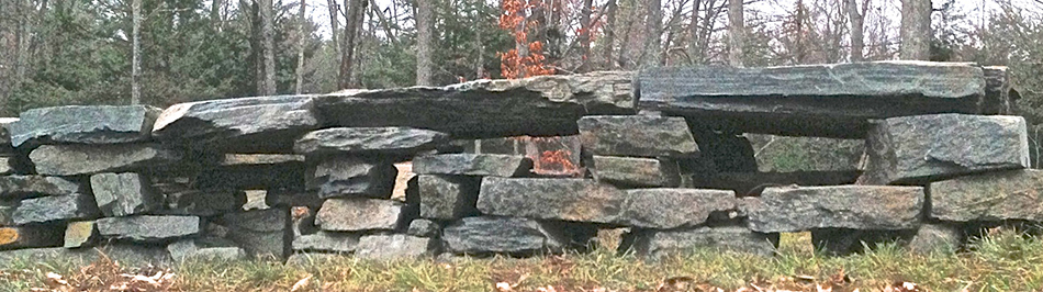


 Pixelized drawing of same:

 But the Swiss mountain maps - and many other data visualizations - can be extended by moving in time
and eventually on 4K or 8K displays. In our video below, note how panning over the Swiss mountain maps
creates a 3D-reading of the mountains, along with some lovely accidentally-separated-slightly-floating type
and a spectacular elevated effect for what may be a ski-lift.
These effects resulting from slow panning repay study:
gentle 3D readings (without contraptionary apparatus) as well as
subtle separations of type/data from other design elements
(without using annoying flashboxes or popups for type/data).
An excerpt from our documentary film
But the Swiss mountain maps - and many other data visualizations - can be extended by moving in time
and eventually on 4K or 8K displays. In our video below, note how panning over the Swiss mountain maps
creates a 3D-reading of the mountains, along with some lovely accidentally-separated-slightly-floating type
and a spectacular elevated effect for what may be a ski-lift.
These effects resulting from slow panning repay study:
gentle 3D readings (without contraptionary apparatus) as well as
subtle separations of type/data from other design elements
(without using annoying flashboxes or popups for type/data).
An excerpt from our documentary film 


 "North America's best sculpture park: Edward Tufte's Hogpen Hill Farms"
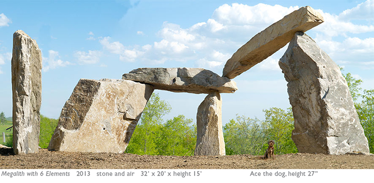


 Triptych, steel series #5, 2013, about 5 x 10 x 1.5 feet


 Ken Carbone,

 Ken Carbone + ET at my Little Steel Horse, mocking the long history of bilaterally symmetric sculptures of Dear-Leader-on-a-Big-Pedestalized-Horse. Little Steel Horse, made from an anvil and the jaw of a vise, sits atop a 30-ton stone pedestal and watches over all of Stone Mountain. 20th-century sculpture happily escaped bilateral symmetry and often sat, now depedestalized, directly on the earth. Near the end of my

 Images above were taken by
 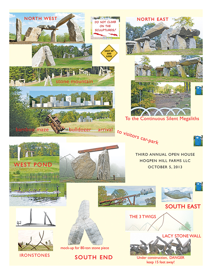 Photographs below are by Fredrick K.Orkin.
Continuous silent megalith, a structure of unknown significance.
2012-2013, native stone and air, 300 x 30 x height 16 feet, or 90 x 9 x height 5 meters, flows along on top of a local ridge.
The entire artwork is devoted to contemplative seeing beyond words, and visitors are requested to remain silent when within sight of the stones. It is constructed entirely of stones found on the farm. Many of the found stones are split to reveal fresh fractured cubist arrangement. Airspaces are constructed and worked by adjusting the stones as the local configurations are created and revised.
Photographs below are by Fredrick K.Orkin.
Continuous silent megalith, a structure of unknown significance.
2012-2013, native stone and air, 300 x 30 x height 16 feet, or 90 x 9 x height 5 meters, flows along on top of a local ridge.
The entire artwork is devoted to contemplative seeing beyond words, and visitors are requested to remain silent when within sight of the stones. It is constructed entirely of stones found on the farm. Many of the found stones are split to reveal fresh fractured cubist arrangement. Airspaces are constructed and worked by adjusting the stones as the local configurations are created and revised.

 Three infrared images of the
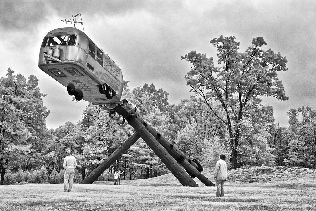
 Airstream Trailer Interplanetary Explorer, with a big stainless steel
  Airspace, 14 feet height, aluminum petals, luscious reflections in pond.
Saturated-color/infrared images adjacent, then rotated upside down:
Airspace, 14 feet height, aluminum petals, luscious reflections in pond.
Saturated-color/infrared images adjacent, then rotated upside down:

 Fred Orkin's infrared photograph combines the textures of the


 Black swan boat at pond.