Philosophical Diamond Signs

When visitors come up the long road to the sculpture fields, on the way they encounter this undiplomatic diamond sign.
Here’s why:
“The great, big thing is to try to devote most of one’s brain-processing power to the seeing. Studies of cell phones and driving automobiles demonstrate that people don’t do very well in seeing where they’re going when they’re talking. Intense seeing, intense focus requires a self-serenity and also serene environment. And in that way, all the brain’s processing power can be into seeing.
“I had this experience, almost a magical experience. Out walking on our farm by a long stone wall, I said to my friend, let’s not talk. And after about five minutes, you first hear the internal sounds produced by the inner ear. And then, after a while, you hear things, just the slightly rustle of leaves. But what happened to seeing after 10 to 12 minutes of just seeing – not talking, not doing anything else – was the ambient light became nearly perfect. That perfect light for photography, filtered light from the sun, and shadows under the trees now didn’t blow out to dark, and the brights from the snow don’t blow out to white.
“The ambient light hadn’t changed, but rather the seeing had changed. Because all brain power was devoted to seeing, it was if you were creating your own improved light.”
Edited from NPR – Edward Tufte wants you to see better
In addition to the blunt “Shut up and look” instruction, most subtle prompts are being deployed. For example, a series of 30 megaliths are called “Continuous Silent Megaliths: Structures of Unknown Significance,” to suggest to viewers that they should be as silent as the stones. And, some more subtle diamond signs will show up at our Fourth annual open house late this September at Hogpen Hill Farms:
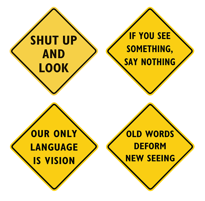
PHILOSOPHICAL DIAMOND SIGNS
Using the format of diamond signs that provide alerts and warnings about the road ahead, this series of works on canvas shows philosophical alerts, imperatives, and thoughts about the path past and future.
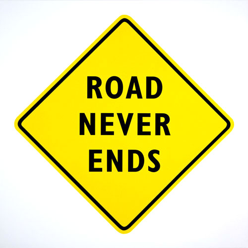
Edward Tufte, Road Never Ends, print on canvas, 29 ½” x 29 ½”, edition of 3
This all started with real diamond signs made by a traffic sign company.
I placed them along a curved road leading to my sculpture fields. The words are those of Ad Reinhardt and suggest the wonders of the pure domain of art-as-art.

Then, 3 prints on canvas:

Edward Tufte, Art is Art And Everything Else Is Everything Else, 3 prints on canvas, 29 ½” x 29
½”, edition of 3
Below, from The Whole Earth Catalog, and, later, in the conclusion to Steve Jobs’ commencement address at Stanford University. A good thought for some, but inappropriate advice for all the 22 year-old graduates who seek to become investment bankers:
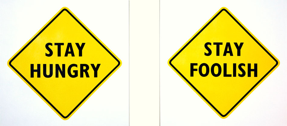
Edward Tufte, Stay Hungry, Stay Foolish, 2 prints on canvas, each print 29 ½” x 29 ½”, edition of 3
Stevie Smith, from her poem, Not waving but drowning.
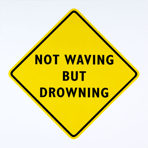
Edward Tufte, Stevie Smith, Not Waving But Drowning, print on canvas, 29 ½” x 29 ½”, edition of 3
Below, there are many variants of the just-show-up advice.
While making a movie, Woody Allen reportedly wears these words on a tee-shirt.

Edward Tufte, Just Show Up, print on canvas, 29 ½” x 29 ½”, edition of 3
Below, a more optimistic play on “Road Never Ends.”
From a rowdy bar song by Robert Earl Keen, a Texas bluegrass singer and song-writer:

Edward Tufte, Forever Road/Party, 2 prints on canvas,
29 ½” x 29 ½”, edition of 3
Among the galleries in Chelsea, about one-third show amazing works of great artists, another third show new artists, and the last third show art that looks like art (or sophisticated kitsch).
Below, from Dwight Macdonald’s esay “A Theory of Mass Culture:”
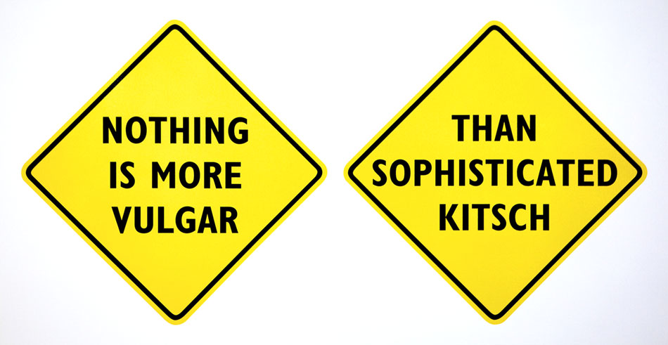
Edward Tufte, Sophisticated Kitsch, print on canvas, 60″ x 29 ½”, edition of 3
There are more philosophical diamond signs to come.
Until then:
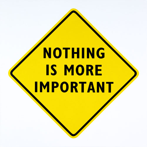
Edward Tufte, Nothing is More Important, print on canvas, 29 ½” x 29 ½”, edition of 3


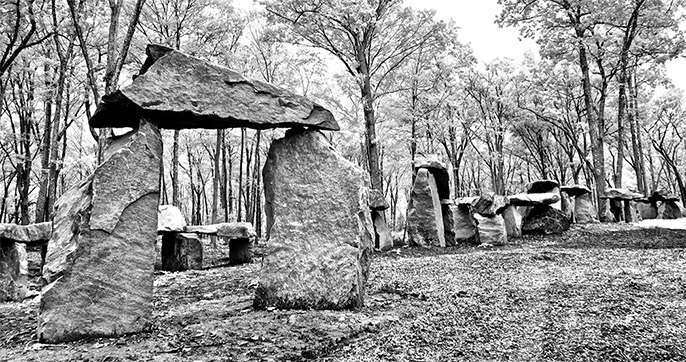
Beautiful!
The juxtaposed signs, “Nothing is more vulgar” and “Than Sophisticated Kitsch” present a playful oxymoron. The flip sides of both of these signs may present the snake biting its tail to become a wheel. The wheels of Progress and Change are fueled by emulation, which become vulgar and kitsch in their wake. I have always enjoyed the play of words, especially when framed in signs, graphics, prose or thought bubbles. It must be a sign!
And from Woody Guthrie:
As I went walking I saw a sign there
And on the sign it said “No Trespassing.”
But on the other side it didn’t say nothing,
That side was made for you and me.
see:
http://en.wikipedia.org/wiki/This_Land_Is_Your_Land
Here are drafts of some new diamond signs, with extended format possibilities.
Edward Tufte
Edward Tufte, Complicated: yellow, print on canvas, 29 ½” x 29 ½”, edition of 3
Edward Tufte, Complicated: black/purple, print on canvas, 29 ½” x 29 ½”, edition of 3
Edward Tufte, Complicated: red, print on canvas, 29 ½” x 29 ½”, edition of 3
Probably the shortest true statement that can be made about causality and correlation is “Empirically observed covariation is a necessary but not sufficient condition for causality.” Or possibly “Correlation is not causality but it sure is a hint.” Or possibly this:
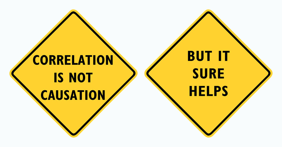
Edward Tufte, Correlation/Causation, print on canvas, 52 ¾” x 27 ½”, edition of 3
Near the beginning of a 3/4 mile farm road winding up a hill:

Then the ART-IS-ART sign sequence appears on a curve in the road at Hogpen Hill Farms, a tree farm and sculpture field in Connecticut. Here are 3 real diamond signs in action:
Edward Tufte, No Poshlust, print on canvas, 29 ½” x 29 ½”, edition of 3
Edward Tufte, Poshlust, print on canvas, 32″ x 32″, edition of 3
The colors (and shape) of the sign silently communicate an idea prior to the users
interpretation of the words / symbols. Human’s prioritize interpreting the importance of this information based on severity.
conventionmeaningsilent prefixexample
text

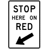
stopforbidden”no…”
textwarning”watch
out…”
textdirectionlaw”law…”
“must…”
text
labelguide”this is…””you should know…”
“Reading” the communication of these pieces is interesting:
Using different sign conventions we can communicate:
…some alternatives I particularly like:
…I had this sign fabricated using conventional us highway sign colors and
font/lettering… (It has not yet been mounted in the wild). It is communicating
“you should know…
PROUD OF YOU”
daytime
night time
night time in headlights
Eric DeFazio’s comments are very thoughtful.
For now I’ll probably stay with diamond (warning) signs, although the green sign message is promising. My warped and oddly-colored signs are the beginning deviations from the tradtional square yellow/black diamond signs.
Regarding the ‘Art Is Art’ sequence along the sculpture field road, I wonder if NASA would ever consider posting Feynman’s admonition from the Challenger Report (“For a successful technology, reality must take place over public relations, for Nature can it be fooled”) along the access roads to their facilities in such a format.
Edward Tufte, Nature Cannot Be Fooled, print on canvas, 78″ x 27 ½”, edition of 3
Indeed. Perhaps most engineers would benefit from reading this sequence on the way to work every day (myself included!).
It may be the difference between US and British English, but I don’t think the three diamonds capture the essence of Feynman’s admonition. I have always interpreted his statement as: “For a technology to be successful, public relations must take second place to reality, because nature cannot be fooled.” The diamonds seem (to me) to say something slightly different: “A successful technology makes public relations irrelevant because nature cannot be fooled.” The problem to me is the word “trumps”: it does not carry the full weight of the phrase “must take place over.”
Donald Knuth has an abiding interest in diamond-shaped road signs. See his chapter on them in Selected Papers on Fun & Games and his webpage http://www-cs-staff.stanford.edu/~uno/diamondsigns/diam.html
(Serialized messages on road signs somehow make me expect the punchline “Burma Shave.”)
Reality Precedes Public Relations
If I remember correctly, the following quote is from James Michener. I looked for an authoritative reference, but I couldn’t find one. It is insightful, pithy, and perfect for a philosophical diamond sign:
“History Tailgates”
Back in about 1968 friends of mine painted the phrase thusly “This is the way the world ends” on the surface of a rather flat bolder in Cascadilla Creek on the Cornell campus. This rock was virtually always covered by flowing water, crisp and always clear, except in midsummers on in full droughts (very infrequent).
So it was located directly beneath one rail of the heavily traveled campus foot, bus and car trafficked Triphammer Road bridge – clearly visible to thousands every day, should they look down into the gorge (about 200 feet from bridge to water at that point), and many did so.
Its appearance was simply ‘perfect’ in its simplicity and unpretentiousness. Located at the bottom of an unprotected fall of hundreds of feet, to many viewers it would have evoked a visceral lump in the throat as the cognitive process elicited a physical response. Covered by what everyone knew was alway cold mostly spring-fed water, it also elicited some mental confusion: how could anyone have created this – it was NOT THERE last night! – in the absolute dark at the bottom of a narrow, deep gorge; how paint it underwater, how could it dry before the water was allowed to cover it by daylight, or was it made from some kind of very special ‘paint’ so it required no protection from the flow at all? etc. etc.
Ah, college campus pranks – amazing bursts of unbridled creativity ! … and this one done in secret subsequently revealed to us, his friends, by our fellow architecture classmates, class of ’69. What fun the world is!!!
P.S. I could not find it image on the web, and can’t reach its primary author (who might have an old scanned photo handy) due to his traveling.
Edward Tufte, No Poshlust
Edward Tufte, Poshlust,
29 ½” x 29 ½”, edition of 3
32″ x 32″, edition of 3
Douglas Adams wrote of a beautifully existential diamond warning sign he often saw on the highway outside Santa Fe, New Mexico. It read “Gusty Winds May Exist.” Indeed. (I live in NM, and these signs are still common here. I expect a Google image search would find examples.)
A handy resource for building one’s own signs with the ‘official signage’ look is St. Claire’s Safety Sign Builder [http://www.stclaire.com/safety_sign_builder/ssb-panel.php]
It’s not much to look at, but if you take advantage of the ‘View Catalog’ buttons, you’ll be a master of ironic signage in no time.
This sign, erected at hundreds of thousands of French roundabouts after they changed the rules of right of way, always seemed to me to have a deeper meaning.
https://www.flickr.com/photos/37643380@N07/7856067154/