Popular Music: The Classic Graphic by Reebee Garofalo
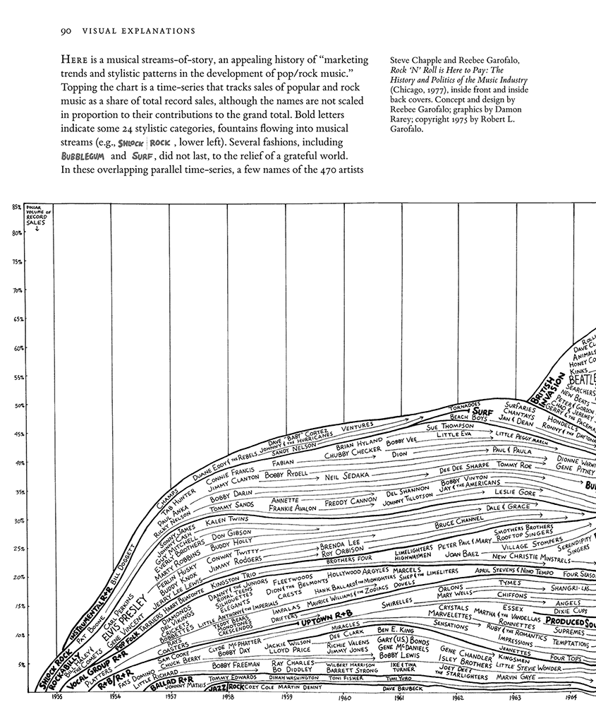
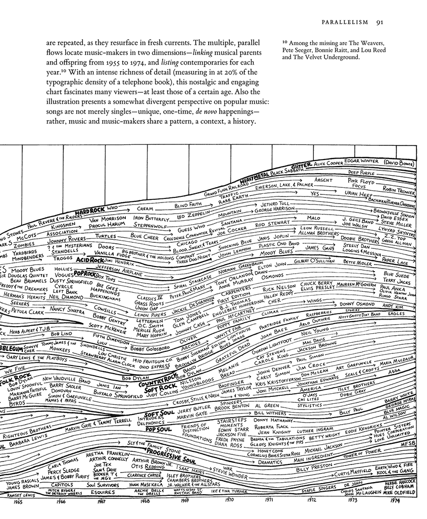
The wonderful visual history of pop/rock music by Reebee Garofalo, featured in my Visual Explanations (pp. 90-91), is now available as a big poster at HistoryShots, the distinguished publisher of many excellent graphic prints.
For Reebee Garofalo’s life and work, as well as an electronic version of the pop/rock music chart, look here.
Here is HistoryShots’ description of their new 36 by 20 inch poster:
This print is a reproduction of Reebee Garofalo’s Genealogy of Pop/Rock Music chart which has been praised by many scholars and fans alike.
Covering the time period from 1955 to 1978, more than 700 artists and 30 styles of music are mapped in currents flowing from left-to-right. For each performer, the length of time that he/she remained a major hit maker is provided. The overlapping streams allow you to compare the longevity and influence of multiple artists for the same time period. The birth and genealogy of each stylistic category is presented, along with an estimation of its share of total record sales.
Genealogy of Pop/Rock Music is referenced in Edward Tufte’s Visual Explanations: Images and Quantities, Evidence and Narrative (Graphics Press): “With intense richness of detail, this nostalgic and engaging chart fascinates many viewers … Also the illustration presents a somewhat divergent perspective on popular music: songs are not merely singles — unique, one-time, de novo happenings — rather, music and music-makers share a pattern, a context, a history.”
This print is printed on high-quality, fine art, acid-free archival paper. It was printed on a Heidelberg offset press. In addition to the four-color printing process, each print is sealed with aqueous-satin coating to provide further longevity.
Credits: Concept and design: Reebee Garofalo. Graphics services: Damon Rarey and Jean Nicolazzo


Here are the pages from Visual Explanations:


Excellent news! I just ordered the print since it is one of my all-time favorite graphics. This chart tells a detailed story of artists within the context of music categories (clearly-depicted patterns), within the big-picture context of real data (sales volume vs. time). This graphic was one of the inspirations for work I am doing in project management graphics (area charts). I am using “earned value management” (EVM) data sets for project story-telling. My prototype software also features animation akin to weather radar maps, so the data density is extremely high. Unlike the music chart, though, I have scaled every detail according to the data. Thank you ET!
Status on the Genealogy of Pop/Rock Music print.
The press run was completed this morning and the prints look great. We’re going to let the ink dry for a few days then we’ll be shipping out the first copies on August 15th.
It was a great pleasure working with Reebee on this new reproduction of his graphic. Our goal was to preserve the appealing design of the original while providing a few enhancements in the overall presentation. We set the music style titles in a different color from the artist names; a gray ink was used for the artist names (note, the ink colors below do not accurately reflect the printed colors); and the arrowhead lines were cleaned up a bit.
Larry from HistoryShots
Congratulations!
ET
The published poster, which I’ve just seen, is wonderful.
In a similar vein, can anyone help me find the origin of several rock/pop tree-style genealogy charts giving links between artists and bands? These were hand-lettered, single-color charts – I believe I saw them in a Yes anthology and a Crosby, Stills and Nash anthology. Perhaps not as elegant in terms of information presentation, but still lovely items.
Thank you!
Jessica, I suspect you may be refering to Pete Frame’s work.
A re-creation of Garofalo’s work (apparently done without advance notice to Garofalo) at Boston’s Institute of Contemporary Art.
[Note added by ET: Turns out also he borrowed my text about the graphic–and got it into the Whitney Biennial. See below.]
At the 2004 Whitney Biennial, Dave Muller’s collage knocked off Reebee Garofalo’s rock-and-roll history chart–along with my text and sidenotes from Visual Explanations.
Source: Whitney Biennial picture: Art in America, June/July 2004, p. 75.
Here are copied pages (90-91) from my book Visual Explanations:
I don’t have any particular problems with this sampling since Muller’s collage spreads the news about Garofalo’s classic and my analysis. Artists and sign-painters, unlike scholars, do not footnote their borrowings. And I finally got something into the Whitney Biennial!
Here is an example of one of the large and very detailed Rock Family tree graphics drawn by Pete Frame. These had been mentioned earlier in this topic. This one has a personal connection for me. It describes the hugely energising creative outburst of bands that happened in Liverpool UK in the early 1980’s and centred around the famous Erics club, which opened on October 1, 1976 in a building basement on Mathew Street opposite The Cavern Club where The Beatles had played.
Pete Frame had this to say in his graphic;
I lived locally and went to Erics and other clubs around Liverpool often enough to have seen or heard of most of the bands or people on this graphic.
Below I show a zoomed in region of the larger graphic that shows the links between the bands Echo & the Bunnymen, the Teardrop Explodes and Bill Drummond (who famously set up the KLF and burned a million pounds as a piece of conceptual art). In late 1979 I saw Echo and the Bunnymen (complete with Echo the drum machine) support The Teardrop Explodes at Chester art centre.
The volume of information that Frame encodes in these family trees and his method of mixing both temporal information with the musical and personal threads is impressive.
My question about this chart would be: how is this kind of graph be called? Specifically, how is this variant of a flow chart (more precisely spoken: of a Sankey diagram) be called when all the white space between branches is removed and the remaining areas form a stacked area graph (however, the areas can split and join again)?
Is there already an established name? Maybe “stacked area flow graph” would be the canonical name.
Also, are there other published examples of this kind of graph? (There are many Sankey diagrams with a time axis but the step to turn the Sankey diagram into a stacked area graph appears to be very uncommon.)
I would appreciate any answer or comment about this question.
For a long time most work about data graphics was organized taxonomically, a list of nouns: a chapter on the dreaded pie chart, then the bar chart, then the line graph, the stacked pie chart, and so on. Not so good, concentrating of the mode of production all the time rather than on data and reasoning about data. Also the name-based analysis of graphics leads to segregation of material by its mode of production. Usually such nouns fail to generate graphical principles.
Better to have principles: maximizing content flow, minimizing format attention, showing causality, making comparisons, eliminating distinctions among modes of productions, and so on.
Better to conceptualize displays in terms of verbs or content or intellectual tasks associated with reasoning about content. So the name of this display is The Ocean of the Flowing Streams of Story of American Popular Music 1955 to 1975.
Another relatable example: Ishkur’s Guide to Electronic Music. It’s a flash-based mapping of the chronology and relation of many forms of electronic music; each node in the graph has samples of the particular genre.
Note: it’s a highly opinionated, sometimes inaccurate work by a single author, as noted in its Wikipedia article. Still an interesting illustration extending Garofolo’s thought of a chronological music genealogy.