Scientific visualization: evidence and/or fireworks
My book Visual Explanations: Images and Quantities, Evidence and Narrative (1997) (with a cover featuring a video still from a scientific animation) suggested some ways of turning flashy visualization solutions (looking for some problems to solve) into credible scientific evidence:
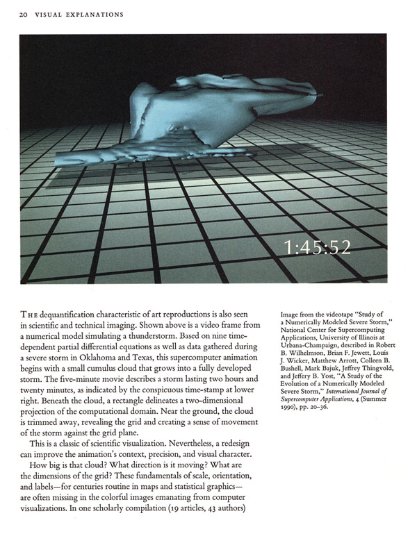


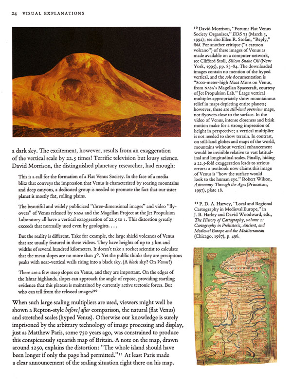
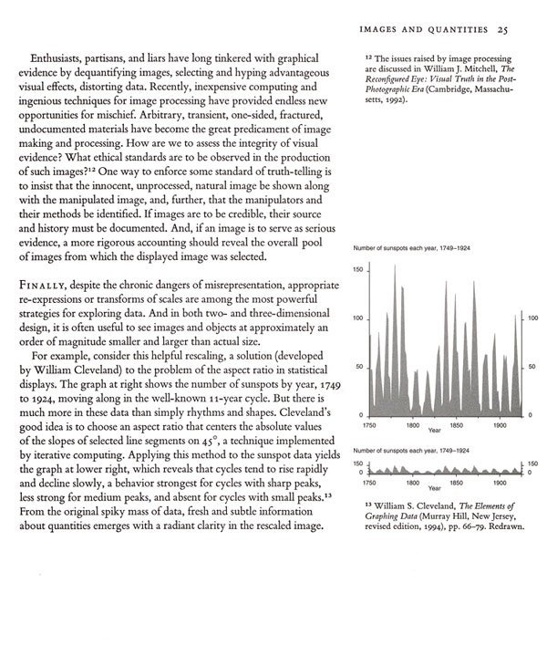
My discussion above deliberately concluded with a brilliant visualization of scientific data by William Cleveland, which indicated how new findings could be achieved by thoughtful visualization.
One look at the current state of the art in scientific visualization was published recently in Science 313 (22 September 2006), 1729-1735:
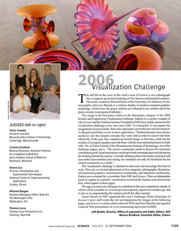
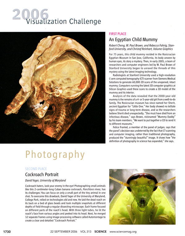


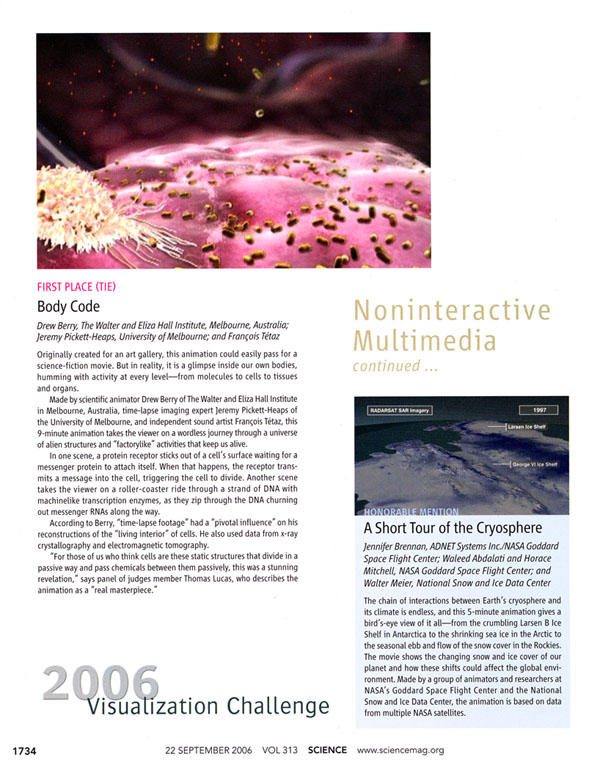
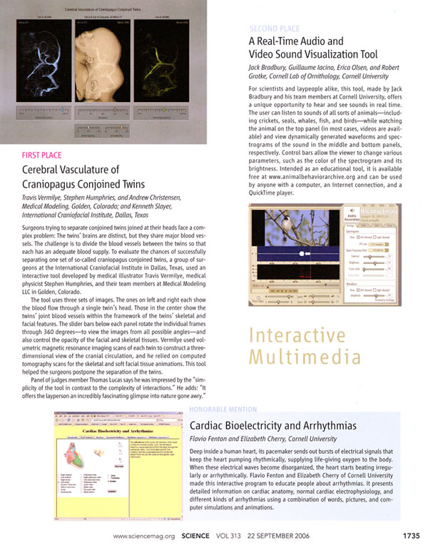
Further information on the Science project is available at www.sciencemag.org/sciext/vis2006
What, then, is the state of scientific visualization on the basis of the Science report?


Here is a link to a page on scientific visualization (as a session in a history of computer graphics course): http://accad.osu.edu/~waynec/history/lesson18.html
I looked at the prize-winning mummy image. I read the blurb, kept looking at the image, and found questions and frustrations at every turn. What does the sarcophagus look like? How big is it? How big is the skeleton inside? Apparently it’s a child mummy, but how does it compare to an adult mummy? Where was it found? What does it tell us about its Egyptian context? How do you know it’s from a “well to do family” — the mere fact that the person was mummified? There are no “tell tale” traumas, but we wouldn’t know from the image. In fact the image says nothing about any of the claims made in the blurb.
The Hawaiian mountains caught my eye: but again frustrations: a full page of high resolution printing to extravagantly point out the somewhat trivial fact that the Hawaiian mountains are higher above the sea floor than Everest is above the sea. It doesn’t even put Hawaii next to Everest to let us compare. Instead it strings out other Hawaiian mountains around a perspective-distorted curved earth, preventing easy comparison. As for the hot-spots and aging volcanoes: again, where is the plot of rock age against distance from Hawaii? What about other volcanic ranges on the earth? Are there any? If so, do they exhibit the same feature? Of not, why is Hawaii unique?
These two visualizations act like PowerPoint grunts: no evidence, no comparison, no causality. Pure technological glitz.
As for the glass-ware: interesting shapes, but is it science? ET’s final chapter in Beautiful Evidence is on the right track, I think. For mathematical shapes, physicality offers an escape from flatland. I saw some excellent examples of such escapes in Sydney a few years ago; the sculptures of Helaman Ferguson: http://www.helasculpt.com/index.html
Richard Palais’s application of an artisan’s craft to pure math is deeply satisfying and his online gallery has many more visualizations.
Nils Sparwasser, who led the Hawaii mountain team, has an online gallery and a new book, Mountains from Space, which Amazon has on discount. One must wonder if he has Imhof’s books.
The credit for the radiology images really should have gone to the open source community that has done such an incredible job with the DICOM radiology standard: OsiriX, Dicomworks, etc. I would have to see technical details for the images, but my sense is these particular imagers got their awards more because of their access to particular subjects than any profound ability to design with imaging software, although they may be quite remarkable people in their own rights. By comparison, will
Science magazine start giving visualization awards for Photoshopping scientific images?
The Flavio Fenton’s cardiac biolectricity tutorials are hardcore modeling and it opened my eyes to what a torsade de pointes arrhythmia really is.
Caryn Babaian’s anatomy chalkboard drawing is wonderful, but I would recommend against medical students focusing on artistic accuracy in their drawings. Anatomy classes seem to have a rich, intense first day experience as part of their culture. The students, however, should first worry about spatial organization, nodal analysis, mechanics, embryologic development, and rapid recognition of structures. Drawing a humerus to scale is not the best use of time. It’s better than nothing, but make sure you have the logical schema down first.
I particularly like David Yager‘s green bug because I described the same technique (and surely many others did before I) in the first post I made on this forum.
I can’t think of anyone involved in air control who would need Aaron’s airspace maps, though I can see why some might want them for their mesmerizing patterns.
The Walter and Eliza Hall Institute has a strong history of supporting informative structural and cellular biology animations, but I have learned more from Xvivo.
I haven’t gone through the ornithology site yet, but here’s a direct link to their ‘browser‘.
Here’s the Mona Lisa project’s flash page.
The only thing I can find on Curtis Dubois is that he may have designed this CD cover.
Didn’t find a page for the material informatics group.
Overall, the competition seems to have been more about confections that reasoning about in the real, work-a-day world, and the awards to the radiologists over the programmers illustrates that.
The Short Tour of the Cryosphere movie (an honorable mention in non-interactive multimedia) is downloadable from the NASA Goddard Space Flight Center Scientific Visualization Studio site.
I haven’t del.ic’d all of them, but of the six I did, three had not yet been submitted to del.icio.us (cryosphere, bird sounds, and flight patterns); presumably the tally for other social networking sites will be even lower.
Should Science have submitted the sites for the winners? What would happen if journals got in on the social networking action? Do the sites have the ability to recognize journals in the same way they recognize heavy-hitting contributors (like anonymgrl on reddit)? Some medical journals have jumped on the Google Co-op, but they seem to only generate links to their own work.
I recently attended your seminar in Indianapolis and per your suggestion for critique, I would like to post one of my company’s scientific renderings for comments, criticisms, critiques, or anything that could help aid the improvement and understanding of our illustration(s).
Nanopore Rendering Link
This image (above link) was created for a Nanotechnology researcher at Purdue University. He provided us with several reference images and academic papers to help aid the accuracy of the image. We were in contact with the researcher throughout the production of the rendering to make sure that he was satisfied with the results.
Now we would like to get everyone’s honest opinions.
Thank you very much!
Most of the winners of the visualization challenge are pure eye candy, but do not reveal a whole lot about the things they depict. They certainly work great as magazine covers, but are not visual tools that researchers use. Scientific visualization can also do much more today, but is generally not nearly as pretty.
I wrote a critique of the 2006 contest when the results were published. Especially the overall winner is a bad choice, because it does not show much information at all. There are much better ways of showing surface structures than shiny surfaces and ray tracing. Also, I keep wondering about visualization in mathematics. Even if I can see the surface well, what does that tell me about its properties? Are there really no better visualizations of the richness of these mathematical constructs?
Compare the Science award winners to Mark Hill’s ink-on-paper animations of one of the more challenging spatial concepts in medicine, the embryogenesis of the heart. The sequence is roughly left to right top to bottom, but you can imagine that ventricular septation is in fact starting as realignment occurs. In the realignment video, pay particular attention to the septation of the orifice between the atria and the back wall of the as yet undivided ventricles. As an aside, it’s quite clear his webpages have handwritten HTML.
Heart Looping (451Kb)
Atrial Septation (995Kb)
Realignment (306Kb)
Ventricular Septation (646Kb)
Hi ET,
Thought your readers may enjoy “Cosmic Imagery: Key Images in the History of Science” by John D. Barrow. Published in the UK earlier this month.
This has hundreds of iconic “images” (actually visual explanations of one sort or another) that have helped define science over the past 500 years. Each image is accompanied by a vignette by Barrow on why/how/when the image was useful. I am personally fond of the images/explanation/impact of Kekule’s dreaming of both linear C-C chains but also his dreaming of cyclical molecules and the famous Benzene ring.
Best wishes
Matt
Compare the winners of the prizes above to the incidental sighting of ovulation in progress, caught by a surgeon with a laparoscopic camera. This has been speculated about for centuries; the most common thought was that the event is a sudden rupture. The surgeon, a gynecologist, reported this took about 15 minutes. The shaft of the surgical instrument is probably 5 mm. The alternative is 10 mm, but that seems a bit large. Those are the most common diameters for this sort of surgery.
Dear Professor Tufte,
I attended your one-day workshop in Arlington earlier this month. During it, you mentioned Nature magazine as an exemplar in portraying scientific evidence and data. On Apr 12th, Nature’s longtime editor, Sir John Maddox, died. The obituary (http://www.economist.com/science/displaystory.cfm?story_id=13525812&CFID=53733653&CFTOKEN=77036648) notes many innovations that Sir John made to the publication and scientific journalism as a whole. Do you (or any of your readers) know what influence he had in how Nature showed scientific data?
Many thanks,
Russell Smith
I am sure the readers and Prof Tufte could contribute helpfully to the important graphs presented in CDC’s weekly update on “Novel Influenza A (H1N1) Virus Infections – Worldwide, May 6, 2009” http://www.cdc.gov/mmwr/preview/mmwrhtml/mm5817a1.htm
At first blush the labeling, colors, frames and line weights on the bar charts all seem to be candidates for improvement (directly on the data, more stark contrast between the probable and confirmed cases, no frames, lighter line weights).
The world map overplays the numbers in Canada since the whole territory is colored, when per capita, or per area might be a more useful measure. Given the numbers we are talking about, total number of cases = 1,882, we should be able to indicate every case easily in the ~300×570 pixel (>180,000 pixels) rectangle used for the world map.
Thoughts?
– Jeremy
In 1968 Nature vol. 217, page 1053, (author H. Mohri), Figure 1 plots the amino acid composition of nine different polypeptides beautifully. Each polypeptide appears as a 16-gon with the length of the distance from the center to each vertex proportional to the abundance of that amino acid. It is a snap to see that the protein of interest to the paper, placed in the center of the nine and solid black, is really different than some, just about the same as others, and closed but not quite the same as a third class. It is elegant and convincing. The data/ink ratio is ~ 1. I am curious whether Mohri invented this representation or if others had used it before. But in any case I thought graphic aficionados would enjoy this example.
Robert Weinberg, a prominent cancer researcher at MIT, submitted a manuscript to the journal Cell in 2011. The final paper has finished drawings, but his original sketches are in the author manuscript in PubMed. A real treat for anyone in the creative process. Unfortunately, they are tied up in a tiling program (like Google Maps) so I haven’t found a way to get the original scans yet.
http://www.ncbi.nlm.nih.gov/pubmed/22000009
A wonderful tour of the auditory system by Brandon Pletsch: http://youtu.be/46aNGGNPm7s
More at http://radiusmedicalanimation.com