Slopegraphs for comparing gradients: Slopegraph theory and practice
Slopegraphs compare changes usually over time for a list of nouns located on an ordinal or interval scale.
Many examples, the first from my The Visual Display of Quantitative Information (1983):
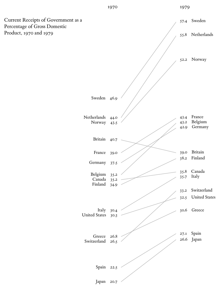
This table-graphic above organizes data for viewing in several directions. When read vertically, the chart ranks 15 countries by government tax collections in 1970 and again in 1979, with the names spaced in proportion to the percentages. Across the columns, the paired comparisons show how the numbers changed over the years. The slopes are also compared by reading down the collection of lines, and lines of unusual slope stand out from the overall upward pattern. The information shown is both integrated and separated: integrated through its connected content, separated in that the eye follows several different and uncluttered paths in looking over the data:
Such an analysis of the viewing architecture of a graphic will help in creating and evaluating designs that organize complex information hierarchically.
Source: Edward Tufte, The Visual Display of Quantitative Information, 158-159.
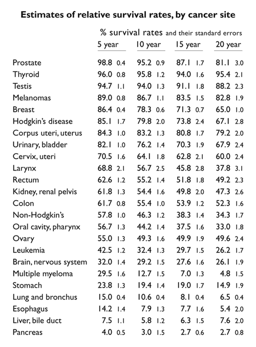
Below, a table showing cancer survival rates for 5, 10, 15, and 20 years.
Below, this table-graphic, a slope graph, gives a rough visual idea of time-gradients for survival for each cancer. Like the original table, every visual element in the graphic shows data.
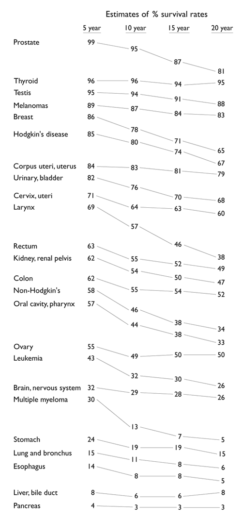
The slopes could also be sparklines showing how the detailed changes add up to the overall change.
Source: Edward Tufte, Beautiful Evidence, 174, 176.
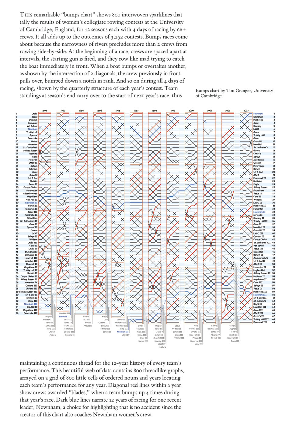
Bumps charts can also be considered slopegraphs. Here is a spectacular bumps chart from my Beautiful Evidence (2006) pages 56-57.
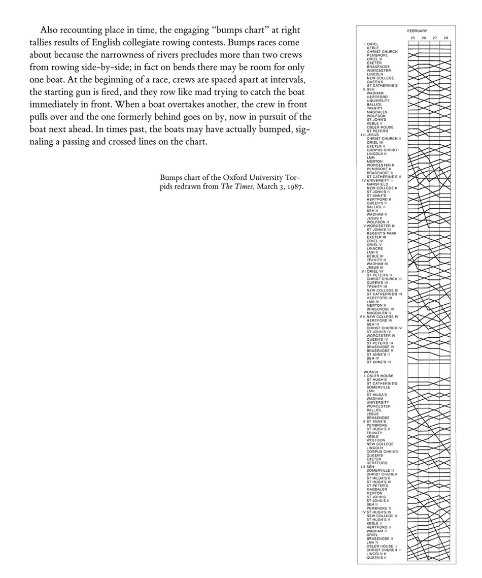
The 1987 bumps chart in my Envisioning Information (1990), page 111, also qualifies as a slopegraph.
Although it would be better to include at the right a shuffled list of nouns.
Can our Kindly Contributors provide other examples?
An obvious candidate is the slopegraph of the average life span in 1980 and in 2010 for 50 or so countries.
January 13, 2014
Slopegraph contest:
Two winners of slopegraph contest, each receives $600 + a set of 4 books
Pascal Schetelat
https://github.com/pascal-schetelat/Slope
Excellent design and interface, good documentation of program, use of color
Ben Concutere
https://github.com/concutere/sg
http://concutere.com/sg/sg.html
Excellent design, good documentation, colors, SVG
Thanks you all! ET and the small commitee of happy judges.
The two winners should get in touch with me at etscuplture ]a t} goomail etc write a program posted on github or as a Chrome app whose output closely replicates the (1) GNP slopegraph and the (2) cancer survival slopegraph immediately below. Necessary subtleties include thin gray lines that don’t crash into words/numbers, typeface Gill Sans or equally refined, tuned ordinal spacing of words at left with the line paths, probably best to make each line graph separately and then order and stack them appropriately to avoid too many line crashes. The idea is to compare slopes, with what are in effect a set of separate plots then ordered by first entry and then stacked with some optical care. User option: assign various clear but quiet colors to occasionally single out a few particular lines of interest. There should be a separate data-documentation box describing the source of the data, a link to the original data set, and the person directly responsible for the data and graph displayed. Much better if your code doesn’t require a lot of extra stuff/apps to run; best if it runs in modern browsers Chrome, Safari, whatever, or as a Chrome app.
You might notify us of your entry by going down to the bottom of this thread to the “contribute” and provide a link to your entry. We will also search the web for good slopegraph programs All this is not easy. But a successful easy-to-use implementation would be a great contribution to open-source statistical graphics. Slopegraphs focus on slopes, deltas, changes; have lots of data; and have a straightforward reading even to the statistically innocent.
$1200 in prizes arbitrarily awarded. thanks, et

Comparing the table of cancer survival rates with the slopegraph, there’s a big loss for a statistics-oriented reader: the standard errors.
This is easy to correct by adding them to the slopegraph, of course (perhaps in a smaller size, in parenthesis, under the number, as some journals require). But a possibility would be to put error bars on those numbers for which the s.e. is so large that the progression is really not significantly different from a straight line.
Another possibility—only in an interactive graph, not paper—would be for the error bars to appear on mouse-over the numbers, or some other interactive method. This would raise the ratio of representation complexity to data complexity, which I believe ET advises against (as does common sense).
A third possibility would be to use the lines connecting the numbers to indicate significance: perhaps a dotted line for non-significant differences. This, of course, would preclude significance tests across different types of cancer, but this is not the type of variable one has a choice over (it’s not like people get to choose which cancer they get), while differences in longevity are important.
I’m sure there are smarter ideas out there. I just like to have the SE whenever looking at statistical data.
JCS
ET reply to Jose Silva:
As the text notes, the data table and the slopegraph are colleagues in explanation not competitors. One display can serve some but not all functions.
So the solution is (1) a table for the data geeks (and the table is lousy for showing and comparing gradients) and (2) a gradient graphic for showing the percent survival and comparing the downward gradients. That is exactly what is done above.
There are also serious problems with standard errors: the assumption of independent observations, the assumption of sampling or randomization that is necessary for generating statistical tests, the assumption of spherical normality for statistical tests. Also the overall slope of the complete gradient (which is optically clear) requires an overall estimate not the point estimate of each 5 year group. Note also the statistical testing mess that results when the viewer compares overall gradients for multiple cancers.
The way to gain inferential credibility and cancer knowledge is not by standard errors but rather by some sort of independent replication on a fresh data set (such as European cancer data). If something were to be added to the gradient graphic, it might be to annotate some of the more interesting results, or replacing the gradient line with a survival year-by-year sparkline, or showing a second slopegraph for European cancer data.
Thanks for Jose Silva for raising the standard error matter.
ET
John P. Boyd in his notes on my display (with a slopegraph architecture) on decade changes in taxes/GNP for various countries suggests that the display resembles “level-crossing diagrams common in quantum chemistry and atomic physics.”
Can a Kindly Contributor confirm this and find a more detailed example in the research literature?
Thanks,
ET
“On being reasonable,” by Horace Dediu.
Note the log scale in the second graph.
Since slope or the gradient is an important component, it is critical, I believe, to use log scale. Using a normal scale would actually distort the rate of change and present a wrong comparative picture.
About the Quantum Chemistry orbital-crossing diagrams:
The most famous ones are the Tanabe-Sugano diagrams that can be used to predict the properties of metal ions that are surrounded by non-metals (H2O for example).
The y-axis is the energy of the possible states of the electrons around the metal ion. On the x-axis, we have a measure of how tightly the non-metal holds onto the metal ion.
If you’re familiar with electron energy level diagrams, you can take a vertical slice out of the T-S diagram to get the spacing of the familiar horizontal lines upon which you can place pairs of electrons, building up from the bottom. Crossings in the T-S diagram indicate that some states become more favorable than others at specific binding strengths.
Numbers above show the exact interweb download times and their big increases in the last 4 years. But the more subtle and relevant gradient is the relative rate of improvement by country. Looks like larger countries in land area roughly tend to have smaller recent gains in download times. (See discussion below about multiple gradient reading in the GNP chart and in the cancer rates.) Also US interwebs access costs more compared to other countries: Bloomberg
As Dilbert said “I can fail at any speed you like.”
Finally, slopegraphs tend to be getting very tall, to pick up relative (rather than just ordinal) positions of the ordering variable. That suggests taking logarithms of the ordering variable if it is varying in a multiplicative, rather than additive, fashion. On taking logarithms, see my essay.
The more general point in statistical analysis is that obvious things are statistically adjusted in order to make keener distinctions: in this case to see acceleration of the download speed improvements.
Inspired by the “Gender Comparisons” slopegraph contribution in the comments and driven to invention due to the lack of tools out there for creating slopegraphs, I tossed a bit of Python together as a skeleton framework for making simple slopegraphs; see my method here.
For things dealing with health, it’s true that showing percentiles is quite interesting as everyone is unique. It is a way to show the distribution of data quite nicely (even more interestingly than standard error bars)
The Body-Mass index curves or height/mass curves are quite interesting in that respect :
Showing the percentile is clearly interesting : not being on the average line is not a problem in itself, it’s being on the edge which is troublesome. It is also quite funny to see that similar curves for France are quite different.
In France, the growth is regularly checked and the points are reported in a book to be able to follow the slope as well as the absolute value for a given child compared to others. It enables to do some prevention and warn nutritionists if needed.
The idea of exploring the whole possible ranges for the data was also explored by Bret Victor in his up and down the ladder of abstraction article. His article is not based on statistics but questions quite deeply the way to present available data.
P.S. Both grids suffer from to heavily gridded data, and the color choice for the Body mass index is quite surprising : anorexia seems not to be a problem while overweight is labeled as such.
P.P.S. For slopegraphs used in chemistry and physics, it is called Walsh diagrams. In chemistry, it is usually used to compare two different geometries and determine which one is preferred.
Martin Verot’s contribution ties slope graphs to nomographs. This board has a thread on nomographs for those interested.
The top 100 baby names in England and Wales for 2011.
Go to The Telegraph website to use the ONS interactive explorer.
Source: http://www.telegraph.co.uk/women/mother-tongue/9472084/The-top-100-baby-names-in-England-and-Wales-in-2011.html
Edward Tufte, The Visual Display of Quantitative Information, pages 31, 116.
Edward Tufte, Envisioning Information, page 45.
Edward Tufte, Envisioning Information, pages 108 and 109.
My design of a bus schedule and route combines a graphical timetable with a route map overlaid on a precisely detailed aerial photograph, so much richer than the typical schematic diagram of bus routes. Hourly, daily, and weekly rhythms of the buses are clearly revealed, as well as details of each journey. During rush hours, lines densely crowd into spaghetti—but then service is so frequent that the jumble of lines informs the rider simply to show up, for there will be virtually no wait for whatever bus it is that arrives. The gray grid is set at ten-minute intervals in order to ease visual interpolation of the times of arrival. The aerial photograph unveils the area mostly at the level of house resolution, that is, with sufficiently fine details to show individual buildings. Indeed, the reaction of those who live in the area is to explore the photograph, personalizing the data, seeking to discover their own residence, school, or workplace. Same picture, but many stories.
This is an experiment in slopegraphs to see if one could enhance an otherwise excellent article by Jean M. Mitchell, Ph.D. last October in the NEJM. I would appreciate your comments. To align the labels and values with their slopes I used an old, stable LaTeX library by Eitan Gurari that I find does a wonderful job of drawing Finite State Automaton diagrams. This may seem like overkill for the current problem.
Amazing, interactive slopegraph by Carlo Zapponi. It shows the migration flow of people from a country selected by the user to related destination countries. Line thickness correlates to the relative proportion of emigrated people.
The earliest example I have found of a slopegraph is by Willard Cope Brinton from his 1914 volume Graphic Methods for Presenting Facts.
Upon further digging around, I have found this beautiful example from 1883, in Scribner’s statistical atlas of the United States, showing by graphic methods their present condition and their political, social and industrial development, by Fletcher W. Hewes and Henry Gannett. The Statistical Atlas for the previous census, published in 1870, did not have a plot like this.
It is available from the Library of Congress in high resolution and is worth having a good hard look at.