Sparkline > Steve Jobs > Andy Warhol in Google results
Sparkline appearances in Google results
A few years ago I made prankish comparisons of Google results for sparkline (a statistical graphic) with Andy Warhol (an artist). Andy Warhol and sparkline ran about even.
Now, below are the Google results from searches today 2011 July 11, 2:10pm EDT:
Number of Google search results:
Sparkline 74,300,000
Steve Jobs 74,000,000
Andy Warhol 25,900,000
From their beginning around 1996, I wanted sparklines to be open source and in the public domain. My benefit and great joy is to see sparklines widely used.
The Andy Warhol surge was partly facilitated by Google’s introduction of sparklines into their API data products in 2007.
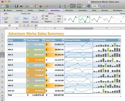
And the recent surge was largely produced by the 2009 introduction of sparklines into Microsoft’s Excel 2010. I am grateful for that.
Sparklines also now appear in Mac Excel 2011:


Origin, a first-rate program for scientific data analysis, introduced sparklines into their product about 3 years ago.
Here are examples from their current sparkline module in Origin 8.5 which shows some excellent sparklines used just like numbers and words in spreadsheets.
Source: http://www.originlab.com
I think you’re selling sparklines short 😉
The Steve Jobs search should be enclosed in quotes to exclude spurious Steve AND Jobs results. Similarly, Andy Warhol.
The revised results are:
sparkline 74,600,000
“Steve Jobs” 54,300,000
“Andy Warhol” 24,400,000
(2:50am GMT, July 12, 2011)
ET comment: the Google results numbers jump around a lot for all kinds of mysterious
reasons (different Google servers? time of day? initial caps vs. lowercase in names?
Google tailoring search result to user profiles?).
“Sparktweets” on Twitter as happily described by Jason Kottke at http://kottke.org/11/05/twitter-sparklines
Skepticism about sparktweets from Than Tibbets at http://thanland.com/notes/regarding-those-sparktweets/
Than Tibbets rightly criticizes the Wall Street Journal sparktweets, but perhaps some sparktweets can be rescued.
My view: if you’re doing Twitter, then sparktweets is about all you can do in regard to data graphics. So now and then a sparktweet will be better than nothing, but that’s all it’s better than (which is a short summary of Twitter in general, although is it amazing what now and then can be done in one 140-character sentence). Sparktweets are awfully low resolution and easily prone to data distortion. The solution: every sparktweet should be accompanied by the beginning and the ending number in the time sequence (which burns up 6 to 8 characters toward the 140 maximum, but with a great increase in data-presentation integrity). Sparktweets don’t measure up to real sparklines, however.
A few of the examples shown by Jason Kottke have decent resolution. For example, this clever baseball win/loss summary by Stu Spivack (which alas has to fold the last 7 games onto the third and fourth lines):