Sparkline theory and practice Edward Tufte
A sparkline is a small intense, simple, word-sized graphic with typographic resolution.
Sparklines mean that graphics are no longer cartoonish special occasions with captions and boxes, but rather sparkline graphics can be everywhere a word or number can be: embedded in a sentence, table, headline, map, spreadsheet, graphic. Data graphics should have the resolution of typography.
See Edward Tufte, Beautiful Evidence, 46-63.
Sparklines: recent finds
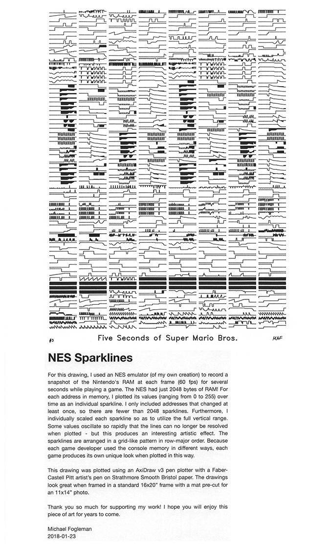
NES Sparklines
Michael Fogleman (January 23, 2018)
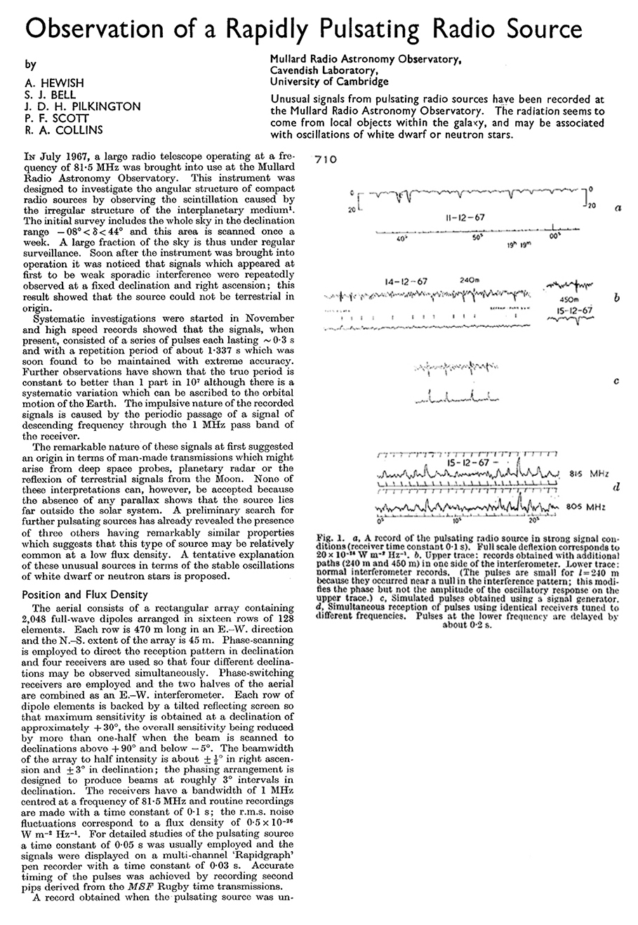
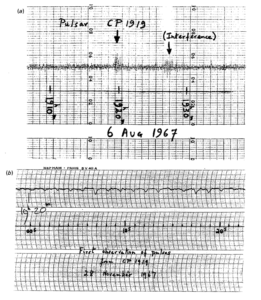
Pulsars and Sparkline-like graphics.
Nature (vol. 217, February 24, 1968)
Sparkline small multiple

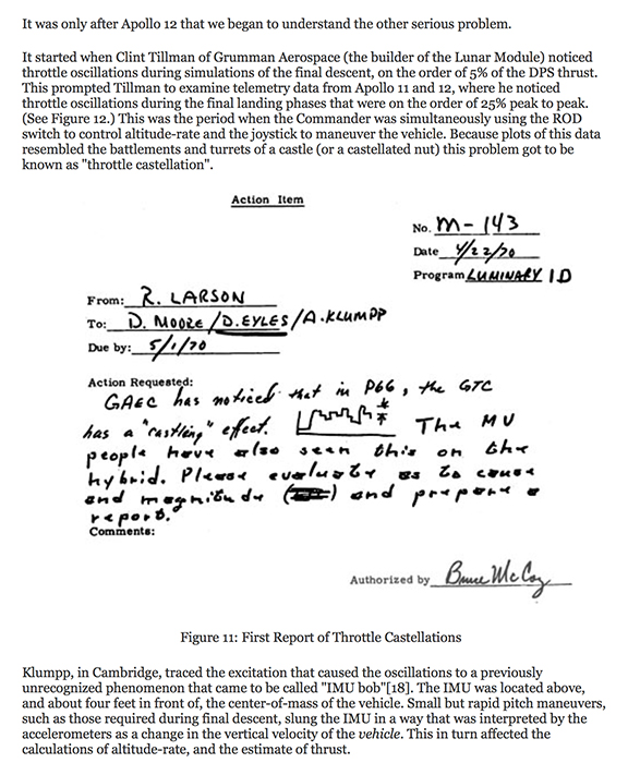
1970 NASA report of throttle problems in the Apollo Lunar Module.
Sparklines in Steven Heller and Véronique Vienne, 100 Ideas that Changed Graphic Design (Lawrence King Publishing, 2012), p. 196:

Apple Watch sparkline, announced September 9, good but should show more detail, more data texture.
Should have design minimization, not data minimization.

.@Mandiant used @EdwardTufte #sparklines to identify attacker activity. Watch No Easy Breach https://t.co/lQMQ6sSAcm pic.twitter.com/oFEFCDAqA6
— Richard Bejtlich (@taosecurity) September 27, 2016
Tutorial here for creating SVG-based sparklines with d3.js.

Implementing angular.js directives for d3.js and nvd3.js, tutorial here.

Below, sparklines in Twitter analytics, good but routinely longer time periods and more intense detail would be better.
General idea = max[data], min[design].

Diluting Perceptual Cluster/Streak Bias:
Informal, Inline, Interocular Trauma Tests
When people look at random number tables, they sees all kinds of clusters and streaks (even in random data). Similarly, when people are asked generate a random series of bits, they generate too few long streaks (such as 6 identical bits a row), because their model of what is random greatly underestimates the amount of streakiness in genuinely random data.
Sports, financial, and political reports are notorious for their narrative overreach, fantasizing about clusters, streaks, momentum, turning points, trend-spotting. The shorter the attention span of the reporter and the audience, the greater the faux trend spotting.
xkcd did this wonderful critique:
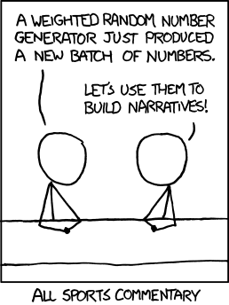
A General Manager of a professional NBA basketball team described to me this strategy for escaping over-storytelling in postgame analysis. When coaches watched the video of a game, they would often simply reinforce their prior story: “When we kicked the ball out of bounds twice in the first minute, that was the beginning of the end, we lost all momentum and never caught up…blah blah.” To overcome premature storytelling, the team did postgame reviews with the plays of the game in random order. This initially was intellectually taxing to viewers with preconceived narratives. In economics, autocorrelation is regarded as a plague. In sports, it is the main explanatory variable.
To dilute streak-guessing, randomize on time over the same data, and compare random streaks with the observed data. Below, the top sparkline shows the season’s win-loss sequence (the little horizontal line = home games, no line = road games). Weighting by overall record of wins/losses and home/road effects yields ten random sparklines. Hard to see the difference between real and random.
The 10 random sparkline sequences can be regenerated again and again by, oddly enough, clicking on “Regenerate random seasons.” This is looking a bit like bootstrap calculation. For the real and amazing bootstrap, applied to data graphics and contour lines, see Persi Diaconis and Bradley Efron, “Computer Intensive Methods in Statistics.”
The test of the 10 randomized sparklines vs. the actual data is an “Interocular Trauma Test” because the comparison hits the analyst right between the eyes. This little randomization check-up, which can be repeated again and again, is seen by the analyst at the very moment of making inferences based on a statistical graphic of observed data.
(Thanks to Adam Schwartz for his excellent work on randomized sparklines. ET)

Sparklines: Intense, Simple, Word-Sized Graphics
From Edward Tufte, Beautiful Evidence
The most common data display is a noun accompanied by a number. For example, a medical patient’s current level of glucose is reported in a clinical record as a word and number:
Placed in the relevant context, a single number gains meaning. Thus the most recent measurement of glucose should be compared with earlier measurements for the patient. This data-line shows the path of the last 80 readings of glucose:
Lacking a scale of measurement, this free-floating line is dequantified. At least we do know the value of the line’s right-most data point, which corresponds to the most recent value of glucose, the number recorded at far right. Both representations of the most recent reading are tied together with a color accent:
Some useful context is provided by showing the normal range of glucose, here as a gray band. Compared to normal limits, readings above the band horizon are elevated, those below reduced:
For clinical analysis, the task is to detect quickly and assess wayward deviations from normal limits, shown here by visual deviations outside the gray band. Multiplying this format brings in additional data from the medical record; a stack, which can show hundreds of variables and thousands of measurements, allows fast effective parallel comparisons:
These little data lines, because of their active quality over time, are named sparklines—small, high-resolution graphics usually embedded in a full context of words, numbers, images. Sparklines are datawords: data-intense, design-simple, word-sized graphics. Sparklines and sparkline-like graphs can also move within complex multivariate spaces, as in these 9-step sequential results (reading down the columns) in merge-sorting 5 different types of input files. Four variables and 18,000 numbers are depicted in these small multiples.
Below, Robert Sedgewick, Algorithms in C (Reading, Massachusetts, 1998), 353.
Sparklines have obvious applications for financial and economic data— by tracking and comparing changes over time, by showing overall trend along with local detail. Embedded in a data table, this sparkline depicts an exchange rate (dollar cost of one euro) for every day for one year:
Colors help link the sparkline with the numbers: red = the oldest and newest rates in the series; blue = yearly low and high for daily exchange rates. Extending this graphic table is straightforward; here, the price of the euro versus 3 other currencies for 65 months and for 12 months:
Daily sparkline data can be standardized and scaled in all sorts of ways depending on the content: by the range of the price, inflation-adjusted price, percent change, percent change off of a market baseline. Thus multiple sparklines can describe the same noun, just as multiple columns of numbers report various measures of performance. These sparklines reveal the details of the most recent 12 months in the context of a 65-month daily sequence (shown in the fractal-like structure below).
Consuming a horizontal length of only 14 letterspaces, each sparkline in the big table above provides a look at the price and the changes in price for every day for years, and the overall time pattern. This financial table reports 24 numbers accurate to 5 significant digits; the accompanying sparklines show about 14,000 numbers readable from 1 to 2 significant digits. The idea is to be approximately right rather than exactly wrong.
By showing recent change in relation to many past changes, sparklines provide a context for nuanced analysis—and, one hopes, better decisions. Moreover, the year-long daily history reduces recency bias, the persistent and widespread over-weighting of recent events in making decisions. Tables sometimes reinforce recency bias by showing only current levels or recent changes; sparklines improve the attention span of tables.
Tables of numbers attain maximum densities of only 300 characters per square inch or 50 characters per square centimeter. In contrast, graphical displays have far greater resolutions; a cartographer notes “the resolving power of the eye enables it to differentiate to 0.1 mm where provoked to do so.”2 ;Distinctions at 0.1 mm mean 250 per linear inch, which implies 60,000 per square inch or 10,000 per square centimeter, which is plenty.
On being “approximately right rather than exactly wrong,” see John W. Tukey, “The Technical Tools of Statistics,” American Statistician, 19 (1965), 23-28.
D. P. Bickmore, “The Relevance of Cartography,” in J. C. Davis and M. J. McCullagh, eds., Display and Analysis of Spatial Data (London, 1975), 331.
Here is a conventional financial table comparing various return rates of 10 popular mutual funds: 3
This is a common display in data analysis: a list of nouns (mutual funds, for example) along with some numbers (assets, changes) that accompany the nouns. The analyst’s job is to look over the data matrix and then decide whether or not to go crazy—or at least to make a decision (buy, sell, hold) about the noun based on the data. But along with the summary clumps of tabular data, let us also look at the day-to-day path of prices and their changes for the entire last year. Here is the sparkline table:
In our redesigned table, the typeface Gill Sans does quite well compared to the Helvetica in the original Times table. Smaller than the Helvetica, the Gill Sans appears sturdier and more readable, in part because of the increased white space that results from its smaller x-height and reduced size. The data area (without column labels) for our sparkline table is only 21% larger than the original’s data area, and yet the sparklines provide an approximate look at 5,000 more numbers.
Astonishing and disconcerting, the finely detailed similarities of these daily sparkline histories are not all that surprising, after the fact anyway. Several funds use market index-tracking or other copycat strategies, and all the funds are driven daily by the same amalgam of external forces (news, fads, economic policies, panics, bubbles). Of the 10 funds, only the unfortunately named PIMCO, the sole bond fund in the table, diverges from the common pattern of the 9 stock funds, as seen by comparing PIMCO’s sparkline with the stacked pile of 9 other sparklines below.
In newspaper financial tables, down the deep columns of numbers, sparklines can be added to tables set at 8 lines per inch (as in our example above). This yields about 160 sparklines per column, or 400,000 additional daily graphical prices and their changes per 5-column financial page. Readers can scan the sparkline tables, making simultaneous multiple comparisons, searching for nonrandom patterns in the random walks of prices.
“Favorite Funds,” The New York Times, August 10, 2003, p. 3-1.
Finally, the practical construction of sparklines requires thinking about their design and production:
Aspect ratio A graphic’s width/height ratio makes a big difference in displaying data. For all types of statistical graphics, the data-shape varies as the aspect ratio varies. Below, for 6 sparklines all showing the same data, note the substantial changes in shape as the y-scale increases by 25% for each line while the x-scale is held constant.
How should a sparkline aspect ratio be chosen? Like a narrow ribbon, sparklines have one long dimension and one short, as their wordlike shapes constrain their aspect ratios. This financial sparkline is 5 to 1,
the full baseball season is 20 to 1,
and DNA chromosome sparklines run about 300 to 1.
In general, statistical graphics should be moderately greater in length than in height. And, as William Cleveland discovered, for judging slopes and velocities up and down the hills in time-series, best is an aspect ratio that yields hill-slopes averaging 45°, over every cycle in the time-series. Variations in slopes are best detected when the slopes are around 45°, uphill or downhill. 5 To put this idea informally, aspect ratios should be such that time-series graphics tend toward a lumpy profile (below left) rather than a spiky profile (below right) or a flat profile. Both graphs here show the same data. The aspect ratio for this lumpy graphic is chosen in accord with the 45° rule.
The lumpy graphic reveals that sunspot cycles tend to rise rapidly and decline slowly, a behavior strongest for cycles with high sharp peaks, less strong for medium peaks, and absent for cycles with small low peaks. None of this is visible in the graph of spikes! Cleveland’s idea is essential for sparkline displays of high-resolution time-series, such as in acoustics, medicine, science, engineering, finance. For multiple sparklines, as in the mutual fund data below, a global aspect ratio is obtained by averaging over the relevant data-lines to yield an overall lumpy quality.
These considerations yield practical advice for choosing aspect ratios for sparklines: use the maximum reasonable vertical space available under the word-like constraint, then adjust the horizontal stretch of the time-scale to meet the lumpy criterion. Occasionally the analytical task or character of the data may suggest a better alternative.
5 William S. Cleveland, Visualizing Data (Summit, New Jersey, 1993), 87-91, 218-227; William S. Cleveland, The Elements of Graphing Data (Summit, New Jersey, revised edition, 1994), 66-79.
Unintentional optical clutter Above left, these binary-outcome sparklines mainly show accidental arrangements of white space rather than binary outcomes. Then, above right, a less cluttered version of the same data. Closely spaced lines produce moiré vibration, usually at its worst when data-lines (the figure) and spaces (the ground) between data-lines are approximately equal in size, and also when figure and ground contrast strongly in color value. The result is hyperactive optical clutter—for example, below. In contrast, note the serene and cleanly differentiated lines on this spring’s new bamboo culm to the right.
Changing the relative weight of the data-lines and also muting the contrast between data and background reduces optical noise, as these before/after designs of sparklines suggest:
The standard method for printing color (4-color process) sometimes produces unintentional noise when printing finely detailed material, such as type and sparklines. In 4-color printing (cyan, magenta, yellow, black), tiny dots of color mix together to make the desired color (for example, cyan dots + yellow dots = apparent green). These color dots do not align perfectly, and both type and thin lines can become gritty when printed by conventional 4-color process, shown below.
High-quality maps avoid color dot combinations, as a close look at the Swiss mountain map will indicate. Sparklines should be printed in a single color, or by a judicious mix of 2 colors (magenta + yellow = red), or in flat color (the ink itself is the desired color), or by stochastic color methods. Areas surrounding data-lines may generate unintentional optical clutter. Strong frames produce melodramatic but content-diminishing visual effects. At left, the dominant visual elements are, of all things, the strong stripes of the negative spaces between the heavy frames:
A good way to assess a display for unintentional optical clutter is to ask “Do the prominent visual effects convey relevant content?” In the exhibits above earning the unfortunate X, the most prominent visual effect is usually the clutter produced by activated negative space.
Resolution of sparklines Sparklines work at intense resolutions, at the level of good typography and cartography. Currently such intensities can be found only on paper, film, and metal—where resolutions >1,200 dpi are easily and inexpensively achieved. Today’s computer monitors operate at about 10% of paper’s resolution, producing coarse typography in the smaller point sizes as well as sparklines lacking in fine detail. Of course sparklines can be displayed on computer screens but for serious work, sparklines should be printed on paper. Combining paper’s resolution with the computer screen’s interactivity is often effective.
Resolution of layouts of multiple sparklines For monitoring processes that produce lots of data (financial trading, sporting events, control rooms, scientific and medical analysis, system administration), sparklines should be printed and viewed at a density of 500 sparklines on A3 size paper (about 25 x 45 cm, or 11 x 17 in). This is the data-equivalent of about 15 large computer screens or 300 PowerPoint slides. Unlike relentlessly sequential screens and slides, 500 sparklines on a large piece of paper are adjacent in space rather than stacked in time. By showing vast amounts of data within the eyespan, spatial adjacency assists comparison, search, pattern-finding, exploration, replication, review.
Just as sparklines are like words, so then distributions of sparklines on a page are like sentences and paragraphs. The graphical idea here is make it wordlike and typographic—an idea that leads to reasonable answers for most questions about sparkline arrangements.
Imagine new software or a new computer display that enormously improved the resolution of data graphics. How wonderful and valuable that would be. Sparklines provide such improvements by design, by direct, public, open-source methods. Sparklines vastly increase the amount of data within our eyespan and intensify statistical graphics up to the everyday routine capabilities of the human eye-brain system for reasoning about visual evidence, seeing distinctions, and making comparisons. And data graphics are no longer a special occasion in a separate place with a frame on some slide with a label “Fig. 17-B”. Sparklines are everywhere. With resolutions 5 to 100 times conventional graphics and tables, sparklines can help us learn from the flood of numbers produced by modern measurement, monitoring, and surveillance technologies. Providing a straightforward and contextual look at intense evidence, sparkline graphics give us some chance to be approximately right rather than exactly wrong.
Sparklines for Medical Patient Data
In Seth M. Powsner and Edward R. Tufte, “Summarizing Clinical Psychiatric Data“, Psychiatric Services 48 (November 1997), I would now change the boxes with normal limits to sparklines with normal limits:
The sparkline-like double-sided patient timeline is medically helpful, data-rich:
Below you will see our implementation of your sparkline idea into a standard software application for data analysis. We have always been very impressed of your rich examples and ideas for visualization. The example shows data of a pharmaceutical manufacturer. The chart helps in comparing the performance of their sales districts.
After having inhaled your books I set up a list of several dozen improvements we are going to implement. We would appreciate and look forward to any comment or feedback from you.
Sincerely yours,
Nicolas
Bissantz
The red dot should refer to a specific number, as in the glucose example on the opening page of the chapter. The bar chart wastes space; you could show at least 100 numbers in the space that now shows 1 number. People read numbers in tables all the time (see the financial section and sports section of any good newspaper) and they don’t need bars to see a bar to understand 1 number.
Background colors, frames and boxes don’t add much. Avoid all data frames; the physical location of the numbers, words, and graphics enforces the implicit grid; that grid never needs to be expressed directly. See the euro exchange-rate table in the sparkline chapter; also the material on frames near the end.
I have a request for your “how-to” section. How would you handle a sparkline that has a value well beyond the normal value, since sparklines have an implied boundary?
For example, a “drug X” may sell about one hundred thousand dollars a month for “illness 1” and then the drug may have a new found curative value for “illness 2”. “Illness 2” has no other drug, which would then put “drug X” in a dominating position with sales in the millions. How would you handle the above scenario?
I’d also like to see a weather example that uses the gray band for normal ranges and possibly the use of red and blue for temperatures above and below zero.
Sean
Outliers are a problem in most statistical graphics, especially so in sparklines because of the limits on the y-axis. Taking the logarithm of Y is a good way to plot highly skewed data. Broken scales are sometimes used. Presumably tables will work. It does depend on what sorts of variance are relevant.
Brad Paley and I prepared some weather sparklines, although not with the good idea of cool/warm colors, but those sparklines have not yet made their way into the chapter as it moves toward closure.
Plotting arctan(x/x0) instead of x is very effective for stabilizing residual plots with outliers. If the scaling factor x0 is chosen so that non-outlier values of x/x0 fall in the range -0.6 to 0.6 then the arctan is within 10% of the unscaled value (close enough to pass unnoticed in a residual plot), but outliers, no matter how large, remain plottable, but still recognizable as outliers. In practice, even if outliers are present one can still, for example, recognize a systematic trend among the non-outliers.
I have the impression that this approach is very little used, but I read about it around 25 years ago, probably in Technometrics or a similar journal.
Some transformations have reasonable interpretations, some don’t. In the 2-variable case, log Y on X, Y on log X, and log Y on log X, the resulting slopes have clear substantive interpretations with regard to the XY relationship. Log Y on log X is particularly helpful since the resulting slope is the elasticity of Y in relation to X. Similarly for Y on 1/X, or for log odds Y on log odds X. (More details in my Data Analysis for Politics and Policy, 108-131.)
But for Y on arctan X, what does it mean to a reseacher to say that a unit change in arctan X is associated with a corresponding estimated slope change in Y? Thus optimizing the statistical properties of univariate distributions, usually by transforming them into a normal distribution, may at the same time be denying straightforward substantive interpretations of bivariate or multivariate relationships. Peculiar transforms useful for statistical courtesy seem contrary to nature. That is, there are few if any laws of nature where Y varies in proportion to arctan X.
In the case of sparklines, Y transforms should make sense in terms of the velocities up and down the time-series. Time-scales can also be transformed, for example, to estimate doubling-times (try logs to the base 2 of time).
I was recently looking at some regressions of art auction prices on time; the researcher included 5 powers of time (t, t-squared, t-cubed, t to the fourth, and t to the fifth) in the multiple regression, resulting in the ludicrous situation of figuring out, say, the meaning of a cubic year, a unit change in cubic year, and how that relates to changes in price. Little drawings of square years and cubic years didn’t help. And drawings were impossible for the hyperspace time scales. Yes, the researcher was looking for turns in prices over time, but the exercise had by then turned into mindless curve-fitting.
We’ve incorporated the idea of sparklines into a new project that we thought might be of interest to readers of this thread.
Data visualizations of Google’s massive news aggregator seem like an interesting way to graphically keep tabs on developing news stories.
We’ve built an In The News visualizer which provides a visual reference for Google’s “In The News” sidebar (seen at news.google.com), providing an archive of popular news items, links to headlines, and a method for comparing news item performance over time. We think this is going to be increasingly interesting as the US election season progresses, and stories about world events erupt and subside.
The interface can be refocused on specific names, and groups of items can be compared over time using sparkline graphs.
news.stamen.com
Nonetheless, Mariano Belinsky’s example is most impressive — not necessarily as a way of integrating graphs into text, but as a way of packing a tremendous amount of intelligible information into a small space. Even printed at high resolution on paper there are few examples that get as much information into a small space as he does, but on a computer screen I have rarely seen anything approaching it. By my estimate he has 90000 pixels for the 15 stocks shown on his web site, or 6000 per graph, yet one can easily see what each graph is doing and where any sudden changes occurred. The use of colour is nice, as well, though not entirely logical: red is used for stocks that fall and also for the yearly low, which is fair enough; but the implied logic is not carried over to the stocks that rise and the yearly high, which are blue and green respectively.
I’m not too worried about the lack of a scale for the x axis, because it’s not too difficult to mentally break up a year into months. However, it might be possible to use vertical white lines to mark off months, or, if that was too noticeable, quarters. Somewhere, however, either in the text or on the graph itself, there ought to be a clear indication of what the time period is.
I am not at all keen on abbreviations. No, that puts it too weakly: I absolutely detest avoidable abbreviations, especially if they aren’t guessable. I can guess what AMZN and MSFT are, and maybe AA, but most of the others suggest nothing at all. With slightly smaller type (and mixed upper- and lower-case) one could use much more obvious labels: “Amazon” takes barely more space than “AMZN”, and even though “Microsoft” is appreciably longer than “MSFT” there would be room for it.
In my field (biochemistry) I argue about this all the time with people who try to insist that (for example) “everybody knows” that LADH is liver alcohol dehydrogenase and NADH is reduced nicotinamide adenine dinucleotide. The problem, however, is that not everyone who reads any given text is expert enough to know what “everybody knows”.
I would like to suggest another possible name: daticons. (I’m pronoucing the ‘i’ as in if—I’ll leave it up to you to decide how the ‘a’ in dat should sound.)
By combining data and icon, the name communicates the idea of packaging information in a small graphic. It avoids the linear bias of sparklines (which makes me think of an entire line of text, not just a single word). It also dodges the possible confusion with Microsoft products that might accompany wordgraphs.
As a bonus, it appears to be a novel word, at least on the web. When I googled daticons, there were only six hits, and they were all in Italian. That leaves you free to define the word without worrying about competing meanings that might confuse your audience.
One possible fly in the ointment: datacons (with an ‘a’ instead of an ‘i’) generates a lot of hits on google, including a company by that name.
con has too many meanings, some unfortunate.
Tonight my friend Philip Greenspun and I discussed sprites after dinner during dessert, 2 homemade hot fudge sundaes, and we don’t think sparklines are sprites. Weren’t sprites a hardware feature of old graphics cards intended to support moving elements in video games?
The suggestion concerning scaling the representations to have approximately a 45 degree angle of change as a cue to the velocity of change suggests two ideas:
First, that is the point at which the sine function is at its greatest rate of change, providing some small justification for that suggestion; the eye is more able to detect the pattern of change, because the relative amount of change is greatest at that point.
Second, sparklines seem to have characteristics of both one and two dimensional shapes. Although fractals are no longer in vogue, applying those ideas might yield useful techniques. Thus, choosing a fractional dimension too small, that is, too close to 1, might result in an display similar to the poor baseball W/L sparkline, while a dimension too large could result in the poor sunspot example. This might help the representation of outliers as well.
I thought I would also post a use of actual sparklines. I found them useful in presenting data from cognitive modeling exercises. The following is an example of how I used several sparklines to describe working memory usage against capacity for an Air Traffic Manager implementing an air traffic restriction known as Miles-in-Trial (MIT). This initiative increases the minimum separation between aircraft.
This is very nice. I can’t remember how I wound up reaching it, but I’m glad I did! Thanks, and I’m looking forward to the new book.
It gave me the idea to try something I wanted to see. In Formula 1 racing it is always said that your biggest rival is your teammate (because he’s the only one with the same car). Sometimes they show stats in tables so that you can see teammates compared, but I don’t remember seeing a graph. So I tried to come up with something to see what could be seen. My first try is the following.
This shows the results for four pairs of teammates in the 1996 season:

The drivers’ names are on the left. The gray bars are drawn to the side of the driver that qualified ahead of his teammate and they are all proportional to the difference in time using the same scale. I think I was lucky in that, because probably there are times when the result would be way out of proportion, and I don’t know what to do to handle that. Maybe just adjust everything to a maximum like 1 or 2 seconds?
The vertical lines on each side show when the driver finished and was officially classified; the longer the line, the higher they finished. If there is no line then the driver did not finish. Since teammates often finish very close to each other it was necessary to add color (green) to the line for the highest-finishing driver; otherwise it might not be easy to tell who finished ahead of whom. I sort of like having the color only when both finished, for some reason.
To show points scored in each race, I added horizontal red bars at the end of each line. The width is proportional to the number of points scored. When you get a win, the bar is the full width of the race in the graph, so win streaks show up as solid bars (see Hill at the start of the season). The end of the graph shows the season total of points for each driver.
So, these little graphs give
Who qualified ahead and by relatively how much in each race. Finishes and non-finishes in each race. Who finished ahead in each race, if both finished. Generally how many points earned in each race. Roughly how high up the driver(s) finished in each race. Wins and win streaks. Total season points.
I was originally thinking about setting up a whole career in a line. I do like the results so far, and I wonder if there are ways to improve them. If I can get more data (I only have one old Autocourse book for 1996) then I could show a whole career across one screen. I was thinking that the driver in question would be on top, and a colored line down the center of the x axis could match up with a key to his teammates. Each color would show a different teammate (and maybe team) for a certain time period.
The remarkable Jason Kottke has pointed out this sweet sparkline-like image by Jeff Gray:
The author of the short animation can be found at http://www.hellofranck.com/
There is little information about the author but he (or she) is either danish or norwegian
In the opening example to the sparkline chapter, a gray band is used to signal normal limits; thus when the sparkline peaks above or below the horizon of the gray band the glucose is critically elevated or critically reduced. Yet the sparkline remains clearly visible within the gray field.
This technique can be generalized in terms of “importance flags”. Thus when something interesting happens in part of a sparkline, the area of interest can be indicated by a yellow or red field or by a change in the color of the sparkline. Similarly, normal or routine readings can be indicated by a light green field over the sparkline or by making the sparkline segment itself green.
In using importance flags, the color coding should be modest, just strong enough to send the editorial or interpretative signal without masking or detracting from the usual reading of unflagged sparklines. The idea is that the sparkline should sit optically on top of the importance flags, or at least be clearly or even decisively visible through the flagging. We don’t want to turn sparklines into vulgar stoplight charts (with their vivid red-yellow-green attitude).
The design theory for making signal flags is found in Envisioning Information, chapter 3 on layering and separation, and in Visual Explanations, chapter 4 on the smallest effective difference.
Sparklines resemble fractals, in the sense that the form and visual texture of sparklines remain the same as the resolution scale changes. This is seen in the zoom-sketch of the data (63 months, 12 months) for euro exchange rates:
The resolution of time-fractals of sparklines can exist in the data-base underlying the sparkline, as viewers zoom through years, months, days, hours, minutes, seconds, and so on. For data analysis, contextual zooms are preferred.
Contextual zooms enforce the micro-macro comparisons resulting from sparkline scale changes, and avoid the where-am-I-now effect of uncontextual zooms that erase the the previous scale version of the sparkline, as too often seen in scale changes when moving in and out of aerial photographs. In this scale shift, note the change in aspect ratio, a matter worth thinking about since the aspect ratio should be data-driven to some extent:
I don’t think the fractal analogy goes anywhere, however.
Sparklines and sparkline-like graphs can also move within complex multivariate spaces, as in these 9-step sequential results (reading down the columns) in merge-sorting 5 different types of input files. Four variables and 18,000 numbers are depicted in these small multiples.
Here are the results of 7 sequential passes to sort a 200 element file in bottom-up merge sort:
These merge-sort images above are a bit large in order to accommodate the resolution of a computer screen. But this material can achieve sparkline-resolutions when printed out on paper.
I gave a talk at Google in December 2005 and emphasized sparklines by giving out a 4-page technical report on sparklines at the beginning of the talk and then asking everyone to read it. After that, I worked my way through the report. My goal was to alert them to the idea of sparklines and then that they would envision all the wonderful possibilities (especially given their excellent sense of analytical design). I gave somewhat similar talks at Genentech and JPL on that trip.
Yahoo uses sparklines for some financial data. The Google financial graphics are competent but utterly conventional. (Maybe someone can post a sample page and also post a redesign combining tables and sparklines, thereby breaking free of standalone graphics). A model for that might be the exchange-rate example in the draft chapter posted at the beginning of this thread.
One problem is that, at leading edge of really high-resolution sparklines, we need paper’s resolution. Computer screens are OK but they don’t operate at the intense resolutions needed by sparklines at their best. Computer displays operate at about 10%-15% of the resolution of paper, a performance level that doesn’t matter that much for routine analysis but does matter for serious, high-resolution visual data analysis.
I had hoped that the New York Times in their revisions of the mutual fund and stock market tables would take advantage of paper’s resolution and build in the daily sparkline histories for a year of each of the 800 or so mutual funds on a single page of newspaper. (I sent an early draft of the sparklines material to the paper’s design director a couple of years ago.) The idea is to exploit paper’s comparative advantage, high resolution, over the computer screen. That might be one way for newspapers to survive, for a while, internet news. On a Times mutual-fund tables page, for example, sparklines would put 400,000 additional prices and changes in prices on each printed page of the market table, and make those tables just sparkle. Readers would soon discover that there are not 800 different funds on that page but probably only about 25 or 43 or something like that, since many funds share roughly identical day-to-day price shifts for a full year–as we saw in the top 10 mutual funds example in the Beautiful Evidence chapter draft on sparklines presented at the beginning of the thread. Mutual fund comparisons are more complicated than that, but the daily year-long comparative price paths are a good start.
My first sparkline sketches were made some 15 years ago when I reviewed an HP medical interface for monitoring hospital patients (which involved, I recall, a Unix box for every ICU patient, or maybe a Unix box on a cart wheeled around the hospital). The idea was to put sparklines on the margin of a big spreadsheet recording all patient data (event by time), thereby summarizing the time-series history of each event category. My conclusion was that the medical staff would rarely look at the original spreadsheet and would instead just look down the column of sparklines showing the events time-series. And then the original medical event spreadsheet could then be down-screen if a user wanted details.
David Flanagan asks above whether it’s best to use anti-aliasing or not, when implementing a sparkline for display on monitors, and Professor Tufte frequently points out that monitors have poor resolution compared to printers.
This prompts me to ask, has anyone implemented sparklines for display on monitors that use so-called sub-pixel resolution techniques? This is the practice of improving the appearance of fine lines or edges by taking advantage of the fact that a colour “pixel” on a monitor is really three physically-separated elements, each a different colour. Microsoft has used this technology in its ClearType fonts, but I haven’t heard of it being used for graphical display purposes.
Here are a variety of sparkline-like drawings, some of them leftovers from my Beautiful Evidence files (that didn’t make it into the published book).
(From Sotheby’s, Livres et Manuscrits, Paris, 30 May 2006), 86-88.
Below, a double-page spread dropped from a nearly final draft of Beautiful Evidence:
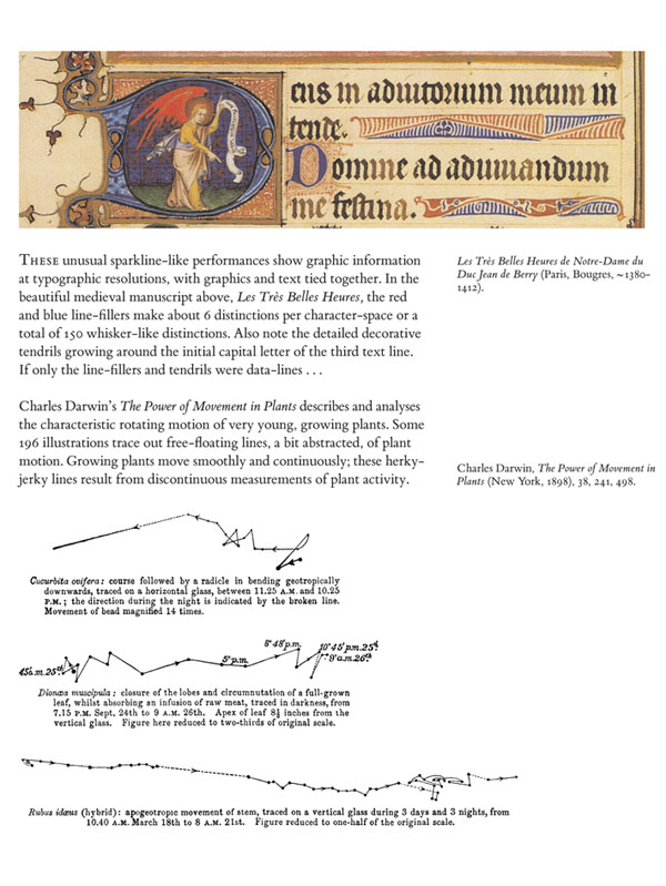
Decorative tendrils running around this page from a 13th-century manuscript bible hint of sparklines.
From Sotheby’s London, Western Manuscripts and Miniatures, 6 July 2006, 33.
The New York Times sports section on June 23, 2006 displayed a sparkline-like graph showing the outcomes of the last 218 basketball games of the New York Knicks. As our scale of measurement shows, the graph is 12 in (30 cm); a real sparkline would be a little over 2 in (5 cm).
The graph is nicely integrated with surrounding text, numbers, and images. The whiskers showing wins are too light compared to the whiskers showing losses. The win-whisker blue-tint is also used as a background tint immediately above, an unnecessary congruence. Wins might be shown in red not pale blue. The instructions for reading the sparkline “Below, each tick mark represents a victory or loss…” are not needed especially since the two rows of ticks are labelled “victories” and “losses”. (Why not “wins” rather the “victories”? Perhaps because “wins” is both a verb and a noun.) Those labels are not needed; every reader of the sports page will know what the whiskers mean. After all the reader is expected to understand these fancy words in the reports accompanying the graph:
sycophantic perpetuity passive-aggressive tenure enigma pariah dysfunctional
Both the column and the news story psychologize about the personalities of those in the team bureaucracy rather than the performances of basketball players and their competition, both of which might have something to do with the team performance. Of course not every column or news story need fully account for all the sources of variance, but these stories seem a bit one-sided in their mode of analysis.
The graphic reporter is not credited for her or his good work, although the columnist, reporter, and photographer are. Publicly acknowledged creatorship signals responsibility for work and also often improves the quality of work.
The enormously talented and productive Jonathan Corum, who took my course in analytical design at Yale, and who founded
http://www.style.org/
http://www.13pt.com/
and is now a graphics editor at The New York Times, writes in about what turns out to be his basketball sparkline:
“Hello Professor Tufte, I can take credit (as well as any blame) for the Times graphic.
I’m not sure that the whisker lines without labels would have been legible to all readers (an early draft without labels at far left was not immediately recognized as showing wins and losses by two in-house readers, prompting the more prominent labels in the final version). But I do agree that the ‘Below, each tick mark …’ instructions are redundant. They were only included because they were unobtrusive, and in case any skeptical readers went looking for clarification.
The word ‘victories’ instead of ‘wins’ is Times style, for the reason you mention, and I didn’t add my name to the graphic in part because the data it is based on was readily available, and in part because the overall presentation seemed simple enough to not merit a credit.”
An excellent use of graphics, including a 3D stack of sparklines:
Source: Thomas Taubner, Dmitriy Korobkin, Yaroslav Urzhumov, Gennady Shvets, Rainer Hillenbrand, “Near-Field Microscopy Through a SiC Superlens,” Science, 313 (15 September 2006), p. 1595.
An interesting possibility for stacked sparkline architectures with information on the apparent surface beneath each sparkline. There’s the usual problem, however, that the horizons toward the front may mask the horizons and surface toward the rear in real data:
In Beautiful Evidence, I verbally implemented (“make sparklines lumpy, not spikey and not flat”) Bill Cleveland’s brilliant analytical method of choosing aspect ratios banking to 45° (William S. Cleveland, Visualizing Data, 1993).
A recent paper by Jeffrey Heer and Maneesh Agrawala, “Multi-Scale Banking to 45°,” IEEE Transactions on Visualization and Computer Graphics, 12 (September/October 2006) provides a way to generate banked sparklines by inputting the data set and the typeface (which provides the vertical dimension if the sparkline is to fit a typographic line, as is usually the case):
Among this range of visualization tools are sparklines:
The general lesson of the paper is to look at multiple views of the same data—because different views answer different questions.
Google has incorporated sparklines into their new release of their Analytics (web site statistics) software:
Shame about the pie chart though.
Sparklines make it easy to compare multiple time series. As always, scaling is crucial: It can ruin or raise beautiful evidence. The following sparklines depict stock quotes of selected DowJones companies for 2007-01-03 through 2007-06-15.
The graph on the left scales from min to max for each quote, misleading the eye to believe that the series could be compared visually. However, without processing the min and max values mentally one cannot. The graph on the right side provides a "fair" scale as it scales from 0 to the max of all quotes, yet it is useless because most of the evidence is gone.
Very helpful, but rarely used in everyday practice is standardization, which is very intuitively understood. The graph shows the variance from an identical initial investment of 100 USD for each quote, in other words, your gains and losses.
Source: New York Times, December 15, 2007
In looking at financial time series, one of the challenges is to be able to analyse a very large number of bivariate relationships. Some of this can be achieved by statistical measures but visualisation of the relationships typically has a significantly positive impact. In the attached image, I’ve attempted to do this (with inspiration attributable to Cleveland) by plotting these bivariate relationships in a matrix. As this analysis is time series analysis, and given that the relationships are symmetrical, I have split the two halves of the matrix into the top-right showing the bivariate x-y plot (the different format datapoints are to highlight different periods of time, with more recent data darker and the latest datapoint shown as red with a callout), and the bottom left showing the time series of the difference between the two series (for those who are interested, the series being plotted are of credit default swap indices, ranked from lowest to highest average spread down the rows with the exception of the two emerging market indices in the top-left – I work in Emerging Markets). The diagonal then shows the time series of each individual index. I would be curious to know if anyone has any feedback or suggestions on how this could be improved.
Will Oswald’s Cross-Credit Historical Relationships matrix is wonderful. Always a fan of these “you are here” plots, I love the black dots against the grey past-values distribution and the red current value. We can see the current data in relation to the past. Beautiful layering.
Perhaps what is most instructive is how the simple times series don’t tell the whole story as they are only marginal distribution summaries; Will has shown us the joint distirbution, which, as is typical, tells a richer story.
Compare the data for the third and fourth entries (NA.IG and NA.IG.HVOL) to the data for the sixth and seventh entries (NA.HY B and NA.HY). Looking just at the time series, the third and fourth entries look mildly similar: flat, then big bump, then rise-to-peak, then fall. The difference plot shows that the differences go flat, then attenuated bump, then rising bumps. The joint distribution shows a really tight relationship, as evidenced by the points so close to the line.
Now look at the sixth and seventh. The time series look very similar: small rise then fall, then bump, then bigger rise then fall. The difference plot isn’t particularly special but the scatter plot of the joint distribution shows that the recent data are completely different from what has happened in the past: all but one of the black dots is completely removed from the other points!
Well done, Will.
Rafe
Flickr has been using a single sparkline on its user accounts “recent activity” page to give a glance at the user’s site traffic:
In Excel the option under the charts tab for sparklines include three types of graphics, lines, bars, and win/loss. Colors and size can be edited. The resulting sparkline can be resized and embedded in Word documents and tables, etc. although the graphics are a bit cumbersome to move to a format like eps. I also embedded text (Jan on one end and Dec on the other) into the sparklines I used in a recent report for the State. The sparklines in the report disappeared when moving between platforms and a coworker’s computer and when converting to PDF. I finally got them to work properly but it required a bit of fiddling.
Deltagraph 6 on the Mac was much easier for exporting the resulting graphic and provided better looking output and transportability.
The LaTeX package mentioned above somewhere works well on my Mac also.
Hopes this helps.
One of the best sparkline applications ever:
Sparklines used on Twitter by Wall Street Journal, May 6 2011, to share unemployment statistics using Unicode graphics symbols.
Last 12 months of the U.S. unemployment rate, which rose to 9% in April:
▇▆▆▇▇▇▇▅▂▁▁▂
More examples here.
Sparklines have become a topic of interest using Unicode on Twitter. It would be interesting to have Mr Tufte add his voice as to their usefulness. My take is that they provide a visual component to the best of the mediums ability compared to bare numbers, so in that they are useful to display trends.
ET comments:
“Sparktweets” on Twitter as happily described by Jason Kottke here.
Skepticism about sparktweets from Than Tibbets:
<img src="https://s3.amazonaws.com/edwardtufte.com/Sparktweet_critique.png" alt="Sparktweets critique"
Than Tibbets rightly criticizes the Wall Street Journal sparktweets, but perhaps some sparktweets can be rescued.
My view: if you’re doing Twitter, then sparktweets is about all you can do in regard to data graphics. So now and then a sparktweet will be better than nothing, but that’s all it’s better than (which is a short summary of Twitter in general, although is it amazing what now and then can be done in one 140-character sentence). Sparktweets are awfully low resolution and easily prone to data distortion. The solution: every sparktweet should be accompanied by the beginning and the ending number in the time sequence (which burns up 6 to 8 characters toward the 140 maximum, but with a great increase in data-presentation integrity). Sparktweets don’t measure up to real sparklines, however.
A few of the examples shown by Jason Kottke have decent resolution. For example, this clever baseball win/loss summary by Stu Spivack (which alas has to fold the last 7 games onto the third and fourth lines):
I just noticed sparklines being used by Quantcast to illustrate web traffic; as seen here on drudgereport.com:
One of the convenient things about the Twitter-style sparklines is that as Unicode text, they work everywhere text does. So you can write a command-line generator for them: github.com/holman/spark
And then you can pipe in data from the rest of the command-line ecosystem. I like the earthquake example myself:
More useful, graphing Beijing air quality:
curl -s https://twitter.com/statuses/user_timeline/15527964.rss | grep /description | perl -nle "print $1 if /PM2.5;[^;]+; (d+)/" | spark ▆▆▇█▇▇▆▆▃▆▁▁▃▄▄▄▃▆The New York Times graphics team has (again) used sparklines effectively in a couple of recent graphics. There may be more, but I noticed these two.
The first is part of the explanatory text for a terrific graphic by Mike Bostock, Shan Carter, and Kevin Quealy that shows the history of college football conference alignments. The rest of the graphic is so compelling and engrossing that the sparkline may be easy to miss:
The second is part of the home page for The Upshot. In March 2014, the header included a small section that shows, with both text and a sparkline, which party is projected to win the Senate according to the Upshot’s forecasting model. This nice touch is also, apparently, the work of Mike Bostock and Shan Carter.
In both cases, the sparklines are used beautifully as ET originally conceived them: “a small intense, simple, word-sized graphic with typographic resolution.”
Epic includes sparklines in its ‘MyChart’ electronic health records app for the iPhone. The app was featured on the big screen at Apple’s WWDC in June 2014.
For those wanting to create sparklines embedded within web views you can do so using the d3 data visualisation package:
Tutorial here.
Nils P. Johnson and colleagues, “Repeatability of Fractional Flow Reserve Despite Variations in Systemic and Coronary Hemodynamics,”JACC: Cardiovascular Interventions, 8, 8, 2015 use hundreds of sparklines to assess cardiac fractional flow reserve.