Sparklines History by Tufte: 1324 to now
HISTORY OF SPARKLINES
EDWARD TUFTE
The essay provides a history of my work creating the concept of sparklines, and then a long history of sparkline-like graphics for hundreds of years.
Sparklines are small, intense, word-sized graphics with typographic resolution. Sparklines can be placed anywhere that words or numbers or graphics can be placed: in sentences, maps, graphics, tables. Sparklines have a data-ink or data-pixel ratio = 1.0, consisting entirely of data, with no non-data at all. Thus sparklines have no frames, tic marks, and non-data paraphernalia. Sparklines often get their quantitative scaling context from nearby words, numbers and graphics; sparklines are directly quantified by numbers on or near the sparkline itself.
Sparklines can show connected data lines, discrete individual data, and lines residing in 2-space or 3-space.


Note the connected-line medical “sparklines” in the grid in Stanley Kubrick’s fine film 2001: A Space Odyssey, which was released in 1968. I saw 2001 in 1968, but not under conditions such that I would remember a data graphic.

ET WORK ON SPARKLINES
My book The Visual Display of Quantitative Information was published in spring 1983. The manuscript was completed spring 1982, based on my work from 1974 to 1982.
Intense continuous time-series, looking just like sparklines, were the very first example after my statement of the fundamental principle of good statistical graphics: Above all else show the data.
I took an example from an ECG textbook, and sunk it to – 75% of its original size = 56% area of original, nicely increasing the data density.
From Edward Tufte, The Visual Display of Quantitative Information (first printing 1983), 92-93:

Sparklines then developed in The Visual Display of Quantitative Information (1983), 133-135:


Sparklines were driven by 3 overlapping principles: maximize data density, minimize or zero-out non-data, and the shrink principle (“graphics can be shrunk way down”).
I deliberately referred to the excellent Jacques Bertin by taking a large page from his book and then substantially reducing its size.
This directly produced, for free, high-res sparkline-like data graphics. The shrink principle served well in making sparklines: start large, then shrink way down to fit into sentences. My students at Yale in the 1990s did data graphics in Excel, and then would reduce the Excel out by a factor of 3 to 5 to make high-res sparklines that would fit into a sentence or a spreadsheet cell.
From The Visual Display of Quantitative Information (1983), 166-167:

PRIOR ART IN THE LAST 700 YEARS
Line-filter graphics in medieval manuscripts look somewhat like embedded sparklines:
,%20fol.%2049v.jpg)
From the illuminated Luttrell Psalter, created by anonymous artists in England around 1320-1340.

From the diminutive Book of Hours of Jeanne d’Evreux, Queen of France in the 14th century
made by artist Jean Pucelle in Paris, around 1324-28.

From the translation of Aristotle’s Politics into French by 14th-century polymath Nicole Oresme.

Galileo Galileo, Istoria e dimostrazioni intorno alle macchie solari (Rome, 1613).
Contour lines can be thought of as three-dimensional sparklines: for various fixed values of Z, the line moves through XY space. Here’s Halley’s magnetic declination map of 1700, and the amazing Swiss mountain maps.

Edmond Halley, “A new and correct chart showing the various of the compass in the Western and Southern Oceans as observed in the year 1700 by his Majesties’ command by Edm. Halley” (London, 1701).

Swiss topographic map (1957).

Michel Florent van Langren, La Verdadera Longitud por Mar y Tierra (Antwerp, 1644).

Patterns of sea drift and the areas where certain whales can be found.
“Sea drift and whales on which the movements of the sea as indicated by the thermometer are shown,”
from M. F. Maury, The Physical Geography of the Sea (New York, 1855)

Electrocardiogram taken with Einthoven’s original string galvanometer, which he invented around 1901.

First human electrocardiogram recorded by Augustus D. Waller of St. Mary’s Medical School showing simultaneous electrometer and cardiography tracings showing an electrical activity preceding every heart beat.
From A. D. Waller, “A demonstration on man of electromotive changes accompanying the heart’s beat,” The Journal of Physiology 8 (1887), 229.
Reproduced in Majd AlGhatrif and Joseph Lindsay, “A brief review: history to understand fundamentals of electrocardiography,” Chimp 2 (2012).

Structure of the Atom: vibration of an electron as progressive waves.
From Max Born, The Restless Universe, figures by Otto Königsberger (New York, 1936).
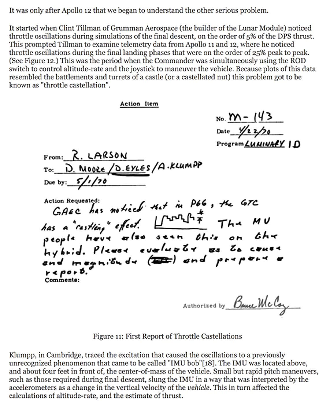
1970 NASA report of throttle problems in the Apollo Lunar Module


Representation of different aspects of a musical melody from Iván Fónagy, La vive vois: Essais de psycho-phonétique (Paris, 1983), reproduced in Geneviève Calbris, The Semiotics of French Gestures (Bloomington, 1990)

Martinus Veltman, Diagrammatica: The Path to Feynman Diagrams (Cambridge, 1994), 150-151.
In the summer of 1989 I consulted for Hewlett-Packard on clinical information systems and patient monitors. I examined a number of products including CareView and Sonos 1000 (for cardiovascular imaging). During one visit I critiqued a cardiovascular imaging interface as I viewed shirtless my mitral valve live on a sonogram. On June 29, 1989 I prepared a design analysis for HP. Point 3 used “postage stamp graphics” to pull together the sparse entries of medical event flowsheets that could go on and on horizontally for 5 to 10 feet. Here is my report, artwork, and notes about “mini-graphics” residing next to spreadsheet rows and summarizing the row data.


ET report for HP, 1989
“SPARKLINES IN THE GRID”
Microsoft filed a patent application in 2008 for “sparklines in the grid.” It seems to be about Excel interface manipulations on sparklines. There are problems:
(1) see prior art above from 2001: A Space Odyssey (1968) and from ET HP consulting and tech notes (1987).

(2) Nearly all design elements (words, numbers, graphics) reside in a manipulated layout grid, as in page design and interface design.
For more see Microsoft claim for “sparklines in the grid”.


