The Drawing Center fax show: ET exhibits
Scroll down for ET exhibits at the fax show.
The initial invite provoked memories of curly, chemically, odd-color faxes. But a few weeks later came this from João Ribas, curator:
“The fax machine model is Canon Pixma MX850. It has a resolution of up to 9600 x 2400 color dpi and 600 x 600 black-and-white dpi. We can receive color if you send your fax from a machine with color capabilities. Our machine uses standard 8.5 x 11 inch letter paper.”
Wow. But it must be pricey, I thought. Only $240 it turns out. Such high-resolution color prompted some color FAX tests.
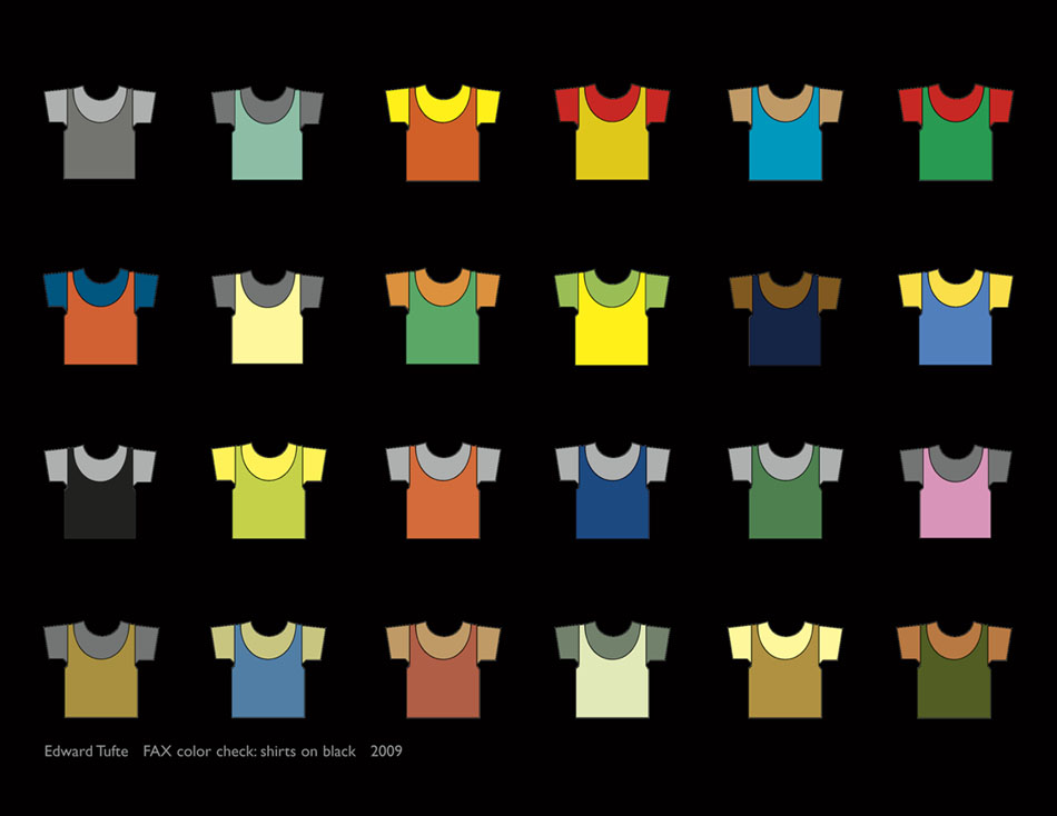
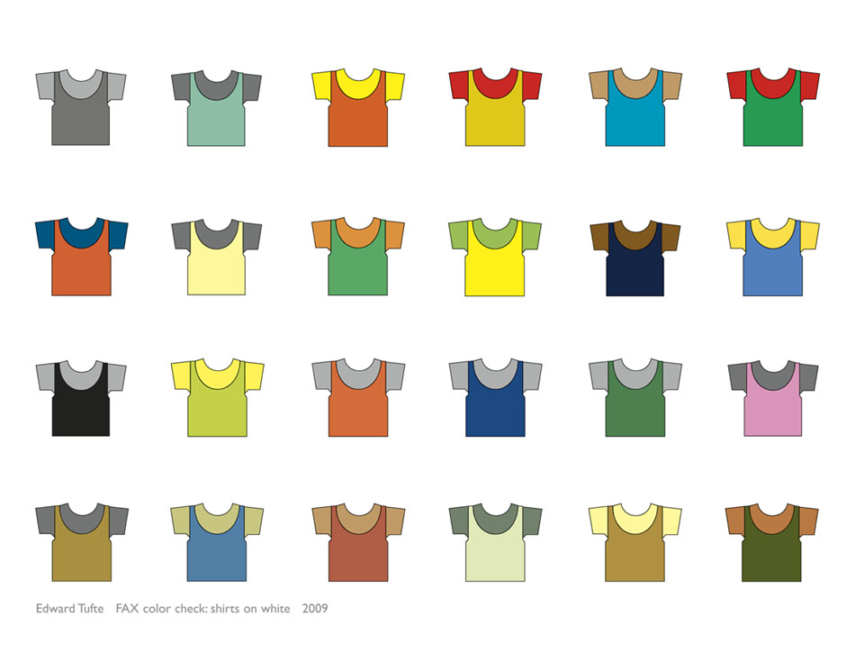
The first two images (our originals) show an image from Envisioning Information, later redone for the Cognitive Art series of fine art prints. The black and white grounds (shirts are identical in both faxes) reveal color effects of brightening, color mixing, and so on:
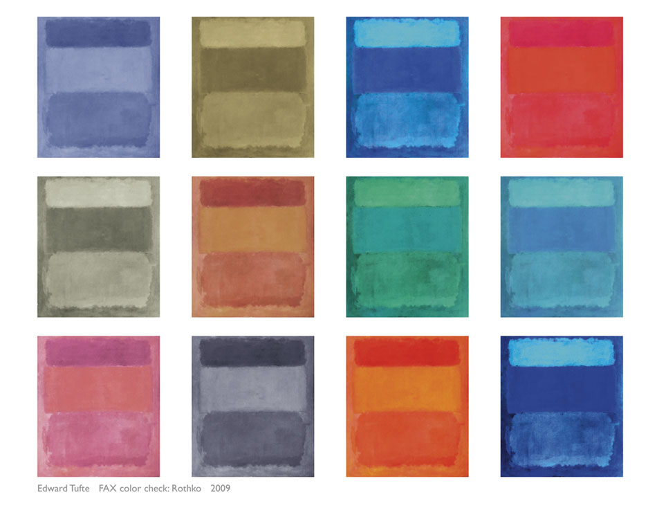
During the last year, for the show at the Aldrich Contemporary Art Museum, I’ve been experimenting with a Rothko-like structure moving through varous palettes. It appears that some of Rothko-beauty derives from structural format (color fields with subtle and ragged margins, and from saturation and value, rather than hue–because the beautiful Rothko character persists over all kinds of hue changes. My test Rothkos are printed out very large, but the FAX can only show very small versions, here collected together:
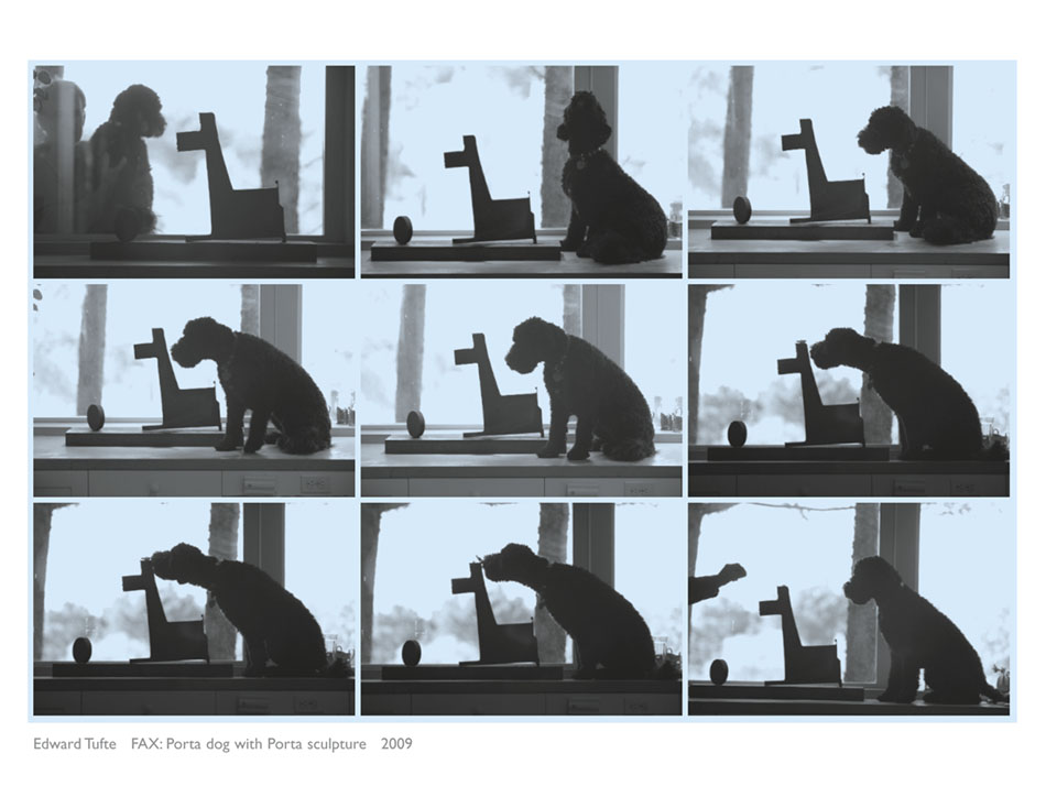
Here below is Porta the (real) Dog interacting with Porta the (sculpture) Dog, from our threads Dog sculpture and Porta and the Birds (at 300 fames/second. Porta, as her name hints, is a Portuguese Water Dog and arrived here about a year ago and happens to look like the Obama’s dog. Four months ago we welcomed Porta’s brother (same parents, not littermates) Ace, who has not yet appeared on this board. Porta is exceptional, as those who saw Porta apparently run full tilt backwards in her debut movie. There are now a bunch of Porta sculpture pieces for the Aldrich show, including a 12 foot high Porta.
But what does this have to do with the FAX show?
If artists can’t put their own dogs and dog sculptures in their own shows, what has the world come to?
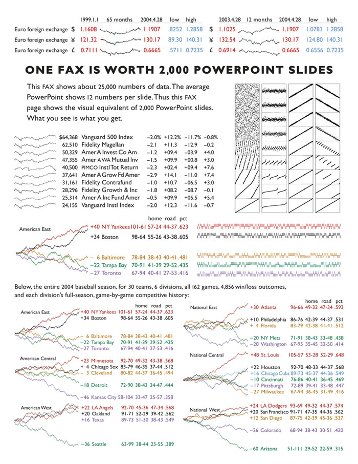
Finally, a comparative resolution test: one FAX vs. 2,000 PowerPoint slides, a play on Ad Reinhardt’s remark “If a picture isn’t worth a thousand words, the hell with it.” The image shows sparklines from Beautiful Evidence.
Shown above are our 5 originals. Below, the resulting FAX to FAX transmission as received and printed by The Drawing Center FAX machine.

Here are the results of color FAX to color FAX.
My originals (printed from those images above) were scanned by the FAX sending machine, then printed by receiving FAX machine.
The faxed Rothkos look better than the originals.
Also Porta the dog has more of a Warhol look than the original; note the FAX mottling of the blue tint. And the faxed tee-shirts have the texture of washed cloth. So perhaps the original images were too crisp and precise, and the reduced precision of color fax reproduction added some artistic noise and texture.
Interesting. The faxed Rothkos do indeed look better than the “originals”.
A really careful comparative study of resolution would make for a great book or exhibition, as would the related subject of focus. I have never understood why so few art historians (or other practitioners of “visual studies”) expressly engage with such fundamental and utterly visual matters.
I am curious why one would say the color studies after fax reproduction were better? To my eye the fax reproduction exaggerated contrast to the detriment of subtle color relationships.
What fun!
Fax machines have come a long way in terms of resolution over the years. Anyone remember trying to decipher those pages that came through as a fax of something that was previously faxed? After a few generations it becomes very hard to distinguish one blocky blob of text from another. My wife, who is a physician, unfortunately still must struggle with this problem when reviewing medical records — still kept on paper in most places and transmitted for review via fax. The higher resolution of modern machines alleviates the problem, but cannot recover the information lost from earlier transmissions. An experiment in faxing and re-faxing over and over again might make a nice art exhibit as well. Perhaps those shirts would develop even more character with repeated “washings”.
The boost in contrast is probably an attempt to improve readability of text and has a similar look to photocopied pages. I wonder how much of that effect is intentional (to aid readability) and how much is a byproduct of whatever compression is done on the image to send it over a phone line. The effect on color images removes subtlety, but adds a special character of its own, which I find to be pleasing. The originals seem somewhat muted, as if they were photographs taken on an overcast day, while the reproductions are vibrant and sharp. Perhaps my interpretation is affected by recent weather here in Boston. The days have been overcast, rainy and muted for several weeks. Today the sun is shining and the colors out my window are bold and bright with vibrant greens from trees and grass busily putting all that recent rain to use.
Click here to view the article online.