Washington Post puts map in global context
May 20, 2003 | Ryan Singer
9 Comment(s)
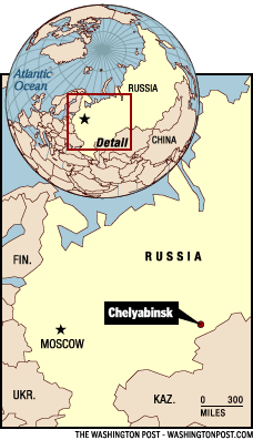
I was impressed by this map from a Washington Post article:

Check out the original article for more context.
I was impressed by this map from a Washington Post article:

Check out the original article for more context.
A good illustration, in that it provides more context than the usual fare, and compactly. Too bad that (on the globe) the Arabian Sea, Bay of Bengal, Caspian Sea, half of the Mediterranean, etc., don’t get colored blue… An accidental oversight, but it raises some questions about the map’s production process. Geographical literacy advances, but not without the occasional retreat!
This map is in in the style of the funky maps in Time years ago.
“FIN.” “UKR.” and “KAZ.” will not do. It would be straightforward to use a ready-made cartographic-quality base map here.
I ordinarily like geographic layouts of this sort … the global perspective with the zoom-in feature.
What’s deceptive here is the “detail” section of the graphic has greater width than height. However, when you skip to the zoom-in “detail” section, the height is greater than the length!
Michael Round
The difference in the dimensions of the two rectangles is caused by the map projection chosen- probably Mercator. Presumably, all of the stock plan-view maps in the Post newsroom are in Mercator projection, which is notoriously bad at describing relative area at extreme latitudes.
Michael Round raises an excellent point by questioning the projection used for these maps. My guess is that rather than Mercator, the “zoom-in” may be a cut-and-paste from the shown globe (note a small piece of Greenland in the upper left corner of the zoom-in frame), and the globe is probably in an orthographic projection.
One of my frequent concerns with maps like this example is that a scale is shown when the projection is unknown- a concern because scale can vary across the map!
The good and bad points of several map projections are briefly discussed and summarized at the US Geologic Survey’s website: http://erg.usgs.gov/isb/pubs/MapProjections/projections.html
[link updated February 2005]
Scale and political content seem to be inextricably linked of late. See this disquisition re Baghdad and your favorite cities.
http://www.cockeyed.com/citysize/baghdad_dc.html
The relative scale of streets and rivers would lead one to believe that a metropolis of 5 million was not being attacked. View and decide for your self.
Not to fond of it myself. While I like the superposition, it seems there’s a lot of wasted space in the details [did the map have to be tall enough to show Svalbard?], and the two maps show me different things [I see Moscow in the bird’s-eye, but Chelyabinsk in the details].
What’s China got to do with it, anyway?
This topic is quite personal for me. The Washington Post does not use ‘stock’ projections for any of their maps — and certainly none of the Mercator variety. All maps in The Post are custom made for each story unless an appropriate map has been produced previously. Indeed, The Post graphics department has no less than 4 full-time cartographers on staff at any given time. Let me emphasize, they are ‘cartographers’ — not graphic generalists who also make maps, but educated cartographers by profession. This has been the case for over three decades.
As for the lack of color in some of the water area, this is indeed an oversight not caught in the editing process. The Post produces hundreds of maps every year. Mistakes happen on deadline and are corrected accordingly.
Abbreviations such as “FIN.”, UKR” and “KAZ.” are AP style and something all news agnecies follow for consitency. However, the general rule often followed is that if there is room for a place name then it should be spelled-out.
As for the projections, the globe locator is likely a simple perspective view. The main map is either an equidistant or equal-area projection — the primary flavors of Post cartos — hence a scale is entirely appropriate. The detail box is on the globe is shaped that way because the two projections are independent and therefore show the same area in different proportions. To be completely accurate, the outline of the detail box on the globe would follow the contours of the projection itself.
All of this said, based on my knowledge of how Post cartographers and news artists work, this particular map was not produced by a Post cartographer. Possibly a news artist or one of the artists at the website as it does not meet the typical standards for a Washington Post map. Notable is the lack of detail in the line-work of the main map — far too generalized — and the afore mentioned color issue and abbreviations.
Kind regards,
Lou Spirito — Former Washington Post Cartographer and Senior News Artist, 1997-2001 & 2003-2005
Thanks for this thoughtful contribution from Louis Spirito about the cartographic process.
From the reader’s point of view, what matters is the published outcome.