|
All 5 books, Edward Tufte paperback $180
All 5 clothbound books, autographed by ET $280
Visual Display of Quantitative Information
Envisioning Information
Visual Explanations
Beautiful Evidence
Seeing With Fresh Eyes
catalog + shopping cart
|
Edward Tufte e-books Immediate download to any computer: Visual and Statistical Thinking $5
The Cognitive Style of Powerpoint $5
Seeing Around + Feynman Diagrams $5
Data Analysis for Politics and Policy $9
catalog + shopping cart
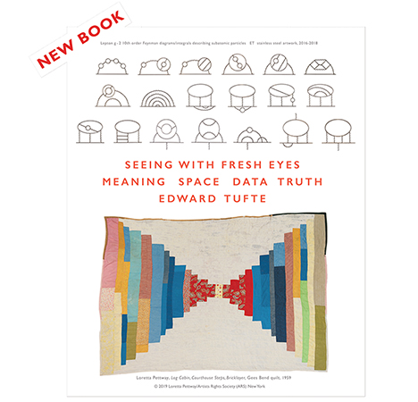
New ET Book
Seeing with Fresh Eyes:
catalog + shopping cart
Meaning, Space, Data, Truth |
Analyzing/Presenting Data/Information All 5 books + 4-hour ET online video course, keyed to the 5 books. |
Question
Do you think the days of the strict corporate design manual are numbered? I have designers around me who say 'oh no we can't do that it breaks the pre-ordained design parameters set i.e. grid width not specified, colour not specified, typeface not specified. My view is, if it does the job for which the change is intended - gets the company noticed and helps sell more products or services, stuff the parameters. We are not here to please our senses or look uniform but to do a good job.
Perhaps I'm the only one who thinks like this. Be interested in your views.
-- paul filer (email)
Response to corporate identity
Consistency in design such as typeface and colour can really enhance the equity of a company or brand over time in my opinion. But I don't think very many companies do it very well.
Those that do it well include Apple. You just know you're seeing an Apple ad before you ever have to see their logo. The clean look and consistent typeface always says Apple. I worked for Bose Corporation for 10 years and they are also pretty good at it.
Providing parameters for design helps keep all the people responsible for communications within some type of bounds. If you don't have some parameters, you get people in various departments creating their own favourite looks- whether it be HR creating ads for jobs, or other non-marketing types deciding what's cool at the moment (and to them).
The end result is often veering away from the core message that the company wants to portray and also that creators focus on design at the expense of content.
Corporate design manuals might be best to convey a required tone, typeface selection and frankly a number to call if you're not sure what that means.
I guess I am a fan of some kind of 'manual'.
-- Alison Fraser (email)
DESIGN IN LARGE CORPORATIONS: DON'T GET ORIGINAL, GET IT MORE OR LESS RIGHT
In a large corporation, it is very hard to get hold of graphic design. Thousands of employees are putting vast amounts of visual material out for public consumption--forms, advertising, interfaces, manuals, and so on and on. That material represents and exemplifies the corporation and is the design presence, indeed often the very expression, of the corporation along with the products themselves.
If there is a well thought-out design standard, it should be followed. In practice, great design comes from great designers. That is empirically the case. If a great designer did a first-rate standard, that model should be followed. Great design is not democratic; it comes from great designers. If the standard is lousy, then develop another standard.
These views grow out of my experiences for many years long ago in working with Paul Rand on graphic design and Richard Sapper on industrial design with IBM--and in my own hard experiences in trying to improve the manuals and the interface at IBM. These views are contrary to my deep and inherent contempt of bureaucratic hierarchy, but this approach is the only way I know to produce design excellence in the enormous range of visual displays and products in a big corporation. I wish it could be otherwise.
Standards and templates are an efficient way to produce decent design. In the corporate world, the key word here is "efficient." Or as someone (Steve Jobs?) once said: "Great designers ship."
If your goal is to produce original, creative designs, the big corporation is probably not the best place to work. Better to do consulting or teach or start your own design business.
A fundamental task of the lead designer is education, teaching the meaning and relevance of good design standards. And enforcing those standards, along with identifying and rewarding improvements over the standards.
-- Edward Tufte
ET: Thank you for your contribution to this thread. I appreciate a good design manual. The Steve Jobs quote is "Real artists ship."
-- John Driscoll (email)
Are "strict identity manuals" out of fashion? No. Quoting from www.identityworks.com... "The word 'Guidelines' is in fashion, but implies flexibility. I prefer 'Standards.' The appearance and exposure of the corporate brand must be constant. In even the most entrepreneurial corporate culture where 'all permissions are granted unless expressly denied,' identity must be the great exception, in which... all permissions are denied unless expressly granted.
"Until 2000 or so, the best manuals were beautifully designed books or boxes of booklets, expensively produced in support of their quality message and policy importance. Today, print is more often used for a beautiful 'voice' brochure that promotes the corporate brand's visual impact to its employees; the heavy lifting, the nitty-gritty details and application templates, are on a web site. This solves the problem of aging manuals, with their high cost and their rapidly declining respect and observance."
Bottom line... the strong brand demands firm design standards. Only then can leaders enjoy the great corporate brand paradox; the stronger brand loosens bureaucratic constraints, empowers greater autonomy.??
[Dr. Tufte: On the identityworks/tools/manuals page, may I quote from your (above) comment?]
-- Tony Spaeth (email)
You are welcome to quote the ENTIRE statement, but please no picking and choosing just certain sentences. The statement is meant as a whole, seeking to reveal and to weigh the conflicting values involved.
-- Edward Tufte
In corporate identity, consistency matters more than the absolute "quality" of design.
This doesn't mean a design standard can't be flexible.
To paraphrase the Steve Jobs paraphrase: "Real designers do great work *within* the corporate standard".
I was involved in a very large identity roll-out in Australia where only three design firms (including the one that developed the identity) and one writer were initially allowed to do design work (I think, for the first six months).
This expanded the identity manual from a set of abstract standards to a diverse library of finished work. So as other designers were commissioned, they could see how the standards could be applied.
-- David Glover (email)
On guidelines and standards manuals, see
http://www.identityworks.com/tools/guidelines_and_standards_manuals.htm
-- Edward Tufte
Building brand equity is in part a process of neuro-imprinting. Seeing the same graphic within the same context over and over creates a permanent imprint on the mind. (e.g. The golden arches triggers recognition in 2-year olds.) The degree of 'sameness' affects the efficiency of the imprinting. So within limits, marginal design that is perfectly consistent might build more brand equity over time than great design presented inconsistently.
For this reason, logo lock-ups at large corporations are often updated infrequently and only with changes that are imperceptible to anyone without a manual and a micrometer.
The context is also critically important. A traumatic experience at McD's at 2-years old might trigger a negative association with the logo and product for life. Nurturing the combination of perfect consistency with positive customer experience makes building brand equity a bit tricky -- and makes graphic design work within large corporations very dull.
-- Ken Rohleder (email)
The problem with shifting away from an easily identifiable branding is the difficulties and costs this raises with any re-branding effort. As more companies move their presence online, the ability to change identity easily via the use of technology such as cascading style sheets (CSS) reduces very significantly the cost of rebranding. By contrast, total independence within a company of the look and feel that is used will make such global changes near-impossible to achieve.
-- Will Oswald (email)
|
||||||||||||||||

