|
All 5 books, Edward Tufte paperback $180
All 5 clothbound books, autographed by ET $280
Visual Display of Quantitative Information
Envisioning Information
Visual Explanations
Beautiful Evidence
Seeing With Fresh Eyes
catalog + shopping cart
|
Edward Tufte e-books Immediate download to any computer: Visual and Statistical Thinking $5
The Cognitive Style of Powerpoint $5
Seeing Around + Feynman Diagrams $5
Data Analysis for Politics and Policy $9
catalog + shopping cart
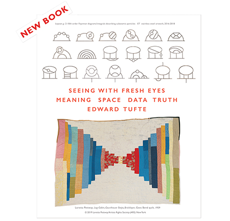
New ET Book
Seeing with Fresh Eyes:
catalog + shopping cart
Meaning, Space, Data, Truth |
Analyzing/Presenting Data/Information All 5 books + 4-hour ET online video course, keyed to the 5 books. |
James Fallows provides a fascinating annotation of the recent State of the Union speech. The annotation is from several viewpoints: (1) the technical problems faced by speech-writers (Fallows wrote presidential speeches), (2) the parts of the audience addressed by parts of the speech, (3) the quality of argument and evidence, (4) the use of rhetorical ploys in most SOTU addresses (e.g., "Lenny Skutnicks").
Fallows interpolates annotation (italics) between sentences of the speech (roman), an interesting technique. Another method is to place annotations in the margins of the primary document, as in the ICU hospital bill in Envisioning Information and in the analysis of the Boeing-Columbia slide at https://www.edwardtufte.com/bboard/q-and-a-fetch-msg?msg_id=0000Rs&topic_id=1
Here is the link https://www.theatlantic.com/issues/2004/01/sotu-address.htm (requires registration)
This thread might evoke discussion about techniques of annotation and rhetoric, not about partisan views.
-- Edward Tufte
Microsoft's Comment function provides a fantastic way of annnotating texts. A slight visual signal (a footnote mark or highlighting on a word/phrase) cues that there is more to be seen. By floating the cursor over the comment notation, the comment pops up after a short pause.
The benefit to this is that 1) it does not necessitate moving your eyes from the original text in any way. The text can be read through in one flow without any annotation, specific annotations can be immediately viewed by the reader without changing location of attention (as opposed to a sidebar). 2)It also requires no matching or reference: a heavily annotated text is as easy to view as a non-annotated, since to view annotation, one simply "touches" where the notation is - no numerical reference necessary.
Obviously, the downside is that it is electronic, not print.
-- Daniel Egan (email)
I've used Adobe Acrobat to annotate narratives, and sometimes graphical images. Of course, the document has to be converted (or already be) into the PDF format first.
-- Gene Prescott (email)
It's nice to be able to read the commentaries running along with the text of the speech. But I found it difficult to differentiate the notes from the body of the address. With both text and commentary in the same typeface and size, the only difference is that the commentaries are set in italic and marked by brackets, making it all just run together. Better typography would make both easier to follow. One option is the side note layout noted by Dr. Tufte above. As some of the commentaries are quite a bit longer that their accompanying text, this may make for a fair bit of jumping back and forth from speech to notes. I've reset a page's worth below in a sort of hybrid, with inset comments set in a different face, size and color and hanging just below the text. (The paragraphs are as laid out in the article). This seems to better allow for the flow of the speech and nicely sets off the commentary, making both easier to read.
 |
-- Steve Sprague (email)
I've always been fascinated by the arrangement of text / commentary on pages of the Talmud; significance is conveyed not only by the use of different scripts but also by the specific placement of text on the page (in the center, towards the outside margin, etc. etc.)
See
http://www.ucalgary.ca/~elsegal/TalmudPage.html
http://www.jewishencyclopedia.com/images.jsp?artid=32&letter=T&imgid=1910
-- Mike Christenson (email)
In college religion courses I used to appreciate The Interpreter's Bible, a multivolume commentary from a Protestant perspective. It divides most pages into 3 zones: a few lines of scriptural text (in English) at the top of the page, a commentary for scholars, and a commentary for writers of sermons. I'm not enough of a scholar (or Protestant) to speak to its quality, but as a student I found it enlightening.
-- Erik Schwab
Take a look at PBS NewsHour's take on annotations of the speech. The annotations appear in simple boxes that float above the noted text. I find it to be very effective.
-- laurabug (email)
Here is an example of putting `out of band' data in context with running content. The example demonstrates the use of a software package for LaTeX. Despite the name `todonotes', I think this package is a decent way of approaching the problem. It combines effective use of margins with color-coding and physical links between the margin notes and their relevant subject in the text. Of course, color choices could lead to some design misfeatures, but such is the nature of sharp tools.
-- Jorden Mauro (email)
|
||||||||

