|
All 5 books, Edward Tufte paperback $180
All 5 clothbound books, autographed by ET $280
Visual Display of Quantitative Information
Envisioning Information
Visual Explanations
Beautiful Evidence
Seeing With Fresh Eyes
catalog + shopping cart
|
Edward Tufte e-books Immediate download to any computer: Visual and Statistical Thinking $5
The Cognitive Style of Powerpoint $5
Seeing Around + Feynman Diagrams $5
Data Analysis for Politics and Policy $9
catalog + shopping cart
New ET Book
Seeing with Fresh Eyes:
catalog + shopping cart
Meaning, Space, Data, Truth |
Analyzing/Presenting Data/Information All 5 books + 4-hour ET online video course, keyed to the 5 books. |


What font do you recommend for official correspondence? I would like to try and convince my work (a State government agency) to switch from Arial (10,12 and 14 pt, with fully-justified paragraphs!) to the most reader-friendly font/layout possible.
I know from reading your books that serifs make reading much less of a chore, as do left-justified paragraphs, but I'm not sure which font would be the best. I have personally made the switch to Times New Roman 12pt for my writing at work but of course nearly everyone else is toeing the line and using Arial.
I note that the US State Department has recently switched from Courier 12pt to Times New Roman 14pt, refer link for news report, so maybe Times New Roman is the way to go?
-- Jim Moore (email)
The original reason for Arial may be a residual echo from past intellections on the subject. In them, there may have been the factor of limiting technologies. Even the Arial with fully-justified paragraphs may have been due to older screen technology limiting choices. Remember when computer screen resolutions came in 40 and 80 lines only?
While my design side agrees with you in your desire to shed Arial, my engineering inclinations would like some evidence. A final font choice for organizations should have considered what violent devices might be used on the documents. How does the font survive the resolution of fax, text scanners, and general reprographics? Someday technology might make our lives easier, until then we find ourselves at its mercy as usual.
It may be worthwhile to create a test page with three to fifteen alphabets, each with different fonts. Then copy the page, make a copy of the copy. See how many times you can copy before those serifs start bloating and fracturing away. Fax it, copy the fax, and re-fax it. Can the paper document be scanned and read by a computer? Can you think of any other technology your government uses that might compromise the print? When you discover which fonts survived the ordeal you'll have your font choice, and perhaps ammunition for your cause.
You may be able to do with many serifed fonts, but it's risky with technology in the mix. Even Dr. Tufte resorted to creating a proprietary Bembo font (ETBembo) to fix problems which occured when the original Bembo font was mirrored to an electronic version. What you see on the screen isn't always exactly what hits the paper. You may find yourself with a fine font, but with odd results on different systems two years from now. How might the font choice appear on a PDA?
Above all we're moving into tax season in an election, make the choice the cheap one. What I owe will be as clear in Arial as it is in Times. And right now, I'd rather have more Time.
By the way, Is ETBembo available?
-- Jeffrey Berg (email)
The question of what font to use for official correspondence is a question with no real answer. It all depends on what you like. Granted that "official correspondence" imposes some limitations (ballon-like characters are out!) but within those limitations the choices are endless. I'd recommend a copy of "Stop stealing sheep" a book on elementary typography that doubles as an adobe type catalog. It should give you some ideas.
Some typefaces you may wish to consider are:
Lucida - a family of typefaces designed for low resolution devices
Garamond - A typeface common in computing books
Bembo - Another book typeface that could be adapted to correspondence although I think it's too formal for anything but a book
Century - a typeface from the turn of the century (19 to 20) with many members (not just 'schoolbook'). Try Century roman.
Caslon - A typeface much favoured by GB Shaw.
Baskerville - a typeface much favoured by early US printers
Optima - a sans bookface with 'virtual' serifs
You seem to have the basics down (serifed typeface, left justified paagraphs) but there are other factors to consider also. The line length should be about 60 to 70 characters and no more, the interline spacing should be about 120% of the font size (more or less depending on the font), ample margins, correct use of ligatures and kerning. Remember good typefaces only show their quality at 600 dpi and above. Therefore a low resolution device like a monitor screen (72 dpi) is not truly WYSIWYG. Fonts that look good on screen rarely print well and vice versa (e.g. print out a paragraph or two in Helvetica or Times Roman or Baskerville (fonts designed for print) and compare them to the same paragraph in Trebuchet, Verdana or Georgia (designed for the screen). You will find a marked difference in the readability of the print output. Also remember that choosing a typeface is only one step, using it well is an ongoing journey.
-- John Walker (email)
A few more criteria to keep in mind:
1. What platforms will the typeface be used on (Windows, MAC, Linux, UNIX)? 2. Does the typeface contain all of the glyphs that will be needed?
3. What languages besides English must be supported, and what special characters might these languages require?
4. What range of weights will be needed?
5. What do you want the choice of face to "say" to the reader, from a design and historical perspective?
If I were in your shoes and had to choose a single face, I would pick Adobe's Warnock Pro. It's a very robust face, bold enough with stand many cycles of printer/fax/copier/scanner and remain legible. At the same time it looks good on the computer screen. It is available in OpenType format, which is cross platform (Windows and Mac) and supports the Unicode standard. It has an incredibly rich set of glyphs. It form is "classic yet contemporary" which might be just the message a government agency wants to send. The only downside might be that it has so many weights and so many characters that can be a bit overwhelming to manage. Although one might say that Warnock's manifold glyphs are consistent with government's modus operandi.
-- Reynold Dodson (email)
Response to Font for official correspondence
Seth- I'm no expert, but I copied a paragraph from your post into MSWord and tried as many of the different fonts mentioned as were available. I have to agree with you about Garamond. After attending an ET seminar, I got the idea of using blue screen with white letters in order to cut down on white-screen glare. Garamond cuts down the font glare even more than any of the other fonts. It's a little smaller than the others even at 12 points, so it doesn't jump out at you as much, but it doesn't beat you over the head, either. (If I increase the font to 14, though, it's about as bright [dark, in your terms] as the others.) A screen full of Garamond is easier to read, easier on the eyes, and has a classier feel than any of the others. I write all my school papers in APA style, which wants a dark, serif font that's double-spaced, and this font looks even better that way; maybe it'll fly. Thanks for the tip!
-- Ted Heaberlin (email)
Response to Font for official correspondence
What is "best" may depend on the eyes of the person doing the reading, and especially on their age. Now that I'm getting elderly (61) I find I agree with most of what previous posters have said about Garamond, both for printed work and on the screen. 40 years ago, however, when my eyes were more acute than they are now, I would definitely not have agreed. I remember trying to read a book set in 12 pt Garamond many years ago, and finding it almost impossible to concentrate on the text because I found the very sharp cusps of the letter r so distracting. I looked again at the same book recently, and found no problem with the typeface. I think the difference is that I don't see such fine details as I did then. I find Bembo takes a lot of beating, though I tend to use Baskerville more for technical work as Bembo looks too literary for mathematics.
-- Athel Cornish-Bowden (email)
Response to Font for official correspondence
Any suggestions on a font that is a good compromise in terms of universal use? I agree on the relative attractiveness of Garamond for many purposes but this doesn't read as well on-screen or in PDF until printed. For data, are there any free TTF that resemble Bell Centennial, as a lot of the work I do involves data tables.
-- Will Oswald (email)
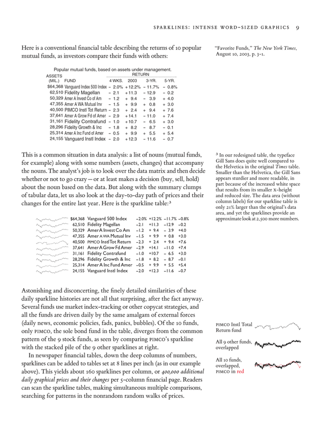
Gill Sans for tables
I've found Gill Sans very good for tables; see the sparklines chapter, page 9, for a comparison of Gill Sans and Helvetica for mutual fund tables.
 |
-- Edward Tufte
In defense of Courier
In response to all of the deprecating comments on the Courier family, and monospace fonts in general, I would like to offer another viewpoint.
I often find myself performing work on the other side of data analysis, and have to make sense, technically, of some random stream of data. Imagine a spreadsheet dumped out into a text file, for example, or finding ways to appropriately match values between two disparate sets of data describing the same subjects. Monospace fonts are invaluable in any situation where one must count the number of characters (including spaces) for comparison, programming, some aspects of math, or even some forms of reporting.
I dare you to try to do something like this without a monospace font or some sort of rich text or markup language:
Category  Value
--------  -----
North         3
East          1
West          2
If you have the time and resources for rich text or some sort of markup schema, you can do something like:
| Category | Value |
|---|---|
| North | 3 |
| East | 1 |
| West | 2 |
Of course, not everyone will want to turn on HTML rendering in an email.
-- Matt Grimaldi
-- Matt Grimaldi (email)
Response to Font for official correspondence
The point is a good one, but it doesn't demand clunky Courier or monospaced letters. It only requireds monospaced numbers in order to get the columns to line up.
-- Edward Tufte
Response to Font for official correspondence
I'm going to have to agree with Mr Grimaldi on this one and humbly disagree with Dr Tufte's statement that the only requirement is monospaced numbers.
I often make little data summaries, akin to Mr Grimaldi's "North, East, West" table but typically with more columns, and include them within email text. A monospace font, complete with monospaced letters, is invaluable since often the table rows contain words as well as numbers.
Perhaps Courier is clunky but I know that it seems to be readily available in just about every piece of software into which I enter content, so I use it likely more than anything else. In fact, perhaps ironically, in the browser window in which I am currently typing, Courier seems to be the font I am using. (And monospaced fonts keep my programs looking sharp as well!)
Anyway, feel free to take away my Courier but please leave me a font complete with monospaced numbers AND letters!
-- rafe donahue (email)
Monospace fonts
Unless the whole line (in plain text) is monospace, nothing will line up reliably. Not even tabs are reliable.
Perhaps I should have found a better example than a table, such as finding all the variations in the way somebody's name is spelled. Monospace fonts can help expose cases where an extra space or letter might get hidden by a proportional font. As I said before, this is not the kind of thing to be found and analyzed in a final report, but more in the early data analysis and normalization stages.
I don't want to get into a discussion about how poor a medium plain text is for reporting -- I'd be the first to agree. My point was more about the sometimes useful tools of lining up patterns and counting spaces, etc. which really do require monospace fonts.
E.T.'s point about monospce numbers does make sense in a full page-layout toolset context, especially if you want to make a numeric column pull double duty as a kind of logarithmic bar chart.
-- Matt Grimaldi (email)
Response to Font for official correspondence
For a long time I used Times New Roman, that being the font of choice at my firm, a major investment bank. I switched firms, and generally kept using this font, without thinking about it very much -- it is practical, rerlatively easy to read, etc etc. Then I moved to a firm where the secretary insisted on putting all my correspondence into Garamond 12 pt. I began to love it -- it has a slightly lighter feel, a bit more elegant, and I think makes a distinctive statement without being too obvious. It's Garamond for me!
-- David Schwartz (email)
Response to Font for official correspondence
Paul Rand once said that if the IBM logo were designed by market testing, the logo would have been set in Cheltenham.
Well-conducted typographic popularity contests (which the example above is not) will yield reasonable workaday conventional (in a good sense) typography, which probably will be better than designer choices. But such taste testing will never produce innovative excellence.
-- Edward Tufte
Response to Font for official correspondence
I think the typeface used should depend on the amount of information you have to present. A couple of paragraphs and left-justified Arial is fine and even Arial may look neater and clearer than a serif font. For reports of more than a couple of pages I would definitely go for a serif face. Tahoma may be a good compromise and I would suggest trying the new faces in MS Office 2007.
As for justification, I think that would depend on how ragged your right hand side is or how unevenly spaced certain lines become if justified. One of my local newspapers has overly narrow justified columns which makes for overly uneven character spacing. In a proper newspaper justification can imply a grid better than actual grid-lines, but I like the mix of justified and left-aligned text provided by the Daily Telegraph.
As a programmer I can put up a vigorous defence of monospaced fonts and Bitstream Vera Sans Mono in particular. Even though programmers prefer huge high definition displays, I write this on a mere single 21" CRT at 160x1200 (two 24" LCDs would be sweet), in programming the implied grid of a monospaced type face is a great tool for simple layouts that is not just a throwback to the limitations of early displays.
I suppose it could be argued that the need for a monopsaced typeface is a throwback to the limitations of computer languages as a way of describing solutions to problems and also the limitations of the mouse and keyboard as an input device. I look forward to being able to sketch computer instructions on a tablet PC (preferably from Apple). I was also thinking last night about another thread on a programming web site, where the topic was syntax highlighting and adding new symbols to the computer language and came up with the following metaphor. ASCII code is like cash, everyone accepts it even though other things like debit cards can be more efficient. ASCII can be read by nearly everyone and also just requires so much less infrastructure in terms of a programmer's time than rich text and graphics - in a similar way to cash needing less infrastructure than debit cards. For example, it is easy for me to put pictures of items for sale on a website and accept cash in the post as payment, but for secure electronic transactions I would need to jump through a few more hoops to get the money flow set up. Maybe that's why Jeff Bezos has more money than me.
Finally some boosterism for Bitstream Vera Sans Mono. It has a horrible name but is a truly beautiful face and is completely free for anyone to use. In some cases I forget it is monspaced until I see the zero with a dot in the middle. Mono's siblings, Sans and Serif, are not perfect but I do think they beat Verdana and Georgia every time.
-- John Ferguson (email)
Screed against Arial font
My two cents...
We are general contractors. The hours before bid time are full of frantic bid comparisons from suppliers and subcontractors. Invariably, these are faxed documents. I cringe every time I see the tiny, clotted Arial font—when it is difficult, if not impossible, to differentiate between the numerals ‘6’ and ‘8’. This is especially frustrating since it happens so frequently. Since the bulk of our contracts are unit-price, every number matters. Sometimes I need to multiply quantity times unit price to make sure I’m entering the right unit price. This is not the time to make silly multiplication checks. Give me Times New Roman over Arial any time!
Jeffrey Berg’s suggestion of February 2, 2004 to run a potential font through several generations of faxing and copying is very helpful—I wish everyone would try this. Such a test will reveal quickly if the selected font (and size) is readable or not, under sub-optimal conditions.
Another helpful practice is to fax critical documents with small characters at a higher resolution. The construction industry still relies heavily on faxed bids. Owners, architects and engineers are issuing more construction documents as Adobe .pdf files, but the contracting side has been slower to adopt this format.
Someday, the fax machine will occupy its rightful place in the Smithsonian Institution as an antique communication device.
-- Jon Gross (email)
ET,
What is your opinion of ragged-right vs. full justification for magazine-style annual reports? I have been trying to find research that will indicate whether one or the other is preferred from a readability standpoint, but so far have found conflicting information on the topic.
-- Karen Johnson (email)
Even in an magazine style format, a financial report should convey a solidity and strength to reassure investors that the company is on a sound footing - the numbers will tell the truth but the report should support them. A cliched but useful approach in that style of document is to use a modern serifed font like Bodoni or Walbaum in single column format about 60-70 characters wide with full justification rather than ragged right. Modern fonts are heavily associated ith banks and financial institutions as a result of heavy use by ad companies from the 70's onward. However if the report is being formatted in something like Word, the justification functions are simply not good enough, the result will be rivers of spaces in columns due to the use of a line by line justification algorithm. Our distaste for fully justifed text is because it is so poorly done by many commonly used programs. The report should be laid out using something like InDesign or PDFTeX (with microjustification turned on) that has a paragraph and page based justifcation algorithm (The latest Word may have this, I'm not sure). If you are using a multicolumn page, then a more informal font (e.g. garamond) with a ragged right setting are better choices. But don't confuse ragged right with no hyphenation. The best typographers of days gone by used hyphenation to prevent the right margin from being too ragged. Again very few tools do this well automatically. None of this is new. Read some typography books to get more information (Bringhurst's "The elements of typographic design" is a good starting point).
-- John Walker (email)
Use of monospace font for email
I work as a government contractor. In my e-mail correspondence with government employees all e-mails are converted to plain text (monospace font). Any tables or other HTML formatting within an e-mail body are stripped. Tables are particularly problematic as they end up being unreadable in non-HTML e-mail. I have resorted to attaching .pdf's to show my tables (created in either Word or Excel). This may actually be clunkier than preparing the email in plain text and using a table similar to Matt Grimaldi's September 12, 2005 post.
-- Bill C. (email)
The narrower the columns, the less likely fully justified paragraphs won't be sucktastic. But no hyphenation at all can be just as bad (especially in German). Knuth:
To do a decent job of ragged-right setting, the trick is to set \rightskip so that it will stretch enough to make line breaks possible, yet not too much, because short lines should be considered bad. Furthermore the spaces between words should be fixed so that they do not stretch or shrink.Tex and the ragged2e package in Latex both implement a 2 em-wide buffer zone at the right margin, i.e., not hyphenating if there's a word break within 2 em of the right margin, and hyphenating if there isn't. I think I recall Tufte mentioning InDesign for his book production; the default in CS3 is a 1/2 inch buffer.
-- Patrick Carr (email)
You're using MSWord at the same time that you're wanting to make serious decisions about fonts. MSWord does not make proper use of any font, for instance, all the bolding/italicising/underlining is faked and darn ugly. Control of layout is hopeless and control of ragged lines non-existent. Fully justified text is nothing like what I would send out to anyone. Sure, you can get ligatures in when you try, but the words turn into non-dictionary words. When all is said and done, the best font in the world isn't going to improve much correspondence written in MSWord. You'll barely get 10% from the full potential of any professional font when using MSWord.
If you're just switching from one MS font to another, from my experience it's all about the same, after a few months in the new font. That's not to say you can use any MS font for anything or that you shouldn't look for improvements. The return on energy invested is slight.
-- Chris (email)
|
||||||